


 Your new post is loading...

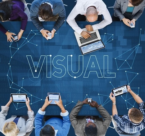

Big data is revolutionizing the way businesses gather and analyze data. Ultimately, it is optimizing the speed and efficiency of the decision making process. While advanced analysis tools bolster the information gathering and analysis of data, purely numerical models can be difficult for anyone who isn’t an IT guru to read.
Visualization tools take the data gathered by your company and make it palatable. Analyses can be difficult to comprehend, but once it is put into context through the use of visual aids like length, position, size and color, the outputs no longer look like hieroglyphs. The proper big data visualization tool can create visuals based on human preference and perception. That’s right, it even analyzes data to decide how to best present data to you.
By putting statistics into pictorial format, it allows those you to make tough business and marketing decisions by helping you see analytics like IT specialists. Visually appealing data enables you to identify trends and have a better grasp of previously unnoticed causes and effects. Infographics, geographic maps, and enhanced pie and bar graphs and time-series charts can bring to life to show data in real-time.
Learn more / En savoir plus / Mehr erfahren:
https://www.scoop.it/t/21st-century-learning-and-teaching/?&tag=Big+Data...