2012 in review: designer Val Head selects 20 of the best uses of CSS we've seen this year...
Via Miriam Stenson
Get Started for FREE
Sign up with Facebook Sign up with X
I don't have a Facebook or a X account


 Your new post is loading...
 Your new post is loading...
Your new post is loading...
 Scoop.it!
2012 in review: designer Val Head selects 20 of the best uses of CSS we've seen this year... Via Miriam Stenson 
No comment yet.
Sign up to comment
Scoop.it!

You can't afford to ignore the challenges presented by the prevalence of hi-res displays, but fortunately, there are some great tools out there for hi-res design It’s pretty clear that hi-res displays aren’t going away. Modern smartphones almost exclusively boast displays with pixels packed so tightly you can’t see them. Apple has also introduced similar displays to its iPad and MacBook Pro lines, and other manufacturers will soon follow suit. Indeed, Google recently announced its Nexus 10 tablet will have a 2560x1600 pixel resolution, clocking in at around 300 pixels per inch. If you’re keeping count, that’s essentially print quality.
The problem with such high-resolution displays is that although native text on the web renders beautifully on them, raster images do not. Photographs are upscaled and appear blurry, and visual components exported from vector art (logos and the like) get a bad case of the jaggies in addition to the blur. Short of ignoring hi-res displays entirely, your only option is to embrace new techniques and workflows that enable you to efficiently output suitable content.
What follows is a list of 10 useful tools, including scripts, techniques and software, which should make this task easier for you.
Scoop.it!

Designing a website that looks good on the desktop is challenging enough, but these days that’s just the start. If you want to attract the widest possible audience, then your pages will need to work just as well when they’re viewed on an iPad, iPhone, Android tablet or any of the hundreds of other mobile devices – so testing your site’s mobile-readiness can be a complicated and time-consuming business.
MITE shows you how your pages look on more than 2,100 mobile devices, highlights problems, can run scripted tests and more – and it’s all for free, says Mike Williams
Scoop.it!

Martha Rotter, freelance web developer and co-founder of Idea magazine, explains how you can make your content portable but discovers quite a few accessibility issues with digital magazines (RT @stevefaulkner: 10 great ways to make your content portable...
|
Scoop.it!

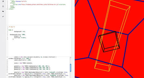
UX developer Paul Hayes showcases what you can do with the power of CSS3 3D transforms. He covers everything from 3D image galleries and subtle transitions to experimental 3D environments Via Armen Safaryan

Armen Safaryan's curator insight,
August 19, 2013 7:03 AM
Great collection. Looking forward to the day when the browsers are all on board adn we can actually use these.
Scoop.it!
Pair programming, social coding, collaborative development. Whatever you want to call it, there's been an explosion of tools for sharing, developing and debugging code in the browser.
Here are 20 of the best

Kirsten Wilson's curator insight,
February 11, 2014 1:17 PM
Another resource to provide students who are passionate about coding. 
Ivan Rados's curator insight,
March 28, 2014 9:26 AM
Coding tools are great to help people work out programs and web developments. i found these and they helped great! here it is... the top 20, the best of the best.
Scoop.it!
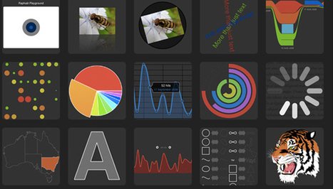
From simple charts to complex maps and infographics, Brian Suda's round-up of the best – and mostly free – tools has everything you need to bring your data to life... A common question is how to get started with data visualisations. Beyond following blogs, you need to practice – and to practice, you need to understand the tools available. In this article, get introduced to 20 different tools for creating visualisations... Via Lauren Moss, Baiba Svenca

Randy Rebman's curator insight,
January 28, 2013 12:33 PM
This looks like it might be a good source for integrating infographics into the classroom.
Scoop.it!

Gary Marshall shares 50 of the best free web tools to help build your site, from well known tools as WordPress and Drupal through to some you may have never considered (http://t.co/HQYqCM2u 50 free web design... Via Peter Shanks
|