


People love to learn by examining visual representations of data. That’s been proven time and time again by the popularity of both infographics and Pinterest. So what if you could make your own infographics? What would you make it of? It’s actually easier than you think… even if you have zero design skills whatsoever.


Type: Versus
Pros: Easy to understand and read
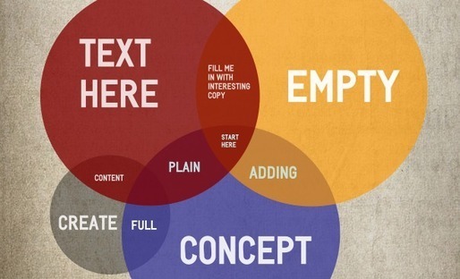
cons: The colors clash with one another to the point at which it's hard to look at, the colors also look dull and washed out
Pro: Good idea for useful bait. The headline really grabs a readers attention.
Con: The colors chosen for the font and details of the infograph clash a little with the picture of the players.