Must Design
75.5K views | +0 today
Must Design
Design Is Revolutionary
Your new post is loading...
Scooped by Martin (Marty) Smith
Scoop.it!

Hot, Flat, Colorful: 33 Examples of Ultra-Hot Flat Web Design Trend

Hot, Flat, Colorful: 33 Examples of Ultra-Hot Flat Web Design Trend | Must Design | Scoop.it
Currently, one of the biggest trends in the web design industry is the flat design style. In case you are not yet familiar with the term, flat design is essentially design without the drop shadows, gradients, and textures that have been common in web design for some time. Flat design uses solid colors and often typography figures prominently into the design. In this post we'll showcase 33 excellent examples of the flat web design trend. Hopefully they can provide some inspiration that can be put to use in your own work. Buffalo
Martin (Marty) Smith's insight:

Mobile is the secret driver of many of 2014's hottest web design trends. One of the hottest is flattening out web design. Small screens can't handle shading and three dimensionality as well as bigger screens, so flat is one of the HOTTEST web design trends as these 33 examples share. .

Alaina Duty's curator insight, September 25, 2015 1:45 PM

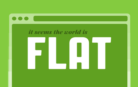
Here are some great examples of some bold, attention-grabbing color combinations incorporated in flat design.

Scooped by Martin (Marty) Smith
Scoop.it!

125 Flat Web Design Examples Inspire | Designrazzi

125 Flat Web Design Examples Inspire | Designrazzi | Must Design | Scoop.it
This collection consist best of website design inspiration that mainly have flat website design examples like headlines, images or content areas. In this
Martin (Marty) Smith's insight:

My favorite is Heather Lynn.

No comment yet.
Scooped by Martin (Marty) Smith
Scoop.it!

Good, Bad & Ugly of 2014 Web Design Trends: Large Hero, Responsive Design, Animated Storytelling - Intercore

Good, Bad & Ugly of 2014 Web Design Trends: Large Hero, Responsive Design, Animated Storytelling - Intercore | Must Design | Scoop.it

Web Design Example Intercore
There are a lot of things I like about this website design for the private equity firm Intercore such as:

The Good
* Responsive Design.
* Animated Storytelling (love the factoids fading in and out).
* Large Hero.
* Flat color palette (monochrome color schemes).
* Location of social media in CONTACT area.

The Bad
The biggest nit I have is the lack of social media, but that brings up an interesting choice too. I'm betting a private equity firm isn't dependent on the web either for customers or SEO so Intercore's decision to only have Facebook and to put that link low down on the contact page reflects their business model better than it would most (who need customers from the web and care about SEO).

I Liked the company and there is confusing information on their abaout page. Don't feel compelled to play shuffle the deck in social media. If I was going to explain their corporate umbrella the Facebook About age is not where I would do it (lol).

Interesting and good ideas well executed to steal here. Whoever created this site knew what they were doing from a design and content architecture perspective.

The Ugly
By zooming out on my laptop I found their Twitter link. This is one of the perils of responsive design. The link is also broken directing into the home page so will share the fact their Twitter is broken on their Facebook page.

No comment yet.
Scooped by Martin (Marty) Smith
Scoop.it!

Why The New World is FLAT: What Is Flat Design?

Why The New World is FLAT: What Is Flat Design? | Must Design | Scoop.it
With the release of iOS7 just around the corner, clamor over the changes Jony Ive will institute is growing. The general consensus--on this site and elsewhere--is that Apple is about to get a flat makeover. But for the uninitiated, “flat design” can be a confusing term. So let’s talk it out, shall we?
Martin (Marty) Smith's insight:

Web Design Trends 2014
Like several other major web design trends this year flat design has its origins on our phones. Flat looks better on mobile and so flat is coming to a website near you too.

This is true for other design trends as well such as fewer colors, bigger heroes and better fonts. Since flat design is such a MONSTER trend in 2014 good idea to visit the question of What Is Flat Design. Here Gizmodo explains flat design and its mobile origins.  

No comment yet.
Scooped by Martin (Marty) Smith
Scoop.it!

"Snowfall" Interative Web Design Storytelling 20 Examples | Web Directions

"Snowfall"  Interative Web Design Storytelling 20 Examples | Web Directions | Must Design | Scoop.it
Yesterday an article on Medium, Snowfallen, caught my eye. It's about a technique for presenting longform writing online, by embellishing it with integrated
Martin (Marty) Smith's insight:

Not sure how I feel about "snowfall" design. My favorite is the Buzzfeed History of Pong. My concerns are:

* Gets boring to scroll that much.
* Pagespread - is it better SEO to have a single long page or many pages?

The issue of pagespread is tricky. The new Google cherishings engagement and long pages create longer engagement assuming people don't click off.

But Google also likes pagespread (more pages about a topic with social shares and links confirming their importance). I don't know the RIGHT answer her since each approach - long pages or many pages - have distinct SEO benefits.

I find the experience of that long page offputting and wonder how snowfall will play on mobile devices. Mobile may be easier because of the swipe.

In fact, snowfall design may have its roots in mobile (sure feels that way). Whether your website should be 100% snowfall designed is above my pay grade (lol). M  

No comment yet.
Rescooped by Martin (Marty) Smith from Social Infografic Trend Social Media Metrics & Web Design Strategic Marketing
Scoop.it!

2014 Marketing Trend: Smaller More Visual Messages, Bigger Impact [great #startups tip]

2014 Marketing Trend: Smaller More Visual Messages, Bigger Impact [great #startups tip] | Must Design | Scoop.it

The new word in content marketing is small. Increasingly, brands are marketing via short-form social media like Vine, Twitter, Instagram, Instagram video and the newer platform Snapchat--not by broadcasting their silly old messages but by treating their prospects and customers with respect, engaging with them directly through brief snippets of conversation, personality and humor.


But it's not just for fun: Consumers who engage with brands via social media demonstrate a deeper emotional commitment to those brands and spend 20 to 40 percent more than other customers, according to a report from Bain & Company.


Taco Bell has been killing it on Twitter, creating a hip, fun presence to turn customers into evangelists. Based in part on its snappy, very human interactions, the fast-food giant generated enough early buzz to make Doritos Locos Tacos its most successful product launch to date....


Via Jeff Domansky, luigi vico
Martin (Marty) Smith's insight:

Great post for content-phobic startups. If sitting down and blogging daily is too much find alternatives for "little messaging" and do so more frequently and more visually (video, graphics). 


I'm a content and social marketer so would prefer to have both long form and short form content, but if creating the one is too intimidating create the other (short form) since some content marketing is always better than none.

Jeff Domansky's curator insight, November 25, 2013 11:47 AM

Ann Handley says increasingly, brands are marketing themselves via short-form social media.