Must Design
75.5K views | +0 today
Follow
Must Design
Design Is Revolutionary
Your new post is loading...
Rescooped by Martin (Marty) Smith from Digital Brand Marketing
Scoop.it!

Unique & Creative Text-Focused Websites Inspire

Unique & Creative Text-Focused Websites Inspire | Must Design | Scoop.it

Typography is an important but often under-represented part of a website's layout. With so much focus being placed on the presentational aspects of CSS and the use of large images and media that choke bandwidth restraints; it’s nice to occasionally remember that textual content can also make an impact on users and their experience. Content remains king, and a few good fonts can make even the simplest of sites look smart - though not so many that you have to wait for ages for the text to be visible.

Because of this, I’m going to show you a few handpicked examples of sites that make their content look terrific, and why you should consider following their example in your own work. We’re going to take a journey of how elegant typography can make a site shine; looking at the bold, creative, navigational, simplistic and interactive content that makes the designer's voice speak volumes - so let’s get started!...


Via Jeff Domansky, Os Ishmael
Jeff Domansky's curator insight, May 27, 2015 12:01 AM

Here's to the power of typography in website and landing page design.

malek's curator insight, May 27, 2015 7:54 AM

Headings grab our attention, but the body of content is what makes us stay. 

Jasmin Davies-Hodge's curator insight, May 28, 2015 5:07 AM

Remember,  content is king!

Scooped by Martin (Marty) Smith
Scoop.it!

27 E-commerce Website Designs Scenttrail Hates & Why

27 E-commerce Website Designs Scenttrail Hates & Why | Must Design | Scoop.it

Marty (Scenttrail) Note: 27 Bad Ecommerce Designs
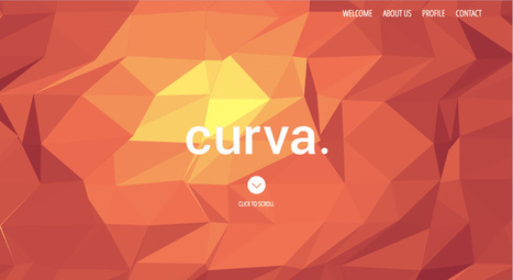
These CSS Design Award Winning sites illustrate why designers shouldn't be in charge of your commercial website. In a recent G+ post I shared our journey across time, place and money online (Why Time Is Money Online: https://plus.google.com/102639884404823294558/posts/RdjAjWoJTHw ).

It's easy to get lost. We kept trying to make narrative, movie and book-like) logic work on our ecommerce site and it never did. To the extent we told stories we depressed conversions and we conducted these tests before the web was drowning in content.

Not that the web has been fully "content shocked" to within an inch of its life one of the FIRST jobs any ecommerce site must accomplish is loudly and clearly proclaiming their STORE-NESS.

These 27 "pretty picture" designs are find for big established brands people trust, but they would CRUSH a new commercial site. The "store-ness" is confusing. Are these content sites or can we buy stuff here.

Some communicate some "store-ness",but none have the "ditch digging" realities of large, successful ecom sites such as REI.com or Schwan's.com (highest converting ecom site in world). Call-To-Actions are missing (mostly), navigation is murky and not keyword dense and images don't you line of sight rules (viewers' eyes go where people's eyes in your images go).

Real ecommerce needs a few things to be successful that most of these sites ignore, miss or don't know such as:

* Email subscription forms (email list = your most profitable channel because YOU OWN IT, don't believe BS about email marketing being dead mobile is making email marketing different but dead =nope.
* AN OFFER - see REI.com's "daily deals" or Amazon's ability to sell any and everything.
* Great navigation balanced between seo and customer engagement.
* Images mapped to produce CLICKS where merchants want them.
* Every image, click and share creates analytics and data so part of what you need to map into an ecom design is WHAT DATA YOU NEED. Can't figure out what actionable thing I would know after a month's traffic on these designs.
* Sense of TIME and PLACE (what season are we in? Where are these sites?).
* TRUST and that comes from other people (testimonials, curation of User Generated Content and NONE of these have anything like that so unless they are major brands they won't pass the trust test with many shoppers).
* TRUST MARKS = didn't see a VISA or MC logo either. One way to create trust online is to align with brands and marks people already trust. Those badges look like ugly scars to designers and they help make merchants millions.
* Content - we love VISUAL MARKETING but some context such as the context one satisfied customer would share is a must.
* Design = Trust - we grant that these sites look amazing and looking amazing helps with creating trust, but junk 'em up a little and make more money.

That last bullet reminds me of a story from my P&G tenure. My boss Russ Mills taught me to never leave a display too neat. "People won't disturb a display that is too neat," he explained. These ecommerce designs are too neat for me (by half). If you aren't a major brand ignore every one of these 27 "inspirational" ecom web designs.

PS. Favorite has to be the example in the picture above. Not only do we chop people in half we ask visitors to kiss their behinds (lol). Opposite of the welcoming atmosphere I want to create on my ecom sites (lol) back when I was responsible for millions of online sales yearly. At my core I remain an online merchant, but I don't miss not sleeping and sweating sales numbers from now until Valentine's Day. Don't miss that at all :).


No comment yet.
Scooped by Martin (Marty) Smith
Scoop.it!

15 Best CSS3 Websites Inspire Consistent With 2014 Design Trends - via AWWards

15 Best CSS3 Websites Inspire Consistent With 2014 Design Trends - via AWWards | Must Design | Scoop.it
Fantastic CSS3 Website Designs for Inspiration. Selection of Awwwards winning CSS3 websites. CSS3 is a powerful tool for web designers to enhance the appearance of a website.
Martin (Marty) Smith's insight:

Strong first few pages of examples here. My favs include 

Cat Magnet for actually telling a fish story (nice large CTA too). 
Design Council - love the flat, few colors with red as accent. 

True - don't like blocking the face, but works here. 

Stealable Ideas ae consistent with 2014 design trends:

* Big heros (tells a better story).

* Limit color palette. 
* Flatten out the design so it looks good on mobile too.
* Large Call-to-actions (DECLARE what you want your customers to do).

That last bullet, using a clear CTA, seems to be the hardest one to sell designers who feel to DECLARE is to shout. I disagree. I view DECLARATION in this context as helping by MAPPING and POINTING.

No one wants their TIME wasted and when you point them in the right direction with a large, high contrast CTA you've created a helpful hint. Subtle, when you have seconds, seems an unsupportable luxury. When DON'T we want to be CLEAR and help our visitors know how to journey along our paths?

A: NEVER :). M  


No comment yet.
Scooped by Martin (Marty) Smith
Scoop.it!

12 Examples of Flat Web Design Inspire ~ Creative Market Blog

12 Examples of Flat Web Design Inspire ~ Creative Market Blog | Must Design | Scoop.it
Buy and sell handcrafted, mousemade design content like vector patterns, icons, photoshop brushes, fonts and more at Creative Market.
Martin (Marty) Smith's insight:

Flat website design is a major 2014 web design trend. Here are 12 examples of the art of flat website design. My favorite is the last example http://wistia.com/ .


Wondering why flat design is all the rage in 2014? Easy to answer in a single word - MOBILE.

Margaux Brachotte's curator insight, April 1, 2014 4:33 AM

Jeunes gens voilà du FLAT !!!

Cezame conseil's curator insight, April 28, 2014 3:06 PM

Quelques exemples de sites Internet dans la tendance du "Flat design"

Scooped by Martin (Marty) Smith
Scoop.it!

10 Web Design Trends You'll See in 2015 (and how to survive them)

10 Web Design Trends You'll See in 2015 (and how to survive them) | Must Design | Scoop.it


This time last year I made 7 predictions for web design in 2014, with mixed results (I’m looking at you SVG). This year, I’ve sought out 10 web design trends you'll actually see:

1. Lettering
2. Goodbye to IE
3. Micro-design
4. The Internet of no thing

5. Mobile video
6. The decline of framework dominance

7. The beginning of the end for the old guard

8. Art direction
9. Pooled analytics

10. SVG will (finally) take off

Martin (Marty) Smith's insight:

Great post here and agree with every one of these 10 trends especially the glee in discontinuing support for IE 6 and IE7. Sounds like even Microsoft is about to turn away.

No comment yet.
Scooped by Martin (Marty) Smith
Scoop.it!

The White Album: 50 Fantastic White Web Designs Inspire

The White Album: 50 Fantastic White Web Designs Inspire | Must Design | Scoop.it
The color white is simple, elegant and peaceful and the use of this color is seen in lots of websites. Whether they're portfolios or online shops, people agree on...
Martin (Marty) Smith's insight:

The space between the notes may be the most defining thing about music. I think of web design as a form of music. Web designs, like music, need space between their notes.

This is what made Google so astonishing and easy to use. White page, search box and as few menu options as possible. There is even a person who stands sentry on Google's design saying NO much more than they say yes.

I love to study great WHITE websites to learn how to put space in to quiet and strengthen web design.

No comment yet.
Rescooped by Martin (Marty) Smith from Social Marketing Revolution
Scoop.it!

Eye Tracking, Banner Blindness, Website Design & REI.com

Eye Tracking, Banner Blindness, Website Design & REI.com | Must Design | Scoop.it


An article on Banner Blindness which explains the physcology behind it and enlists common techniques to reduce it and improve ad revenues.

Marty Note

Interesting post and definitions that is true to my experience designing high converting ecommerce websites. There are ways to manipulate eye tracking with images and call-to-actions, but that area on the right the "strong fallow area" was a GUTTER.

REI is my favorite example at how to manipulate the "gutter" tendency to be a black hole or a roach motel (visitors check in but never out). REI takes a link they know everyone is looking for, their SALE link, they color it different than the rest of their menu (red).

REI defeats the "roach motel" aspects of the right gutter with intelligence and design. In my experience the SALE area shopper will ferret that link out no matter where you put it.

By taking an area that is normally a dead end and putting something the sale shopper will surely find they kill the proverbial two birds -

* Their SALE shoppers can beeline right to their favorite place to check BEFORE they do anything else.

* The SALE curios can easily find the link too so they lose nothing and gain an active link in an area that is typically weak. Just one reason why REI is one of the best-crafted ecommerce website:

http://www.rei.com

Martin (Marty) Smith's curator insight, February 25, 2014 4:48 PM

Interesting post and definitions that is true to my experience designing high converting ecommerce websites. There are ways to manipulate eye tracking with images and call-to-actions, but that area on the right the "strong fallow area" was a GUTTER.

REI is my favorite example at how to manipulate the "gutter" tendency to be a black hole or a roach motel (visitors check in but never out). REI takes a link they know everyone is looking for, their SALE link, they color it different than the rest of their menu (red).

REI defeats the "roach motel" aspects of the right gutter with intelligence and design. In my experience the SALE area shopper will ferret that link out no matter where you put it.

By taking an area that is normally a dead end and putting something the sale shopper will surely find they kill the proverbial two birds -

* Their SALE shoppers can beeline right to their favorite place to check BEFORE they do anything else.

* The SALE curios can easily find the link too so they lose nothing and gain an active link in an area that is typically weak. Just one reason why REI is one of the best-crafted ecommerce website:

http://www.rei.com


Scooped by Martin (Marty) Smith
Scoop.it!

50 Cool CSS3 Design Examples Inspire

50 Cool CSS3 Design Examples Inspire | Must Design | Scoop.it
It's amazing what can be done with CSS these days. Support for the latest CSS3 properties is strong in the latest versions of all the major browsers - even Internet Explorer - and the possibilities for typography, animation and interactivity have never been greater. But finding web design inspiration can be tricky.
Martin (Marty) Smith's insight:

CSS3 has some cool applications as these 50 examples show.

Michael Allenberg's curator insight, February 21, 2014 8:26 AM

The future of web design...