Your new post is loading...
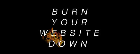
Burn Your Website Down
Websites are about to become an expensive tyranny. Tomorrow's e-commerce happens everyone and at any time on any device. Still demanding customers come to your website? Crazy!
Better to "burn your website" and all of the preconceived notions about what a website is and should be down today. Recreate your site as a fluid expression of content, community and commerce.
Here's how: http://bit.ly/burn-down-website
With 22,000+ views SEO for Web Designers blew up thanks to a defined tribal audiences, advocates and luck. Discover tips on how to blow your content up too.
17,162 People Later
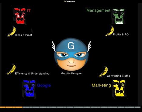
We've been asked to make the presentation that created our most viewed Hiaku Deck again at the Iron Yard Code Academy again (made the first presentation six months ago). There were important ideas we shared last time:
* SEO THRIVES or DIES with graphic designers. * Graphic designers are heroes under siege by many groups. * Set REALISTIC expectations.
* Set reasonable boundaries (with gorillas looking for bananas).
* Shared a few easy to remember tips to help designers improve their technical SEO skills.
Obviously we hit a nerve. We will be updating benchmarks shared six months ago to see how those we mentioned fared since. Remember technical SEO is important, but your content must engage, be exciting (visually too) and develop sustainable online community to win over time.
Good luck and if you have SEO questions we didn't cover email them to martin(at)Curagami.com and we will include and send you a Curagami Rules tee.
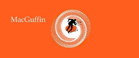
Website MacGuffins are ideas such as Free Shipping whose absence hurts more than their presence helps. What are your website's MacGuffins?
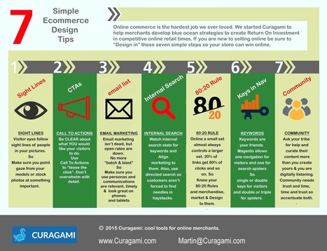
7 Easy To Forget Simple Ideas
As you design your ecommerce store keep in mind these easy to forget but sure to make you more money online commerce tips:
* Sight Lines - visitor eyes go where your models eyes go so point them at something good.
* CTAs - don't be afraid to tell your customers what to do with Calls To Action. * Email - email marketing is the ability to communicate with your tribe without asking permission from a middleman.
* Internal Search - tells you if your navigation is working and what customers are looking for so use data from internal search. * 80:20 Rule - a small set almost always controls a larger set online so find your 80:20 rules and design, merchandise and sell to them. * Keywords - make sure you use keywords in your navigation and use a rewrite tool to show visitors one set of keys and spiders another. * Community - create an ASK (for help) and listen more than you talk and online community will form.
In this post we will try to review the current status of web design scene and predict some trends for 2015.
Marty Note
Great summary of some "new to me" trends for next year such as video backgrounds and rise of website generators (still looking for a really good one of these, most suck).
Hope the stock photography and personal branding predictions come true.
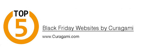
Top 5 Black Friday Websites Curagami's annual list sees Big Boys move in. Amazon tops the list. There are surprises & we share our Black Friday scorecard.
1. Amazon.
2. Sears.com. 3. Dell.com 4. Walmart.com 5. Nordstrom.com
Find out how we rated these websites TOPS in Black Friday preparation, free shipping and merchandising:
http://www.curagami.com/featured/top-5-black-friday-websites/
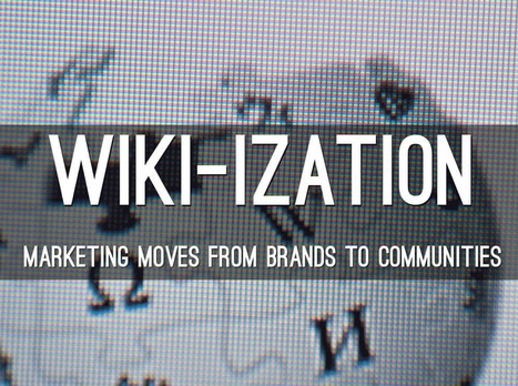
Here A Wiki, There A Wiki, Everywhere A Wiki
What is a Wiki if not an invitation to create online community. The "open source" like collaboration Wiki's provide is a blueprint for creation of online community. After months working on http://www.Curagmai.com we've discovered how close Wikis are to...well everything.
Wiki Ideas To Steal Include:
* Open Source Like Content Collaboration.
* Use community to steer and de-spam ecosystem.
* Depend mostly on social reward.
* A healthy and competitive contest never hurts. * Feature and thank contributors.
* Provide ways for contributors to know where they stand vis-à-vis other contributors.
* Create ways contributors can follow and communicate with each other.
* Include ways for contributors to create mini-tribes. * Make sure "rules of the road" are understood and published. * Communication with sponsoring agents must be easy too.
* Normalize greatness by sharing across ecosystem.
* Role of sponsors becomes more curators than creators.
* Ask for help.
* Provide social rewards (such as features) to contributors.
* Create ways to identify contributors in the world (t-shirts, stickers).
* Appreciate, be nice and thankful (always no matter what). Following a few simple rules will dramatically increase the most important content you can't buy (User Generated Content or #UGC) and build sustainable online community. Sustainable online community means costs go DOWN even as other material rewards (UGC, followers, traffic, money) go UP.
This Haiku Deck is about why we are all in the Wiki business whether we realize it or not AND how to design for the Wiki-ization of marketing, brands and online community.
An updated look at the hottest best web design trends of 2014 including a showcase of modern web design inspiration.
Marty Note
This @justcreative post hit many nails on the head when it was initially published and Jacob's update of Helga Moreno's post doesn't disappoint either. Things I REALLY agree with:
See Less of (PLEASE):
* Stock photography (no photos? ASK your employees / followers for help but please no more Stepford people in pics on websites).
* Flash (has killed more #seo and sites than you can shake a stick at and fact it is still alive is amazing).
* Capcha - spam sucks but so do capcha forms.
More of PLEASE:
* Content First (implied in Responsive or Mobile First Design is a new way of thinking about, tagging and presenting content).
* Interactive Exploring (BIG AGREEMENT see my post about Time is Money Online https://plus.google.com/+MartinWSmith/posts/RdjAjWoJTHw and tag this next to #gamification).
* Arresting pictures and Video (YES, your great content will be ignored or under-shared UNLESS it is paired with strong visual hooks and supports).
Great post by Helga for Just Creative and so TRUE to our experience of web dev in 2014 for leading ecommerce clients such as Moon Audio.com.
Marty Note
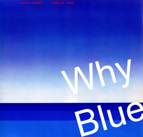
I LOVE Blue as a web design color. When I was a senior at Vassar I painted a common room in Main the blues of Keith Jarret's album Arbor Zena (in image). Took a week, but the room shared some of the same reasons I love blue for web designs.
5 Reason Blue Rocks Web Design
* Sends trust, strength, grace and beauty signals. * Easy to manipulate ( shades of blue work online see LoewyDesigns). * Works as accent or background.
* Images pop off of blue nicely.
* There are many text and font options with blue.
Here are my 3 favorites from the examples:
* LoewyDesigns (shades of blue).
* Black Sea Fisheries (for way blue caries type and fonts). * Z-Index.it - for how calming blue can be to chaotic multiple image Pinterest-like heroes
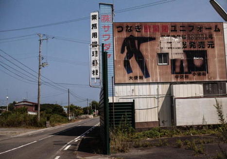
Unknown Spring In March 2011 Jake Price, a freelance producer for the BBC, journeyed to Tohoku, Japan to document the devastation left in the wake of the Pacific tsunami.
The result of his trip is evident in his powerful and beautiful immersive web documentary, "Unknown Spring," which was awarded the World Press Photo Multimedia Awards...'
Via siobhan-o-flynn
We asked several developers what their favorite sources are for web design and code inspiration, and they pointed to these 17 wide-ranging sites.
Marty Note
I like several of these designs including Web Design Ledger and The Source for their creative balance between images, copy and headlines. There are so many things dancing on the head of a pin on any homepage such as:
* Your desire to SHARE everything. * Their (visitor's) desire to find what they want. * Navigation.
* Images.
* Headlines & Copy.
Getting all of these dancers to tell a coherent story in 9 seconds is the challenge. Usually as content being shared increases understand decreases. Several of these designs manage to present a lot of options intelligently.
Which one is your fav?
Check out the hottest web UI patterns used by Pinterest, Facebook, Twitter, Kickstarter, AirBnB, Tinder, and more.
Marty Note
This is a great web design scope full of examples and lots of good suggestions. At Curagami we are devoted to the conversations as The Next Ecom idea. Love the suggestion about conversational tone in forms.
Forms SUCK, but that doesn't mean you can ask for things in a MORE INTIMATE way than standard boring routine. The visual organization riff is evidence of a much larger tectonic shift - visual marketing is ruling the world.
Visual Marketing in a nutshell is...
1. GRAB attention with an arresting visual.
2. Tease a read with a great headline.
3. Snipit-ize your content so it daisy chains a series of "play list" like cliff hangers.
4. Move visitors to subscribers and buyers. 5. Create an ASK (such as Join our Ambassador Group). 6. Rinse and Repeat.
Via Jakarta Web Developer
|
Learning From Video Game Designers
Video game designers can teach you a lot about how to great great ecommerce and B2B websites. Video games are gamified, social and understand the stimulus - response nature of online interaction in a fluid and must imitate ways.
Here are WhatCulture.com's picks for the 20 best video game websites in the world. We like Gamers With Jobs and Kotaku (though we don't understand a lot of it).
Canonical URLs Explained
The Yoast post provides an easy way to understand why rel=canonical is a powerful new SEO tag. Yoast has a dog in the hunt. They make a Magento plugin that easily writes the rel=canonical tag into a product page's head.
The explanation about WHY canonical URLs are so important is only half right. We have a million ways of expressing and sharing URLs these days. Without rel=canonical we end up duping content to distraction.
Here's the rub. All ecommerce sites dupe content. They must. When I was a Director of Ecommerce a single product accounted for 50% of our profits. You better believe I merchandised that product into every nook and cranny our site offered. I duped that product and it's content to distraction.
There are other ways to limit duplication including:
* Use of your Robots.txt file.
* Locking content behind a firewall. * Use of blockquotes & rel=canonical tags.
* Rewrite duplicated content so it's not as duplicated (lol).
We included our email output into a folder with a "no follow" line in our robots.txt. You may think such a move is enough. It isn't. Be sure NOT to drive links from spiderable content INTO that folder or you eliminate the effectiveness of the robots.txt.
In the end every ecom site worth it's salt MUST duplicate content. Rewriting sounds like a good strategy, but it isn't. Content = time and time = money when managing million dollar commercial sites. You will be duping content.
Best to use rel=canonical because it shows Google you aren't trying to STEAL anything. Reminds me of what a friend shared about the disavow tool (used to deny inbound links or signal they may be untrusted).
My friend was using the disavow tool daily on his clients accounts. "So you are brown-nosing Google," I kidded him. "Exactly," was his answer. Rel=canonical tells Google you are TRYING to do the right thing and sometimes that is enough.
Burn Down Your Website
Websites are cool and a great marketing aid...until they aren't. If the line of when they aren't isn't behind us we are approaching it. What is a "website" when we share posts on Medium, Scoop.it and GPlus?
Feels like the idea of a website as a MUST GO HERE to interact with our marketing message is hopeless out of touch. Even when we do GO to a website what are we looking for?
FUN, ENGAGEMENT and RELEVANCE.
The typical talking to yourself about yourself marketing that most flog online feels more than dead, it feels dangerous. Google's vote is clear - if your content doesn't create an increasing number of likes, loves, shares and loyalty your website is screwed, blued and tattooed.
Especially if someone in your immediate competitive sphere knows how to THROW DOWN, create community and MOVEMENTS instead of the usual solipsistic crap. Keep talking to yourself while someone else in your business vertical is hosting a party and you will be waxed.
Waxed because what really matters NOW is LOVE. If your win hearts and minds because you are honestly all in and listening hard you get to "win". If you are amazing you create blue oceans and uncontested competitive space for however long the ride lasts. Talking about FUN.
This Haiku Deck discusses the death of tactical web marketing. You can't out email market my team and I, or not for very long. We've been doing this crazy biz since 1999. You can gain an inch and we are likely to come back and take a mile.
https://shar.es/12ekPU
Good News & Bad News
As a rare web marketer with more than ten years experience, I created our first site FoundObjects.com in 1999 (gone now sadly), we want to confirm something every likely reader of our online marketing post already knows - the low hanging fruit is gone plucked by previous generations of pickers.
What to do now? Be something online and start today with these "be something now" tips.
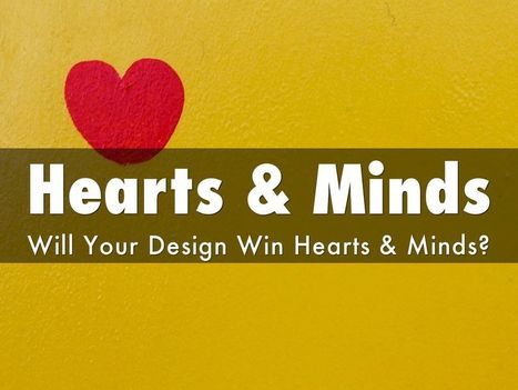
Web Designer SEO
Our SEO Tips for Web Designers hit a nerve. It is heading to 13,000 views (probably today). We hit a nerve because web Designers are where SEO rubber meets the road. This Haiku Deck is full of SEO tips for web designer including:
* Know who has the banana and why.
* Know how much SEO you need to know. * Learn what is MIST vs what is Gorilla.
* Listen Digitally.
* Understand how SEO & Content marketing work together. * Design to Win Hearts, Minds and Loyalty.
And More SEO tips designed for designers.
Ten Web Trends To Look For In 2015
- Responsive Wins.
- Ghost Buttons (made with Divi).
- Emphasis on Type.
- Large & Beautiful Backgrounds.
- Scrolling BEATS Clicking.
- Card Design Gets Better.
- Flat Design morphs into Material Design.
- Microiterations.
- Interactive Storytelling.
- Personalized UX.
Web Design Basics
Love these five web design basics:
* Learn TYPE Design.
* Pick Great Fonts That Fit Your TONE.
* Pick 3 Color Palette & STICK TO IT.
* Photos = RIGHT SIZE.
* When In Doubt, Give It SPACE.
This last tip is our favorite. Nothing we hate more than claustrophobic web design. Problem is claustrophobia is easy to create. We all WANT to do so much.
When I was an Ecommerce Director we studied our links carefully. We found that 5% of our links received 90% of the clicks. That equation turned out to be a fractal. No matter how small we cut it, no matter how we shifted the design, a small % of the links dominated.
This means MOST of what WE, as designers, think is important isn't. We learned to be Google - Vicious about what we added. Adding meant something had to COME OFF the design. This strange User Interface math means you have more ROOM than you realize.
Find what matters and LINK IT. Design what matters and eliminate the flotsam and jetsam so you have SPACE around what matters since it is that SPACE that signals IMPORTANCE to your visitors. .
Marty Note
Watching the excellent HBO Documentary about James Brown Mr. Dynamite made me think of FUNK and web design. Web design is easy to get WRONG (lol).
It is tricky to design online with a sense of surprise, beauty and novelty. I like the Digital Invaders design as it feels free and spontaneous. Other designs such as Monster CSS and Creative With A K feel like they are trying to appear spontaneous and free.
Trying too hard is EASY in web design too. Remember all websites are STAGES we designers SET. The trick is to set a stage that feels like it is happening now and won't feel dated tomorrow. Feels like there are enough visual hooks in Digital Invaders it would be easy to keep it fresh with minimum fuss.
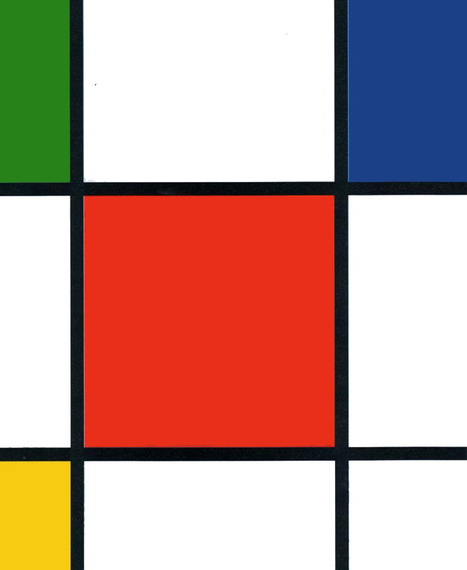
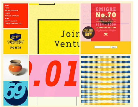
I like Emigre too. Emigre creates the same sense of happening now but that design is at the other end of the spectrum from Digital Invaders. Its hard to beat the grid. First website I created, in 1999, used a Mondrian grid.
Grids help organize massive amounts of information without that mountain feeling like it is about to crush you. I like the funky NOISE contrasted to the quiet grid because they demonstrate the need to find a visual VOICE in your web design. That voice can be anything as long as it feels authentic TO YOU.
The web is very good at finding and amplifying DISSONANCE. When you try to FUNK IT UP and aren't really funky it shows like you are wearing the wrong decades fashion (painful). Your customers are your audience.Set the stage anyway you want, but do so with an eye toward YOUR TRUTH.
The closer you stay on the tiny beam of "authentically us" the more success your web design has. This is why there are no web design maxims that apply all the time. What works for Emigre is very different than Digital Invaders but both work, both are authentic and have that hard to describe but know it when you see it TRUTH great web design must have.
Best In Class From Conversion IQ
The other day I complained about "pretty picture' ecommerce sites that make conversion harder. So much of ecom is ditch digging. Ditch digging to make sure you have things such as:
* Email subscription form (prefer presence to popunders).
* Clearly ECOM - looks like a store with things to sell not content to read.
* Social (easy to find theirs and easy to contribute).
* Content Curation from social / comments / reviews (should feel like a party with people who share love / interests). * Offers, deadlines and a sense of time (of the year today is Columbus Day for example).
These examples from Conversion IQ are closer to "ditch digging" ecommerce websites. Conversion either BUYING or into a list are easier, more clear and so these designs make more money than the pretty picture websites I shared last (http://sco.lt/4ijZIH ),
Responsive Web Designs
Responsive design, forming a website's information so it looks great on any device, is becoming mission critical. Here are 65 of the best responsive designs in 2014 via SocialDriver.com.
Angela Jones, a freelance designer in St. Charles, Illinois, uncovers how 7 websites promote their products in exciting ways.
Marty Note - Great From Boring
Loved this post, but they bury the lead. Their tips aren't sub-heads but buried in the copy about the example. I liberated their 5 tips to create exciting sites for boring products:
* Employ imagery and icons that speak to the benefits (i.e. tell a story and match with cool visuals).
* Focus on HEADLINES that describe your benefits (i.e. use trusted sources and let THEM tell your story).
* Write creative copy (there are NO BORING PRODUCTS only boring stories lol).
* Minimal and easy to navigate (always a winner in my book too, but especially if what you are selling is boring. YES I will spend 3x the time it should have taken to order the new iPhone despite the horrible web design, your product...not so much, so make it easy to buy.)
* Create Community & Let THEM (your customers) supply the amazing stories. When YOU tell your brand's story it is always more boring than the same words from a customer.
* VISUALS - boring products benefit from great visuals. Tilt your boring product, hang it from the rafters, find a way to depict excitement and excitement flows downstream to your product.
Marty Note
Red is an IMPOSSIBLE web design color except when it isn't. There is an excellent comment at the end of this post sharing the best red websites:
Ashley Pajak Comment
I find that red can very easily become too overpowering. Even though some of these are running into that, others display the color proudly and cleverly, such as the Venkat Portfolio and Svizra.
The only design I liked used red as an accent (Project 1,000). Others just made me want to RUN away. When I started designing websites in 1999 I read a book about red, white and black as a powerful combination of design elements.
The book pointed out the power of simple lines and few colors especially when done so from the MINIMAL school of online design made so popular now by MOBILE. There are flashes of that clarity in some of these designs, but red as a base color is tricky and difficult as many of these designs prove..
If you know great red or great red, black and white designs please share and we will update. Thanks, M
|


![Remarkable Websites For Boring Products: 5 Tips [Scenttrail Unburied Lead] | Must Design | Scoop.it](https://img.scoop.it/Dc6u-j_Bsc0wgLdAMa-H9Dl72eJkfbmt4t8yenImKBVvK0kTmF0xjctABnaLJIm9)