Must Design
75.5K views | +0 today
Follow
Must Design
Design Is Revolutionary
Your new post is loading...
Scooped by Martin (Marty) Smith
Scoop.it!

Picasso At The Beach and The NEW Art of Web Design

Picasso At The Beach and The NEW Art of Web Design | Must Design | Scoop.it

PicassoHead App
Sharing this cool "draw a "Picasso Head" app (my PicassoHead http://www.picassohead.com/?id=5290a28#.VBCfth1bqjo.twitter ) to illustrate a few of our favorite web design concepts such as:

* DO LESS and let them DO MORE (them = customers, visitors, advocates_.
* GALLERIES ROCK - especially when your gallery is chock a block full of User Generated Content (UGC).
* Engagement Rocks - do you have a tool that is fun to use AND promotes positive site heuristics such as time on site, pages viewed, lower bounce?
* Every product, idea or website starts about the creators and must become about those who visit and love it.
* People love what THEY create and contribute more than what you do.
* This means all web design is or will be about collaboration.

We love the simplicity of this little app, but the even COOLER riff came from our confirming email. This is the email that shares the link where my Picasso At The Beach drawing lives (linked from this post http://www.picassohead.com/?id=5290a28#.VBCSuy4Lksk.twitter ) and where this little pitch lived:

"This summer check out Picasso Looks at Degas at the Clark in Williamstown, MA. You won’t want to miss this groundbreaking, Clark-exclusive exhibition that is the first to look at Pablo Picasso’s deep fascination with Edgar Degas.

http://www.clarkart.edu/exhibitions/picasso-degas/ "

Wow, cool idea. Create a little art based app and sell related links in the confirmation email. That's brilliant marketing, subtle marketing and the art of web design. Kudos to Picassohead creators RFI Studios, http://www.rfistudios.com.

#toogood


Martin (Marty) Smith's insight:

add your insight...


No comment yet.
Scooped by Martin (Marty) Smith
Scoop.it!

Finding Stories Inside Paintings via Tracy Chevalier TED Talk [+ 3 Find Your Story Tips via @Scenttrail]

Finding Stories Inside Paintings via Tracy Chevalier TED Talk [+ 3 Find Your Story Tips via @Scenttrail] | Must Design | Scoop.it

Storytelling & Content Marketing
Tracy Chevalier imagines the stories behind paintings:


* How did the painter meet his model?
* What would explain that look in her eye?
* Why is that man … blushing?

She shares three stories inspired by portraits, including the one that led to her best-selling novel "Girl With a Pearl Earring."

3 Find Your Story Tips
One of the most common "we can't do it" complaints we hear is, "Our content is boring and no one on out team knows how to tell a story".  There are no "boring" products or services and we are surrounded by stories. Here are 5 tips to help you find the magical content needed to wins hearts and minds online.

Story Finder Tip #1: Your Employees
You never need to look far for great stories. Stories of heroic efforts against great odds are sitting in your office now. There are cancer survivors, triathletes and parents with special children in your company as I write this.

You might think, "I don't want to invade their privacy," and we aren't suggesting it. We suggest explaining that any company really only exists in the minds of its employees. Since publishing costs are now zero you can afford to explain who you are by proxy - via your employees stories, passions and loves.

This is "Employee Story of the Month" instead of a banal award your customers learn about the journey your team members have experienced and so feel close to them, you and your brands and products. "I feel like I know you," a woman said hugging my ex at the Gift Show in San Francisco.

Our potential customer learned about Found Objects and Janet McKean from our monthly newsletters. Those newsletters led to the hug and made doing business together easy.


Oh, btw each month I included a short story about Janet's life, experiences and family. May be why I'm divorced (lol), because Janet hated sharing so much. "You married a storyteller, " I would say smiling and writing and well you can figure out how well that worked in our relationship. Worked GREAT with our customers though (lol).

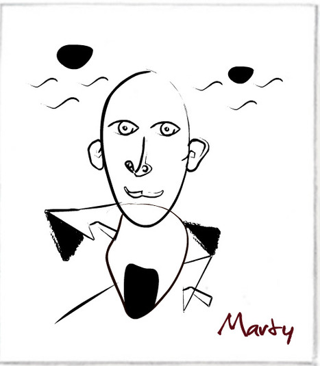
Story Finder Tip 2: Be Like Tracy Imagine An Image's Story
Tracy wrote a best seller by imagining questions implied but not stated. Your online marketing uses images all the time, but what are the questions BEHIND the image.

If you have a picture from a company event who is there? What was being celebrated? What in the image doesn't make sense? Is there something that hints at a mystery o some enigma? Work backwards from an image. Begin like Tracy. Ask questions. The answers are your story.

Story Finder Tip 3: Ask For Customer Stories
Take the image in example #2 and ask your customers to share their questions, stories or answers to hidden riddles. Asking for a story may be too hard and intimidating, but asking what these people in the corner are doing could be fun and spark imaginations and lead to stories.

Once you have an "Ambassador" group of customers / advocates established ask them to help shape your ASK. Ask your advocates to help you know the best way to engage and hear stories your customers are itching to share.

Writing this tip reminds me of a story (of course lol). I left home for the first time. I was in the 10th grade and enrolled at The Choate School. My mom cried when she and my father dropped me off. Now I was sitting in my first English class.

Mr. Noland, a bearded thirty something teacher dressed not unlike every preppie in the room (straight leg corduroys, button down oxford shirt) asked, "Tell me the story of this pencil". He said this hold a pencil inches from his nose and staring at it as he rotated it and waved it up and down.

Dutifully I set out to describe the pencil. "Pencils down," Mr. Noland said asking a student he clearly knew to read his story first. "She couldn't tell why. All she could smell was stale cigar...." the novella this student wrote about a possible murder, broken hearts and a love affair gone wrong made me realize I wasn't in Kansas anymore.

If Mr. Noland's shill can write 500 words on a pencil, YOU can tell a captivating story online about you, your company, brands and products.


Web Design & Stories
Now that you know WHERE to find stories don't forget to DESIGN them in. Sharing stories online is tricky. You want to make readers do a little work to get to a place they can read and read.

Don't do like some and break your stories into tiny 200 word bites. Too much clicking ruins the "all in" feel of a good story. Make your readers click a couple of times to pan out readers from scanners and then let them read.

Will cover more "story design" tips in another post. First FIND your stories since that is often the hardest task. Next create a design that does the impossible - makes it fun to read online.

No comment yet.
Scooped by Martin (Marty) Smith
Scoop.it!

What Is A MacGuffin & Why Web Design Needs To Include Them - Curatti

What Is A MacGuffin & Why Web Design Needs To Include Them - Curatti | Must Design | Scoop.it
MacGuffins are plot devices in films & conventional web design "best practices" that hurt more in absence than presence helps. How to design for MacGuffins.
Martin (Marty) Smith's insight:

Website MacGuffins include Free Shipping, Satisfaction Guarantees and email subscription boxes. Important to know what has reached "MacGuffin" status in your business. This post explains what a MacGuffin is and how to design for yours.

No comment yet.
Scooped by Martin (Marty) Smith
Scoop.it!

Gamification - Designing for Engagement

Gamification is fundamentally rewriting the rules of engagement and design. We can leverage its techniques to create unprecedented connections with our customer
Martin (Marty) Smith's insight:

Building Engagement In

There are ways to BUILD engagement into a website's design. Here are three secrets to promote engagement not included in this excellent Slideshare:

* Place Email Subscription High Up and Prominent. 
* Include curated User Generated Content on every page.

* Create CTAs with CONTRAST.


Email Subscriptions
When your "Subscribe To Our Email List" Call to Action is high on the page in a Can't Miss It spot you communicate a clear "we want YOU" signal. 

UGC Everywhere
When you curate User Generated Content to your site you communicate how well you listen and care for community members. The website isn't all about YOU and what you think the inclusion of UGC says.


CTAs
I see to very common mistakes in websites I'm asked to review as Director of Marketing for Atlantic BT in Raleigh (http://www.atlanticbt.com ): NO CTAs or poorly contrasted CTAs. I PREFER CTAs to be buttons and usually test red, orange or green (depending on the background color). I'm convinced there is no ONE magic CTA color but the contrast is what makes a Call To Action helpful or not, clicked on or not, converting or not.  

Michael Allenberg's curator insight, June 2, 2013 7:17 AM

Engaging and experience should always go hand-in-hand, regardless of the implementation.

Scooped by Martin (Marty) Smith
Scoop.it!

Deigning Tomorrow's Ecommerce Today

Deigning Tomorrow's Ecommerce Today | Must Design | Scoop.it

Designing Tomorrow's Ecommerce
I'm writing a blog post for Curatti that will go live at midnight tonight that discusses the "best practices" of "Tomorrow's Ecommerce". I'm also writing a Curagami blog post (also published at midnight) about how social shopping will change Tomorrow's Ecommerce.

Tomorrow's Ecom Current Best Practices (Curatti tonight)
Tomorrow's Ecom Social & Mobile Web (on Curagami now)

The Haiku Deck that bridges both of these posts is linked above and here:
http://shar.es/1nkJef

As we publish each post we will link them here.


Martin (Marty) Smith's insight:

add your insight...


No comment yet.
Scooped by Martin (Marty) Smith
Scoop.it!

Imagine There Are No "Websites", Now Create A Website - David Merrill & Siftables

Imagine There Are No "Websites", Now Create A Website - David Merrill & Siftables | Must Design | Scoop.it

Websites Are Dead Men Walking
At our Startup Factory Funded startup Curagami (http://www.Curagami.com) we've been thinking about the end of tactical marketing. When we were helping The Man make millions online we could do so with TACTICS.

When our team was 2% better at SEO, PPC or email marketing we made millions. "Catch up" time, the time it took competitors to zero out the tactical advantage, took a long time. Sometimes we had YEARS on tactics such as content marketing.

We started content marketing in 2003 and NO ONE CARED until about 2010 / 2011. Oh, our traffic, the traffic that comes from Google, is related to our content. Whoops, okay NOW we care.

As websites become more mission critical in all companies the time an elite priesthood can have a tactic to themselves is shrinking fast. Now extend our thinking about tactics and you begin to understand why the web of boxes, borders and "sites" is so OVER.

As social media scales our loyalty is increasingly to EACH OTHER. Think of how your life changes as your personal network scales:

* Search less, ask more (ask friends, followers and friends of friends).
* Consume less, collaborate more.
* Understand MORE & FASTER.
* Curate More Than Create.
* Engineer, Quant and Artist.


NOW, imagine how you DESIGN a non-website website. Here are some things you will need:

* ASKS are legitimate ONLY in a sea of legitimacy (create that).
* Collaboration depends on EASE and TRUST (get those).

* Images, Copy, Navigation & Social ARE THE SAME THING.
* Leave ROOM for their notes (user generated content).
* Curate more than you create.
* Create Siftable-like "blocks" & relate them to each other & US.

That last bullet is where artist (web designers), engineers (programmers) and quants (data analysts) collide to create an artistic experience capable of correcting itself via flexible business rules and "on call" creative.

Now imagine how to TEST in such a dynamic POOL of content, curation and near real time reactions (thanks to the social / mobile web). Today we test and validate conclusions. The orange add to cart button beats the green button.

Tomorrow we test POSSIBILITIES. Once we test "possible" Multivariate testing wins. Once MVT testing wins you MUST mashup a cross functional team (designers, quants, marketing) because A/B testing will be to static and yesterday's news.


What about you? What do you think is next in web design?


No comment yet.
Scooped by Martin (Marty) Smith
Scoop.it!

Make Web Designs Welcoming Don't Say Welcome via @Scenttrail [Before and After graphic]

Make Web Designs Welcoming Don't Say Welcome via @Scenttrail [Before and After graphic] | Must Design | Scoop.it

Working with a team at UNC Emergency Room trying to make their website more engaging. As the BEFORE (on the right) image shows their current site "talks to itself about itself". Ways to fix that include:

* Hero image that heeds the sight line rule.
* Clear Calls To Action.
* Move Social from bottom left to upper right.
* Prominent Join Our List subscription form.
* Curate Customer / Patient content in (coming soon).

Your visitors' eyes follow the eyes of people in your photos. The image son the right show what NOT to do - make images that look like they are self referential. Never have people in an image on your site talking among themselves. Nothing says "we don't care about you" louder than images that are either too "smart", "exclusionary" or busy.

If people in your images don't look at the camera have their site lines pint to a Call To Action. Don't create ideas that are exclusionary either such as Leading, Teaching and Caring. That sounds like "selfspeak" to me.

OR, if you must have "selfspeak" then shore it with icons the way the UNC design lead did and use those icons to begin a conversation not a lecture about each of those ideas.

I LOVE text on a homepage for SEO, but it can be very exclusionary as the BEFORE image on the right proves. Tease the read with a few sentences and a "read more". BTW, the only time I use Read More CTAs is when I've teased something.

I prefer "learn more" since it feels more like we are learning together and less like work. Use closed loop CTAs when you are completing a proised action. All other times use CTAs that are more creative and fun.

The next step for this design, and the one that will make it really welcoming, is to curate in User Generated Content (UGC). When you include your customers (or patients in this case0=) you break down the THEM vs. US walls better than anything I can think of. Important to break down those walls since you need UGC and social shares to survive these days even if your have a .edu in your URL.

No comment yet.