Must Design
75.5K views | +0 today
Follow
Must Design
Design Is Revolutionary
Your new post is loading...
Scooped by Martin (Marty) Smith
Scoop.it!

Best-in-Class eCommerce Web Designs via @conversioniq

Best-in-Class eCommerce Web Designs via @conversioniq | Must Design | Scoop.it

Best In Class From Conversion IQ
The other day I complained about "pretty picture' ecommerce sites that make conversion harder. So much of ecom is ditch digging. Ditch digging to make sure you have things such as:

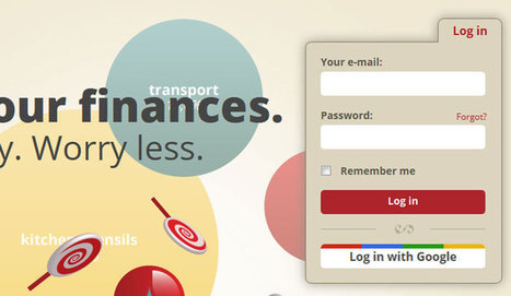
* Email subscription form (prefer presence to popunders).
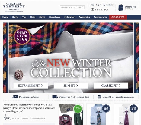
* Clearly ECOM - looks like a store with things to sell not content to read.
* Social (easy to find theirs and easy to contribute).
* Content Curation from social / comments / reviews (should feel like a party with people who share love / interests).

* Offers, deadlines and a sense of time (of the year today is Columbus Day for example).

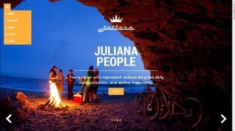
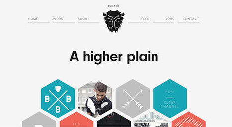
These examples from Conversion IQ are closer to "ditch digging" ecommerce websites. Conversion either BUYING or into a list are easier, more clear and so these designs make more money than the pretty picture websites I shared last (http://sco.lt/4ijZIH ),

No comment yet.
Scooped by Martin (Marty) Smith
Scoop.it!

10 Beautiful Websites for Your Inspiration - Can Beauty Win As A Strategy?

10 Beautiful Websites for Your Inspiration - Can Beauty Win As A Strategy? | Must Design | Scoop.it

Design Beauty As Online Strategy
Beauty has a problem online. Imagine a line with pretty pictures on one end and makes money / converts on the other. As website design travels away from the balanced center out to either pole something is given up.

Beautiful sites often feel solipsistic and self referential. Commerce sites feel transactional and much like an not very special commodity. As visual marketing commands more and more of our attention, efforts and communication arresting imagery is important.

You can't sell someone who doesn't stop long enough to know who you are. Is beauty an effective strategy in and of itself? No. Is commerce an effective strategy in and of itself? No. Truth lies in the magic promise of a balanced approach as these 10 examples of somewhat practical beauty share.

My favorite and the one most centered between those two poles?
Juliana Bicycles - I don't typically like group scenes that aren't open to the viewer as they can send an exclusionary message. This bicycle site doesn't because of the magic of place pictured and the ancient desire to warm next to a fire with friends.

Would NEVER have thought Juliana Bicycles hero could feel so beautiful, friendly and inviting breaking several key rules - but it does.

malek's curator insight, April 25, 2014 8:50 AM

One Unusual trend we ignore

In Digital strategy pay maximum attention to social media tools, digital tricks and marketing tips. But, we don’t always keep tabs on website design trends and evolution

Scooped by Martin (Marty) Smith
Scoop.it!

2013 Color Trends In Web Design

2013 Color Trends In Web Design | Must Design | Scoop.it
Just like every other element of web design, color palettes follow fads that are constantly evolving. This year’s color trends are as diverse as they are
Martin (Marty) Smith's insight:

Great summary of evolving "color" best practices in web design.

No comment yet.
Scooped by Martin (Marty) Smith
Scoop.it!

Deigning Tomorrow's Ecommerce Today

Deigning Tomorrow's Ecommerce Today | Must Design | Scoop.it

Designing Tomorrow's Ecommerce
I'm writing a blog post for Curatti that will go live at midnight tonight that discusses the "best practices" of "Tomorrow's Ecommerce". I'm also writing a Curagami blog post (also published at midnight) about how social shopping will change Tomorrow's Ecommerce.

Tomorrow's Ecom Current Best Practices (Curatti tonight)
Tomorrow's Ecom Social & Mobile Web (on Curagami now)

The Haiku Deck that bridges both of these posts is linked above and here:
http://shar.es/1nkJef

As we publish each post we will link them here.


Martin (Marty) Smith's insight:

add your insight...


No comment yet.
Scooped by Martin (Marty) Smith
Scoop.it!

The Art & Science of Social Login Design

The Art & Science of Social Login Design | Must Design | Scoop.it
Social login, also known as social sign-in, provides users with one single login using an account they already have – their social network account.
Martin (Marty) Smith's insight:

The NEW Web Design
Reading a new Social Media Examiner report (Scooped here http://sco.lt/5jE7qj ) social login is looming LARGE and IN CHARGE especially thanks to "password fatigue" and big F success as a universal trust mark.

Designing social lgoin can be tricking. When the Atlantic BT team created social login for http://www.curecancerstarter.org

it became clear to me (as client) they were in over their heads. Here are some examples of the art and science of design social login in ways that blend, support and intrigue.

Why is social login so important? The next web is going to be more distributed and less go to a website and consume content. Facebook's dream of becoming infrastructure seems to be coming true, so we need to understand how to design websites with social signin and the social reach it provides.

Martin (Marty) Smith's comment, March 23, 2014 11:28 AM
Good note @wayne_b. I'm sure there are many "more technical" who will use password helper apps. I also see your point about, for a certain segment, Facebook = distrust (me included), but there is a big broad breadbasket of users who will use FB because they trust it and social signon because its easy. That being the case, I will always include a well thought out social signin option on the big stuff we create at @CrowdFunde and Scenttrail Marketing. Marty