This piece was posted by Loren Sorenson for Hubspot, I selected it because as she says "If you aren’t prepared for the visual content revolution, you may be left in the dust.
Not convinced? Let's take a look at exactly how visual contentis positively contributing to marketing strategies -- it may just give you the push you need
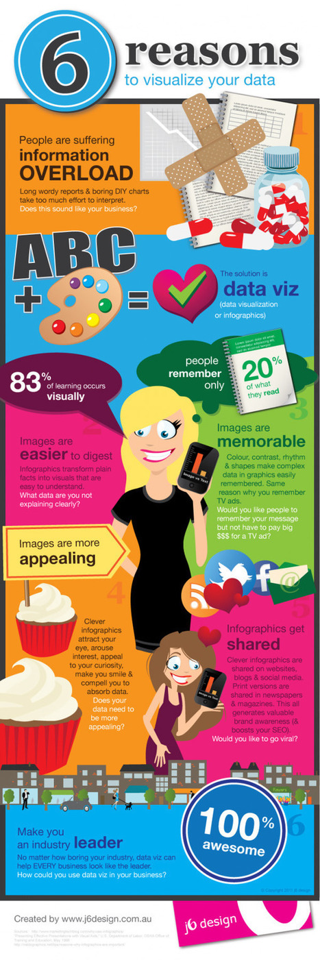
"Learn why visual content is a critical part of your content creation strategy.
Here are some highlights:
**People remember only 20% of what they read
**83% of learning is visual
Condenses and Explains Large Amounts of Information
**Today, there is too much information on the Internet you have about 3 seconds to catch someone’s eyes so they'll consume your information.
Gives Your Brand an Identity
**Visual content draws people in, letting viewers better understand your brand's identity
Drives User Engagement
**If you've ever read a book with a child, you probably know they find pictures more interesting than words; but are adults really that different?
Selected by Jan Gordon covering "Content Curation, Social Business and Beyond"
Read full article here: [http://bit.ly/Ifujbp]
Via
janlgordon


 Your new post is loading...


![Branding: How It Works in a Social Media Age [INFOGRAPHIC] | Must Design | Scoop.it](https://img.scoop.it/thwPL1oXBQFDmgl9UC6eaDl72eJkfbmt4t8yenImKBVvK0kTmF0xjctABnaLJIm9)


![Fonts & Colors Big Brands Use To Win Loyalty and Promote Engagement [Infographic] | Must Design | Scoop.it](https://img.scoop.it/S-KxbZ4_NhYiD2xJkatI5jl72eJkfbmt4t8yenImKBVvK0kTmF0xjctABnaLJIm9)


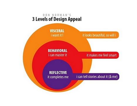
Great primer on how to build emotions into your product, web, and services designs.