Must Design
75.5K views | +0 today
Must Design
Design Is Revolutionary
Your new post is loading...
Scooped by Martin (Marty) Smith
Scoop.it!

Best-in-Class eCommerce Web Designs via @conversioniq

Best-in-Class eCommerce Web Designs via @conversioniq | Must Design | Scoop.it

Best In Class From Conversion IQ
The other day I complained about "pretty picture' ecommerce sites that make conversion harder. So much of ecom is ditch digging. Ditch digging to make sure you have things such as:

* Email subscription form (prefer presence to popunders).
* Clearly ECOM - looks like a store with things to sell not content to read.
* Social (easy to find theirs and easy to contribute).
* Content Curation from social / comments / reviews (should feel like a party with people who share love / interests).

* Offers, deadlines and a sense of time (of the year today is Columbus Day for example).

These examples from Conversion IQ are closer to "ditch digging" ecommerce websites. Conversion either BUYING or into a list are easier, more clear and so these designs make more money than the pretty picture websites I shared last (http://sco.lt/4ijZIH ),

No comment yet.
Scooped by Martin (Marty) Smith
Scoop.it!

5 Ecommerce Checkout Tips - How To DESIGN For More Conversions Next Year

5 Ecommerce Checkout Tips - How To DESIGN For More Conversions Next Year | Must Design | Scoop.it
Martin (Marty) Smith's insight:

CureCancerStarter.org Lessons In Checkout Mechanics
We did a lot of things right with our initial design of http://www.curecancerstarter.org our crowdfunding cancer research website, but there are some "checkout mechanics" that need tuning including:

* 1,2,3 Graphic.

* Trust Marks.

* Ability To SEE what is happening. 

* Too many Steps (superfluous information requested). 

* Doesn't FEEL Secure.


Your ecommerce or charity donations page should be in lockdown until next year. While checkout process changes can often bring the biggest ROI, they are to be avoided this close to a major deadline like 12.25.

1,2,3 Graphic
Always MAP your checkout process and then use a different color to indicate YOU ARE HERE. This repeatable graphic is a great TRUST creator and costs NOTHING other than the design time to create it.

Trust Marks
When I use the Authorize.net Trust Mark I DON'T use their widget. Widgets allow visitors to click on the Authorize.net logo and hear all about how great they are. NO ONE clicks on that link and the overhead for carrying the JavaScript is too high. I take a picture of the logo and use that (no link). If you must link to something link to your privacy policy, but be sure to include the same graphic at the top and begin with an explanation of the Trust Mark in your copy.

SEEING What Is Happening
Our current CureCancerStarter.org checkout has a popup to save a credit card. PopUps are horrible as they destroy confidence. Confidence is lost when customers can't SEE what they've done and how it relates to the end goal. "Relates to the end goal" is why the graphical map of your checkout process is so crucial.

Too Many STEPS
We have a profile creation page in our current checkout and we aren't doing anything with that data so a BIG NO NO. Don't PROFILE your customers during checkout since you will lose half of them. Profiling should be done via incentives and email marketing WHEN you have a curators need for the data (and not before). Once I can actually USE a picture of a CureCancerStarter.org donor THEN and ONLY THEN should that information be requested.

Must FEEL Secure
Trust Marks are so common no one sees them, but boy you sure see their ABSCENCE. Why make me wonder if you are secure. Slap a logo on your checkout and write the words TRUSTED and SECURE under them. Research shows the presence of the words is valuable as it provides context to the logos AND increases trust.

When we redesign CureCancerStarter.org's checkout I will be sure to share it so we can do a BEFORE and AFTER comparison (and a real graphic designer will polish my rough drafts).


Seth Storey's curator insight, October 23, 2013 12:15 PM

Great tips on good checkout design

Scooped by Martin (Marty) Smith
Scoop.it!

Look Inside and Steal From The Top 10 Converting Websites

Look Inside and Steal From The Top 10 Converting Websites | Must Design | Scoop.it

Marty Note
Great article sharing similarities and differences in the approach to ecommerce used by the Top 10 converting websites. When you look at these websites with your, "I want beautiful," glasses on you may be depressed. Don't be, learn from the tactics these high converting sites use such as remarketing. In fact, steal them blind since better conversion is the next web revolution.

No comment yet.
Scooped by Martin (Marty) Smith
Scoop.it!

5 Quick Tips About Images & Web Design

5 Quick Tips About Images & Web Design | Must Design | Scoop.it

Hard Won Lessons
I spent almost a million dollars of OPM (Other People's Money) learning these five lessons about images and web design, so lessons learned the hard way:

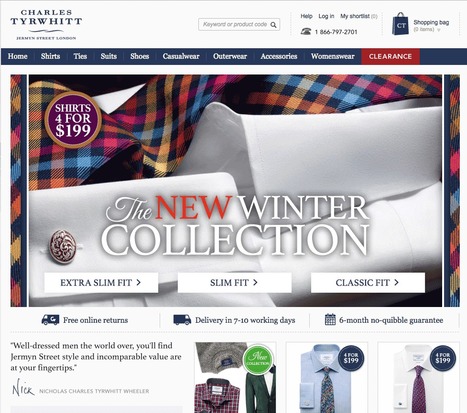
1. Portraits Are Powerful
Portrait images where the model looks directly at the camera, are powerful "welcoming" images great for home, about and category "splash" pages.

2. Babies are DYNAMITE - Use Carefully
Thanks to our ancient caveman brain we can't NOT look at babies. Problem is that is not a secret so babies are now overused to hock insurance, tires and shampoo. If you use a baby my preference is to have the baby looking AT something.

Visitors eyes go where the eyes of people (or babies) are looking, so point your baby image directly at an important Call-to-Action and bet your conversions go up.

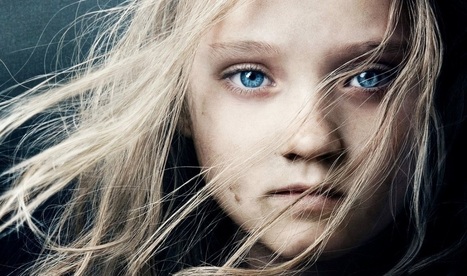
3. People Talking To Each Other = DANGEROUS
There may be context where it makes sense for you to have an image where people in the image are huddled together, but I doubt it. If you have two people huddled and a third looking directly out at the camera the image works better.

We respect a huddle. We don't want to intrude, so your web image is working against your online marketing purpose. Your image says we are here having a conversation and YOU (visitor) aren't invited. Not a good idea.

4. People Sell Better Than Widgets, but...
I  prefer to tell human stories even about the most widgety widget, but people bring "like me" problems too. Every visitor is looking for "like me" signals. If you know your archetype and tribe well enough to risk it use images of people consistent with your understanding.

If you have a wide variety of customers and members best to avoid single archetype "like me" images. This is yet another reason I like portraits. Portraits are "universal" meaning the welcoming look directly at the camera removes some of the "must be like me to engage" requirements.

5. In Action Shots Use The MOVEMENT
If your image is riding a bicycle POINT the movement at something important. I don't like movement images as heroes (largest images on a page is called a hero), but I love them in "sub-hero" images because movement creates excitement and allows me to direct the visitor's eyes where we want them to go.

Use these 5 hard won tips and your images won't fight your site's desire to connect, create community and convert visitors into buyers and members.


Martin (Marty) Smith's insight:

add your insight...


Michael Allenberg's curator insight, July 25, 2014 8:48 AM

Having spent over a decade as a professional photographer, this is spot on! Of utmost interest to Experience Designers interested in persuasive design methodologies! 

Rescooped by Martin (Marty) Smith from Business and Marketing
Scoop.it!

The 7 Principles of Conversion-Centered Landing Page Design

The 7 Principles of Conversion-Centered Landing Page Design | Must Design | Scoop.it
Are you applying the principles of conversion-centered design to your landing pages? Well, you should be ...

Via Gregg Breward
Martin (Marty) Smith's insight:

Landing Page Design Is A CSF
Landing Page Design is a Critical Success Factor. I saw an amazing statistic somewhere not long ago. The stat said those with more landing pages did much better than those with fewer. If we Freakonmics this stat we see there could be many reasons. 

Those with more landing pages may be better at email marketing, video marketing and design for conversion. The fact they have more landing pages is an indication that they understanding Internet marketing as a whole better than their cousins or other siblings. 

There is both ART and SCIENCE to creating landing pages that convert (like all things web design).  This post is an excellent summary of how to build a landing page that does what you want it to - convert visitors into customers. 

No comment yet.