Must Design
75.5K views | +0 today
Must Design
Design Is Revolutionary
Your new post is loading...
Scooped by Martin (Marty) Smith
Scoop.it!

Want To Beat Content Shock? Magazine Your Content Marketing

Want To Beat Content Shock? Magazine Your Content Marketing | Must Design | Scoop.it

Beating Content Shock
We don't disagree with author and web marketing guru Mark Schaefer. There is too much content chasing too little attention. Once you have attention you need to convert visitors to buyers.

Creating content "magazines" is a great way to beat Schaefer's content shock, create trust, win hearts and minds and engender loyalty. This LinkedIn Post shares a synopsis of tips shared on Curagmai including:


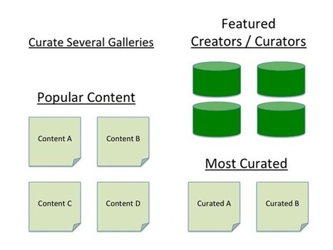
  • Find 3 – 5 content groups that interest your visitors.
  • Decide your schedule (we recommend monthly updates at first because that is a big commitment that must be kept to gain trust).
  • Curate content from trusted sources such as brands, manufacturers and even competitors.
  • Automate at least one of your content groups with feeds.
  • Find and nurture free visual media sources such as Haiku Deck.


The Curagami post is here:
http://www.curagami.com/ecommerce/5-tips-magazine-content-marketing/?v=7516fd43adaa 

And The http://www.Moon-Audio.com example is here:
http://www.moon-audio.com/chord-hugo/magazine.html#

The LinkedIn Synopsis is here:
https://www.linkedin.com/pulse/how-magazine-your-content-marketing-martin-marty-smith 
 

No comment yet.
Scooped by Martin (Marty) Smith
Scoop.it!

Make Web Designs Welcoming Don't Say Welcome via @Scenttrail [Before and After graphic]

Make Web Designs Welcoming Don't Say Welcome via @Scenttrail [Before and After graphic] | Must Design | Scoop.it

Working with a team at UNC Emergency Room trying to make their website more engaging. As the BEFORE (on the right) image shows their current site "talks to itself about itself". Ways to fix that include:

* Hero image that heeds the sight line rule.
* Clear Calls To Action.
* Move Social from bottom left to upper right.
* Prominent Join Our List subscription form.
* Curate Customer / Patient content in (coming soon).

Your visitors' eyes follow the eyes of people in your photos. The image son the right show what NOT to do - make images that look like they are self referential. Never have people in an image on your site talking among themselves. Nothing says "we don't care about you" louder than images that are either too "smart", "exclusionary" or busy.

If people in your images don't look at the camera have their site lines pint to a Call To Action. Don't create ideas that are exclusionary either such as Leading, Teaching and Caring. That sounds like "selfspeak" to me.

OR, if you must have "selfspeak" then shore it with icons the way the UNC design lead did and use those icons to begin a conversation not a lecture about each of those ideas.

I LOVE text on a homepage for SEO, but it can be very exclusionary as the BEFORE image on the right proves. Tease the read with a few sentences and a "read more". BTW, the only time I use Read More CTAs is when I've teased something.

I prefer "learn more" since it feels more like we are learning together and less like work. Use closed loop CTAs when you are completing a proised action. All other times use CTAs that are more creative and fun.

The next step for this design, and the one that will make it really welcoming, is to curate in User Generated Content (UGC). When you include your customers (or patients in this case0=) you break down the THEM vs. US walls better than anything I can think of. Important to break down those walls since you need UGC and social shares to survive these days even if your have a .edu in your URL.

No comment yet.
Scooped by Martin (Marty) Smith
Scoop.it!

Gamification - Designing for Engagement

Gamification is fundamentally rewriting the rules of engagement and design. We can leverage its techniques to create unprecedented connections with our customer
Martin (Marty) Smith's insight:

Building Engagement In

There are ways to BUILD engagement into a website's design. Here are three secrets to promote engagement not included in this excellent Slideshare:

* Place Email Subscription High Up and Prominent. 
* Include curated User Generated Content on every page.

* Create CTAs with CONTRAST.


Email Subscriptions
When your "Subscribe To Our Email List" Call to Action is high on the page in a Can't Miss It spot you communicate a clear "we want YOU" signal. 

UGC Everywhere
When you curate User Generated Content to your site you communicate how well you listen and care for community members. The website isn't all about YOU and what you think the inclusion of UGC says.


CTAs
I see to very common mistakes in websites I'm asked to review as Director of Marketing for Atlantic BT in Raleigh (http://www.atlanticbt.com ): NO CTAs or poorly contrasted CTAs. I PREFER CTAs to be buttons and usually test red, orange or green (depending on the background color). I'm convinced there is no ONE magic CTA color but the contrast is what makes a Call To Action helpful or not, clicked on or not, converting or not.  

Michael Allenberg's curator insight, June 2, 2013 7:17 AM

Engaging and experience should always go hand-in-hand, regardless of the implementation.

Scooped by Martin (Marty) Smith
Scoop.it!

Designing For Community: Master Blasters & Galleries - Curagami

Designing For Community: Master Blasters & Galleries - Curagami | Must Design | Scoop.it

Master Blasters
When everything is social community rules. Curagami our Triangle Startup Factory funded startup is working on helping ecommerce merchants and content marketers validate the ROI of social and content marketing. Community is a CSF, Critical Success Factor, because community is what creates an army of advocates.

This post is about how to win the hearts and minds of your most important customers - those willing to advocate your products, services and web content.

No comment yet.
Scooped by Martin (Marty) Smith
Scoop.it!

"Snowfall" Interative Web Design Storytelling 20 Examples | Web Directions

"Snowfall"  Interative Web Design Storytelling 20 Examples | Web Directions | Must Design | Scoop.it
Yesterday an article on Medium, Snowfallen, caught my eye. It's about a technique for presenting longform writing online, by embellishing it with integrated
Martin (Marty) Smith's insight:

Not sure how I feel about "snowfall" design. My favorite is the Buzzfeed History of Pong. My concerns are:

* Gets boring to scroll that much.
* Pagespread - is it better SEO to have a single long page or many pages?

The issue of pagespread is tricky. The new Google cherishings engagement and long pages create longer engagement assuming people don't click off.

But Google also likes pagespread (more pages about a topic with social shares and links confirming their importance). I don't know the RIGHT answer her since each approach - long pages or many pages - have distinct SEO benefits.

I find the experience of that long page offputting and wonder how snowfall will play on mobile devices. Mobile may be easier because of the swipe.

In fact, snowfall design may have its roots in mobile (sure feels that way). Whether your website should be 100% snowfall designed is above my pay grade (lol). M  

No comment yet.