
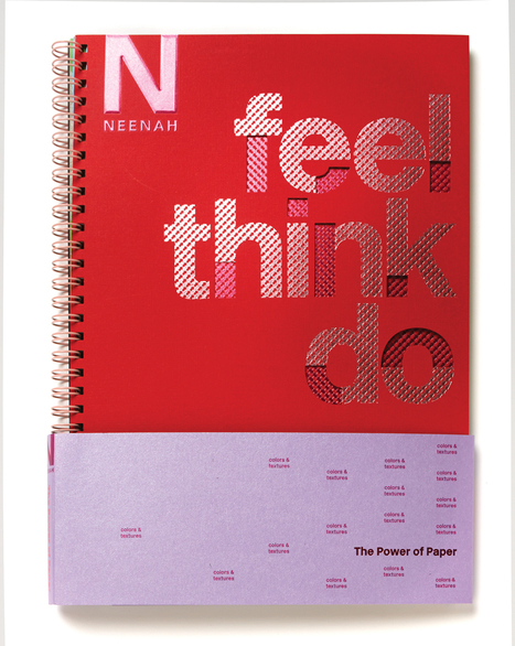
Across all the categories in HOW's Promotion & Marketing Design Awards, we see a number of projects featuring great typography. Check out these selected projects for some typography inspiration.
Get Started for FREE
Sign up with Facebook Sign up with X
I don't have a Facebook or a X account


 Your new post is loading... Your new post is loading...
Across all the categories in HOW's Promotion & Marketing Design Awards, we see a number of projects featuring great typography. Check out these selected projects for some typography inspiration.
Martin (Marty) Smith's insight:
Great Type Design 
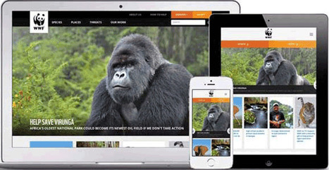
Designing a good website that accommodates a lot of content is a tricky balancing act to pull off. Does one attempt to present the user with all the information
Martin (Marty) Smith's insight:
Great tips in this "beautiful content heavy websites" post. The Verge has always been one of our favorites and we like the WIRED example too.
|

|
Scooped by Martin (Marty) Smith |
In this article, Kendra Schaefer examines the things all web professionals should know before swan-diving into the Chinese market, including how mobile-only social platforms have become the revolutionary new frontier of Chinese web design, and who’s designing beautiful websites in China today.
Cool post. China is ahead of us on MOBILE leaving "Mobile First" for "mobile only" and they take more web design risks that pan out more often than you think.
|
|
Scooped by Martin (Marty) Smith |
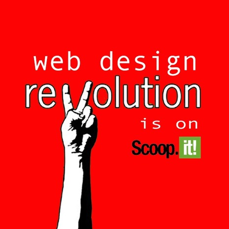
Design Is Revolutionary
Don't have to be Steve Jobs to know design is revolutionary. Our Web Design Revolution feed on Scoop.it is one of our favorites. We love THINKING visual because most of us (save one poor CTO) are marketing geeks who visualize in our sleep.
If you visualize in your sleep consider contributing a Scoop or two or three to The Web Design Revolution in 2015. Several easy ways to contribute:
1. If you are on @Scoop.ituse the Suggest Feature. We appreciate all the great suggestions we've already received and promise a new focus on collaboration in 2015.
2. If you aren't on Scoop.it you are missing one of the best "do less, get more" tools we know, but you can still contribute ideas for stories we should include by:
email: martin(at)Curagami.com
Twitter: @Curagami
Call For Help NOW
Right now we are interested in creating a year-end mashup of all the web design predictions for 2015. If you have a favorite prognosticator and they write about what they think is going to happen in web design next year send us the link and we will mash your contribution up into a summary with early views going to contributors.
Thanks for a great year and hope you will contribute to The Revolution in 2015.
|
|
Scooped by Martin (Marty) Smith |
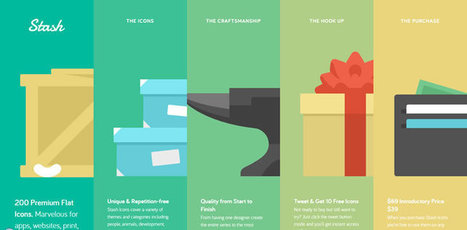
Flat Design Rocks Mobile
Flat web design looks great on any device so it is one of he hottest trend i 2014. My faves from this group of great flat designs:
StashIcons
VeloSport (more because I'm a cycling nut)
Bollox
Flatness in and of itself doesn't make a web design look good on mobile. Responsive design is the holy grail of platform agnostic design. Responsive + Flat more powerful than either of those ideas alone.
|
|
Scooped by Martin (Marty) Smith |

I like Salesforce and SquareSpace and was surprised I didn't hate the Microsoft design.

Unusual and creative responsive designs that look great on a huge monitor and a tiny smartphone screen - that's great
|
|
Scooped by Martin (Marty) Smith |
![30 Black And Blue Web Designs Inspire [examples] | Must Design | Scoop.it](https://img.scoop.it/Y3CTqfjVjelTmXyz04bEZzl72eJkfbmt4t8yenImKBVvK0kTmF0xjctABnaLJIm9)
Details of the website as featured within CoolHomepages web design inspiration gallery.
Marty Note
Blue is a great color. There is a reason blue is many of your visitor's favorite color. Online blue is soothing, easy on the eyes and beautiful against black. My favorite is the UK design "un.titled.co.uk" (used as the image above).
Love using opacity to "hide" things in plain view as that kicks in the curiosity of visitors and gets the click. Current Un.titled site isn't as interesting or special as the design noted here. . Love blue online and these examples show why.
|
|
Scooped by Martin (Marty) Smith |
Beautiful Unusual Navigation Designs for Inspiration. Selection of Awwwards websites with a strong presence of unusual navigation. An effective navigation design is crucial for a website
Navigation feels old and moldy. There are few things MORE critical than navigation. We've moved from left nav sitting firmly in the "golden triangle" to horizontal top navigation.
Neither of these options inspire and both are feeling long in the tooth and stupid. The social / mobile web requires a RETHINK about navigation. Can we find ways to make very page a homepage?
Can navigation be more relevant and less middle of the road boring? Here are some navigation examples from AWWWARDS.com that don't solve the problem...yet. But the dialogue helps begin the process of reducing our dependency on static, boring, "has-been" ideas like left or horizontal nav.
Are you as surprised that navigation hasn't been on the "top changes" list for web design in 2014? Has to be on our 2015 list because every current option is BAD and getting worse.

Merci ! il est bon de repenser aussi le webdesign pour une nouvelle expérience utilisateur
|
|
Scooped by Martin (Marty) Smith |

Red is one of the most used colors out there. Among other things it symbolizes passion and courage and it has a strong visual impact. Numerous designers implement it in their work either in logos, backgrounds or other website elements. In today’s article we have selected 45 web designs using the color red in various …
|
|
Scooped by Martin (Marty) Smith |
![10 Rock Solid Website Layout Examples | Design Shack [cool way to SEE web design] | Must Design | Scoop.it](https://img.scoop.it/oTupv3ms8sh4CpeucsgQDTl72eJkfbmt4t8yenImKBVvK0kTmF0xjctABnaLJIm9)
Reading an article entitled 10 Rock Solid Website Layout Examples on Design Shack.
Love how Design Shack shares just about every web layout in silhouette then provides examples. Good idea to train your eye to see the frames (they are always there). Soon we will be training ourselves to think in ZONES and this wireframe approach is critical to that next step.
|
|
Scooped by Martin (Marty) Smith |

There are hundreds of websites launched in every day and mostly web design are available in CSS Website Galleries for awards, reviews and inspiration for web
|
|
Scooped by Martin (Marty) Smith |
Minimalism has been a popular website design style for years. It has so many benefits; minimalist sites load faster, take fewer server resources, and are often faster to develop than more graphically complicated designs. Plus, they give a professional, clean impression to visitors. Many people still view minimalist designs as ... Continue reading »
|
|
Scooped by Martin (Marty) Smith |

The Internet has given rise to a slew of networked communities. User profile pages have become the norm for cloned systems such as Facebook, Digg, Twitter, and others. This trend has converted even the most basic websites into social havens for users.
Below I have cataloged 26 of the best profile designs found on the web. These feature tons of advancements including block stats, avatars, profile names, and a few other nifty features. Let us know your thoughts on the design gallery in our discussion area below.
Mary Note
User Profiles & Community
Community is a CSF (Critical Success Factor) for e-commerce success in today's crowded and noisy web. Sharing your site with customers is a great way to begin to build an online community.
These 30 designs share best practices in user profiles today and some don't suck (Plurk, Vimeo). None is breathtaking or outstanding. Common and important elements for community building include:
* Picture
* Following / Follower Stats
* Bio
* Links out to social nets
* Summary of user actions on the site
* Badges or other social status definitions
If you have a favorite user profile please share as we're working on creating one for a client now. Thanks, Marty
User Profiles & Community
Community is a CSF (Critical Success Factor) for e-commerce success in today's crowded and noisy web. Sharing your site with customers is a great way to begin to build online community.
These 30 designs share best practices in user profles today and some don't suck (User Profiles & Community
Community is a CSF (Critical Success Factor) for e-commerce success in today's crowded and noisy web. Sharing your site with customers is a great way to begin to build online community.
These 30 designs share best practices in user profles today and some don't suck (
|
|
Scooped by Martin (Marty) Smith |

People don’t judge a book by its cover, do they?Of course they do.Whether it’s the presentation of your food at a fancy restaurant or the latest Apple product, humans just seem to love things that ...
The Ecommerce Rubicon
As I've written about before on Curagami in Ecommerce Rubicon: 5 Tips On How To Cross Over http://www.curagami.com/ecommerce-rubicon-5-tips/?v=7516fd43adaa finding a web design that tells a great visual story, converts visitors to buyers, builds brand equity, and creates tribes is a multi-headed hydra.
You can see all possibilities and challenges in these 30 examples. Some tell great visual stories but good luck converting visitors to buyers. Others are so focused on transactions there is no "there" there.
|
|
Scooped by Martin (Marty) Smith |
Parallax scrolling is a popular design technique used on websites in order to create an illusion of movement on the screen, to help engage website visitors and move visitor yes where you want them AND parallax scrolling plays beautifully on mobile devices!.
Here are 60 examples of great parallax scrolling.
|
|
Scooped by Martin (Marty) Smith |
Cyber-Duck are an award winning London digital Web Design agency. We can offer a full professional service from web design to programming web technologies
As these examples show better than thousands of words can responsive web design is about more than design. How you architect your information to handle the accordion nature of phones, pads, lap and desktops is paramount. Figuring out how to snippetize everything from images to written content is the new challenge.
|
|
Scooped by Martin (Marty) Smith |
Marty Note
Watching the excellent HBO Documentary about James Brown Mr. Dynamite made me think of FUNK and web design. Web design is easy to get WRONG (lol).
It is tricky to design online with a sense of surprise, beauty and novelty. I like the Digital Invaders design as it feels free and spontaneous. Other designs such as Monster CSS and Creative With A K feel like they are trying to appear spontaneous and free.
Trying too hard is EASY in web design too. Remember all websites are STAGES we designers SET. The trick is to set a stage that feels like it is happening now and won't feel dated tomorrow. Feels like there are enough visual hooks in Digital Invaders it would be easy to keep it fresh with minimum fuss.
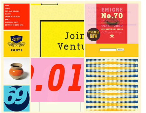
I like Emigre too. Emigre creates the same sense of happening now but that design is at the other end of the spectrum from Digital Invaders. Its hard to beat the grid. First website I created, in 1999, used a Mondrian grid.
Grids help organize massive amounts of information without that mountain feeling like it is about to crush you. I like the funky NOISE contrasted to the quiet grid because they demonstrate the need to find a visual VOICE in your web design. That voice can be anything as long as it feels authentic TO YOU.
The web is very good at finding and amplifying DISSONANCE. When you try to FUNK IT UP and aren't really funky it shows like you are wearing the wrong decades fashion (painful). Your customers are your audience.Set the stage anyway you want, but do so with an eye toward YOUR TRUTH.
The closer you stay on the tiny beam of "authentically us" the more success your web design has. This is why there are no web design maxims that apply all the time. What works for Emigre is very different than Digital Invaders but both work, both are authentic and have that hard to describe but know it when you see it TRUTH great web design must have.
|
|
Scooped by Martin (Marty) Smith |

Best Black & White Web Designs
Color is a tough master. Color sends many conscious and unconscious messages. Some websites strike out to create beauty with a simple palette.
Using only black and white these web designs show how powerful those two colors can be. Favorites include Sofa and Marck Ecko.
|
|
Scooped by Martin (Marty) Smith |
Marty Note
Red is an IMPOSSIBLE web design color except when it isn't. There is an excellent comment at the end of this post sharing the best red websites:
Ashley Pajak Comment
I find that red can very easily become too overpowering. Even though some of these are running into that, others display the color proudly and cleverly, such as the Venkat Portfolio and Svizra.
The only design I liked used red as an accent (Project 1,000). Others just made me want to RUN away. When I started designing websites in 1999 I read a book about red, white and black as a powerful combination of design elements.
The book pointed out the power of simple lines and few colors especially when done so from the MINIMAL school of online design made so popular now by MOBILE. There are flashes of that clarity in some of these designs, but red as a base color is tricky and difficult as many of these designs prove..
If you know great red or great red, black and white designs please share and we will update. Thanks, M
|
|
Scooped by Martin (Marty) Smith |
![Funky Webdesign Ideas [some great, some horrible] | Must Design | Scoop.it](https://img.scoop.it/E7lQO7XPS2ZyjBQKsnipZDl72eJkfbmt4t8yenImKBVvK0kTmF0xjctABnaLJIm9)
Wow, some cool web design ideas here and some HORRIBLE ones. I like Wolf & Badger: https://www.wolfandbadger.com/ Current site doesn't look like the FLASH example.
Never use Flash at this point as it kills SEO and its not "trending" in the right direction). Some of these ideas are a mess, but see which ones are your favorites. Always good to see where the line is. Some of these sites are well over the line.
New design isn't as funky, but it is solid. The idea of walking a customer into the middle of a strange fantasy seen and letting them find their links would not normally be something I would like since it obscures instead of makes clear.
The Online Shop (lower right) is what sold me on this fantasy. I also think we are in a time when sites are sites and so BORING. The Flash needed to be killed but check out the link to there new site and see if you don't still rock a good design.
|
|
Scooped by Martin (Marty) Smith |


Color & Texture
This share bucks the flat monochrome color trend being driven by mobile, but its hard to deny the sensual impact of just the right color and texture as in Paid to Exist and other examples here. Brilliant.
|
|
Scooped by Martin (Marty) Smith |

Explore Kevin Regenrek's hand-picked collection of Pins about Webdesign Inspiration 2014 on Pinterest. | See more about website designs, web design and landing pages.
Marty Note
Almost 200 inspirational web designs on Pinterest.
|
|
Scooped by Martin (Marty) Smith |
Flat web design has been a huge topic in the web, even Apple is adopting flat web design style and you need to make sure you upgrade your site too!
Why so FLAT?
Mobile is the single word answer to why most websites are flattening out their designs. As phones outnumber desktops one of the manifestations of "mobile first" is we are adopting designs that look better on our phones and pads - FLAT designs.
Amazing how quickly this worm turned, but you won't have trouble finding hundreds of examples of great flat website design like these 40. My favorite is http://madebyfibb.com/ for its cascading windows feel and images that engage and point at CTAs.
Marty
|
|
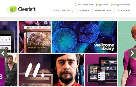
Scooped by Martin (Marty) Smith |
Love the breakout by category. Great examples in each category. My favs are:
ClearLeft.com and SalesForce.com
M


Great Type Design
Type is hard to get right. That is why we like looking at how the pros use type to make amazing designs like these.
Great Type Design
Type is hard to get right. That is why we like looking at how the pros use type to make amazing designs like these.