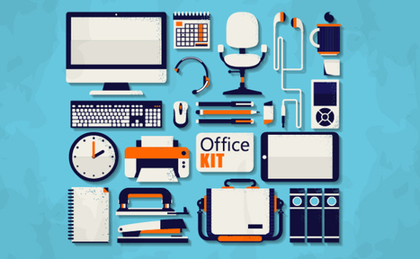
Must Design
75.5K views | +0 today
Follow
Must Design
Design Is Revolutionary
Your new post is loading...
Suggested by David Fournier
Scoop.it!

Web Design Trends 2015 [Infographic]

Web Design Trends 2015 [Infographic] | Must Design | Scoop.it
Explore the top web designing trends for 2015. The infographic discusses the top 6 predictions that are set to rule the web designing world in 2015.
Martin (Marty) Smith's insight:

Liked and agreed with all 6 of these 2015 Web Design Trends when I read the post without the infogfpahic. Infographic helps and I bet wil get more shares :). M

malek's curator insight, December 8, 2014 11:24 AM

I like“Card” design, no, it\s not new, but I find it a good tool for designers working on responsive websites. Cards are a great way to keep things modular

Scooped by Martin (Marty) Smith
Scoop.it!

Drop These 15 Web Design Buzz Words At Your Next Hipster Party

Drop These 15 Web Design Buzz Words  At Your Next Hipster Party | Must Design | Scoop.it
You'll never feel left out at a hipster web design party with these 15 key terms under your belt
Martin (Marty) Smith's insight:

Yes a little knowledge is a dangerous thing and most of our web designers at http://www.Curagami.com wouldn't know CMYK if it jumped up and smacked 'em, but knowing these other 14 "web design buzz words" is a good idea. Since we hang out at a least one hipster web design party a week we can fit right in (lol). M

No comment yet.
Scooped by Martin (Marty) Smith
Scoop.it!

Why The Bauhaus Is Our House As Web Design Moves Into The Future

The Bauhaus ethic applied principles such as "honesty of construction", "truth to ma...

Martin (Marty) Smith's insight:

Great work by Simon Collision (@Colly). Picks up for me on slide 17.

1. Acknowledge the machine.

2. Standardize production.

3. Experiment and synthesize. 

4. Form follows function.

5. Economy and simplicity.

Those values drove designers at the Bauhaus to create a new approach. How will those values influence our web design going forward?

1. Honesty of construction truth to materials.

2. Develop systems.

3. Holistic web design approach (slide 32 what's golden important). .

4. Mass production and individual expression.

5. Adapt and respond to an evolving world.


Here are points I would make about how Bauhaus values will play an important role in what is next online:

* The machine is increasingly SOCIAL and MOBILE.

* Smart Phones & Apps gamify routine (boring) tasks.

* Holistic design will increasingly mean Mobile Fist design.

* We are all in the community building business (whether we know it or not) & community creates mass production OUT OF individual expression.
* Our adaptations will be social & mobile, gamified & curated.

No comment yet.
Scooped by Martin (Marty) Smith
Scoop.it!

Four Days In Paris and 14 Other Flat Design Examples Inspire

Four Days In Paris and 14 Other Flat Design Examples Inspire | Must Design | Scoop.it
Martin (Marty) Smith's insight:

Flat design is amazing. Looks good on mobile, is clean and easy to understand and hard to create. Here are 23 great examples.

cees de roij's curator insight, April 7, 2014 9:31 AM

On this website you can learn a lot and that is very good.

RDV Weekly's curator insight, July 11, 2014 2:48 PM

To meet modern design demands, flat design must be mobile-functional, clean, and user friendly. Some examples here.

Scooped by Martin (Marty) Smith
Scoop.it!

1 Well Designed Content Site & A Rare KISSmetrics Miss

1 Well Designed Content Site & A Rare KISSmetrics Miss | Must Design | Scoop.it

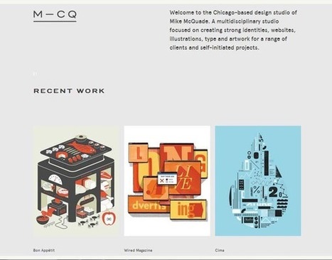
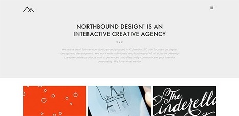
I’ve compiled a list of websites that produce great content, each of which has its own unique qualities. I’ll break them down and explain why they’re good and what you can take away.

KISSMetrics Misses The Mark 2 out of 3
I was looking for a great content/design mix and KISSmetrics got it right one out of the three times here. CopyBlogger is the only site in this group that both has great content and a great design.

The other two blogs may have great content, but their design is so off putting who is going to wade through their content? What makes Copyblogger work well?

* Snowfall design (long page scrolls down).
* Clear and LARGE Call-to-Actions (bet they've tested those big green buttons).
* Good use of icons that mask ads (very non-disruptive).
* Flat responsive design (probably looks great on mobile too).

* Big headline with interesting sophisticated font treatment.

* Video on homepage.

Ignore the other two suggestions here and focus on Copyblogger. Do you know a great content website? We are looking for great examples of DESIGN in content marketing. Share your favs and we will curate in.


No comment yet.
Scooped by Martin (Marty) Smith
Scoop.it!

12 Examples of Flat Web Design Inspire ~ Creative Market Blog

12 Examples of Flat Web Design Inspire ~ Creative Market Blog | Must Design | Scoop.it
Buy and sell handcrafted, mousemade design content like vector patterns, icons, photoshop brushes, fonts and more at Creative Market.
Martin (Marty) Smith's insight:

Flat website design is a major 2014 web design trend. Here are 12 examples of the art of flat website design. My favorite is the last example http://wistia.com/ .


Wondering why flat design is all the rage in 2014? Easy to answer in a single word - MOBILE.

Margaux Brachotte's curator insight, April 1, 2014 4:33 AM

Jeunes gens voilà du FLAT !!!

Cezame conseil's curator insight, April 28, 2014 3:06 PM

Quelques exemples de sites Internet dans la tendance du "Flat design"

Scooped by Martin (Marty) Smith
Scoop.it!

25 Examples of Flat Design Inspire | Vandelay Design

25 Examples of Flat Design Inspire | Vandelay Design | Must Design | Scoop.it

It almost seems that this year flat designs have taken over the world of graphic design by force, but especially in the arena of mobile apps with the first industry-shaking flat design being for the iPhone5. Reality is that flat design has been around longer than the emergence of the iPhone5, but of course it was Apple that helped to bring such cross-industry awareness to the design style. 

Martin (Marty) Smith's insight:

I was wrestling with why we are suddenly awash in "flat design". My first thought was flat design is more lean, easier to figure out where to go and what do do. Nope.

Flat design is upon us because of mobile as this excellent post and 25 examples shares flat transfers beautifully between desktop and mobile. Flat is the new black, so wear it well and find inspiration in these 25 examples.

No comment yet.
Scooped by Martin (Marty) Smith
Scoop.it!

Top 10 Web Design Topics of 2014 From Flat To Content & SEO

Top 10 Web Design Topics of 2014 From Flat To Content & SEO | Must Design | Scoop.it
The "Web Design" category of general interest covers its fair share of ground. Informative articles on everything from UX to client management, to conversion psychology,...
Martin (Marty) Smith's insight:

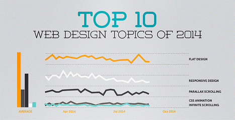
YES, seeing all 10 of these trends from flat design to content ISN'T king anymore (not true) and SEO isn't getting easier (true).

No comment yet.
Scooped by Martin (Marty) Smith
Scoop.it!

Black and Blue Web Design Examples Inspire & Look Great on Smartphones

Black and Blue Web Design Examples Inspire & Look Great on Smartphones | Must Design | Scoop.it
What are two of the coolest colors in web site design? And do you think we've assembled a collection for you that will knock your socks off? Take a peek >>
Martin (Marty) Smith's insight:

Mobile is forcing some good design upon us including:

* Simplified Color.
* Flat design.
* Better Fonts.
* Bigger Heroes.

These Black and Blue examples shows how limiting colors can create simple, more straightforward web designs.  

No comment yet.
Scooped by Martin (Marty) Smith
Scoop.it!

Your 2014 Website Can't Be Too RICH, THIN or FLAT - 40 Web Design Examples

Your 2014 Website Can't Be Too RICH, THIN or FLAT - 40 Web Design Examples | Must Design | Scoop.it
Flat web design has been a huge topic in the web, even Apple is adopting flat web design style and you need to make sure you upgrade your site too!
Martin (Marty) Smith's insight:

Why so FLAT?
Mobile is the single word answer to why most websites are flattening out their designs. As phones outnumber desktops one of the manifestations of "mobile first" is we are adopting designs that look better on our phones and pads - FLAT designs.

Amazing how quickly this worm turned, but you won't have trouble finding hundreds of examples of great flat website design like these 40. My favorite is http://madebyfibb.com/ for its cascading windows feel and images that engage and point at CTAs.

Marty

No comment yet.
Scooped by Martin (Marty) Smith
Scoop.it!

Why The New World is FLAT: What Is Flat Design?

Why The New World is FLAT: What Is Flat Design? | Must Design | Scoop.it
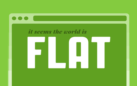
With the release of iOS7 just around the corner, clamor over the changes Jony Ive will institute is growing. The general consensus--on this site and elsewhere--is that Apple is about to get a flat makeover. But for the uninitiated, “flat design” can be a confusing term. So let’s talk it out, shall we?
Martin (Marty) Smith's insight:

Web Design Trends 2014
Like several other major web design trends this year flat design has its origins on our phones. Flat looks better on mobile and so flat is coming to a website near you too.

This is true for other design trends as well such as fewer colors, bigger heroes and better fonts. Since flat design is such a MONSTER trend in 2014 good idea to visit the question of What Is Flat Design. Here Gizmodo explains flat design and its mobile origins.  

No comment yet.
Scooped by Martin (Marty) Smith
Scoop.it!

Good, Bad & Ugly of 2014 Web Design Trends: Large Hero, Responsive Design, Animated Storytelling - Intercore

Good, Bad & Ugly of 2014 Web Design Trends: Large Hero, Responsive Design, Animated Storytelling - Intercore | Must Design | Scoop.it

Web Design Example Intercore
There are a lot of things I like about this website design for the private equity firm Intercore such as:

The Good
* Responsive Design.
* Animated Storytelling (love the factoids fading in and out).
* Large Hero.
* Flat color palette (monochrome color schemes).
* Location of social media in CONTACT area.

The Bad
The biggest nit I have is the lack of social media, but that brings up an interesting choice too. I'm betting a private equity firm isn't dependent on the web either for customers or SEO so Intercore's decision to only have Facebook and to put that link low down on the contact page reflects their business model better than it would most (who need customers from the web and care about SEO).

I Liked the company and there is confusing information on their abaout page. Don't feel compelled to play shuffle the deck in social media. If I was going to explain their corporate umbrella the Facebook About age is not where I would do it (lol).

Interesting and good ideas well executed to steal here. Whoever created this site knew what they were doing from a design and content architecture perspective.

The Ugly
By zooming out on my laptop I found their Twitter link. This is one of the perils of responsive design. The link is also broken directing into the home page so will share the fact their Twitter is broken on their Facebook page.

No comment yet.
Scooped by Martin (Marty) Smith
Scoop.it!

Web Design: 20 Hottest 2014 Trends [+ Scenttrail Take On Each]

Web Design: 20 Hottest 2014 Trends [+ Scenttrail Take On Each] | Must Design | Scoop.it

2014 We Design Trends

1. Grid Layouts - Agree & Is Good!
Yes visual marketing + pinterest + mobile is making the grid ubiquitous. I created a Mondrian grid in 1999 when we launched FoundObjects.com (not gone sadly). Grids help share MORE information faster and in the same space than any other design element.

2. Image Captions - Agree and is GREAT
The area immediately under an image is HOT. Everyone looks there but few designers use captions to reinforce or explain the image. Paying more attention to keywords under images is a great idea.

3. Extended Form Elements with JQuery - Don't Know? Does anyone?
Can't comment on this trend as it is new to me and I don't program so its potential benefits are fuzzy at the moment.

4. Deeply Focused Landing Pages thanks to Mobile - Agree & Is Cool
Don't understand this trend except enough to say COOL and WANT ONE.

5. HTML5 Video Players - Agree and GLAD
Don't play your videos on YouTube only since you just make the rich get richer. Figuring out how to play videos "in your stack" is important and having your own HTML5 player is cool.

6. 3D vs. 7. Flat Design - I come down on Flat Design as the winner due to mobile.

8. Personal Portraits - Agree and Like

9. SVG Vector sweeps web as browser support escalates. Agree & Glad.

10. Fonts get cool thanks to server advance - cool and like but not a religion or anything lol.

11. Lazy Loading Animations - cool and can think of several uses.

12. Customized Image Galleries - cool and we need.

13. Mega Navigation Menus - Don't know but don't like idea, seems confusing where confusion can really hurt.

14. Expanding Search Bars - cool and will use.

15. Featured Detail List - LIKE and is cool and new to me.

16. Mobile First Design - Agree and am doing my first now with CrowdFunde.

17. HTML5 Canvas - cool and new to me.

18, Pixel Sprites and Browser Games - New to me but COOL!

19. Quick Registration via social - AGREE!

20, CSS3 Keyframe Animation - Cool, want one.


Monica S Mcfeeters's curator insight, February 22, 2014 10:05 AM

Here are some current WEB designing programs.

Scooped by Martin (Marty) Smith
Scoop.it!

10 Web design trends you can expect to see in 2014

10 Web design trends you can expect to see in 2014 | Must Design | Scoop.it
December is always a great time to look back on the year that was and the new year that is soon to come. There are many exciting things that 2014 has in store for us who live, work, ...
Martin (Marty) Smith's insight:

Great UI for this look at 2014 Web Design Trends. Trends are inline with consensus including:

* Better and more artistic type online (cloud may help this too).

*  Flat design.

* Large heroes kill sliders (hope so, sliders are distracting & bad). 

* More MOBILE (thinking and design).

* VIDEO instead of text (YES).
* The LONG Scroll (already seeing this). 
* Simple colors (and NEON accents from another trends post).

* Simplified Content (lean content, visual content).
* Dropping the sidebar (especially magazine-type designs).

* Image manipulation (old is new, new old, Instagram-ization).
* More crazy cool stuff (agree cloud is going to change design and then change it again). 

Love the way they say VIDEO instead of text and I would modify to say hyper-short video (Vine-like).  

No comment yet.