Must Design
75.5K views | +0 today
Follow
Must Design
Design Is Revolutionary
Your new post is loading...
Rescooped by Martin (Marty) Smith from Digital Brand Marketing
Scoop.it!

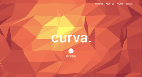
Unique & Creative Text-Focused Websites Inspire

Unique & Creative Text-Focused Websites Inspire | Must Design | Scoop.it

Typography is an important but often under-represented part of a website's layout. With so much focus being placed on the presentational aspects of CSS and the use of large images and media that choke bandwidth restraints; it’s nice to occasionally remember that textual content can also make an impact on users and their experience. Content remains king, and a few good fonts can make even the simplest of sites look smart - though not so many that you have to wait for ages for the text to be visible.

Because of this, I’m going to show you a few handpicked examples of sites that make their content look terrific, and why you should consider following their example in your own work. We’re going to take a journey of how elegant typography can make a site shine; looking at the bold, creative, navigational, simplistic and interactive content that makes the designer's voice speak volumes - so let’s get started!...


Via Jeff Domansky, Os Ishmael
Jeff Domansky's curator insight, May 27, 2015 12:01 AM

Here's to the power of typography in website and landing page design.

malek's curator insight, May 27, 2015 7:54 AM

Headings grab our attention, but the body of content is what makes us stay. 

Jasmin Davies-Hodge's curator insight, May 28, 2015 5:07 AM

Remember,  content is king!

Scooped by Martin (Marty) Smith
Scoop.it!

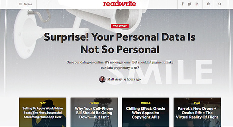
100 (Non-Design) Blogs Every Web Designer Should Read

100 (Non-Design) Blogs Every Web Designer Should Read | Must Design | Scoop.it
Martin (Marty) Smith's insight:

ReadWrite and 99 other "non-design" blogs every web designer should read is great and I love the way the list is organized.

Michael Allenberg's curator insight, May 13, 2014 7:37 AM

Pay special attention to numbers 20-38, the UX section! Great stuff!

Scooped by Martin (Marty) Smith
Scoop.it!

Dr. Dre's Web Design Tips

Dr. Dre's Web Design Tips | Must Design | Scoop.it

Beats By Dre Web Design Lessons
A friend shared the impressive NEWSJACK Dr. Dre and his Internet markeing team pulled off last week. Beats By Dre (http://www.beatsbydre.com ) has some cool web design tricks to steal too such as:

* Consistent images across channels (the Richard Sherman image rode the crest of the wave created by his "controversial" statements after last Sunday's game).
* HUGE RED BUY NOW Call To Action on the home page.
* Hero moves but does so SLOWLY so it isn't jarring.
* They've programmed their Richard Sherman page so his picture matches to every style, something I bet the site does for all celebrity endorsements (cool and NEW).
* Their social buttons are a little low for my taste, but they are well labeled as the "Beats Army" and every major social net is there and they are robust and fresh on all social nets.
* I like how they handle the colors too via the small swatches.

All in all a great ecommerce site in support of one of the best NEWSJACKS I've seen (see my notes on Dr. Dre's multi-channel attack of the web here:   http://sco.lt/8bJiDJ

No comment yet.
Rescooped by Martin (Marty) Smith from I love design
Scoop.it!

Graphic Design Inspirational Sources #33

Graphic Design Inspirational Sources #33 | Must Design | Scoop.it
a weekly article intended to always follow the trends happening in the world of graphic design and visual arts

Via Yesta Desamba, Adriana Montoya
Martin (Marty) Smith's insight:

I love the bridge here between two of my favorite topics - visual art and graphic design.

Yesta Desamba's curator insight, December 17, 2012 2:01 PM

Graphic Design sources #33

Scooped by Martin (Marty) Smith
Scoop.it!

"Had Script, Needed WARRIORS" - 30 Lessons In Creativity via Jodorowsky's Dune

Greatest Film Never Made
"What is he purpose of life," the director Jodorowsky asks in this must view documentary film for any creative, "to create a soul". The amazing creativity and vision of El Topo's director is shared in a series of linked stories.

Much like any creative's mind, this film flies between the surreal, heroic, mystical and crazy. Stories about Orson Wells and Pink Floyd are rich in "sounds true" detail, but pales in comparison to the "I can't type that fast" advice shared.

Advice such as:

* Be all in.
* Be a prophet.

* When it comes to missions THINK BIG (something important for humanity).
* Start with clear ideas, but find and respect "light of genius".
* Challenge people to find their best.
* Give Morning Motivation speeches.
* Your VISION should become OUR IDEA.
* OUR Ideas become art.
* When you think you are looking at a rock its an object & vice versa.
* Lucky enough to meet a prophet FOLLOW HIM.
* Be supportive of others.

* Transport people. MOVE THEM.
* Look for and work with WARRIORS (life is too short for anything else).
* Imagine and then imagine again.
* No such thing as "too far".
* Let the work rule.
* One man's obsession is another man's art.
* MOTIVATE others.

* If you can Seduce Salvador Dali DO SO.
* Create enigmas.
* If chance puts Dali at your hotel, send him a strange note.
* When you find a clock in the sand discover who lost it.
* Create MOVEMENTS and ART with your life.
* If Dali asks you for a helicopter, GIVE IT TO HIM.
* Dali gets you Giger, Giger gets you Magma (and so on).
* If you can get a meeting with Mich Jagger, TAKE IT.
* If Andy Warhol invites to the FACTORY, go there.
* Plan everything, Plan Nothing (chance).
* When you see Orson Wells in a Paris restaurant, send wine.
* Live a EULOGY Life not a Resume Life.


That last bullet picks up on a great David Brooks TED Talk I wrote about on LinkedIn yesterday: http://www.linkedin.com/today/post/article/20140717125545-13925622-are-you-living-a-resume-or-a-eulogy-life 


Hope you are living a Eulogy Life. Jodorowsky sure did. I had to be shoved kicking and screaming on the Eulogy train by the Big C. Glad I got on this train even if it turns out to be the last train from Clarksville :). M

Are you a "plural being"?


Martin (Marty) Smith's insight:

add your insight...

No comment yet.
Scooped by Martin (Marty) Smith
Scoop.it!

Prescient Mashable Web Design Predictions (2012) Coming TRUE! via @dtelepathy

Prescient Mashable Web Design Predictions (2012) Coming TRUE! via @dtelepathy | Must Design | Scoop.it

Marty Note
Wow, you don't get much more money than Chuck Longanecker's 2012 predictions for web design's almost immediate future. 

Chuck is CEO of Digital Telepathy and boy does he have a copious amount of telepathy based on just how TRUE each of these trends is turning out. Talk about hitting the NAIL directly on its head.

We all need to get into Chuck's head (lol) because understanding how our design tectonic plates are shifting doesn't get any better:

* Lean Design (YES).
* Animation and more sophisticated HTML5 party tricks (YES).
* Less is More (YES).
* Multi-screen, multi-platform (YES!).

Great stuff every web designer and Internet marketer should walk and talk.  

No comment yet.
Suggested by SmilingAnny
Scoop.it!

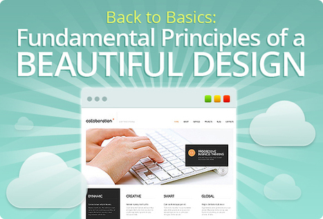
7 Basics of Great Website Design Are NOT What You Think

7 Basics of Great Website Design Are NOT What You Think | Must Design | Scoop.it

The purpose of this post is not just to present the state of today's web design - it’s more pragmatic. Seven basic principles of a good web design are presented here.

Marty Note
This is a great post about what web design IS and IS NOT. I'm going to include my notes here so they follow the post since the writing, though brilliant, is not as direct as I like. Here are my much more direct interpretations of the 7 Basics of Great Website Design:


1. Website Design Can’t Win, But You Can Sure LOSE Due to It.
We've past the period when shinny websites work. Every website has seconds before a visitor clicks off to find what they are looking for on some other website.

2. Create Website Surfaces For Scanners and Skimmers since Readers will work for what they want.
Key to know not all information is great for "scanning" and "skimming". Tease the click don't drown it is another way to think of this idea. Also, content such as news, Q&A and testimonials have more attention hooks than sharing complex or highly detailed material. If your website depends on sharing complex and highly detailed content tease it with snippets and with graphics firs.


Stay with simple, clean and useable as your guide.

3. Avoid NEW until it is UNDERSTOOD.
You don't have to wait until some new thing is old hat, but avoid using The New simply because it is new. New hurts conversion because it requires explanation and is hard to tease since visitors don't have "made to stick" context. If you must present "new" present with an "old" analogy.

Read Made To Stick by Heath brothers for more.


4. Confused customers do many things, BUYING and CONVERTING and never among them.

5. Hierarchy of information and navigation is LIFE online.
People know there is a YOU or a team behind your design. They want to know what YOU want them to DO and why they should do it with YOU. Sites that make the curator's hand visible via navigation, images and copy win. Those who challenge visitors to figure everything out for them selves lose.

This is NOT to say some mystery can't work in a web designer's favor, but make sure the mystery is immediately solved before posing another one. Daisy chain one mystery on another and visitors get frustrated and leave since benefit doesn't equal the work to realize it.

6. Colors can ruin a website.
Colors have so many overt and covert signals they should be used sparingly and consistently with the brand. If you use RED for a Zen website do so in accents and carefully since red is an ALERT color and so may be inconsistent with the brand.


7. Devil is in the web design details.
In my almost 15 years of experience NOTHING on this list is more true. Once you make a website simple and clean any small dissonance becomes LARGE because it sticks out like the proverbial "sore thumb". Make sure your site is a smooth surface with a clear message.


Martin (Marty) Smith's insight:

One of the best posts about website design I've read in a long time. So much of what WE think is "website design" either "was website design" or is more an expression of someone's ego than what is happening NOW. This post is one of the best "what is happening now" in website design articles I've read. M

No comment yet.
Scooped by Martin (Marty) Smith
Scoop.it!

5 NEW Revolutionary Web 3.0 Design Features Of CureCancerStarter.org

5 NEW Revolutionary Web 3.0 Design Features Of CureCancerStarter.org | Must Design | Scoop.it

Didn't ASK for a Web 3.0 site (necessarily) from the design and UX team at Atlantic BT, but they built me one anyway. Here are 5 Web 3.0 features they built into http://www.curecancerstarter.org :

* Cloud Content Management via CDN.

* Control to "Users" and math. 
* Control to "Visitors" & MVP. 
* Highly Responsive. 
* Framework to Unique Backends. 

Cloud Based Content Delivery Network
I used to have to worry about image "weight". Now talented programmers can use the cloud and caching to keep page load snappy even as the traditional "weight" of the page is high. Large images with large file sizes can be stored and cached in ways so they look great and don't slow the page presentation.  

Control To Cancer Centers & Algorithms
The IDEA of CureCancerStarter.org is to create a framework with more and more control available for "users", a term I hate but in this case users=cancer research centers. Even things like Hero image management will be managed by the framework code and an algorithm (when we have hundreds of cancer research campaigns on the website). The key is to design with as small a "designer" footprint as possible passing more and more "control" over via the Content Management System (CMS). 

Control to Visitors and MVPs
Visitors will be cancer patients, their friends and families so we created personas for our main groups of donors. Personas help understand the behaviors of any websites archetypes, something very important with donations. We are lacking a few features such as the ability to donate in someone's name and the ability to create tribes (groups and sub-groups), but the framework ASSUMES these features are coming (i.e. Atlantic BT's team coded a flexible framework capable of moving in any number of directions). We got something UP and LIVE (Ries stresses MVPs in The Lean Startup). 

Highly Responsive
We are working to make the framework SWIPE so IOS devices aren't compatible yet, but the site plays like an accordion (moves to meet the device looking at it be it phone, pad or computer). 

4 Unique Backends We Can't See
Perhaps CureCancerStarter.org's most revolutionary idea is to take the Facebook Framework idea and extend it via Authorize.net to an individual backened for each platform user (cancer center). CureCancerStarter.org pipes donations directly into the Authorize.net account of a cancer center. 

We pass the ball over to the cancer centers and so 100% of donations go to them. This pass does mean we are helpless when UNC has trouble setting up their Authorize.net environment (as they are now), but they will work it out with the bank and then the GENIUS of Mark Foulkrod's idea comes to the front - it is possible to divorce merchandising from payment systems with this methodology. 

I want to add commerce features to Scoop.it, Facebook and GPlus, but haven't been able to figure out a seamless way to do so. Once the Authorize.net environment is established it is AGNOSITIC to where transactions come from. This means ecommerce is simply a matter of a link, some graphics and an individual can accomplish the same thing as PayPal (easily transportable shopping cart). 

Explaining that StoryofCancer.org is the Charge To if you are on my Scoop.it may be needed, but the ability to easily add commerce into any corner means the distance between content and conversion just got shorter. 

KUDOS to the programmers and designres at Atlanticbt.com. They rocked this one!
http://www.atlanticbt.com  


No comment yet.