Must Design
75.5K views | +0 today
Must Design
Design Is Revolutionary
Your new post is loading...
Suggested by Lior Frenkel
Scoop.it!

Badass List of Free Stock Photos Websites for Designers

Badass List of Free Stock Photos Websites for Designers | Must Design | Scoop.it
Why is it so freaking hard to find high quality, high-res free stock photos? Here are the most awesome free stock photo websites + tools.
Martin (Marty) Smith's insight:

Can never have too many sources for images. This post covers a few that were new to us. 

malek's curator insight, May 26, 2015 11:00 AM

Your lucky day with a great pic on "Stock Photos". Otherwise, try flickr under creative common.

Scooped by Martin (Marty) Smith
Scoop.it!

15+ Awesome Food Web Designs & One BIG Mistake Your Design Can Learn From

15+ Awesome Food Web Designs & One BIG Mistake Your Design Can Learn From | Must Design | Scoop.it

Marty Note
Food Websites are great places to learn key elements of web design such as:

* Sensual and romantic images.
* Great mouth watering headlines.
* Visual marketing storytelling.

I like http://www.whitmansnyc.com/ and Soup Peddler. Whitmans BRANDS a hamburger beautifully. Food is HARD to shoot. Food can easily look TERRIBLE in a picture especially a picture with limited web resolution. Whitmans solves that problem creatively with a thin transparent layer between us and the burger. Well done!

Soup Peddler, in the example shown, is the ONLY site that includes PEOPLE. Foodies have "widget-itis" worse than techies. Widget don't sell as well as PEOPLE.

The SINGLE possible exception to that rule might be a foodie site, the one in 10M foodie sites that creates INCLUSION with their food. Whitman's is close since a hamburger is a universal thing, but the site remains a tad sterile due to lack of community.

If you scroll down below Whatman's hero you will see another pet peeve. WHY do web designers EVER let someone show an interior image WITHOUT PEOPLE.

Yes the lines are clean and the emptiness is sort of beautiful, but think about the NONVERBAL communication sent by an empty room. How long do you stay in an empty room when there is a party going on next door?

Food Heroes
So, foodie sites need people. There are several ways I would work people into the equation so the story being  told feels more inclusive and fun:

* Chef as Hero.
* People with SMILES looking UP at chef or waitstaff.
* Fan as hero (with story).

Food heroes (largest image on the page = hero) need to be QUIET and CONFIDENT. Too much NOISE or any WEAKNESS and we don't trust a website (or eat their food).

The CHEF is a hero that WORKS for any restaurant. Seeing Wolfgang Puck creates a brand. Seeing a chef wearing whites with a slightly stained towel over his (or her) shoulder says, "My food is so amazing you haven't LIVED until you've eaten here".

Instead of EMPTY rooms the picture is smiling, well dressed people looking up at the Chef or waitstaff listening in rapt attention. Better if dishes are gone b/c signals meal is over and everyone is still smiling (a tacit endorsement).

DON'T STAGE THIS PHOTO. Shoot it when a group is in for dinner (with permission and releases). Share the event and caption the photo. NEVER stage actors in food websites. Canned art + food says NO TRUST and DANGEROUS.

If your fans are MODEL good looking TELL THE STORY of the event that prompted the picture. What was being celebrated, shared or discussed. If the group is a nonprofit your restaurant supports MORE THE BETTER as you can tell 2 stories in one (risky but worth it).

Finally, you can feature a fan in your hero, BUT same "no canned or artificial" photos here either. ALSO, click me through to a page of pictures of other fans and stories (why they wanted to share their picture and story about FOOD i.e. make sure people know they aren't related :).

Food is SO individual, what I like and what you like can be very different, so think about the 5 stories you need to tell that "star" your content (i.e. tells the stories that cover the rainbow of your food's tribes).


One story shares love of sauces and sweet. Another story tells the visual romance story. Another might discuss meeting the chef and getting to know the "people behind the scenes".


Sharing different and strategically savvy stories creates the "like me" connection with the different tribes your food, restaurant and content should attract. Every restaurant has a passion. Share that passion.

Also share the reception the food creates, the passion others have for the food. Tell those stories in those ways and your foodie (or other) website wins hearts, minds and loyalty.

Martin (Marty) Smith's insight:

add your insight...


No comment yet.
Scooped by Martin (Marty) Smith
Scoop.it!

Make Web Designs Welcoming Don't Say Welcome via @Scenttrail [Before and After graphic]

Make Web Designs Welcoming Don't Say Welcome via @Scenttrail [Before and After graphic] | Must Design | Scoop.it

Working with a team at UNC Emergency Room trying to make their website more engaging. As the BEFORE (on the right) image shows their current site "talks to itself about itself". Ways to fix that include:

* Hero image that heeds the sight line rule.
* Clear Calls To Action.
* Move Social from bottom left to upper right.
* Prominent Join Our List subscription form.
* Curate Customer / Patient content in (coming soon).

Your visitors' eyes follow the eyes of people in your photos. The image son the right show what NOT to do - make images that look like they are self referential. Never have people in an image on your site talking among themselves. Nothing says "we don't care about you" louder than images that are either too "smart", "exclusionary" or busy.

If people in your images don't look at the camera have their site lines pint to a Call To Action. Don't create ideas that are exclusionary either such as Leading, Teaching and Caring. That sounds like "selfspeak" to me.

OR, if you must have "selfspeak" then shore it with icons the way the UNC design lead did and use those icons to begin a conversation not a lecture about each of those ideas.

I LOVE text on a homepage for SEO, but it can be very exclusionary as the BEFORE image on the right proves. Tease the read with a few sentences and a "read more". BTW, the only time I use Read More CTAs is when I've teased something.

I prefer "learn more" since it feels more like we are learning together and less like work. Use closed loop CTAs when you are completing a proised action. All other times use CTAs that are more creative and fun.

The next step for this design, and the one that will make it really welcoming, is to curate in User Generated Content (UGC). When you include your customers (or patients in this case0=) you break down the THEM vs. US walls better than anything I can think of. Important to break down those walls since you need UGC and social shares to survive these days even if your have a .edu in your URL.

No comment yet.
Scooped by Martin (Marty) Smith
Scoop.it!

5 Killer & Easy To Forget Web Design Basics

5 Killer & Easy To Forget Web Design Basics | Must Design | Scoop.it

Web Design Basics
Love these five web design basics:

* Learn TYPE Design.
* Pick Great Fonts That Fit Your TONE.
* Pick 3 Color Palette & STICK TO IT.
* Photos = RIGHT SIZE.
* When In Doubt, Give It SPACE.

This last tip is our favorite. Nothing we hate more than claustrophobic web design. Problem is claustrophobia is easy to create. We all WANT to do so much.

When I was an Ecommerce Director we studied our links carefully. We found that 5% of our links received 90% of the clicks. That equation turned out to be a fractal. No matter how small we cut it, no matter how we shifted the design, a small % of the links dominated.

This means MOST of what WE, as designers, think is important isn't. We learned to be Google - Vicious about what we added. Adding meant something had to COME OFF the design. This strange User Interface math means you have more ROOM than you realize.

Find what matters and LINK IT. Design what matters and eliminate the flotsam and jetsam so you have SPACE around what matters since it is that SPACE that signals IMPORTANCE to your visitors.  .

Lori Wilk's curator insight, November 11, 2014 9:04 PM

Fabulous#design #advice from Marty Smith. It reminds me that when you are not an #expert in something, get someone who is to help guide your #success

Jeff Domansky's curator insight, November 13, 2014 11:07 AM

Awesome web design advice. Highly recommended.  9/10

Scooped by Martin (Marty) Smith
Scoop.it!

10 Reasons Visual Content Dominates 2014 - The Wishpond Blog

10 Reasons Visual Content Dominates 2014 - The Wishpond Blog | Must Design | Scoop.it

10 Reasons Visual Content will Dominate 2014 What marketing strategies will we focus on in 2014? What will we leave behind? This article takes a look at the rise of visual content - and why 2014 will dominate in 2014:

1. 90% of information transmitted to the brain is visual. Visuals are processed 60,000X faster in the brain than text.

2. Videos on landing pages increase average page conversion rates by 86%.

3. Visual content is social-media-ready and social-media-friendly. It’s easily sharable and easily palatable.

4. Businesses who market with infographics grow in traffic an average of 12% more than those who don’t.

5. Posts with visuals receive 94% more page visits and engagement than those without.

6. 60% of consumers are more likely to click on a business whose images appear in search results.

7. Clear, detailed images carry more weight than product information or customer ratings say 67% of consumers.

8. Visuals show your products without telling people about them. This allows viewers to make their own decisions without feeling pressure from your business.

9. Visuals express ideas quickly - in a snapshot. This breaks through the overwhelming clutter of online content.

10. Visuals are becoming easier and easier to create as photo editing tools become more accessible


Martin (Marty) Smith's insight:

I can think of a few more reasons visual marketing will dominate in 2014 including:

* Visuals are cross-cultural and global (don't have to speak english to understand visuals)..

* Mobile LOVES visuals and everything is going mobile 

* Visual marketing is more viral, more "shareable". 
*  Visual marketing is more fun. 

Wow, this post is  sparking a lot of great conversations including one on G+ about images and real estate thanks to Janis Bourgeuta: https://plus.google.com/102639884404823294558/posts/LhoaHP8ChnJ 


And this comment from Monida on Scoop.it:

Grat Monica S Mcfeeters Comment:

This is one of the best reasons for art education. A visually or media illiterate citizen or consumer is very apt to be manipulated or make unwise choices.

From Wikipedia:

 Visual literacy includes in addition the ability to understand visual forms of communication such as body language, pictures, maps, and video.Evolving definitions of literacy often include all the symbol systems relevant to a particular community. Literacy encompasses a complex set of abilities to understand and use the dominant symbol systems of a culture for personal and community development. In a technological society, the concept of literacy is expanding to include the media and electronic text, in addition to reading and writing.


Lynn Pineda's curator insight, March 14, 2014 11:25 PM

All I can say, is thank goodness for Visuals in content!  I've always been a visual person being a visual learner. Information is easier to retain and comprehend when visuals are employed as it pulls you in.


The article's statistics further supports the importance of visuals. I love visuals!

mjboyce's curator insight, March 15, 2014 1:17 PM

see?

Carlos Bisbal's curator insight, March 16, 2014 10:15 AM

10 Razones por las que los contenidos visuales dominarán el 2014


¿En qué estrategias de marketing nos vamos a centrar en el 2014? ¿Qué vamos a dejar atrás?


Este artículo echa un vistazo al ascenso del contenido visual y por qué 2014 será el año de los elementos visuales.

.

Rescooped by Martin (Marty) Smith from AtDotCom Social media
Scoop.it!

Want To Make MILLIONS Online? Use Images Like This In Your Website Designs

Want To Make MILLIONS Online? Use Images Like This In Your Website Designs | Must Design | Scoop.it
They say a picture is worth a thousand words. True or not, images are an important part of any website we create. Since it is so easy to embed an image in a website (even the process of creating your

Via Robin Good, John van den Brink
Martin (Marty) Smith's insight:

Confessions of A Director of Ecommerce
I've spent the last few years trying to share as many "secrets" as I learned as a Director of Ecommerce. I don't run an ecommerce website anymore so can afford to be generous (lol). 

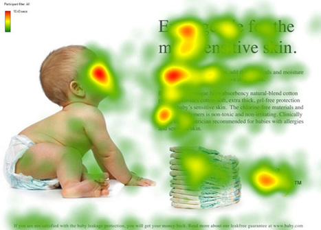
One of my pet peeves was directing the eye sight line of people in our images. I wanted the eyes pointed at something that mattered. People follow the eye line of those they are looking at. We had three tactics:

1. Gaze straight at visitor - promotes engagement.

2. Gaze directly at a Call To Action - promotes clicks.

3. Gaze at other people in same picture - promotes connection.


 We used #1 for pages with broad reach such as our homepage and category top-level pages. 

We used #2 in 4Q on the home page and bending the sight lines of any people in images on a product page works well (our product pages tended to make the PRODUCTS the heroes so few people). 

We used #3 when connection was one of the benefits of a product. If you sell wine, travel or family cars you may want to have pictures of people looking at each other. I would never ONLY have this picture on a webpage since it can make the viewer feel left out. 

The natural companion to the "connection" picture is a picture of a single person gazing out at the viewer. This says, "Yes, we see you, value your visit and want to be friends". 


Websites communicate SO MUCH in covert ways. Balancing what you say with one image such as the people looking at each other with another image to promote engagement is the game you play, the inside baseball "secrets" that separate teams capable of making millions in profits online from those who won't and wonder why :).M 


Robin Good's curator insight, March 6, 2013 5:40 AM


If you want to learn how to use images effectively inside your website or blog here is a truly excellent guide by Chistian Vasile on 1WD.


In the guide you will find rational and fact-supported advice on how to choose, place and test image use inside web-based content as well as lots of extremely relevant examples of effective image use online.


From the original article: "...if you manage to find the right pictures and insert them in the right places, they can do wonders for you, as they did for some others."


Well written. Informative. Resourceful. 8/10


Full guide: http://www.1stwebdesigner.com/design/images-on-web-design-usability-guide/


Peter Zalman's curator insight, March 10, 2013 8:06 AM

#cro