Must Design
75.5K views | +0 today
Follow
Must Design
Design Is Revolutionary
Your new post is loading...
Scooped by Martin (Marty) Smith
Scoop.it!

Responsive Web Design At Artifact Conference : Slow Loading & Bloated As Design Flaws

Responsive Web Design At Artifact Conference : Slow Loading & Bloated As Design Flaws | Must Design | Scoop.it

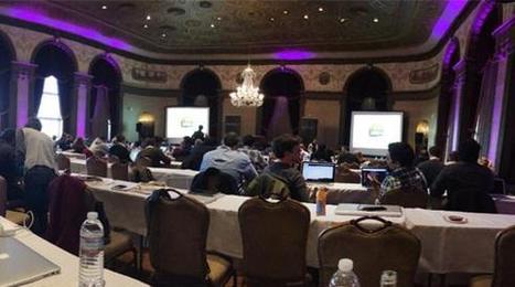
Last week, Jeremy Osborn, Academic Director for Aquent Gymnasium, had the chance to attend the Artifact Conference. Here are his key takeaways.

Marty Note
This Artifact Conference looks interesting and worth checkout out (http://artifactconf.com/ ). I love this quote from the Responsive panel at the conference in Providence, RI:

"On the other hand, responsive design is forcing companies to prioritize site performance. The consensus is that slow-loading and bloated sites are just as much of a “design” flaw as confusing layout, clashing colors, and the rampant proliferation of typefaces on page. "

Most designers focus on how to accordion a website so it looks good on any device. The real challenge is deeper. How do we architect "less bloat"? How do we design information to be lean and responsive?

Couple of things I've noticed include:

* Building stories via visuals and rich snippets.
* Taking advantage of the swipe and spin options on mobile devices.
* Creating easier to understand backend functionality.
* Using a LEAN or MEAN filter forcing messaging to get to the point FAST.

The SEO and engagement benefits of the second half of responsive design - the information architecture half - are enormous. We know that as engagement goes up so do our site's heuristics and the "new Google" loves more time on site, lower bounce rates and other "engagement metrics".

The "Responsive Challenge" for designers is to realize more is involved than look and feel. The very core of our communication must be reviewed, reevaluated and changed to be leander and more responsive too or we design dissonance in. Confused customers do many things converting is never one of them.  

No comment yet.
Scooped by Martin (Marty) Smith
Scoop.it!

Implications Of Infograhic Revolution on Website Design

Implications Of Infograhic Revolution on Website Design | Must Design | Scoop.it

What does the Infographic Revolution mean for your website design efforts?

* Less is more.

* Get to the point.
* Tease Don't Smother.
* Interactive beats Lectures.
* Colors Matter.
* Design Matters.

Friends @Scoopit are creating the Lean Content Movement and it is a movement web designers should join. Lean sites can still SUCK if they don't deliver a meaningful experience. Think of "meaningful experience" as one of two things:

1. Visitors quickly find what they want.
2. Visitors are intrigued enough to explore.

3. Some combination of 1 and 2.

One common web design error is to SMOTHER visitors instead of teasing them. Designers think great design means sharing everything NOW. Turns out you want poeple to work A LITTLE to find cool things. If we don't work we don't value and until a visitor starts clicky you don't know enough to smother.

What is the most common social stance now? Head down looking at a phone right? We expect and want to be include now. Visitors don't want lectures. They want to be included, to see what their friends thought and to share their take - LET THEM.

Color and Design have and will always matter. Be aware of the social signals your color choices send. Know if your design is clean and easy or complex and confusing (and you want the former :).

Note: The interactive Why Your Brain Craves Infographic seemed the best link for this post (and its fun :).

Andrés Romero's comment, July 12, 2013 8:17 PM
Excelente Infografía
ramil navidad's comment, July 15, 2013 7:31 AM
good article....
Scooped by Martin (Marty) Smith
Scoop.it!

10 Web design trends you can expect to see in 2014

10 Web design trends you can expect to see in 2014 | Must Design | Scoop.it
December is always a great time to look back on the year that was and the new year that is soon to come. There are many exciting things that 2014 has in store for us who live, work, ...
Martin (Marty) Smith's insight:

Great UI for this look at 2014 Web Design Trends. Trends are inline with consensus including:

* Better and more artistic type online (cloud may help this too).

*  Flat design.

* Large heroes kill sliders (hope so, sliders are distracting & bad). 

* More MOBILE (thinking and design).

* VIDEO instead of text (YES).
* The LONG Scroll (already seeing this). 
* Simple colors (and NEON accents from another trends post).

* Simplified Content (lean content, visual content).
* Dropping the sidebar (especially magazine-type designs).

* Image manipulation (old is new, new old, Instagram-ization).
* More crazy cool stuff (agree cloud is going to change design and then change it again). 

Love the way they say VIDEO instead of text and I would modify to say hyper-short video (Vine-like).  

No comment yet.