Must Design
75.5K views | +0 today
Follow
Must Design
Design Is Revolutionary
Your new post is loading...
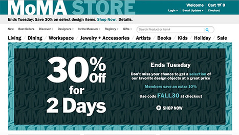
Scooped by Martin (Marty) Smith
Scoop.it!

Stealing Ecommerce Tips from the Museum of Modern Art

Stealing Ecommerce Tips from the Museum of Modern Art | Must Design | Scoop.it

MoMA's Store Rocks
Wow, I don't usually think of museums as sources of ecommerce inspiration and learning, but the Museum of Modern Art (MoMA) has a special team you can learn a lot from. MoMA's team excels at ecommerce blocking and tackling such as:

  • Great email followups (abandon cart, push emails)
  • Great promotion schedule understands DEADLINES and web's constant NOW 
  • Easy to understand and use navigation
  • Great clean lines and images 
  • Tells great visual stories


Best ways to make money online is to excel at the basics. MoMA doesn't stop there they excel at advanced ecommerce ideas too such as:
  • Bundled and "this = that" merchandising
  • Developing exclusive products and bundles
  • Email marketing


MoMA's backend could be better. They take too long to ship, but once their products arrive they are packed carefully and with a sense of how special the order is / was. If you want to learn ecommerce you should follow and visit the Museum of Modern Art. 

No comment yet.
Scooped by Martin (Marty) Smith
Scoop.it!

5 Simple Rules To Know Your Site's Navigational Taxonomy via @Curagami

5 Simple Rules To Know Your Site's Navigational Taxonomy via @Curagami | Must Design | Scoop.it

Knowing your website's navigational taxonomy can mean the difference between millions in traffic and money. Here are 5 Simple Navigational Taxonomy Rules.

* It's About THEM not YOU.
* Create A Commons.
* It's FREE and EASY.

* Srart with Brands & Work OUT.

* Find Engagement & Work IN.

Easy to follow rules so your site's nav WINS traffic, hearts, minds, SEO and loyalty needed to be around for a bit.

No comment yet.
Scooped by Martin (Marty) Smith
Scoop.it!

How Responsive Web Design Works [Infographic]

How Responsive Web Design Works [Infographic] | Must Design | Scoop.it
This infographic illustrates what responsive web design is, how it works, and why you should make the switch.
Martin (Marty) Smith's insight:

Responsive Web Design 
Here is an email I wrote to a friend this morning about responsive:

NO ONE understands mobile seo btw (lol). Not a huge leap to think that what makes a site responsive could also confuse the spider. Could also HELP the spider since the re-imagining of the information architecture should do things like:


* Move from novels to linked snippets. 
* Rely on tags (tags are about to be HUGE because they create new dimensions into the data). 
* Can open a site's content for social (reduce distance between THEM [customers] and US [site creators / managers]).
* Create clear meta data (goes with connected snippets). 

That last bullet puts stress on current database thinking and tech. With this many windows into the same data a developer must know about how to cononicalize a URL (or the dupe penalties will be crushing). Responsive websites become an evolving puzzle. As new pieces get created they must fit the existing framework or blow the whole thing up. 

That said, I don't see any way BUT thinking mobile first from here on out. In the end that is going to be a good thing for all of us, but transitioning is a bear :). Marty 


Tony Guzman's curator insight, October 6, 2014 11:28 AM

This infographic describes what responsive website design is and how to best accomplish it.

Scooped by Martin (Marty) Smith
Scoop.it!

Picasso Trigger Learning To Think & Create Websites Like A Child

Picasso Trigger Learning To Think & Create Websites Like A Child | Must Design | Scoop.it

"I spent a lifetime learning to draw like a child." Picasso

This is an interesting post from Thomas King about the complex nature of simplicity. Picasso's point about spending a lifetime learning to draw like a child seems important for web designers too.

The hardest thing to do is do less. The hardest mind to recover is the exploratory mind, the mind before judgement. When we recover the playful mind, the simple easily rewarding routine of play, our designs run free like Picasso's bull. 

No comment yet.
Scooped by Martin (Marty) Smith
Scoop.it!

Best of Indian Web Design with Zomato.com A Clear Standout

Best of Indian Web Design with Zomato.com A Clear Standout | Must Design | Scoop.it


Indian web design is marked by innovation, clear Calls-To-Action and graceful use of current and future technology. "In India my generation," my friend Ravi told me the other day, "went right to mobile skipping laptops and desktops altogether".

I was looking at these sites with my laptop and expect they look great on smart phones too. Nothing like having must of your customers using mobile tech to make mobile first in both responsive templates and impressive data architecture (easy to see how these sites would accordion in mobile.

The foodie site Zomato.com lives up to its great name. The content, despite their not being "here" yet, is fresh, beautiful to look at and engaging. Zomato is about FOOD and, much like India herself, has few preconceived notions about what that means. .

Instead they curate with clear passion and grace. Every Indian site we studied had a clear sense of GET TO IT many American sites could learn from. Indian web designers know how to "tease", charm and win clicks by providing just the right information at the right time.

Many American designers seek to overwhelm and thus end up speaking to themselves about themselves. Better to box not look for the haymakers we seem to love so much here these great Indian web designed sites illustrate.

No comment yet.
Scooped by Martin (Marty) Smith
Scoop.it!

Best-in-Class eCommerce Web Designs via @conversioniq

Best-in-Class eCommerce Web Designs via @conversioniq | Must Design | Scoop.it

Best In Class From Conversion IQ
The other day I complained about "pretty picture' ecommerce sites that make conversion harder. So much of ecom is ditch digging. Ditch digging to make sure you have things such as:

* Email subscription form (prefer presence to popunders).
* Clearly ECOM - looks like a store with things to sell not content to read.
* Social (easy to find theirs and easy to contribute).
* Content Curation from social / comments / reviews (should feel like a party with people who share love / interests).

* Offers, deadlines and a sense of time (of the year today is Columbus Day for example).

These examples from Conversion IQ are closer to "ditch digging" ecommerce websites. Conversion either BUYING or into a list are easier, more clear and so these designs make more money than the pretty picture websites I shared last (http://sco.lt/4ijZIH ),

No comment yet.
Scooped by Martin (Marty) Smith
Scoop.it!

RETHINK Web Design: Unusual Web Navigations Inspire | AWWWARDS

RETHINK Web Design: Unusual Web Navigations Inspire | AWWWARDS | Must Design | Scoop.it
Beautiful Unusual Navigation Designs for Inspiration. Selection of Awwwards websites with a strong presence of unusual navigation. An effective navigation design is crucial for a website
Martin (Marty) Smith's insight:

Navigation feels old and moldy. There are few things MORE critical than navigation. We've moved from left nav sitting firmly in the "golden triangle" to horizontal top navigation.

Neither of these options inspire and both are feeling long in the tooth and stupid. The social / mobile web requires a RETHINK about navigation. Can we find ways to make very page a homepage?

Can navigation be more relevant and less middle of the road boring? Here are some navigation examples from AWWWARDS.com that don't solve the problem...yet. But the dialogue helps begin the process of reducing our dependency on static, boring, "has-been" ideas like left or horizontal nav.

Are you as surprised that navigation hasn't been on the "top changes" list for web design in 2014? Has to be on our 2015 list because every current option is BAD and getting worse.

BOUTELOUP Jean-Paul's curator insight, June 27, 2014 2:21 AM

Merci ! il est bon de repenser aussi le webdesign pour une nouvelle expérience utilisateur