Your new post is loading...
We Live In Google's World
If the web is the wild west then Google is the organizing and calming sheriff. There latest moves including slapping artificial intelligence into their algorithm and moving to real-time updates mean we live in Google's world perhaps more than ever.
Google's ability to balance an ever changing world on the head of a pin can be admired, feared or detested depending on where your website is coming out, on how much traffic your site is losing or gaining based on the latest.
These changes mean a favorite too, the Penguin Tool ( http://barracuda.digital/panguin-tool/) is about to lose it's relevance. The ability to overlay Google's moves on your Google Analytics is yet another "not provided" move. Google wants to hold and control their data since control translates into the ability to sell those tools back to us.
As my friend and Google Watcher, Bill Slawski told me he thinks web marketers should be boning up on AI. As we lose our ability to SEE and learn from the web's data Bill is right. We better know AI or diversify our multichannel marketing FAST.
We live in Google's world perhaps now more than ever!
http://www.curagami.com/google-penguin-4-rankbrain-love/?v=7516fd43adaa http://barracuda.digital/panguin-tool/
Canonical URLs Explained
The Yoast post provides an easy way to understand why rel=canonical is a powerful new SEO tag. Yoast has a dog in the hunt. They make a Magento plugin that easily writes the rel=canonical tag into a product page's head.
The explanation about WHY canonical URLs are so important is only half right. We have a million ways of expressing and sharing URLs these days. Without rel=canonical we end up duping content to distraction.
Here's the rub. All ecommerce sites dupe content. They must. When I was a Director of Ecommerce a single product accounted for 50% of our profits. You better believe I merchandised that product into every nook and cranny our site offered. I duped that product and it's content to distraction.
There are other ways to limit duplication including:
* Use of your Robots.txt file.
* Locking content behind a firewall. * Use of blockquotes & rel=canonical tags.
* Rewrite duplicated content so it's not as duplicated (lol).
We included our email output into a folder with a "no follow" line in our robots.txt. You may think such a move is enough. It isn't. Be sure NOT to drive links from spiderable content INTO that folder or you eliminate the effectiveness of the robots.txt.
In the end every ecom site worth it's salt MUST duplicate content. Rewriting sounds like a good strategy, but it isn't. Content = time and time = money when managing million dollar commercial sites. You will be duping content.
Best to use rel=canonical because it shows Google you aren't trying to STEAL anything. Reminds me of what a friend shared about the disavow tool (used to deny inbound links or signal they may be untrusted).
My friend was using the disavow tool daily on his clients accounts. "So you are brown-nosing Google," I kidded him. "Exactly," was his answer. Rel=canonical tells Google you are TRYING to do the right thing and sometimes that is enough.
17,162 People Later
We've been asked to make the presentation that created our most viewed Hiaku Deck again at the Iron Yard Code Academy again (made the first presentation six months ago). There were important ideas we shared last time:
* SEO THRIVES or DIES with graphic designers. * Graphic designers are heroes under siege by many groups. * Set REALISTIC expectations.
* Set reasonable boundaries (with gorillas looking for bananas).
* Shared a few easy to remember tips to help designers improve their technical SEO skills.
Obviously we hit a nerve. We will be updating benchmarks shared six months ago to see how those we mentioned fared since. Remember technical SEO is important, but your content must engage, be exciting (visually too) and develop sustainable online community to win over time.
Good luck and if you have SEO questions we didn't cover email them to martin(at)Curagami.com and we will include and send you a Curagami Rules tee.
Burn Down Your Website
Websites are cool and a great marketing aid...until they aren't. If the line of when they aren't isn't behind us we are approaching it. What is a "website" when we share posts on Medium, Scoop.it and GPlus?
Feels like the idea of a website as a MUST GO HERE to interact with our marketing message is hopeless out of touch. Even when we do GO to a website what are we looking for?
FUN, ENGAGEMENT and RELEVANCE.
The typical talking to yourself about yourself marketing that most flog online feels more than dead, it feels dangerous. Google's vote is clear - if your content doesn't create an increasing number of likes, loves, shares and loyalty your website is screwed, blued and tattooed.
Especially if someone in your immediate competitive sphere knows how to THROW DOWN, create community and MOVEMENTS instead of the usual solipsistic crap. Keep talking to yourself while someone else in your business vertical is hosting a party and you will be waxed.
Waxed because what really matters NOW is LOVE. If your win hearts and minds because you are honestly all in and listening hard you get to "win". If you are amazing you create blue oceans and uncontested competitive space for however long the ride lasts. Talking about FUN.
This Haiku Deck discusses the death of tactical web marketing. You can't out email market my team and I, or not for very long. We've been doing this crazy biz since 1999. You can gain an inch and we are likely to come back and take a mile.
https://shar.es/12ekPU
Typography is an important but often under-represented part of a website's layout. With so much focus being placed on the presentational aspects of CSS and the use of large images and media that choke bandwidth restraints; it’s nice to occasionally remember that textual content can also make an impact on users and their experience. Content remains king, and a few good fonts can make even the simplest of sites look smart - though not so many that you have to wait for ages for the text to be visible.
Because of this, I’m going to show you a few handpicked examples of sites that make their content look terrific, and why you should consider following their example in your own work. We’re going to take a journey of how elegant typography can make a site shine; looking at the bold, creative, navigational, simplistic and interactive content that makes the designer's voice speak volumes - so let’s get started!...
Via Jeff Domansky, Os Ishmael
We're boiling down 13 of the most prominent web design trends emerging in 2015. Will they change your understanding of a "modern website"? You be the judge.
Marty (@Scenttrail) Notes:
1. Make it big (Agree but not as easy to do well as they make it look). 2. The multimedia experience (agree and same as #1) 3. The Parallax effect mutations (Horizontal Scrolling) Agree 4. Animated storybook (Agree and cool). 5. Flat design (agree & effect of mobile) 6. No more boxes (Agree and YES!). 7. Tiles (Pinterest effect and agree). 8. Navigation widgets (Agree!) 9. Integrating Google maps (Agree where appropriate). 10. Mashup interfaces (AGREE grab those APIs :). 11. Minimize (Seems to contradict #1, but agree). 12. World Wide Wait (speed is going to be KEY). 13. Designer automation (Agree, can do a lot with templates now).
Responsive web design is the practice of creating websites that display evenly on all devices. Understand the basics of responsive web design with examples.
Marty Note
Don't make the common mistake of thinking responsive design is all about look and feel. Yes some WordPress templates can make it FEEL that way since they are built to accordian with different receptions created by phone, laptop and computers.
The important idea for marketers to understand is to THINK Mobile First. Thinking mobile first brings a slew of changes such as:
* Flat web design.
* Limited Colors.
* Less functionality that is easier to understand.
* Content snippets instead of novels.
* Emphasis on VISUAL MARKETING.
* Need to make content & communication feel & act like a game.
Those last bullets speak to the gamification of marketing so implied by smartphones and a mobile / social / connected world. Mobile means never having to say you're sorry because you listen and curate more than you talk, create sustaining community and engagement and understand all the implications of "the network is the computer".
Just shared an overview of Marketing Timelines on G+ (https://plus.google.com/102639884404823294558/posts/EkXN57uJyjq ). All that said, you still need to understand Responsive Design 101 so appreciate this Scoop.it suggestion from @David Fournier. .
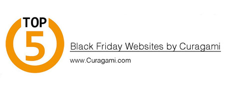
Top 5 Black Friday Websites Curagami's annual list sees Big Boys move in. Amazon tops the list. There are surprises & we share our Black Friday scorecard.
1. Amazon.
2. Sears.com. 3. Dell.com 4. Walmart.com 5. Nordstrom.com
Find out how we rated these websites TOPS in Black Friday preparation, free shipping and merchandising:
http://www.curagami.com/featured/top-5-black-friday-websites/
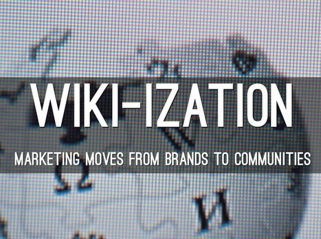
Here A Wiki, There A Wiki, Everywhere A Wiki
What is a Wiki if not an invitation to create online community. The "open source" like collaboration Wiki's provide is a blueprint for creation of online community. After months working on http://www.Curagmai.com we've discovered how close Wikis are to...well everything.
Wiki Ideas To Steal Include:
* Open Source Like Content Collaboration.
* Use community to steer and de-spam ecosystem.
* Depend mostly on social reward.
* A healthy and competitive contest never hurts. * Feature and thank contributors.
* Provide ways for contributors to know where they stand vis-à-vis other contributors.
* Create ways contributors can follow and communicate with each other.
* Include ways for contributors to create mini-tribes. * Make sure "rules of the road" are understood and published. * Communication with sponsoring agents must be easy too.
* Normalize greatness by sharing across ecosystem.
* Role of sponsors becomes more curators than creators.
* Ask for help.
* Provide social rewards (such as features) to contributors.
* Create ways to identify contributors in the world (t-shirts, stickers).
* Appreciate, be nice and thankful (always no matter what). Following a few simple rules will dramatically increase the most important content you can't buy (User Generated Content or #UGC) and build sustainable online community. Sustainable online community means costs go DOWN even as other material rewards (UGC, followers, traffic, money) go UP.
This Haiku Deck is about why we are all in the Wiki business whether we realize it or not AND how to design for the Wiki-ization of marketing, brands and online community.
Marty Note
Watching the excellent HBO Documentary about James Brown Mr. Dynamite made me think of FUNK and web design. Web design is easy to get WRONG (lol).
It is tricky to design online with a sense of surprise, beauty and novelty. I like the Digital Invaders design as it feels free and spontaneous. Other designs such as Monster CSS and Creative With A K feel like they are trying to appear spontaneous and free.
Trying too hard is EASY in web design too. Remember all websites are STAGES we designers SET. The trick is to set a stage that feels like it is happening now and won't feel dated tomorrow. Feels like there are enough visual hooks in Digital Invaders it would be easy to keep it fresh with minimum fuss.
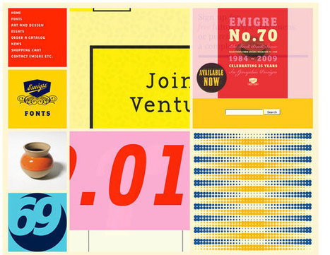
I like Emigre too. Emigre creates the same sense of happening now but that design is at the other end of the spectrum from Digital Invaders. Its hard to beat the grid. First website I created, in 1999, used a Mondrian grid.
Grids help organize massive amounts of information without that mountain feeling like it is about to crush you. I like the funky NOISE contrasted to the quiet grid because they demonstrate the need to find a visual VOICE in your web design. That voice can be anything as long as it feels authentic TO YOU.
The web is very good at finding and amplifying DISSONANCE. When you try to FUNK IT UP and aren't really funky it shows like you are wearing the wrong decades fashion (painful). Your customers are your audience.Set the stage anyway you want, but do so with an eye toward YOUR TRUTH.
The closer you stay on the tiny beam of "authentically us" the more success your web design has. This is why there are no web design maxims that apply all the time. What works for Emigre is very different than Digital Invaders but both work, both are authentic and have that hard to describe but know it when you see it TRUTH great web design must have.
Marty (Scenttrail) Note: 27 Bad Ecommerce Designs
These CSS Design Award Winning sites illustrate why designers shouldn't be in charge of your commercial website. In a recent G+ post I shared our journey across time, place and money online (Why Time Is Money Online: https://plus.google.com/102639884404823294558/posts/RdjAjWoJTHw ).
It's easy to get lost. We kept trying to make narrative, movie and book-like) logic work on our ecommerce site and it never did. To the extent we told stories we depressed conversions and we conducted these tests before the web was drowning in content.
Not that the web has been fully "content shocked" to within an inch of its life one of the FIRST jobs any ecommerce site must accomplish is loudly and clearly proclaiming their STORE-NESS.
These 27 "pretty picture" designs are find for big established brands people trust, but they would CRUSH a new commercial site. The "store-ness" is confusing. Are these content sites or can we buy stuff here.
Some communicate some "store-ness",but none have the "ditch digging" realities of large, successful ecom sites such as REI.com or Schwan's.com (highest converting ecom site in world). Call-To-Actions are missing (mostly), navigation is murky and not keyword dense and images don't you line of sight rules (viewers' eyes go where people's eyes in your images go).
Real ecommerce needs a few things to be successful that most of these sites ignore, miss or don't know such as:
* Email subscription forms (email list = your most profitable channel because YOU OWN IT, don't believe BS about email marketing being dead mobile is making email marketing different but dead =nope.
* AN OFFER - see REI.com's "daily deals" or Amazon's ability to sell any and everything.
* Great navigation balanced between seo and customer engagement.
* Images mapped to produce CLICKS where merchants want them.
* Every image, click and share creates analytics and data so part of what you need to map into an ecom design is WHAT DATA YOU NEED. Can't figure out what actionable thing I would know after a month's traffic on these designs.
* Sense of TIME and PLACE (what season are we in? Where are these sites?).
* TRUST and that comes from other people (testimonials, curation of User Generated Content and NONE of these have anything like that so unless they are major brands they won't pass the trust test with many shoppers).
* TRUST MARKS = didn't see a VISA or MC logo either. One way to create trust online is to align with brands and marks people already trust. Those badges look like ugly scars to designers and they help make merchants millions.
* Content - we love VISUAL MARKETING but some context such as the context one satisfied customer would share is a must.
* Design = Trust - we grant that these sites look amazing and looking amazing helps with creating trust, but junk 'em up a little and make more money.
That last bullet reminds me of a story from my P&G tenure. My boss Russ Mills taught me to never leave a display too neat. "People won't disturb a display that is too neat," he explained. These ecommerce designs are too neat for me (by half). If you aren't a major brand ignore every one of these 27 "inspirational" ecom web designs.
PS. Favorite has to be the example in the picture above. Not only do we chop people in half we ask visitors to kiss their behinds (lol). Opposite of the welcoming atmosphere I want to create on my ecom sites (lol) back when I was responsible for millions of online sales yearly. At my core I remain an online merchant, but I don't miss not sleeping and sweating sales numbers from now until Valentine's Day. Don't miss that at all :).
Marty Note
Red is an IMPOSSIBLE web design color except when it isn't. There is an excellent comment at the end of this post sharing the best red websites:
Ashley Pajak Comment
I find that red can very easily become too overpowering. Even though some of these are running into that, others display the color proudly and cleverly, such as the Venkat Portfolio and Svizra.
The only design I liked used red as an accent (Project 1,000). Others just made me want to RUN away. When I started designing websites in 1999 I read a book about red, white and black as a powerful combination of design elements.
The book pointed out the power of simple lines and few colors especially when done so from the MINIMAL school of online design made so popular now by MOBILE. There are flashes of that clarity in some of these designs, but red as a base color is tricky and difficult as many of these designs prove..
If you know great red or great red, black and white designs please share and we will update. Thanks, M
Storytelling & Content Marketing
Tracy Chevalier imagines the stories behind paintings:
* How did the painter meet his model?
* What would explain that look in her eye?
* Why is that man … blushing?
She shares three stories inspired by portraits, including the one that led to her best-selling novel "Girl With a Pearl Earring."
3 Find Your Story Tips
One of the most common "we can't do it" complaints we hear is, "Our content is boring and no one on out team knows how to tell a story". There are no "boring" products or services and we are surrounded by stories. Here are 5 tips to help you find the magical content needed to wins hearts and minds online.
Story Finder Tip #1: Your Employees
You never need to look far for great stories. Stories of heroic efforts against great odds are sitting in your office now. There are cancer survivors, triathletes and parents with special children in your company as I write this.
You might think, "I don't want to invade their privacy," and we aren't suggesting it. We suggest explaining that any company really only exists in the minds of its employees. Since publishing costs are now zero you can afford to explain who you are by proxy - via your employees stories, passions and loves.
This is "Employee Story of the Month" instead of a banal award your customers learn about the journey your team members have experienced and so feel close to them, you and your brands and products. "I feel like I know you," a woman said hugging my ex at the Gift Show in San Francisco.
Our potential customer learned about Found Objects and Janet McKean from our monthly newsletters. Those newsletters led to the hug and made doing business together easy.
Oh, btw each month I included a short story about Janet's life, experiences and family. May be why I'm divorced (lol), because Janet hated sharing so much. "You married a storyteller, " I would say smiling and writing and well you can figure out how well that worked in our relationship. Worked GREAT with our customers though (lol).
Story Finder Tip 2: Be Like Tracy Imagine An Image's Story
Tracy wrote a best seller by imagining questions implied but not stated. Your online marketing uses images all the time, but what are the questions BEHIND the image.
If you have a picture from a company event who is there? What was being celebrated? What in the image doesn't make sense? Is there something that hints at a mystery o some enigma? Work backwards from an image. Begin like Tracy. Ask questions. The answers are your story.
Story Finder Tip 3: Ask For Customer Stories
Take the image in example #2 and ask your customers to share their questions, stories or answers to hidden riddles. Asking for a story may be too hard and intimidating, but asking what these people in the corner are doing could be fun and spark imaginations and lead to stories.
Once you have an "Ambassador" group of customers / advocates established ask them to help shape your ASK. Ask your advocates to help you know the best way to engage and hear stories your customers are itching to share.
Writing this tip reminds me of a story (of course lol). I left home for the first time. I was in the 10th grade and enrolled at The Choate School. My mom cried when she and my father dropped me off. Now I was sitting in my first English class.
Mr. Noland, a bearded thirty something teacher dressed not unlike every preppie in the room (straight leg corduroys, button down oxford shirt) asked, "Tell me the story of this pencil". He said this hold a pencil inches from his nose and staring at it as he rotated it and waved it up and down.
Dutifully I set out to describe the pencil. "Pencils down," Mr. Noland said asking a student he clearly knew to read his story first. "She couldn't tell why. All she could smell was stale cigar...." the novella this student wrote about a possible murder, broken hearts and a love affair gone wrong made me realize I wasn't in Kansas anymore.
If Mr. Noland's shill can write 500 words on a pencil, YOU can tell a captivating story online about you, your company, brands and products.
Web Design & Stories
Now that you know WHERE to find stories don't forget to DESIGN them in. Sharing stories online is tricky. You want to make readers do a little work to get to a place they can read and read.
Don't do like some and break your stories into tiny 200 word bites. Too much clicking ruins the "all in" feel of a good story. Make your readers click a couple of times to pan out readers from scanners and then let them read.
Will cover more "story design" tips in another post. First FIND your stories since that is often the hardest task. Next create a design that does the impossible - makes it fun to read online.
|
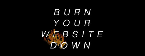
Burn Your Website Down
Websites are about to become an expensive tyranny. Tomorrow's e-commerce happens everyone and at any time on any device. Still demanding customers come to your website? Crazy!
Better to "burn your website" and all of the preconceived notions about what a website is and should be down today. Recreate your site as a fluid expression of content, community and commerce.
Here's how: http://bit.ly/burn-down-website
Web Design Jazz is the conversational alchemy that is website design riffing important conversations your brands have with visitors and potential customers. What about you? What conversations are your having with customers? How did you get there?
Check out our Web Design Jazz video and join the conversation:
http://www.curagami.com/master-classes/web-design-jazz/
How Become A Great Web Marketer?
Every time I suggest this idea to B2B content marketers they roll their eyes and think my suggestion stupid. Everyone can learn new ideas, ideas that inform all digital marketing, from creating an online store.
Each day someone asks how they can learn Internet marketing? Hard to sit in a classroom and learn this stuff. Better to DO IT and no better thing to do than use a tool such as Amazon's Associates to create an online store.
Think of how much stronger your personal brand would be if a potential hiring manager could see what you are reading, ask you questions about those books and get to know you long before an offer is made.
We live in a DIY time when 60% or more of the decision about YOU and your company's products, services and brands will be made BEFORE any active engagement (before picking up the phone or asking you to interview).
Given how much scrutiny your brand is under BEFORE you ever meet a prospect be it for a job or to make a B2B sale wouldn't it be a good idea to do something simple, engaging and fun to show how much you know about digital marketing. Let's see say I have two resumes on a pile and qualifications are equal, but one has a link to a blog & a "bookstore".
Which resume gets more engagement? Let's say your B2B Software As A Service Company is up for a big project. I go to your site and see the books that made you. I, as the hiring manager, have read several of them. We have a connection now and who am I more likely to hire?
HUGE benefits for half a day's work and work that teaches you more about how the web really works than every class you are likely to take (unless I'm teaching it of course lol). DO don't STUDY and you will understand one of the most important concepts about web marketing.
Good News & Bad News
As a rare web marketer with more than ten years experience, I created our first site FoundObjects.com in 1999 (gone now sadly), we want to confirm something every likely reader of our online marketing post already knows - the low hanging fruit is gone plucked by previous generations of pickers.
What to do now? Be something online and start today with these "be something now" tips.
Asking the right questions in the right way is key to online marketing success. How SMBs can compete with Amazon isn't as important as what is their why and how are they learning from Amazon's web marketing power.
Running into the web team from http://www.MoonandLola.com today after meeting them last week helped us realize we needed to add slides to our presentation. We HATE IT when that happens (lol).
Last week we spoke with about 40 Small to Medium Sized Businesses (SMBs) in a conference sponsored by FedEx and seeing the team at the Digital Summit today jogged our thinking. We forgot to discuss the importance of PLATFORM thinking.
We all know winning platforms such as Facebook, Twitter and my favorite Scoop.it. Platforms are winning because they play the "new SEO" game beautifully. We added Video Notes on YouTube to explain all of this (https://youtu.be/tSHeIxtrs4g ).
Find the Haiku Deck here: http://shar.es/1g7Kfb
In this post we will try to review the current status of web design scene and predict some trends for 2015.
Marty Note
Great summary of some "new to me" trends for next year such as video backgrounds and rise of website generators (still looking for a really good one of these, most suck).
Hope the stock photography and personal branding predictions come true.
Ten Web Trends To Look For In 2015
- Responsive Wins.
- Ghost Buttons (made with Divi).
- Emphasis on Type.
- Large & Beautiful Backgrounds.
- Scrolling BEATS Clicking.
- Card Design Gets Better.
- Flat Design morphs into Material Design.
- Microiterations.
- Interactive Storytelling.
- Personalized UX.
5 Must Knows BEFORE You Design A Website
Team Curagami (http://www.Curagami.com ) has, over the course of our combined careers, helped thousands of clients build websites and about 99% have cart before the proverbial horse. "What is our design going to look like," they ask.
Most think "web design" is creating the look and feel of a site. Actually the look and feel, while important, is at least #6 on the "do these things to create a great web presence" list. Here are the first 5 things on that list:
1. Elevator Pitch - Who Are You?
If we were riding in an elevator could you explain your business before we reached your floor? If NO is your answer you are not alone and you need to go back to the drawing board and practice until you have your "elevator pitch" down. All things flow from that defining snippet.
Tags can help define your elevator pitch. Curagami.com Cool Tools For Ecommerce Merchants explains what we do in 5 words. Note that I don't have the the site yet so do as we are saying not as we do (always :).
2. Pain Point - Whose Your Tribe?
We create stuff to DO SOMETHING. Your product or service must help some tribe. Curagami helps ecommerce merchants understand content marketing because finding the balance beam between content that works and content that hurts is a CSF (Critical Success Factor) for ecommerce merchants. So our tribe begins with ecom merchants and we address the PAIN of understanding content marketing. We don't LIMIT ourselves. We don't say, "Go away" to B2B SaaS clients but they are cream on the top of our core tribe and mission.
3. UCA - What Are Your Customers' Aspirations
Unique Customer Aspirations is a metrics we developed as Marketing Director for Atlantic BT. UCA speaks to the transformation your content, product and service creates. Yes Curagami helps merchants make more money, but we also relieve the STRESS of not knowing what to do and why. We help merchants have confidence in their content. No one can build sustainable online community (everyone's master goal whether they know it or not) without being confident in their ability to create, share and curate content. Content is king online and the implications of that statement go far and wide. It's not enough to know your tribes shape you must know their CHARACTER too. Our tribe is STRESSED OVERWHELMED and WORRIED. Anything we do to relieve any of that makes our content sticky and sure to be shared.
4. Know Difference Between Content CREATION and CURATION
Being able to create content is important. We suggest our clients create about 10% of content from unique brand based strings. 90% of the content we want clients to share, discuss and riff off of comes from gurus, customers and THE OTHER. The other is anyone other than you and keeping tabs on your category information, knowing what matters most to your readers and why and understanding the need to tuck ego in back pocket and share competitive information is one of the hardest skills we teach. Web marketing is MOSTLY about THEM not YOU so knowing when you need to blog vs. when you need to comment is key.
5. Know Social Marketing Basics
I'm staying at The Blackwell Inn in Ohio while being treated at Ohio State's James Cancer Center. I've tweeted several positive comments @theBlackwell. Noneof those comments have been ReTweeted and they don't follow me.
ERROR.
My social following dwarfs theirs so breaking the FOLLOW BACK rule hurts 'em. By not picking up my @tweets they discourage such shares and lose the value of that communication (that they actually LISTEN and CARE). I think they do listen and care, but they don't have the skills to do so ONLINE. Before you create a website you need to know what's up in social media.
The Blackwell's lackof knowledge isn't fatal since they are located on Ohio State's campus and are the ONLY such hotel so located. They can SUCK at social media (for a bit) without pain. Doubtful your website, especially if it brand spanking new can afford such a deficit.
Since the master goal of your site is the creation of sustainable online community NOT understanding the implied contracts and un-stated ways social media works can be DEADLY.
Know those 5 things and we can begin to discuss wireframes, look and feel and visual marketing :). Marty
One More Thing - reason this stuff is so important, as my friend Frank Pollock would explain, is the web is a lie detecting amplifier. If you lie it will be shared with the world and known instantly or before, so don't lie. If you are CONFUSED, as many SMBs are, get STRAIGHT before you put crayon to paper and design a site or risk having your confusion being your main message.
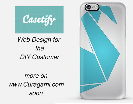
*Web Design For DIY*
The Do-It-Yourself revolution is blowing up thanks to mobile apps and social media. This link includes one of our favorite examples: http://www.Casetify.com where we just created our http://www.Curagami.com logo case for iPhone 6Plus.
We are working on a series of posts about how to engage and empower your DIY customers & you can help. Send ideas, comments and your experiences with DIY marketing and we will curate into the piece with attribution and a link (martin (at) curagami.com).
Find more DIY Marketing thoughts and a secret code you can use to get $10 off your Casetify.com creations (8PGZX3). Sharing a code like that is powerful brand ambassador fuel.
Share your DIY tips and check out more notes on GPlus:
https://plus.google.com/102639884404823294558/posts/Nezb4QZgayx
Best In Class From Conversion IQ
The other day I complained about "pretty picture' ecommerce sites that make conversion harder. So much of ecom is ditch digging. Ditch digging to make sure you have things such as:
* Email subscription form (prefer presence to popunders).
* Clearly ECOM - looks like a store with things to sell not content to read.
* Social (easy to find theirs and easy to contribute).
* Content Curation from social / comments / reviews (should feel like a party with people who share love / interests). * Offers, deadlines and a sense of time (of the year today is Columbus Day for example).
These examples from Conversion IQ are closer to "ditch digging" ecommerce websites. Conversion either BUYING or into a list are easier, more clear and so these designs make more money than the pretty picture websites I shared last (http://sco.lt/4ijZIH ),
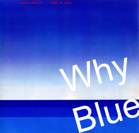
Marty Note
I LOVE Blue as a web design color. When I was a senior at Vassar I painted a common room in Main the blues of Keith Jarret's album Arbor Zena (in image). Took a week, but the room shared some of the same reasons I love blue for web designs.
5 Reason Blue Rocks Web Design
* Sends trust, strength, grace and beauty signals. * Easy to manipulate ( shades of blue work online see LoewyDesigns). * Works as accent or background.
* Images pop off of blue nicely.
* There are many text and font options with blue.
Here are my 3 favorites from the examples:
* LoewyDesigns (shades of blue).
* Black Sea Fisheries (for way blue caries type and fonts). * Z-Index.it - for how calming blue can be to chaotic multiple image Pinterest-like heroes
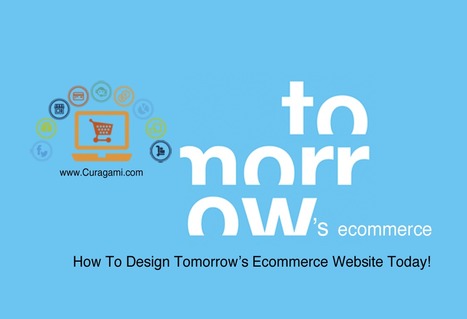
Designing Tomorrow's Ecommerce
I'm writing a blog post for Curatti that will go live at midnight tonight that discusses the "best practices" of "Tomorrow's Ecommerce". I'm also writing a Curagami blog post (also published at midnight) about how social shopping will change Tomorrow's Ecommerce.
Tomorrow's Ecom Current Best Practices (Curatti tonight)
Tomorrow's Ecom Social & Mobile Web (on Curagami now)
The Haiku Deck that bridges both of these posts is linked above and here:
http://shar.es/1nkJef
As we publish each post we will link them here.
|


![Finding Stories Inside Paintings via Tracy Chevalier TED Talk [+ 3 Find Your Story Tips via @Scenttrail] | Must Design | Scoop.it](https://img.scoop.it/9KsJuaD4g7w6ZRzYDL-2TDl72eJkfbmt4t8yenImKBVvK0kTmF0xjctABnaLJIm9)