Must Design
75.5K views | +0 today
Follow
Must Design
Design Is Revolutionary
Your new post is loading...
Scooped by Martin (Marty) Smith
Scoop.it!

55 Blue Designs to Inspire & 5 Reasons Blue Rocks Web Design

55 Blue Designs to Inspire & 5 Reasons Blue Rocks Web Design | Must Design | Scoop.it

Marty Note
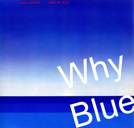
I LOVE Blue as a web design color. When I was a senior at Vassar I painted a common room in Main the blues of Keith Jarret's album Arbor Zena (in image). Took a week, but the room shared some of the same reasons I love blue for web designs.

5 Reason Blue Rocks Web Design
* Sends trust, strength, grace and beauty signals.

* Easy to manipulate ( shades of blue work online see LoewyDesigns).

* Works as accent or background.
* Images pop off of blue nicely.
* There are many text and font options with blue.

Here are my 3 favorites from the examples:
* LoewyDesigns (shades of blue).
* Black Sea Fisheries (for way blue caries type and fonts).

* Z-Index.it - for how calming blue can be to chaotic multiple image Pinterest-like heroes

Martin (Marty) Smith's insight:

add your insight...

No comment yet.
Scooped by Martin (Marty) Smith
Scoop.it!

The Psychology of Color in Marketing and Branding via HuffPost

The Psychology of Color in Marketing and Branding via HuffPost | Must Design | Scoop.it

Marty Note
Great HuffPost roundup of several important infographics and psychology of color studies. Which ones surprised you? Problem is every website wants ALL of those emotions, but not all at once (lol). Key is picking right color for right content / place on your site.

RED may SUCK as a homepage because it chases people away, but red could ROCK as an accent. Red "buy" buttons have only been beat ONE TIME in thousands of tests we've run. So find the right color conversation and have it at the right time.

At Curagami (http://www.Curagami.com) we think of colors as ways to help tell stories. We try to "match the hatch" of the story we are telling to colors in our images or within supporting graphics such as icons or widgets.

When our story is EXCITING we like RED or variations of it. We may also isolate the red by using black and white. Isolating red makes its power SHOUT in just the right minimal way sometimes. Too much red makes you want to RELAX so we may follow a RED with a soothing green or blue.

Websites are hub and spoke so it van be impossible to map stories to color in sequence. BUT if you match the PAGE to your colors you can win and be sure to daisy chain content telling the same story with enough similar colors and scenttrail to create a sense of connection. If you tell a GREEN story and suddenly smack your readers with too much red they RUN.

Win the page, link the page and win the psychology of color battle in your web design.

And YES I'm breaking my Big Blogs curation rule for the 3rd time in a day (lol). Soon as you state a stupid rule like that you break it and that is a definite RULE (lol). M


Martin (Marty) Smith's insight:

add your insight...


Scott Langston's curator insight, September 23, 2014 11:52 PM

Emotion and marketing