 Your new post is loading...
Smashing Perfect Sliders
Sliders, those moving images at the top of your homepage or other key pages, can be effective communication tools. They can also, when done badly, drive traffic into the night.
This Smashing Magazine "Perfect Slider" tutorial helps define when sliders are a good idea and how to execute them for conversion, not aversion.
Mobile Marketing Tips
This is a MUST READ post if you're a marketer trying to understand how mobile is changing...well everything. Shorter, sharper, and seamless is our quick summary. Shorter and more VIDEO-centric because who reads anymore.
Sharper because the phone is flatter, less able to share nuance and variations. Simplify, simplify and simplify some more is a good way to think about "mobile first" re-design.
Finally, the opening point about how mobile and LIFE merge for millennials is worth reading several times. A life that isn't on a millennials smartphone has no validation. It simply doesn't exist.
Building Online Community This Curagami post shares the 3 easy steps to building online community. This is not to imply building online community is easy since it is not. Winning hearts, minds and loyalty online isn't easy, but the steps you need to take are known and get easier as you practice, practice and practice failing in public more and more. * Ask for Help * Gamify * Fail in Public Rinse and Repeat. When in doubt go back to step #1. http://www.curagami.com/building-online-community-1-2-3/
Adding Haiku Decks To WordPress I love Haiku Deck tool and figured out a way to add our decks to our blog:
http://www.curagami.com/marketing-haiku-decks/
I've been prodding Adam Traitt, one of Haiku's founders, for a user profile (done) and more control over display (Haiku Deck team is working on it). In the mean time I decided to add my decks to Curagmai's blog. Here's how we did it.
*How To Add Haiku Deck To Your WP Blog*
1. Create a new Haiku Deck category on your blog.
2. Create posts for every Haiku Deck to be added. You may want to use a date from last year or the year before to fool WordPress into moving your new Haiku Deck posts to the back of your stack.
3.Create a grid we used WP Ultimate Post Grid and we upgraded to premium for the ability to filter by category.
4. Redirect your WP posts to your Haiku Deck (we cheated and used the Twitter links, better to grab the nasty URL you can find in the embed area since we will drive up our Twitter share numbers artificially) we used Redirection plugin by John Godley.
We wrote copy into this page mostly for reasons. You can see a grid without copy here; http://www.curagami.com/magazines-2/ ;
We also use embedded feeds behind the "Magazines" link. Each "Magazine" is firing from our Scoop.it feeds. This is how we see "websites" changing. Instead of a place where you creating everything tomorrow's sites will share your creations from all over and encourage visitors to collaborate and share too. If that sounds like we suggest you create online community you win a cookie (and I'm writing this from so just tell me what kind you want :). Marty
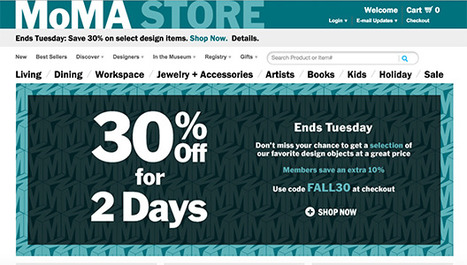
MoMA's Store Rocks
Wow, I don't usually think of museums as sources of ecommerce inspiration and learning, but the Museum of Modern Art (MoMA) has a special team you can learn a lot from. MoMA's team excels at ecommerce blocking and tackling such as:
- Great email followups (abandon cart, push emails)
- Great promotion schedule understands DEADLINES and web's constant NOW
- Easy to understand and use navigation
- Great clean lines and images
- Tells great visual stories
Best ways to make money online is to excel at the basics. MoMA doesn't stop there they excel at advanced ecommerce ideas too such as: - Bundled and "this = that" merchandising
- Developing exclusive products and bundles
- Email marketing
MoMA's backend could be better. They take too long to ship, but once their products arrive they are packed carefully and with a sense of how special the order is / was. If you want to learn ecommerce you should follow and visit the Museum of Modern Art.
With 22,000+ views SEO for Web Designers blew up thanks to a defined tribal audiences, advocates and luck. Discover tips on how to blow your content up too.
17,162 People Later
We've been asked to make the presentation that created our most viewed Hiaku Deck again at the Iron Yard Code Academy again (made the first presentation six months ago). There were important ideas we shared last time:
* SEO THRIVES or DIES with graphic designers. * Graphic designers are heroes under siege by many groups. * Set REALISTIC expectations.
* Set reasonable boundaries (with gorillas looking for bananas).
* Shared a few easy to remember tips to help designers improve their technical SEO skills.
Obviously we hit a nerve. We will be updating benchmarks shared six months ago to see how those we mentioned fared since. Remember technical SEO is important, but your content must engage, be exciting (visually too) and develop sustainable online community to win over time.
Good luck and if you have SEO questions we didn't cover email them to martin(at)Curagami.com and we will include and send you a Curagami Rules tee.
In this article, Kendra Schaefer examines the things all web professionals should know before swan-diving into the Chinese market, including how mobile-only social platforms have become the revolutionary new frontier of Chinese web design, and who’s designing beautiful websites in China today.
Design Is Revolutionary
Don't have to be Steve Jobs to know design is revolutionary. Our Web Design Revolution feed on Scoop.it is one of our favorites. We love THINKING visual because most of us (save one poor CTO) are marketing geeks who visualize in our sleep.
If you visualize in your sleep consider contributing a Scoop or two or three to The Web Design Revolution in 2015. Several easy ways to contribute:
1. If you are on @Scoop.ituse the Suggest Feature. We appreciate all the great suggestions we've already received and promise a new focus on collaboration in 2015.
2. If you aren't on Scoop.it you are missing one of the best "do less, get more" tools we know, but you can still contribute ideas for stories we should include by:
email: martin(at)Curagami.com
Twitter: @Curagami
Call For Help NOW
Right now we are interested in creating a year-end mashup of all the web design predictions for 2015. If you have a favorite prognosticator and they write about what they think is going to happen in web design next year send us the link and we will mash your contribution up into a summary with early views going to contributors.
Thanks for a great year and hope you will contribute to The Revolution in 2015.
When I think of responsive web design I think of Transformers: Websites in Disguise. With one set of code you can build a website layout that runs flexibly...
Marty Note
Yesterday we shared thoughts on the marketing side of responsive web design along with some design basics. Responsive design creates a flexible membrane adapting itself to any receiving device.
Creating responsive design is INVOLVED. You can trash your SEO (Search Engine Marketing) without really knowing it, confuse your web designers and customers and do more damage than good.
I like this Jake Rocheleau "ultimate guide' because its a natural part 2 to yesterday's responsive basics (http://sco.lt/4ob6DR ). Responsive design is a MUST, but, as you will agree after reading Jake's Ultimate Guide, not to be undertaken lightly or without some reading about what is happening under the covers.
Great job by Jake and V
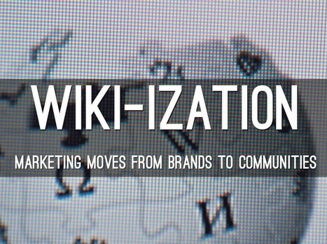
Here A Wiki, There A Wiki, Everywhere A Wiki
What is a Wiki if not an invitation to create online community. The "open source" like collaboration Wiki's provide is a blueprint for creation of online community. After months working on http://www.Curagmai.com we've discovered how close Wikis are to...well everything.
Wiki Ideas To Steal Include:
* Open Source Like Content Collaboration.
* Use community to steer and de-spam ecosystem.
* Depend mostly on social reward.
* A healthy and competitive contest never hurts. * Feature and thank contributors.
* Provide ways for contributors to know where they stand vis-à-vis other contributors.
* Create ways contributors can follow and communicate with each other.
* Include ways for contributors to create mini-tribes. * Make sure "rules of the road" are understood and published. * Communication with sponsoring agents must be easy too.
* Normalize greatness by sharing across ecosystem.
* Role of sponsors becomes more curators than creators.
* Ask for help.
* Provide social rewards (such as features) to contributors.
* Create ways to identify contributors in the world (t-shirts, stickers).
* Appreciate, be nice and thankful (always no matter what). Following a few simple rules will dramatically increase the most important content you can't buy (User Generated Content or #UGC) and build sustainable online community. Sustainable online community means costs go DOWN even as other material rewards (UGC, followers, traffic, money) go UP.
This Haiku Deck is about why we are all in the Wiki business whether we realize it or not AND how to design for the Wiki-ization of marketing, brands and online community.
Responsive Web Designs
Responsive design, forming a website's information so it looks great on any device, is becoming mission critical. Here are 65 of the best responsive designs in 2014 via SocialDriver.com.
Learn what to include in your website design before you build and find out the 10 ‘must-haves’ to drive more traffic to your site.
1. Incorporate Keywords. 2. Multiple points of contact. 3. Consistent branding. 4. Call To Actions.
5. EASY to read (font size, short paragraphs, bullet points).
6. EASY to navigate. 7. Important above fold. 8. Load time (faster is better). 9. Build credibility & trust. 10. Social
|
Rock Mobile Or It Rocks You You want to be on the right side of the "mobile" revolution, but where is that exactly. This post shares critical information about screen size that will help your mobile design rock!
Web Design Lessons from Westworld This Curagami post shares Five Content Marketing Lessons from HBO's Westworld such as:
- Show Don't Tell
- Tease Never Bore
- Beauty is half the Battle
- Believe and MOVE
- Create Another Loop
http://www.curagami.com/content-marketing-five-lessons-from-hbo-westworld/
Lessons don't end there. HBO's Westworld uses design in ways web developers and designers should steal including:
- Design should speak to and deepen your story lines
- There is not half measures in design, all in or nothing
- Create space around your designs, don't overwhelm
- A few little things done very well often work better than many things done poorly
Design & Web Stories Websites must tell stories, stories consistent with and supporting brands represented. Look at the examples in our YouTube video (https://youtu.be/IC4KHAIZKWM ) and particularly REI.com for ways to blend your brand's message and site design.
No Half Measures You either believe in your designs, copy, website and brand or you don't. There are no half measures online. Half measures are like fear. Visitors can smell fear and know when they are being manipulated. Every webpage is s statement and you either believe in what you are doing or you don't. See the Red Bull example in the video for the impact BELIEF can have on marketing and movement creation.
Space
Great Designs need SPACE to breathe. White space may be the most important part of web design few think about. In our rush to crowd everything in we violate HBO's brilliant use of space, time and an unhurried process. HBO isn't trying to overwhelm or flood us into submission. HBO would rather create one incomplete thread after another and leave them and us hanging. Space is confidence. When you're confident in your product, brand or site you do what you believe and learn from every interaction. When you keep throwing things at customers hoping they will comply, they never do btw, your marketing looks chaotic and confusing. Confused customers do many things buying and advocating are rarely among them.
Brilliant Little Things
Have you noticed how DARK the Westworld lab is? If you're wondering why Westworld's titles are so amazing look no further than the dark lab. Creating the CGI needed to have a cool lab is expensive. Better to create a great title sequence and leave the lab a little seedy and rundown since doing so saves money and helps the plot.
Websites can't look "seedy" so much these days, but they can do a few things brilliantly and let the credit spread. When asked how teams I've managed made over $30M in online sales I often explain it was what we DIDN'T do that mattered most.
The list of things we needed to do was always infinite, so we were strict in the very few things we did and could do. HBO proves the point. Spending millions on the lab would rob the show of it's seedy underbelly. Better to create a great title sequence with a few brilliant pieces like the robot dipper and the "world overview" than try and do it all.
Find our Content Marketing tips from Westworld on Curagami:
2016 The Year of the Story
Storytelling may be the most important and least understood online marketing craft. This Curagmai post shares a 5 Tip "How To" craft a story working backwards from your landing page.
Tips included:
- Create A Landing Page and Work Backwards
- Place your offer in context
- Repeat 3 to 5 key brand specific themes
- Share your creation story
- Define your audience
http://www.curagami.com/online-marketing-5-storytelling-tips/
Burn Down Your Website
As we noted on G+ (Inevitable Lightness of Being) websites are a tyranny few will be able to afford soon. Let's follow the rules of improvisation (always a good web marketing idea) and say, "Yes, and" to the issue of burning down your website. What are the web design implications of embracing the next generation of consumer marketing?
* Build for Curation Not Creation * Remember about THEM (customers) not you so build community in
* FAST, FLAT and FURIOUS
* Don't forget profiles, timelines and shares
* Read behavior THEN create the page (i.e. More Google-like)
Curation Not Creation
Friends @Scoop.itsuch as @Guillaume Decugisand @Marc Rougierare sitting in the cat bird seat. After the latest Google changes, and the last time we will know when Google makes algorithm changes, the curate don't create rule is strong.
Strong because you can't afford to put content on owned properties that isn't insanely great. In a world where the NY Times gets gigged for poorly supported content you need to test BEFORE you write.
Scoop.it is our favorite, "Test before you write" tool. Content curation is more democratic tool. Nothing like finding a cool post, sharing it and explaining why you think it is cool with rich snippets to create relationships. Doubt that? I have 45,300 followers on Scoop.it. Curate don't create and build your next site to make your curation easy, sticky and shareable.
Them Not You
One of the wooden stakes in the heart of tactical web development is it assumes too much control for the creators. As a creator I can attest where the power lives - THEM (your customers) not you. Your future web development needs to build community, make your curation of your user's content, the User Generated Content (UGC) every web miner needs to win today. If you don't have a plan to create user profiles, timelines and following better get one.
Fast, Flat and Furious (in Real Time)
If you haven't watched Joi Ito's TED talk about Nowism do so. The web only has one time - NOW. We've noticed anything we do, share, or create close to NOW does better. Figure the need to share and have content pinging (updating and being shared) constantly will be a huge need in tomorrow's web development.
Building flat and fast sites influenced by mobile's less is more philosophy is highly recommend. If your dropdowns are War and Peace novels you need to reconsider. EASY, simple and beautiful works better in a mobile, connected, and FAST world.
Profiles & More
Changing your role from creator to curator opens your thinking. If your site is about what THEY (your customers) do with it include them in your web design. Create profiles, timelines and make it easy for your customers to speak to and interact with each other.
Gamified and Predictive
No one gives things for long without reinforcement. We agree with Daniel Pink's great book Drive. Paying = jobs. Don't pay money, but do find ways to share your legitimacy.
Share your position and site and your community will help build it. Make sure to curate too. When you find great content THEY (customers) gave you, share and elevate the example everyone learns.
Canonical URLs Explained
The Yoast post provides an easy way to understand why rel=canonical is a powerful new SEO tag. Yoast has a dog in the hunt. They make a Magento plugin that easily writes the rel=canonical tag into a product page's head.
The explanation about WHY canonical URLs are so important is only half right. We have a million ways of expressing and sharing URLs these days. Without rel=canonical we end up duping content to distraction.
Here's the rub. All ecommerce sites dupe content. They must. When I was a Director of Ecommerce a single product accounted for 50% of our profits. You better believe I merchandised that product into every nook and cranny our site offered. I duped that product and it's content to distraction.
There are other ways to limit duplication including:
* Use of your Robots.txt file.
* Locking content behind a firewall. * Use of blockquotes & rel=canonical tags.
* Rewrite duplicated content so it's not as duplicated (lol).
We included our email output into a folder with a "no follow" line in our robots.txt. You may think such a move is enough. It isn't. Be sure NOT to drive links from spiderable content INTO that folder or you eliminate the effectiveness of the robots.txt.
In the end every ecom site worth it's salt MUST duplicate content. Rewriting sounds like a good strategy, but it isn't. Content = time and time = money when managing million dollar commercial sites. You will be duping content.
Best to use rel=canonical because it shows Google you aren't trying to STEAL anything. Reminds me of what a friend shared about the disavow tool (used to deny inbound links or signal they may be untrusted).
My friend was using the disavow tool daily on his clients accounts. "So you are brown-nosing Google," I kidded him. "Exactly," was his answer. Rel=canonical tells Google you are TRYING to do the right thing and sometimes that is enough.
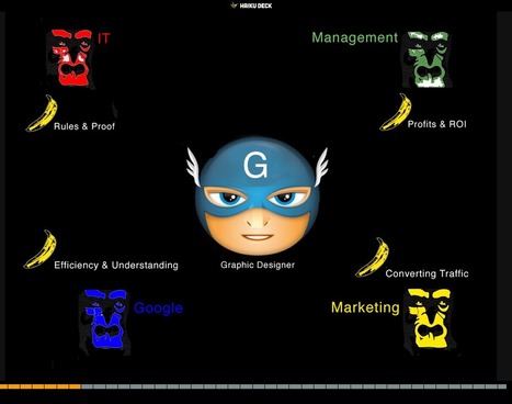
Web Designer SEO
Our SEO Tips for Web Designers hit a nerve. It is heading to 13,000 views (probably today). We hit a nerve because web Designers are where SEO rubber meets the road. This Haiku Deck is full of SEO tips for web designer including:
* Know who has the banana and why.
* Know how much SEO you need to know. * Learn what is MIST vs what is Gorilla.
* Listen Digitally.
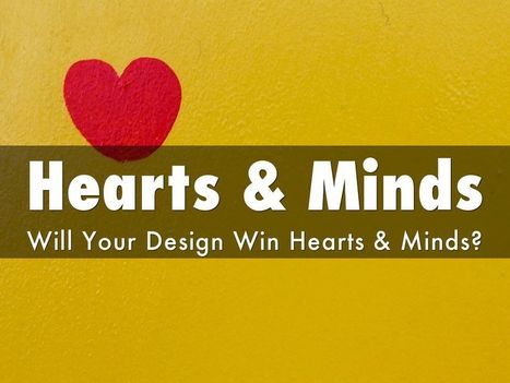
* Understand how SEO & Content marketing work together. * Design to Win Hearts, Minds and Loyalty.
And More SEO tips designed for designers.
HOW art director Adam Ladd shows us 10 more of the top design websites, many of which are sure to give you the graphic design inspiration you crave.
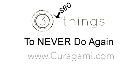
3 SEO Things To NEVER Do Again
The New SEO
Search Engine Optimization may be different, but it isn't dead. Until search engine spiders can understand context YOU have to provide it. Today team Curagami discovered 3 big things to NEVER do again while working with our great customer http://www.Moon-Audio.com :
* Original Copy Only
Never copy a manufacturer's product or brand copy. You MUST write original copy for every page or risk being put in the "dupe box". Duplicate content from THEM (manufacturers) is foolish for another reason - few manufacturers write great copy about their products, services or brands.
If you do copy manufacturer notes or specifications either 1. blockquote them out or 2. use inline rel no follows to tell the search spiders you know you've duped the content and aren't looking for kudos on it.
* Never Assume Branded Sites Know SEO
Working with Moon Audio team Curagami realized we could make a killing JUST helping major electronic brands such as Shure, Astell & Kern and Chord Hugo improve their SEO. The team at Moon assumed since the manufacturer's site was coming up high in the Search Engine Results Pages they had their SEO down.
NOPE, not even a little bit. The manufacturer benefits from all those links being driven into their pages by people who DO KNOW SEO. They don't so don't copy them.
* Do Use the SERPS
If you want to know who is doing well on your keys logout of Google (this won't kill all the filters but will help) and search for sites consistently showing up for keys you want. Next use Mike's free keyword tool to see how well the site you found ACTUALLY ranks for your keys.
You have to use a tool to see THROUGH the float. Used to be when you and I typed the same search at the same time we saw the same results. Not so much anymore thanks to Google's "floating" their index and making decisions about what you see based on a host of new things like what your friends see & like, what you've liked before (you in this instance is your computer's IP address) and other filters so secret no one really knows.
Watch Pariser's Filter Bubbles TED talk for more on why search is just showing you what you already know these days and NEVER steal copy or SEO advice from dumb and dumber manufacturers.
They win their brand name FOR FREE. If you want to know if they understand SEO type a phrase like "portable audio" and see who shows up (the usual suspects like Amazon, Wikipedia, Cnet Mashable, Techcrunch, HuffPost, etc...).
Responsive web design is the practice of creating websites that display evenly on all devices. Understand the basics of responsive web design with examples.
Marty Note
Don't make the common mistake of thinking responsive design is all about look and feel. Yes some WordPress templates can make it FEEL that way since they are built to accordian with different receptions created by phone, laptop and computers.
The important idea for marketers to understand is to THINK Mobile First. Thinking mobile first brings a slew of changes such as:
* Flat web design.
* Limited Colors.
* Less functionality that is easier to understand.
* Content snippets instead of novels.
* Emphasis on VISUAL MARKETING.
* Need to make content & communication feel & act like a game.
Those last bullets speak to the gamification of marketing so implied by smartphones and a mobile / social / connected world. Mobile means never having to say you're sorry because you listen and curate more than you talk, create sustaining community and engagement and understand all the implications of "the network is the computer".
Just shared an overview of Marketing Timelines on G+ (https://plus.google.com/102639884404823294558/posts/EkXN57uJyjq ). All that said, you still need to understand Responsive Design 101 so appreciate this Scoop.it suggestion from @David Fournier. .
Marty Note
Watching the excellent HBO Documentary about James Brown Mr. Dynamite made me think of FUNK and web design. Web design is easy to get WRONG (lol).
It is tricky to design online with a sense of surprise, beauty and novelty. I like the Digital Invaders design as it feels free and spontaneous. Other designs such as Monster CSS and Creative With A K feel like they are trying to appear spontaneous and free.
Trying too hard is EASY in web design too. Remember all websites are STAGES we designers SET. The trick is to set a stage that feels like it is happening now and won't feel dated tomorrow. Feels like there are enough visual hooks in Digital Invaders it would be easy to keep it fresh with minimum fuss.
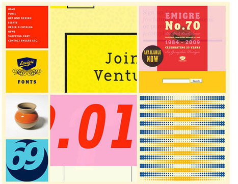
I like Emigre too. Emigre creates the same sense of happening now but that design is at the other end of the spectrum from Digital Invaders. Its hard to beat the grid. First website I created, in 1999, used a Mondrian grid.
Grids help organize massive amounts of information without that mountain feeling like it is about to crush you. I like the funky NOISE contrasted to the quiet grid because they demonstrate the need to find a visual VOICE in your web design. That voice can be anything as long as it feels authentic TO YOU.
The web is very good at finding and amplifying DISSONANCE. When you try to FUNK IT UP and aren't really funky it shows like you are wearing the wrong decades fashion (painful). Your customers are your audience.Set the stage anyway you want, but do so with an eye toward YOUR TRUTH.
The closer you stay on the tiny beam of "authentically us" the more success your web design has. This is why there are no web design maxims that apply all the time. What works for Emigre is very different than Digital Invaders but both work, both are authentic and have that hard to describe but know it when you see it TRUTH great web design must have.
Angela Jones, a freelance designer in St. Charles, Illinois, uncovers how 7 websites promote their products in exciting ways.
Marty Note - Great From Boring
Loved this post, but they bury the lead. Their tips aren't sub-heads but buried in the copy about the example. I liberated their 5 tips to create exciting sites for boring products:
* Employ imagery and icons that speak to the benefits (i.e. tell a story and match with cool visuals).
* Focus on HEADLINES that describe your benefits (i.e. use trusted sources and let THEM tell your story).
* Write creative copy (there are NO BORING PRODUCTS only boring stories lol).
* Minimal and easy to navigate (always a winner in my book too, but especially if what you are selling is boring. YES I will spend 3x the time it should have taken to order the new iPhone despite the horrible web design, your product...not so much, so make it easy to buy.)
* Create Community & Let THEM (your customers) supply the amazing stories. When YOU tell your brand's story it is always more boring than the same words from a customer.
* VISUALS - boring products benefit from great visuals. Tilt your boring product, hang it from the rafters, find a way to depict excitement and excitement flows downstream to your product.
|


![Remarkable Websites For Boring Products: 5 Tips [Scenttrail Unburied Lead] | Must Design | Scoop.it](https://img.scoop.it/Dc6u-j_Bsc0wgLdAMa-H9Dl72eJkfbmt4t8yenImKBVvK0kTmF0xjctABnaLJIm9)


Great, comprehensive, and illustrated "perfect slider" tutorial from Smashing Magazine.