Must Design
75.5K views | +0 today
Follow
Must Design
Design Is Revolutionary
Your new post is loading...
Scooped by Martin (Marty) Smith
Scoop.it!

Great Typography in Promotion Design - HOW Design

Great Typography in Promotion Design - HOW Design | Must Design | Scoop.it
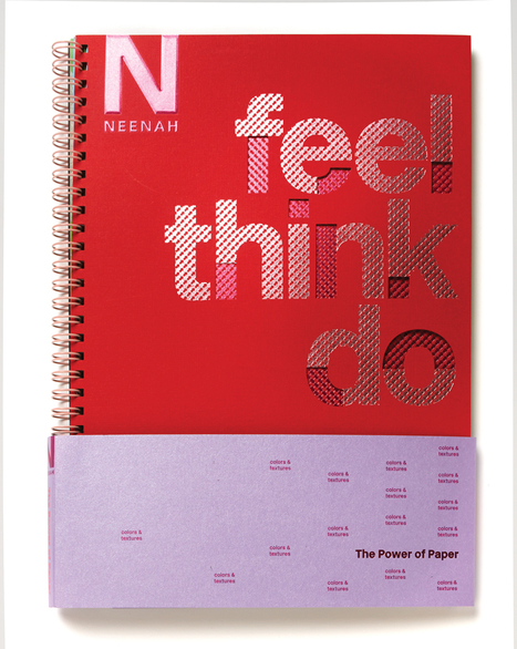
Across all the categories in HOW's Promotion & Marketing Design Awards, we see a number of projects featuring great typography. Check out these selected projects for some typography inspiration.
Martin (Marty) Smith's insight:

Great Type Design
Type is hard to get right. That is why we like looking at how the pros use type to make amazing designs like these. 

Jae Pil Shim's curator insight, March 8, 2016 5:35 AM

Great Type Design
Type is hard to get right. That is why we like looking at how the pros use type to make amazing designs like these. 

Antonios Bouris's curator insight, March 9, 2016 10:00 PM

Great Type Design
Type is hard to get right. That is why we like looking at how the pros use type to make amazing designs like these. 

Scooped by Martin (Marty) Smith
Scoop.it!

Web Design Trends 2015 & Hot To Keep Your Website Current

Web Design Trends 2015 & Hot To Keep Your Website Current | Must Design | Scoop.it

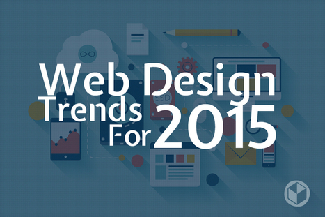
Now it’s time to analyze the web designs that have emerged this year, and place predictions for the possible trends that lie ahead for 2015.

Marty Note
Promise to create a mashup of all web design trends postings to identify common consensus and outliers.

No comment yet.
Scooped by Martin (Marty) Smith
Scoop.it!

Bauhaus Web Design

Bauhaus Web Design | Must Design | Scoop.it

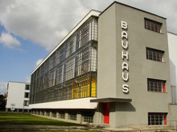
Bauhaus is not only one of the most important design movements in history, but an especially relevant style for Web Designers. Alex and Simone tell you why.

Marty Note
Wow, love this post by SitePoint.com's Web Developer Alex Walker and graphic designer Simone Sala because it both EXPLAINS Bauhaus Design Principles and then applies them with examples to the web. #toogood

The Bauhaus stressed form and function. Removing ornamentation in favor of clarity, ease of use and beauty. Sounds like MOBILE DESIGN to me.

Mobile is so SMALL it forces the right choices. Look how "mobile design" is not impacting web design. Mobile stared trends such as limited color palettes and flat graphics because of limitations (of smart phones), but those limitations can also help FREE up a website and point it more clearly at true north.

True north online is where visitors know what to do and why easily and are so engaged by your content they want to do (what you want them to do) AND they want to share the experience with friends. Mobile's "game console-like" BEING is reshaping marketing (see Marketing's Big Bang Manifesto https://plus.google.com/102639884404823294558/posts/Tf9GNsX35qn ).

Great, helpful post.


No comment yet.
Scooped by Martin (Marty) Smith
Scoop.it!

We Don't Come to BURY Helvetica But To PRAISE It [video]

We Don't Come to BURY Helvetica But To PRAISE It [video] | Must Design | Scoop.it

This is a great video by Objectified's (another great video) Director Gary Hustwit. The fact we CAN do something doesn't mean doing it is the right thing to do. This is so true with type.

Because we have more crazy "grungy" fonts doesn't mean we serve our designs well by using them. Sometimes the simple and true work best. Also, as many designers demonstrate in this great design film, the tried and true can be bent into a pretzel.

Helvetia has an innovative side too (shared in numerous examples), so font and typography are really just tools. They stand neutral and wait to see what we do TO them (lol). Helvetia is so clean it makes great headlines online where people don't want to read anyway.

They want to scroll and increasingly swipe so watch this video to learn new tricks for an old, reliable dog.

No comment yet.
Suggested by Sanjana Singh
Scoop.it!

10 Key Elements of Great Web Design + 2 From @Scenttrail

10 Key Elements of Great Web Design + 2 From @Scenttrail | Must Design | Scoop.it


Great TechMagnate.com Post
Agree with all 8 of these TechMagnate.com Great Web Design tips and would add two more:


1. Audience (Know Yours)

2. Creative (Develop A Process)
3. Organization (Wireframes & Nav)

4. Innovation (Include Some)

5. Responsive Design (Get Some)

6. Simplify, Simplify, Simplify7. Don’t Stop Testing
8. Type

& Scenttrail's 2 Additions

9. Calls-To-Actions & Keywords are your friends.
10. Know your 80:20 Rules.

Here is our Curagmai.com post on how to find your website's 80:20 Rule: http://www.curagami.com/magica-thinking/new-seo/finding-80-20-rule/


No comment yet.
Suggested by David Fournier
Scoop.it!

Web Design Trends 2015 [Infographic]

Web Design Trends 2015 [Infographic] | Must Design | Scoop.it
Explore the top web designing trends for 2015. The infographic discusses the top 6 predictions that are set to rule the web designing world in 2015.
Martin (Marty) Smith's insight:

Liked and agreed with all 6 of these 2015 Web Design Trends when I read the post without the infogfpahic. Infographic helps and I bet wil get more shares :). M

malek's curator insight, December 8, 2014 11:24 AM

I like“Card” design, no, it\s not new, but I find it a good tool for designers working on responsive websites. Cards are a great way to keep things modular

Scooped by Martin (Marty) Smith
Scoop.it!

Top 10 Web Design Topics of 2014 From Flat To Content & SEO

Top 10 Web Design Topics of 2014 From Flat To Content & SEO | Must Design | Scoop.it
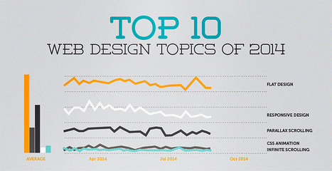
The "Web Design" category of general interest covers its fair share of ground. Informative articles on everything from UX to client management, to conversion psychology,...
Martin (Marty) Smith's insight:

YES, seeing all 10 of these trends from flat design to content ISN'T king anymore (not true) and SEO isn't getting easier (true).

No comment yet.