An article on Banner Blindness which explains the physcology behind it and enlists common techniques to reduce it and improve ad revenues.
Marty Note
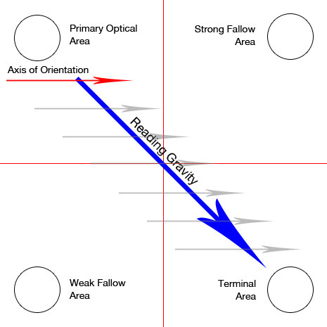
Interesting post and definitions that is true to my experience designing high converting ecommerce websites. There are ways to manipulate eye tracking with images and call-to-actions, but that area on the right the "strong fallow area" was a GUTTER.
REI is my favorite example at how to manipulate the "gutter" tendency to be a black hole or a roach motel (visitors check in but never out). REI takes a link they know everyone is looking for, their SALE link, they color it different than the rest of their menu (red).
REI defeats the "roach motel" aspects of the right gutter with intelligence and design. In my experience the SALE area shopper will ferret that link out no matter where you put it.
By taking an area that is normally a dead end and putting something the sale shopper will surely find they kill the proverbial two birds -
* Their SALE shoppers can beeline right to their favorite place to check BEFORE they do anything else.
* The SALE curios can easily find the link too so they lose nothing and gain an active link in an area that is typically weak. Just one reason why REI is one of the best-crafted ecommerce website:
http://www.rei.com


 Your new post is loading...


Mobile first isn't everything it is the only thing. This Adobe post provides an intelligent look into how AI will impact web design, user experience, and the customer journey.