 Your new post is loading...
AI & UX and UI Mobile isn't everything it is the only thing at least as far as data architecture and design goes. The "mobile first" movement didn't go nearly far enough.
Mobile first means thinking about and changing how we think about User Interface design. As we're thinking about design we need to layer artificial intelligence (AI) in too.
AI impacts the sentient nature of the conversation between customers, websites and robots. Robots not of the Skynet variety but crawlers determined to understand, share, and search.
Future Tools
This is a great web design post. Don't worry if you don't know or understand only about half of it. Importance is in the tools suggested to test, design and pivot toward a future of more flexible web design.
But there's a problem.
I created my first highly static website in 1999. Not static in the sense we didn't update it since we updated it all the time. Static in the servers and code we used. Today and especially true tomorrow your websites will need to fly around the web curating information from the 4 corners of the web.
The more "flying around" your website does the greater the stress on your backend serving architecture and the more the need for the cool web design tools outlined in this Smashing Magzine post.
Burn Your Website Down
Websites are about to become an expensive tyranny. Tomorrow's e-commerce happens everyone and at any time on any device. Still demanding customers come to your website? Crazy!
Better to "burn your website" and all of the preconceived notions about what a website is and should be down today. Recreate your site as a fluid expression of content, community and commerce.
Here's how: http://bit.ly/burn-down-website
Learning From Video Game Designers
Video game designers can teach you a lot about how to great great ecommerce and B2B websites. Video games are gamified, social and understand the stimulus - response nature of online interaction in a fluid and must imitate ways.
Here are WhatCulture.com's picks for the 20 best video game websites in the world. We like Gamers With Jobs and Kotaku (though we don't understand a lot of it).
With 22,000+ views SEO for Web Designers blew up thanks to a defined tribal audiences, advocates and luck. Discover tips on how to blow your content up too.
Smart Web Design Trends Post
@jowitaziobro taught our team some important ideas about what's next in #webdesign this morning. She states her goal as digging deeper than the usual suspects in web trends and she succeeds. Here are her 7 What's Next in Web Design Trends:
1. Gestures are the new clicks. 2. The "Fold" is dead (longer swipe-y pages see #1). 3. Websites are quicker users too (so lack of speed kills). 4. Pixel is dead (we used to limit our image sizes and "weight" with the web's advanced caching and Content Delivery Networks no need for such limitations anymore). 5. Animation is back (and about to be in a big way). 6. Components and frameworks are the new design and programming (need to reread and think on this one some). 7. Social Media is dead long live "direct" email.
Great post for a Monday. Hell great post for any day. Well done Jowita. Rock on. Marty
SEO For Web Designers
Web designers are where rubber meets road for Search Engine Optimization, but it is unrealistic to expect designers to become SEO experts. This Haiku Deck sets reasonable expectations and outlines a handful of technical SEO best practices sure to help any web designer understand the most Darwinian of practices - today's SEO.
Design Revolutions Now On Curagami
Finally decided to use @Scoop.it's easy to use embed tool. The tool makes it easy to add content curation to a blog. Simply copy the embed code and your Scoops appear inside your blog.
Why would you want Scoops on a blog? Content curation has more reach and costs less than content creation. Content curation is or can become a big help to content creation.
The "4th Estate" for Scoop.it is finding ways to bring the easy content curation Scoop.it creates with a company's content marketing. Scoop.it's easy to use embed (you embed the feed) bridges the 4th estate of content marketing. Well done!
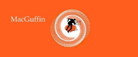
Website MacGuffins are ideas such as Free Shipping whose absence hurts more than their presence helps. What are your website's MacGuffins?
Typography is an important but often under-represented part of a website's layout. With so much focus being placed on the presentational aspects of CSS and the use of large images and media that choke bandwidth restraints; it’s nice to occasionally remember that textual content can also make an impact on users and their experience. Content remains king, and a few good fonts can make even the simplest of sites look smart - though not so many that you have to wait for ages for the text to be visible.
Because of this, I’m going to show you a few handpicked examples of sites that make their content look terrific, and why you should consider following their example in your own work. We’re going to take a journey of how elegant typography can make a site shine; looking at the bold, creative, navigational, simplistic and interactive content that makes the designer's voice speak volumes - so let’s get started!...
Via Jeff Domansky, Os Ishmael
Web Designer SEO
Our SEO Tips for Web Designers hit a nerve. It is heading to 13,000 views (probably today). We hit a nerve because web Designers are where SEO rubber meets the road. This Haiku Deck is full of SEO tips for web designer including:
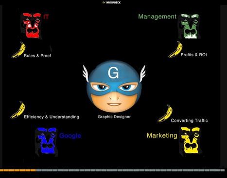
* Know who has the banana and why.
* Know how much SEO you need to know. * Learn what is MIST vs what is Gorilla.
* Listen Digitally.
* Understand how SEO & Content marketing work together. * Design to Win Hearts, Minds and Loyalty.
And More SEO tips designed for designers.
Web designers shouldn't be SEO experts since keeping up with DESIGN is a full-time job. But web designers are where SEO rubber meets the Google Road so understanding a handful of ideas is critical to the online success of any designers creations.
Parallax scrolling is a popular design technique used on websites in order to create an illusion of movement on the screen, to help engage website visitors and move visitor yes where you want them AND parallax scrolling plays beautifully on mobile devices!.
Here are 60 examples of great parallax scrolling.
|
Web Design Tips - Image FIles
The questions we ask are often wrong on their face. In this case a website owner was asking how best to put the detailed image of rug, pillows and sofa on their website. The answer is they shouldn't.
The detailis so HEAVY it will need a jpeg or compressed file to look good and NOT slow down page load times. The text on the right is the real problem. When you use jpegs text looks horrible because the compression makes everything fuzzy.
The human eye doesn't notice fuzzy in the rug and pillows, but in things we're trying to read fuzzy sucks. That is why this image shouldn't be loaded to any website. An image of the rug, pillows and sofa can be loaded as a jpeg and the text should be written in with a Cascading Style Sheet (CSS).
CSS will write the text into the html and so be readable. At this point designing with CSS is so common anyone asking for money to design a website should be able to create a layer with the text in it. The little point might be a tad tricky, but not so tricky most designers shouldn't be able to handle it.
The serif font is a whole other issue (lol), but the answer to how to put this image up is already wrong. This image shouldn't go up to the web as we explain on Stack Exchange.
Burn Down Your Website
As we noted on G+ (Inevitable Lightness of Being) websites are a tyranny few will be able to afford soon. Let's follow the rules of improvisation (always a good web marketing idea) and say, "Yes, and" to the issue of burning down your website. What are the web design implications of embracing the next generation of consumer marketing?
* Build for Curation Not Creation * Remember about THEM (customers) not you so build community in
* FAST, FLAT and FURIOUS
* Don't forget profiles, timelines and shares
* Read behavior THEN create the page (i.e. More Google-like)
Curation Not Creation
Friends @Scoop.itsuch as @Guillaume Decugisand @Marc Rougierare sitting in the cat bird seat. After the latest Google changes, and the last time we will know when Google makes algorithm changes, the curate don't create rule is strong.
Strong because you can't afford to put content on owned properties that isn't insanely great. In a world where the NY Times gets gigged for poorly supported content you need to test BEFORE you write.
Scoop.it is our favorite, "Test before you write" tool. Content curation is more democratic tool. Nothing like finding a cool post, sharing it and explaining why you think it is cool with rich snippets to create relationships. Doubt that? I have 45,300 followers on Scoop.it. Curate don't create and build your next site to make your curation easy, sticky and shareable.
Them Not You
One of the wooden stakes in the heart of tactical web development is it assumes too much control for the creators. As a creator I can attest where the power lives - THEM (your customers) not you. Your future web development needs to build community, make your curation of your user's content, the User Generated Content (UGC) every web miner needs to win today. If you don't have a plan to create user profiles, timelines and following better get one.
Fast, Flat and Furious (in Real Time)
If you haven't watched Joi Ito's TED talk about Nowism do so. The web only has one time - NOW. We've noticed anything we do, share, or create close to NOW does better. Figure the need to share and have content pinging (updating and being shared) constantly will be a huge need in tomorrow's web development.
Building flat and fast sites influenced by mobile's less is more philosophy is highly recommend. If your dropdowns are War and Peace novels you need to reconsider. EASY, simple and beautiful works better in a mobile, connected, and FAST world.
Profiles & More
Changing your role from creator to curator opens your thinking. If your site is about what THEY (your customers) do with it include them in your web design. Create profiles, timelines and make it easy for your customers to speak to and interact with each other.
Gamified and Predictive
No one gives things for long without reinforcement. We agree with Daniel Pink's great book Drive. Paying = jobs. Don't pay money, but do find ways to share your legitimacy.
Share your position and site and your community will help build it. Make sure to curate too. When you find great content THEY (customers) gave you, share and elevate the example everyone learns.
5 Super Secret Marketing Trends
One of the "Super Secret" Marketing Trends we see for 2016 is Nowism. As defined brilliantly in a TED Talk by Joi Ito (embedded in the post) Nowist plan less and react more. Nowist look to the web to provide the collaborative means to react to what is happening now.
Nowism brings several important design considerations including:
* Incorporation of Social Media Feeds * More space for Content Curation * More flexibility and less rigid and static boxes * More movement and change throughout a site
When something BIG happens and a web design looks and feels the same the sit steps away from the now. One of http://www.Moon-Audio.com major partners is about to launch an earth shatteing new product.
Moon's site needs to have the ability to curate, create and spin content about this innovation fast and furious. The more your content marketing and website live in the now the stronger its relationship with your customers.
See the other 4 Super Secret Marketing Trends for 2016 here:
http://www.curagami.com/5-super-secret-marketing-trends/?v=7516fd43adaa
Designing a good website that accommodates a lot of content is a tricky balancing act to pull off. Does one attempt to present the user with all the information
Canonical URLs Explained
The Yoast post provides an easy way to understand why rel=canonical is a powerful new SEO tag. Yoast has a dog in the hunt. They make a Magento plugin that easily writes the rel=canonical tag into a product page's head.
The explanation about WHY canonical URLs are so important is only half right. We have a million ways of expressing and sharing URLs these days. Without rel=canonical we end up duping content to distraction.
Here's the rub. All ecommerce sites dupe content. They must. When I was a Director of Ecommerce a single product accounted for 50% of our profits. You better believe I merchandised that product into every nook and cranny our site offered. I duped that product and it's content to distraction.
There are other ways to limit duplication including:
* Use of your Robots.txt file.
* Locking content behind a firewall. * Use of blockquotes & rel=canonical tags.
* Rewrite duplicated content so it's not as duplicated (lol).
We included our email output into a folder with a "no follow" line in our robots.txt. You may think such a move is enough. It isn't. Be sure NOT to drive links from spiderable content INTO that folder or you eliminate the effectiveness of the robots.txt.
In the end every ecom site worth it's salt MUST duplicate content. Rewriting sounds like a good strategy, but it isn't. Content = time and time = money when managing million dollar commercial sites. You will be duping content.
Best to use rel=canonical because it shows Google you aren't trying to STEAL anything. Reminds me of what a friend shared about the disavow tool (used to deny inbound links or signal they may be untrusted).
My friend was using the disavow tool daily on his clients accounts. "So you are brown-nosing Google," I kidded him. "Exactly," was his answer. Rel=canonical tells Google you are TRYING to do the right thing and sometimes that is enough.
Web Design Jazz is the conversational alchemy that is website design riffing important conversations your brands have with visitors and potential customers. What about you? What conversations are your having with customers? How did you get there?
Check out our Web Design Jazz video and join the conversation:
http://www.curagami.com/master-classes/web-design-jazz/
17,162 People Later
We've been asked to make the presentation that created our most viewed Hiaku Deck again at the Iron Yard Code Academy again (made the first presentation six months ago). There were important ideas we shared last time:
* SEO THRIVES or DIES with graphic designers. * Graphic designers are heroes under siege by many groups. * Set REALISTIC expectations.
* Set reasonable boundaries (with gorillas looking for bananas).
* Shared a few easy to remember tips to help designers improve their technical SEO skills.
Obviously we hit a nerve. We will be updating benchmarks shared six months ago to see how those we mentioned fared since. Remember technical SEO is important, but your content must engage, be exciting (visually too) and develop sustainable online community to win over time.
Good luck and if you have SEO questions we didn't cover email them to martin(at)Curagami.com and we will include and send you a Curagami Rules tee.
Burn Down Your Website
Websites are cool and a great marketing aid...until they aren't. If the line of when they aren't isn't behind us we are approaching it. What is a "website" when we share posts on Medium, Scoop.it and GPlus?
Feels like the idea of a website as a MUST GO HERE to interact with our marketing message is hopeless out of touch. Even when we do GO to a website what are we looking for?
FUN, ENGAGEMENT and RELEVANCE.
The typical talking to yourself about yourself marketing that most flog online feels more than dead, it feels dangerous. Google's vote is clear - if your content doesn't create an increasing number of likes, loves, shares and loyalty your website is screwed, blued and tattooed.
Especially if someone in your immediate competitive sphere knows how to THROW DOWN, create community and MOVEMENTS instead of the usual solipsistic crap. Keep talking to yourself while someone else in your business vertical is hosting a party and you will be waxed.
Waxed because what really matters NOW is LOVE. If your win hearts and minds because you are honestly all in and listening hard you get to "win". If you are amazing you create blue oceans and uncontested competitive space for however long the ride lasts. Talking about FUN.
This Haiku Deck discusses the death of tactical web marketing. You can't out email market my team and I, or not for very long. We've been doing this crazy biz since 1999. You can gain an inch and we are likely to come back and take a mile.
https://shar.es/12ekPU
Good News & Bad News
As a rare web marketer with more than ten years experience, I created our first site FoundObjects.com in 1999 (gone now sadly), we want to confirm something every likely reader of our online marketing post already knows - the low hanging fruit is gone plucked by previous generations of pickers.
What to do now? Be something online and start today with these "be something now" tips.
7 Easy To Forget Simple Ideas
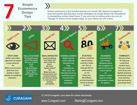
As you design your ecommerce store keep in mind these easy to forget but sure to make you more money online commerce tips:
* Sight Lines - visitor eyes go where your models eyes go so point them at something good.
* CTAs - don't be afraid to tell your customers what to do with Calls To Action. * Email - email marketing is the ability to communicate with your tribe without asking permission from a middleman.
* Internal Search - tells you if your navigation is working and what customers are looking for so use data from internal search. * 80:20 Rule - a small set almost always controls a larger set online so find your 80:20 rules and design, merchandise and sell to them. * Keywords - make sure you use keywords in your navigation and use a rewrite tool to show visitors one set of keys and spiders another. * Community - create an ASK (for help) and listen more than you talk and online community will form.
Marty Note
@David Amerlandis one of the great THINKERS of our generation and he gives much of his work away (as we all do, but his thoughts are worth more than most). Every Sunday David Amerland on G+ shares a “Sunday Read”. Since my prism leans toward web marketing I see lessons in today’s Sunday Read for Internet marketers and web designers.
David is discussing "life design", but web designers would be well advised to watch the TED talks he references and build empathy into their lives and websites. David is a "must follow". Find his blog, twitter and GPlus links in the post and follow him if you want to learn how all of this stuff really works.
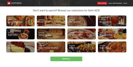
Best of Indian Web Design with Zomato.com A Clear Standout
Indian web design is marked by innovation, clear Calls-To-Action and graceful use of current and future technology. "In India my generation," my friend Ravi told me the other day, "went right to mobile skipping laptops and desktops altogether".
I was looking at these sites with my laptop and expect they look great on smart phones too. Nothing like having must of your customers using mobile tech to make mobile first in both responsive templates and impressive data architecture (easy to see how these sites would accordion in mobile.
The foodie site Zomato.com lives up to its great name. The content, despite their not being "here" yet, is fresh, beautiful to look at and engaging. Zomato is about FOOD and, much like India herself, has few preconceived notions about what that means. .
Instead they curate with clear passion and grace. Every Indian site we studied had a clear sense of GET TO IT many American sites could learn from. Indian web designers know how to "tease", charm and win clicks by providing just the right information at the right time.
Many American designers seek to overwhelm and thus end up speaking to themselves about themselves. Better to box not look for the haymakers we seem to love so much here these great Indian web designed sites illustrate.
|


 Your new post is loading...















Mobile first isn't everything it is the only thing. This Adobe post provides an intelligent look into how AI will impact web design, user experience, and the customer journey.