 Your new post is loading...
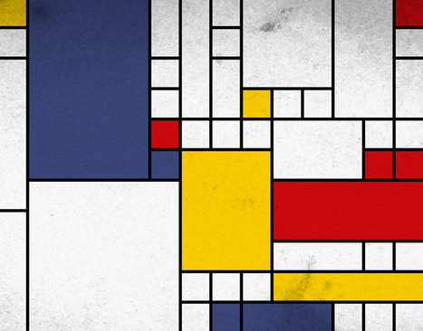
Minimal Is Hard I love this post about how to be a game designer minimalist because doing less is the hardest thing. The ideas shared are applicable to web design too.
This may be the most important two paragraphs for anyone creating a website to read: The Basics"The general purpose of minimalism in game design is to accentuate a game's specific elements by limiting the scope or detail of the other surrounding elements. For a simplified 'real world' example, imagine wearing a blindfold to place a greater emphasis on your sense of touch. An entire game can be designed with minimalism as a core concept, but minimalism can also be invoked only when needed. Art, sound, gameplay, and narrative can all be subject to minimalist interpretations." Read a great book, The Paradox of Choice by Schwartz, to understand why most websites lower conversion with too much choice. Designing a website creates the idea you can do more than you should. It's easy to create mess. "Limiting" is an important word for any new web designer. Even as i write this I know chances are poor anyone working . on a websites wireframes is listening. There is something busy, chaotic and endless about web design. Because we can do something doesn't mean it is the right thing to do.
Blockchain and the Future of Web Design via @Scoopit
Blockchain Disruptions As we shared in BI Revolution and Curation Revolution Blockchain isn't just for Bitcoin anymore. Imagining a distributed, verified and all but fraud-proof transaction network will change how we think about designings websites too. Websites are Dumb
Today, as social media proves, our customers want collaboration, community, and conversations. Google understands the value of highly personalized results. The Google "float" where you and I can type the same search at the same time and receive different results is an example of hyper-personalization blockchains are sure to bring to e-commerce. Websites powered by algorithms to read a customer's blockchain show the most relevant information to convert now. Lectures die in favor of predictive analytics and conversations.
When we learn, thanks to the blockchain, a customer just purchased something related to what we sell why show customers anything other than the products our data tells us will convert visitation to transactions? Answer: we wouldn't. Internet of Things The "life is better" promise suggested by the Internet of Things (IOT) is a harvest we only reap with creative use of blockchain. If everything knows everything about everyone, where we are head anyway, our ability to turn chaos into meaning, efficiency and a better life depends on a multipoint, verified and shared network.
As we noted in our Curagami post The Blockchain Disruption Is Coming Sun Microsystems John Burdette Gage was right - the network is the computer. And the only way our lives don't dissolve into a puddle of chaos, confusion, and anger is by using community blockchain to inform, personalize, and humanize the Internet of things.
Read our friend David Amerland's great What If We Had A New Value System for Goods and Services to understand the need for, the promise of, and difficulty to create a meaningful, fair, and efficient future. How Blockchain Change Web Design Web design changes from static to flexible, from we create to we curate and from lectures to conversations. Like Google, we won't create a single, static, boring page. Instead, thanks to the blockchain, we will design interactive experiences capable of changing on the fly. And we'll have flying cars too. We realize we've heard similar mostly unfulfilled promises before. And there are significant hurdles such as how most merchants feel about their customer information - highly proprietary. If the web proves anything, it is the absurdity of "highly proprietary" thinking. What is exclusive when what we do is digital and so easily shared instantly and around the world? Answer: nothing is uniquely yours anymore.
We don't see the usual drip, drip, drip of acceptance for blockchain empowered, flexible and personal web design. Everyone goes, or no one and the undeniable benefits of using a "dispersed ledger" to inform our digital marketing is so holdouts will lose share, traffic, and loyalty.
Best to LEAD in innovative ways to use blockchain to inform your web designs since to do otherwise is to risk...well everything.
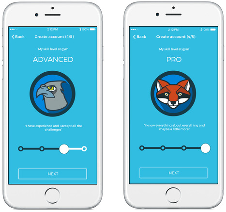
UX Must Reads If you're new to web design do yourself a favor and read at least two of these free User Interface (UX) design books. You'll save yourself time in the end if you know how to design for conversion, engagement, and functionality. That's not to downplay the need for excitement, but nothing turns more users off faster than a hard to understand website.
The Tao of Marty summarizes the OVER (gain) versus UNDER (loss) philosophy we used to make over $30M in online sales with hundreds of thousands of orders.
Best $28 Bucks You'll Spend
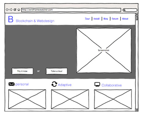
The simple ideas often have the greatest impact on your productivity, life and sense of accomplishment. Anyone who has designed a website, and someday soon that will be all of us (lol), knows how frustrating creating the "site storyboard" or wireframes can be.
@_senorcastillo's Wireframe kit may be the best $28 bucks you spend. Wireframes create a common ground between geeks, marketers and designers. Wireframes force a common language on often dissonant and groups. If that sounds like wireframes can put down rebellions you aren't far off.
Once everyone is on the same page on the look and feel coders know how to code, designers learn how this design needs to go and marketers feel like they are in Santa's workshop.
Chris' masterstroke is mocking up just about every variation of page we've ever created and we've developed about 10 sites and made over $30M in online sales(mostly for other sadly enough lol).
Why we didn't hesitate to pull out the CC and buy Chris' wireframe design kit - that and because we are in the middle of creating the Community In A Box project where clients, programmers and designers need to be on the same page yesterday. http://chriscastillo.me/gravitykits/wireframe?ref=producthunt
2016 The Year of the Story
Storytelling may be the most important and least understood online marketing craft. This Curagmai post shares a 5 Tip "How To" craft a story working backwards from your landing page.
Tips included:
- Create A Landing Page and Work Backwards
- Place your offer in context
- Repeat 3 to 5 key brand specific themes
- Share your creation story
- Define your audience
http://www.curagami.com/online-marketing-5-storytelling-tips/
Content Marketing Is Key
Important post from Scoop.it CEO @Guillaume Decugis because the 12 step program he outlines clearly cleaves content marketing pros from everyone else. We share this post in our Design Revolution Scoop.it feed because we would add 2 more items to a solid list:
13. You aren't designing for content curation and content marketing. 14. You are building community in
Designing for content curation means incorporating the automated feeds Guilluame discusses and leaving room for community and collaboration.
Community's pillars such as user profiles, timeliens, following, comments, wikis and blogging have to be fuilt into a design or you are talking to yourself about yourself even if you follow many of Guillaume edicts. Guillaume's 12 Step Progam: 1. You’re not tracking your results. 2. You’re not repurposing your content. 3. You aren’t automating at least part of your social media activity. 4. You aren’t automating some of your email marketing. 5. You’re only sharing your own content – you’re not adding any content curation to the mix. 6. You aren’t testing. 7. You don’t have a content strategy that’s tied to business goals and your buyers’ journey. 8. You haven’t defined your buyers’ personas or their typical journey. 9. You aren’t creating content strategically. 10. You don’t have a centralized “vault” of all your company’s content assets. 11. You aren’t promoting your content, either via social sharing or by making it visible to the search engines. 12. You have nothing to show for your work.
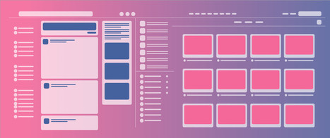
The Internet has given rise to a slew of networked communities. User profile pages have become the norm for cloned systems such as Facebook, Digg, Twitter, and others. This trend has converted even the most basic websites into social havens for users.
Below I have cataloged 26 of the best profile designs found on the web. These feature tons of advancements including block stats, avatars, profile names, and a few other nifty features. Let us know your thoughts on the design gallery in our discussion area below.
Mary Note
User Profiles & Community Community is a CSF (Critical Success Factor) for e-commerce success in today's crowded and noisy web. Sharing your site with customers is a great way to begin to build an online community.
These 30 designs share best practices in user profiles today and some don't suck (Plurk, Vimeo). None is breathtaking or outstanding. Common and important elements for community building include:
* Picture
* Following / Follower Stats
* Bio
* Links out to social nets
* Summary of user actions on the site
* Badges or other social status definitions
If you have a favorite user profile please share as we're working on creating one for a client now. Thanks, Marty
Static websites are hardly new, going all the way back to the beginning of the web. So, why the sudden explosion in interest? What’s up? Why now?
Learning From Video Game Designers
Video game designers can teach you a lot about how to great great ecommerce and B2B websites. Video games are gamified, social and understand the stimulus - response nature of online interaction in a fluid and must imitate ways.
Here are WhatCulture.com's picks for the 20 best video game websites in the world. We like Gamers With Jobs and Kotaku (though we don't understand a lot of it).
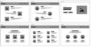
Designing a good website that accommodates a lot of content is a tricky balancing act to pull off. Does one attempt to present the user with all the information
|
Smashing Perfect Sliders
Sliders, those moving images at the top of your homepage or other key pages, can be effective communication tools. They can also, when done badly, drive traffic into the night.
This Smashing Magazine "Perfect Slider" tutorial helps define when sliders are a good idea and how to execute them for conversion, not aversion.
Do Graphic Designers Need Code School? Web design is, like most things, in the middle of an intense revolution. As the backend or reading and writing content to databases continue to move toward the front end of pretty pictures customers see and interact with designers will be tempted to attend a "code school".
Before you pay thousands in tuition to upgrade skills you may need to upgrade read this Curagami post first: http://www.curagami.com/code-schools-will-they-change-your-life/
Wireframing Is A Pain But Less So
Wireframing, the act of prototyping web designs before writing code, is a pain. Less of a pain with these 10 wireframing tools all new to us.
AI & UX and UI Mobile isn't everything it is the only thing at least as far as data architecture and design goes. The "mobile first" movement didn't go nearly far enough.
Mobile first means thinking about and changing how we think about User Interface design. As we're thinking about design we need to layer artificial intelligence (AI) in too.
AI impacts the sentient nature of the conversation between customers, websites and robots. Robots not of the Skynet variety but crawlers determined to understand, share, and search.
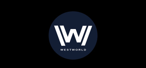
Web Design Lessons from Westworld This Curagami post shares Five Content Marketing Lessons from HBO's Westworld such as:
- Show Don't Tell
- Tease Never Bore
- Beauty is half the Battle
- Believe and MOVE
- Create Another Loop
http://www.curagami.com/content-marketing-five-lessons-from-hbo-westworld/
Lessons don't end there. HBO's Westworld uses design in ways web developers and designers should steal including:
- Design should speak to and deepen your story lines
- There is not half measures in design, all in or nothing
- Create space around your designs, don't overwhelm
- A few little things done very well often work better than many things done poorly
Design & Web Stories Websites must tell stories, stories consistent with and supporting brands represented. Look at the examples in our YouTube video (https://youtu.be/IC4KHAIZKWM ) and particularly REI.com for ways to blend your brand's message and site design.
No Half Measures You either believe in your designs, copy, website and brand or you don't. There are no half measures online. Half measures are like fear. Visitors can smell fear and know when they are being manipulated. Every webpage is s statement and you either believe in what you are doing or you don't. See the Red Bull example in the video for the impact BELIEF can have on marketing and movement creation.
Space
Great Designs need SPACE to breathe. White space may be the most important part of web design few think about. In our rush to crowd everything in we violate HBO's brilliant use of space, time and an unhurried process. HBO isn't trying to overwhelm or flood us into submission. HBO would rather create one incomplete thread after another and leave them and us hanging. Space is confidence. When you're confident in your product, brand or site you do what you believe and learn from every interaction. When you keep throwing things at customers hoping they will comply, they never do btw, your marketing looks chaotic and confusing. Confused customers do many things buying and advocating are rarely among them.
Brilliant Little Things
Have you noticed how DARK the Westworld lab is? If you're wondering why Westworld's titles are so amazing look no further than the dark lab. Creating the CGI needed to have a cool lab is expensive. Better to create a great title sequence and leave the lab a little seedy and rundown since doing so saves money and helps the plot.
Websites can't look "seedy" so much these days, but they can do a few things brilliantly and let the credit spread. When asked how teams I've managed made over $30M in online sales I often explain it was what we DIDN'T do that mattered most.
The list of things we needed to do was always infinite, so we were strict in the very few things we did and could do. HBO proves the point. Spending millions on the lab would rob the show of it's seedy underbelly. Better to create a great title sequence with a few brilliant pieces like the robot dipper and the "world overview" than try and do it all.
Find our Content Marketing tips from Westworld on Curagami:
Web Design Tips - Image FIles
The questions we ask are often wrong on their face. In this case a website owner was asking how best to put the detailed image of rug, pillows and sofa on their website. The answer is they shouldn't.
The detailis so HEAVY it will need a jpeg or compressed file to look good and NOT slow down page load times. The text on the right is the real problem. When you use jpegs text looks horrible because the compression makes everything fuzzy.
The human eye doesn't notice fuzzy in the rug and pillows, but in things we're trying to read fuzzy sucks. That is why this image shouldn't be loaded to any website. An image of the rug, pillows and sofa can be loaded as a jpeg and the text should be written in with a Cascading Style Sheet (CSS).
CSS will write the text into the html and so be readable. At this point designing with CSS is so common anyone asking for money to design a website should be able to create a layer with the text in it. The little point might be a tad tricky, but not so tricky most designers shouldn't be able to handle it.
The serif font is a whole other issue (lol), but the answer to how to put this image up is already wrong. This image shouldn't go up to the web as we explain on Stack Exchange.
.
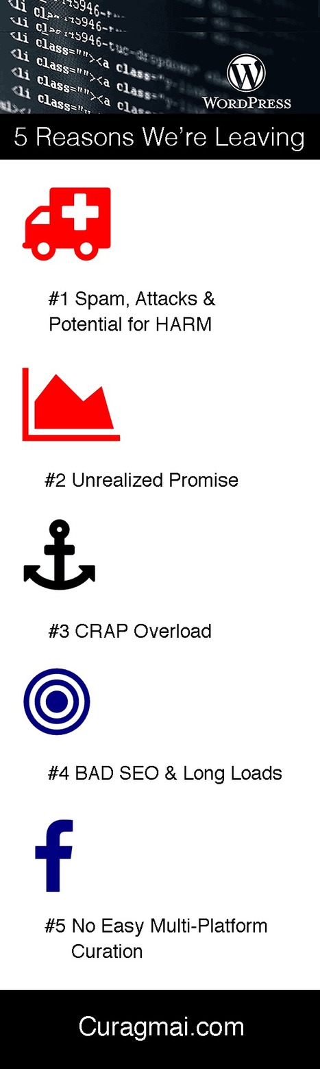
Web Designers Beware
If you can make Wordpress sing like a fine violin we applaud you. We're leaving Wordpress because it's promise of publishing well-designed content to the web feels false, spoiled and crushed.
Crushed under the weight of battling plugins, poorly supported themes and the false belief that beautiful design beats SEO basics (like not putting a rat;s nest of code into your HEAD). Ugly and Google friendly gets more traffic than beautiful and Google nasty.
We've proven the point. Our ugly Blogger site (Scenttrail Marketing started in 2008) had 100,000 visitors. Curagmai.com looks great, but Wordpress is crushing us for 5 reasons:
* Spam, Attacks and Potential for HARM * Unrealized Promise
* Crap Overload * BAD SEO and poor site performance (load times)
* No Easy Multi-Platform Content Curation
Let's Compare to @Scoop.it where we've spent LESS TIME to get more results including:
45,000+ followers
276,000 Views
204,000 visitors
95,000 reactions
WINNER = Scoop.it (as you can read on our Curagmai post). And the horse race isn't even CLOSE!!!
When we started using WP six years ago the platform was full of promise. But there is a problem. Ugly and Google friendly gets more traffic than beautiful and Google nasty. That sentence is worth repeating. If you are a designer who can make WP sing don't forget the ultimate goal - creation of RETURN for your customers.
Beauty and great design is ONE ASPECT of creating online ROI. Make sure your WP designs overcome the 5 reasons we are leaving, out, history, see ya :). Marty
Ugly and Google friendly gets more traffic than beautiful and Google nasty.
Our Bendy Future
Flexible Screen Smartphones Future UI Implications brainstorms implications of bendy screen technology sharing a FastCodeDesign.com riff, short video and brainstorm of User Interface (UI) implications.
Marty Note - Great Lesson In User Interface
The user interface is the great overlooked design element. Overlooked because lousy UI can literally cost millions or worse. Tick off today's mobile empowered surfers and they may make letting their friends know how bad your site sucks their mission for the day.
Eduardo is fixing what is becoming a favorite tool - Feedly. Feedly is how I discover content now their current UI notwithstanding (it is bad). Eduardo's full share tells everything he and Feedly are thinking. Much of it is brilliant and should be copied.
His post was so inspiring I had to weigh in leaving a comment about not presuming too much how I / we use their tool. Best to ASK FOR HELP :).
Burn Down Your Website
As we noted on G+ (Inevitable Lightness of Being) websites are a tyranny few will be able to afford soon. Let's follow the rules of improvisation (always a good web marketing idea) and say, "Yes, and" to the issue of burning down your website. What are the web design implications of embracing the next generation of consumer marketing?
* Build for Curation Not Creation * Remember about THEM (customers) not you so build community in
* FAST, FLAT and FURIOUS
* Don't forget profiles, timelines and shares
* Read behavior THEN create the page (i.e. More Google-like)
Curation Not Creation
Friends @Scoop.itsuch as @Guillaume Decugisand @Marc Rougierare sitting in the cat bird seat. After the latest Google changes, and the last time we will know when Google makes algorithm changes, the curate don't create rule is strong.
Strong because you can't afford to put content on owned properties that isn't insanely great. In a world where the NY Times gets gigged for poorly supported content you need to test BEFORE you write.
Scoop.it is our favorite, "Test before you write" tool. Content curation is more democratic tool. Nothing like finding a cool post, sharing it and explaining why you think it is cool with rich snippets to create relationships. Doubt that? I have 45,300 followers on Scoop.it. Curate don't create and build your next site to make your curation easy, sticky and shareable.
Them Not You
One of the wooden stakes in the heart of tactical web development is it assumes too much control for the creators. As a creator I can attest where the power lives - THEM (your customers) not you. Your future web development needs to build community, make your curation of your user's content, the User Generated Content (UGC) every web miner needs to win today. If you don't have a plan to create user profiles, timelines and following better get one.
Fast, Flat and Furious (in Real Time)
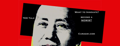
If you haven't watched Joi Ito's TED talk about Nowism do so. The web only has one time - NOW. We've noticed anything we do, share, or create close to NOW does better. Figure the need to share and have content pinging (updating and being shared) constantly will be a huge need in tomorrow's web development.
Building flat and fast sites influenced by mobile's less is more philosophy is highly recommend. If your dropdowns are War and Peace novels you need to reconsider. EASY, simple and beautiful works better in a mobile, connected, and FAST world.
Profiles & More
Changing your role from creator to curator opens your thinking. If your site is about what THEY (your customers) do with it include them in your web design. Create profiles, timelines and make it easy for your customers to speak to and interact with each other.
Gamified and Predictive
No one gives things for long without reinforcement. We agree with Daniel Pink's great book Drive. Paying = jobs. Don't pay money, but do find ways to share your legitimacy.
Share your position and site and your community will help build it. Make sure to curate too. When you find great content THEY (customers) gave you, share and elevate the example everyone learns.
5 Super Secret Marketing Trends
One of the "Super Secret" Marketing Trends we see for 2016 is Nowism. As defined brilliantly in a TED Talk by Joi Ito (embedded in the post) Nowist plan less and react more. Nowist look to the web to provide the collaborative means to react to what is happening now.
Nowism brings several important design considerations including:
* Incorporation of Social Media Feeds * More space for Content Curation * More flexibility and less rigid and static boxes * More movement and change throughout a site
When something BIG happens and a web design looks and feels the same the sit steps away from the now. One of http://www.Moon-Audio.com major partners is about to launch an earth shatteing new product.
Moon's site needs to have the ability to curate, create and spin content about this innovation fast and furious. The more your content marketing and website live in the now the stronger its relationship with your customers.
See the other 4 Super Secret Marketing Trends for 2016 here:
http://www.curagami.com/5-super-secret-marketing-trends/?v=7516fd43adaa
Contests Landing Page Design
How Design Magazine believes in the power of contests. They have a logo, poster or print contest just about every day. Just look at their well designed landing page sharing their current contests to know how much they believe tapping into the User Generated Content wave is valuable.
|


Great post for any web or graphic designer to read.