Must Design
75.5K views | +0 today
Follow
Must Design
Design Is Revolutionary
Your new post is loading...
Scooped by Martin (Marty) Smith
Scoop.it!

13 Whitespace in Web Design Examples Inspire

13 Whitespace in Web Design Examples Inspire | Must Design | Scoop.it
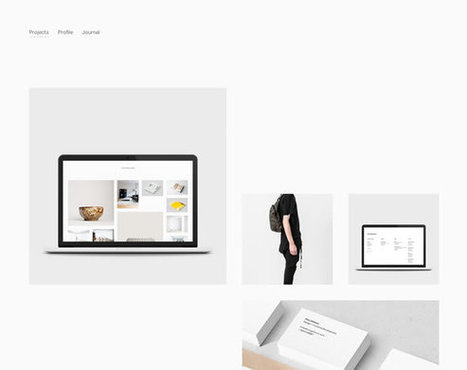
There are a many aspects of good web design, and whitespace is certainly one of them. Whitespace is the empty space around design elements such as images, text,
Martin (Marty) Smith's insight:

White space can be the most defining design element of any website. Hard to use well though. Here are 13 examples of how to use whitespace in your website designs.

No comment yet.
Scooped by Martin (Marty) Smith
Scoop.it!

Top 8 Web Design Tips [Marty Note]

Top 8 Web Design Tips [Marty Note] | Must Design | Scoop.it

Solid tips here with the exception of #4 and #6. My note explains why Internet type is more tricky than the tip in this post explains and why full screen photos should only be used by the most skilled. 

Martin (Marty) Smith's insight:

Top 10 Minus 2
This is an excellent post, but I removed two of the top 10 tips. I removed #4 Type because it isn't clear. Unique type in an image is fine since you know how it will render. Unique type in body text can be a disaster because you don't know how it will render.

The Internet is a billion computers all with different setups for type. When you render an exotic type in HTML text the receiving computer must have that same exotic type or it renders as a more common type (Arial, Veranda).

Let's call this "type roulette" and it is to be avoided. Exotic type in .JPGs or .PNGs or .GIFs (best format for type only images) render exactly as you see them. Type in body text is dependent on the receiving device so I tend to use non-serif universal type (easier to read non-serif type online).

There are ways to select how your type will render when it isn't available on the receiving computer, but I don't like the variability of playing font roulette. Type plays an important but floating point role in website design. I pick a type that will WORK, look pretty much the same on all receiving computers and be easy to read. Don't play font roulette.

I also removed #6 - Drop In Full Screen Photos
Yes this idea can be done well, but your designer better be VERY good. I prefer lots of white space on a website design. White space creates spacing and so highlights design elements NEXT to it. Strange to think of creating highlights by using negative space, but if you think of every great picture or painting you love there is always the use of negative space.

Warhol was famous for using BLACK to create his negative space. Great photographers such as Annie Leibovitz frame negative space in like huge arrows getting your eyes to go where they want them.

You may be the one in 100 designer who can use full screen photos and still create design tension and navigational hierarchy, but odds are better to say USE WHITE SPACE than full screen photos.

No comment yet.