Must Design
75.5K views | +0 today
Must Design
Design Is Revolutionary
Your new post is loading...
Scooped by Martin (Marty) Smith
Scoop.it!

Picasso At The Beach and The NEW Art of Web Design

Picasso At The Beach and The NEW Art of Web Design | Must Design | Scoop.it

PicassoHead App
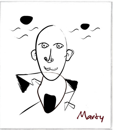
Sharing this cool "draw a "Picasso Head" app (my PicassoHead http://www.picassohead.com/?id=5290a28#.VBCfth1bqjo.twitter ) to illustrate a few of our favorite web design concepts such as:

* DO LESS and let them DO MORE (them = customers, visitors, advocates_.
* GALLERIES ROCK - especially when your gallery is chock a block full of User Generated Content (UGC).
* Engagement Rocks - do you have a tool that is fun to use AND promotes positive site heuristics such as time on site, pages viewed, lower bounce?
* Every product, idea or website starts about the creators and must become about those who visit and love it.
* People love what THEY create and contribute more than what you do.
* This means all web design is or will be about collaboration.

We love the simplicity of this little app, but the even COOLER riff came from our confirming email. This is the email that shares the link where my Picasso At The Beach drawing lives (linked from this post http://www.picassohead.com/?id=5290a28#.VBCSuy4Lksk.twitter ) and where this little pitch lived:

"This summer check out Picasso Looks at Degas at the Clark in Williamstown, MA. You won’t want to miss this groundbreaking, Clark-exclusive exhibition that is the first to look at Pablo Picasso’s deep fascination with Edgar Degas.

http://www.clarkart.edu/exhibitions/picasso-degas/ "

Wow, cool idea. Create a little art based app and sell related links in the confirmation email. That's brilliant marketing, subtle marketing and the art of web design. Kudos to Picassohead creators RFI Studios, http://www.rfistudios.com.

#toogood


Martin (Marty) Smith's insight:

add your insight...


No comment yet.
Scooped by Martin (Marty) Smith
Scoop.it!

What Is A MacGuffin & Why Web Design Needs To Include Them - Curatti

What Is A MacGuffin & Why Web Design Needs To Include Them - Curatti | Must Design | Scoop.it
MacGuffins are plot devices in films & conventional web design "best practices" that hurt more in absence than presence helps. How to design for MacGuffins.
Martin (Marty) Smith's insight:

Website MacGuffins include Free Shipping, Satisfaction Guarantees and email subscription boxes. Important to know what has reached "MacGuffin" status in your business. This post explains what a MacGuffin is and how to design for yours.

No comment yet.
Scooped by Martin (Marty) Smith
Scoop.it!

Imagine There Are No "Websites", Now Create A Website - David Merrill & Siftables

Imagine There Are No "Websites", Now Create A Website - David Merrill & Siftables | Must Design | Scoop.it

Websites Are Dead Men Walking
At our Startup Factory Funded startup Curagami (http://www.Curagami.com) we've been thinking about the end of tactical marketing. When we were helping The Man make millions online we could do so with TACTICS.

When our team was 2% better at SEO, PPC or email marketing we made millions. "Catch up" time, the time it took competitors to zero out the tactical advantage, took a long time. Sometimes we had YEARS on tactics such as content marketing.

We started content marketing in 2003 and NO ONE CARED until about 2010 / 2011. Oh, our traffic, the traffic that comes from Google, is related to our content. Whoops, okay NOW we care.

As websites become more mission critical in all companies the time an elite priesthood can have a tactic to themselves is shrinking fast. Now extend our thinking about tactics and you begin to understand why the web of boxes, borders and "sites" is so OVER.

As social media scales our loyalty is increasingly to EACH OTHER. Think of how your life changes as your personal network scales:

* Search less, ask more (ask friends, followers and friends of friends).
* Consume less, collaborate more.
* Understand MORE & FASTER.
* Curate More Than Create.
* Engineer, Quant and Artist.


NOW, imagine how you DESIGN a non-website website. Here are some things you will need:

* ASKS are legitimate ONLY in a sea of legitimacy (create that).
* Collaboration depends on EASE and TRUST (get those).

* Images, Copy, Navigation & Social ARE THE SAME THING.
* Leave ROOM for their notes (user generated content).
* Curate more than you create.
* Create Siftable-like "blocks" & relate them to each other & US.

That last bullet is where artist (web designers), engineers (programmers) and quants (data analysts) collide to create an artistic experience capable of correcting itself via flexible business rules and "on call" creative.

Now imagine how to TEST in such a dynamic POOL of content, curation and near real time reactions (thanks to the social / mobile web). Today we test and validate conclusions. The orange add to cart button beats the green button.

Tomorrow we test POSSIBILITIES. Once we test "possible" Multivariate testing wins. Once MVT testing wins you MUST mashup a cross functional team (designers, quants, marketing) because A/B testing will be to static and yesterday's news.


What about you? What do you think is next in web design?


No comment yet.
Scooped by Martin (Marty) Smith
Scoop.it!

Make Web Designs Welcoming Don't Say Welcome via @Scenttrail [Before and After graphic]

Make Web Designs Welcoming Don't Say Welcome via @Scenttrail [Before and After graphic] | Must Design | Scoop.it

Working with a team at UNC Emergency Room trying to make their website more engaging. As the BEFORE (on the right) image shows their current site "talks to itself about itself". Ways to fix that include:

* Hero image that heeds the sight line rule.
* Clear Calls To Action.
* Move Social from bottom left to upper right.
* Prominent Join Our List subscription form.
* Curate Customer / Patient content in (coming soon).

Your visitors' eyes follow the eyes of people in your photos. The image son the right show what NOT to do - make images that look like they are self referential. Never have people in an image on your site talking among themselves. Nothing says "we don't care about you" louder than images that are either too "smart", "exclusionary" or busy.

If people in your images don't look at the camera have their site lines pint to a Call To Action. Don't create ideas that are exclusionary either such as Leading, Teaching and Caring. That sounds like "selfspeak" to me.

OR, if you must have "selfspeak" then shore it with icons the way the UNC design lead did and use those icons to begin a conversation not a lecture about each of those ideas.

I LOVE text on a homepage for SEO, but it can be very exclusionary as the BEFORE image on the right proves. Tease the read with a few sentences and a "read more". BTW, the only time I use Read More CTAs is when I've teased something.

I prefer "learn more" since it feels more like we are learning together and less like work. Use closed loop CTAs when you are completing a proised action. All other times use CTAs that are more creative and fun.

The next step for this design, and the one that will make it really welcoming, is to curate in User Generated Content (UGC). When you include your customers (or patients in this case0=) you break down the THEM vs. US walls better than anything I can think of. Important to break down those walls since you need UGC and social shares to survive these days even if your have a .edu in your URL.

No comment yet.