 Your new post is loading...
Smashing Perfect Sliders
Sliders, those moving images at the top of your homepage or other key pages, can be effective communication tools. They can also, when done badly, drive traffic into the night.
This Smashing Magazine "Perfect Slider" tutorial helps define when sliders are a good idea and how to execute them for conversion, not aversion.
Web Design Lessons from Westworld This Curagami post shares Five Content Marketing Lessons from HBO's Westworld such as:
- Show Don't Tell
- Tease Never Bore
- Beauty is half the Battle
- Believe and MOVE
- Create Another Loop
http://www.curagami.com/content-marketing-five-lessons-from-hbo-westworld/
Lessons don't end there. HBO's Westworld uses design in ways web developers and designers should steal including:
- Design should speak to and deepen your story lines
- There is not half measures in design, all in or nothing
- Create space around your designs, don't overwhelm
- A few little things done very well often work better than many things done poorly
Design & Web Stories Websites must tell stories, stories consistent with and supporting brands represented. Look at the examples in our YouTube video (https://youtu.be/IC4KHAIZKWM ) and particularly REI.com for ways to blend your brand's message and site design.
No Half Measures You either believe in your designs, copy, website and brand or you don't. There are no half measures online. Half measures are like fear. Visitors can smell fear and know when they are being manipulated. Every webpage is s statement and you either believe in what you are doing or you don't. See the Red Bull example in the video for the impact BELIEF can have on marketing and movement creation.
Space
Great Designs need SPACE to breathe. White space may be the most important part of web design few think about. In our rush to crowd everything in we violate HBO's brilliant use of space, time and an unhurried process. HBO isn't trying to overwhelm or flood us into submission. HBO would rather create one incomplete thread after another and leave them and us hanging. Space is confidence. When you're confident in your product, brand or site you do what you believe and learn from every interaction. When you keep throwing things at customers hoping they will comply, they never do btw, your marketing looks chaotic and confusing. Confused customers do many things buying and advocating are rarely among them.
Brilliant Little Things
Have you noticed how DARK the Westworld lab is? If you're wondering why Westworld's titles are so amazing look no further than the dark lab. Creating the CGI needed to have a cool lab is expensive. Better to create a great title sequence and leave the lab a little seedy and rundown since doing so saves money and helps the plot.
Websites can't look "seedy" so much these days, but they can do a few things brilliantly and let the credit spread. When asked how teams I've managed made over $30M in online sales I often explain it was what we DIDN'T do that mattered most.
The list of things we needed to do was always infinite, so we were strict in the very few things we did and could do. HBO proves the point. Spending millions on the lab would rob the show of it's seedy underbelly. Better to create a great title sequence with a few brilliant pieces like the robot dipper and the "world overview" than try and do it all.
Find our Content Marketing tips from Westworld on Curagami:
MoMA's Store Rocks
Wow, I don't usually think of museums as sources of ecommerce inspiration and learning, but the Museum of Modern Art (MoMA) has a special team you can learn a lot from. MoMA's team excels at ecommerce blocking and tackling such as:
- Great email followups (abandon cart, push emails)
- Great promotion schedule understands DEADLINES and web's constant NOW
- Easy to understand and use navigation
- Great clean lines and images
- Tells great visual stories
Best ways to make money online is to excel at the basics. MoMA doesn't stop there they excel at advanced ecommerce ideas too such as: - Bundled and "this = that" merchandising
- Developing exclusive products and bundles
- Email marketing
MoMA's backend could be better. They take too long to ship, but once their products arrive they are packed carefully and with a sense of how special the order is / was. If you want to learn ecommerce you should follow and visit the Museum of Modern Art.
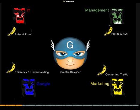
Web Designer SEO
Our SEO Tips for Web Designers hit a nerve. It is heading to 13,000 views (probably today). We hit a nerve because web Designers are where SEO rubber meets the road. This Haiku Deck is full of SEO tips for web designer including:
* Know who has the banana and why.
* Know how much SEO you need to know. * Learn what is MIST vs what is Gorilla.
* Listen Digitally.
* Understand how SEO & Content marketing work together. * Design to Win Hearts, Minds and Loyalty.
And More SEO tips designed for designers.
HOW art director Adam Ladd shows us 10 more of the top design websites, many of which are sure to give you the graphic design inspiration you crave.
When I think of responsive web design I think of Transformers: Websites in Disguise. With one set of code you can build a website layout that runs flexibly...
Marty Note
Yesterday we shared thoughts on the marketing side of responsive web design along with some design basics. Responsive design creates a flexible membrane adapting itself to any receiving device.
Creating responsive design is INVOLVED. You can trash your SEO (Search Engine Marketing) without really knowing it, confuse your web designers and customers and do more damage than good.
I like this Jake Rocheleau "ultimate guide' because its a natural part 2 to yesterday's responsive basics (http://sco.lt/4ob6DR ). Responsive design is a MUST, but, as you will agree after reading Jake's Ultimate Guide, not to be undertaken lightly or without some reading about what is happening under the covers.
Great job by Jake and V
Marty Note
Watching the excellent HBO Documentary about James Brown Mr. Dynamite made me think of FUNK and web design. Web design is easy to get WRONG (lol).
It is tricky to design online with a sense of surprise, beauty and novelty. I like the Digital Invaders design as it feels free and spontaneous. Other designs such as Monster CSS and Creative With A K feel like they are trying to appear spontaneous and free.
Trying too hard is EASY in web design too. Remember all websites are STAGES we designers SET. The trick is to set a stage that feels like it is happening now and won't feel dated tomorrow. Feels like there are enough visual hooks in Digital Invaders it would be easy to keep it fresh with minimum fuss.
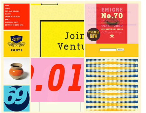
I like Emigre too. Emigre creates the same sense of happening now but that design is at the other end of the spectrum from Digital Invaders. Its hard to beat the grid. First website I created, in 1999, used a Mondrian grid.
Grids help organize massive amounts of information without that mountain feeling like it is about to crush you. I like the funky NOISE contrasted to the quiet grid because they demonstrate the need to find a visual VOICE in your web design. That voice can be anything as long as it feels authentic TO YOU.
The web is very good at finding and amplifying DISSONANCE. When you try to FUNK IT UP and aren't really funky it shows like you are wearing the wrong decades fashion (painful). Your customers are your audience.Set the stage anyway you want, but do so with an eye toward YOUR TRUTH.
The closer you stay on the tiny beam of "authentically us" the more success your web design has. This is why there are no web design maxims that apply all the time. What works for Emigre is very different than Digital Invaders but both work, both are authentic and have that hard to describe but know it when you see it TRUTH great web design must have.
Angela Jones, a freelance designer in St. Charles, Illinois, uncovers how 7 websites promote their products in exciting ways.
Marty Note - Great From Boring
Loved this post, but they bury the lead. Their tips aren't sub-heads but buried in the copy about the example. I liberated their 5 tips to create exciting sites for boring products:
* Employ imagery and icons that speak to the benefits (i.e. tell a story and match with cool visuals).
* Focus on HEADLINES that describe your benefits (i.e. use trusted sources and let THEM tell your story).
* Write creative copy (there are NO BORING PRODUCTS only boring stories lol).
* Minimal and easy to navigate (always a winner in my book too, but especially if what you are selling is boring. YES I will spend 3x the time it should have taken to order the new iPhone despite the horrible web design, your product...not so much, so make it easy to buy.)
* Create Community & Let THEM (your customers) supply the amazing stories. When YOU tell your brand's story it is always more boring than the same words from a customer.
* VISUALS - boring products benefit from great visuals. Tilt your boring product, hang it from the rafters, find a way to depict excitement and excitement flows downstream to your product.
How strong is your content marketing strategy? What is SEO, anyway? Read 6 SEO tips and tricks to help you boost the visibility of your web content.
1. Strong Copy Trumps SEO.
2. Do Keyword Research.
3. Share Link Love (i.e. create great content).
Marty Note
Interesting to see how How Design explains SEO to graphic designers. I would take a slightly different tack. Let's reframe SEO in ways graphic designers can understand and adapt.
I create content daily and am learning SLOWLY how to make headlines sing and links flow in. As competition for links goes UP with the rising tide of content publishers are the right side of the bell curve where more than average links reside will learn a few tricks from graphic designers such as:
* ARRESTING Images.
* Demand hierarchy.
* Clear Calls To Action (CTAs).
* Headlines that GRAB and HOLD.
Content that doesn't get read doesn't help. The first rule of getting your content read is find an ARRESTING related image you won't get sued to use. Haiku Deck (http://www.haikudeck.com) is one of my favorite visual marketing tools. Need lawsuit free arresting images? Use Haiku Deck.
Demand Hierarchy is keeping demands on your visitors LOW. When I was a Director of Ecommerce we did extensive analysis of our 40+ homepage links and 5 mattered. Vicious 90%/10% rule in links. Key is to lower choice and eliminate the superfluous.
CTAs don't have to be "buy now" anymore. We love asking a question with the link between the present page and the answer. Want To Be A Great Internet Marketer? Highlight and underline that sentence and it will get clicked because it is an IMPLIED CTA.
This doesn't mean we are above a good "Learn More", but too many "old style" CTAs can get boring and lose their punch.
Finally your HEADLINE or subheads matter. Headlines should set a hook. Subheads should organize the answer so readers can scan and skip sections. I try to live by the 7 word rule.
I read this rule about roadside billboards. Billboard creators limit their copy to 7 words because who can read more zipping buy at 60 mph. We all zip by at 100 mph on the web these days so short, punchy headlines that align with your arresting image and plant a hook work best.
We like KEYWORDS, Brands and questions in headlines too. Questions create curiosity. Keywords create scenttrail and brands create comfort and "like me" feelings of trust and security.
Designing For Contests
I love home Homes.com doesn't kid around. They create CONTESTS not CONTENT. Why? Because contests have the added value of helping to create community too.
Erica Campbell Byrum How To Create Contests Video (start at 1:41)
http://sco.lt/6myquH VIDEO
Contest and games are FAVORITE engagement tactics because:
* They work (more new people come to play and share their playing).
* They are inexpensive WINNING is the main thing not the prizes.
* Contests have a LONG shelf life.
* Contests help unearth power Contributors and Social Supporters.
That last bullet speaks to the Gladwellian "Mavens, Salespeople and Connectors" tribes within your visitors. When you create a contest you will be visited by "contest trolls" and Ms. Byrum discusses how to deal with them in her video (link above).
This link is to Homes.com's Contest Page. This is a "Contest Splash" Page that shares the many simultaneous contests they run. I would add an ask for their "Blogger Ambassadors Program" too. They use contests to unearth their bloggers, but why not cut out the middle man and ask for those Ambassadors straight out?
Doesn't hurt to do both and I like have a page that explains the elite nature of our "buzz team". Don't think I'm saying Homes.com is missing it. They clearly GET the value of contests and you should STEAL the "ditch digging" design they do to "Splash Page" their contests.
Highly recommend watching Ms. Byrum too as her video is nothing if not comprehensive http://sco.lt/6myquH
25 Great Web Design Tips From Forbes 1. The 5 Second Rule **
2. Proper Messaging 3. Call to Action **
4. Building Trust 5. Keep it Fresh 6. Incorporating Social Media
7. Don’t Make Me Think **
8. Web 2.0 – It’s About the User’s Needs, Not About You 9. Video **
10. Don’t Reinvent The Wheel 11. Don’t Fall Behind – Your Competitors Will Beat You 12. Security 13. Start with SEO in Mind **
14. Avoid Long Page Forms
15. Don’t Make Me Squint 16. Be an Industry Leader 17. It’s No Longer Just About the Desktop 18. Don’t Attempt to Target Everyone 19. Monitor Site Performance 20. It’s Web Pages, Not Websites That Rank 21. Your Website is a Component of Marketing 22. Good websites grow businesses. 23. Flash is dead. 24. Respect text. 25. Future requires wearable tech integration.
All 25 are great web design tips. Our favorite 5 are highlighted in bold.
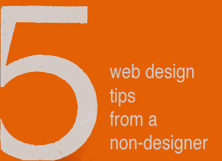
5 Web Design Ideas From A Non-Designer
Graphic Designers ROCK
I have more than tremendous respect and admiration for graphic designers. The ability to use tools like Photoshop and Illustrator to create MAGIC is something I will always envy. I know enough to know just how magical those skills truly are, so thank you.
I would LOVE to convince gifted visual marketers of the need to fix five mistakes I see over and over, mistakes that can HARM a websites bottom line and ability to scale.
I confess to making some of these mistakes myself. Easy to do when caught up in the NEW chase. I got so I printed out this list and keep it in view so it smacks me as a reminder while creating ideas for a new design.
Despite the list being omnipresent I forgot a subscription option on CrowdFunde.com two months ago, so EASY to forget these ideas:
** Email Subscription
Any websites lifeline is the LIST of supporters and subscribers they OWN. If Google changes their algorithm and PPC goes bankrupt you can always may your own list, so making sure the ability to opt in to that list is omnipresent is a CSF (Critical Success Factor).
** Keywords In Category Names
Think, "Do we want to win that keyword," when reviewing your navigation. You may select to have your URLs rewritten to be more keyword specific, but those internal links play an important role with Google's spider and SEO so KEYWORDS are a must.
** Research Keywords
My CrowdFunde co-founder Phil Buckley asked me if I thought attorneys or lawyers would be the most searched term. "Lawyers," I answered confidently knowing I was wrong (you never win these who will win questions lol). Attorneys is the winner and by a large margin. Don't write copy to what you THINK when it is so easy to do a little research and KNOW.
** The Tricky Part To Web Analytics
Here's the rub to web metrics. They operate in a constant seesaw dance with one another. Attorneys may be the most searched, but maybe that is because the Mass Tort guys have crushed the deck in some way (have no knowledge of that only using it as an example so please don't sue me lol). When you DESIGN with numbers you design better, but be sure to ask your SEO contact where the rubs are in the numbers. Rubs are numbers that LOOK one way but actually ARE another. Trust me you NEVER want to spend the kind of time in Google Analytics knowing where the rubs are requires, so ask.
** 80/20 Rule
One Internet marketing FRACTAL we discovered is 20% of the links, traffic, pages always get 80% or more of the value. Your job is to build a flexible framework so when your managing team SEES the emerging 80/20 rule you can easily shift the presentation to favor the 20 over the 80.
Now please take these practical, money making ideas and make them beautiful and THANK YOU for your dedication to BEAUTY in design and life :). Marty
Fantastic Video Website Designs for Inspiration. Selection of Awwwards winning video websites. Video is widely used in today's web design. Video is one of the most powerful tools of visual communication.
Video Online is Harder Than It Looks
These award winning video demonstrate a clear truth - creating a great video experience online is TOUGH. My favorite of all of these examples is Dick's Sporting Goods baseball videos. I like the visual storytelling of the Dick's videos.
I have a real feel for "being there" with Dick's. Problem is as Dicks makes the turn toward home and starts down the positions they lose me. They might lose a die hard baseball person less, but Dick's demonstrates some of video marketing's strengths and liabilities:
Strengths
* Can tell a complex story simply and quickly.
* Holds attention better than reading.
* Creates more hooks to wind a story around.
Weaknesses
* Easy to lose your way from a script / production / website integration standpoint (watch that Keecker and tell me if you don't get a little creeped out too).
* We watch a lot of video, so expectations are HIGH for both production quality and story strength. * Video floats on top of websites more than it is actually part of them.
That last bullet in weaknesses is where the real design stress exists. How do we move back and forth between website and video without losing attention, being confusing or both losing attention and being confusing? Videos tend to dominate webpages.
When I was Director of Ecommerce we finally, after many tries, found a product page video size, style and length that significantly contributed to conversion. Problem is WE created those videos.
As we move into the User Generated Content social Media world of tomorrow we will need to create less and curate more. There is a way to create a web framework to support UGC videos and as soon as I see it I will be sure to share it (if you've seen a video website you think works WITH instead of against its videos please share).
|
Rock Mobile Or It Rocks You You want to be on the right side of the "mobile" revolution, but where is that exactly. This post shares critical information about screen size that will help your mobile design rock!
Burn Down Your Website
As we noted on G+ (Inevitable Lightness of Being) websites are a tyranny few will be able to afford soon. Let's follow the rules of improvisation (always a good web marketing idea) and say, "Yes, and" to the issue of burning down your website. What are the web design implications of embracing the next generation of consumer marketing?
* Build for Curation Not Creation * Remember about THEM (customers) not you so build community in
* FAST, FLAT and FURIOUS
* Don't forget profiles, timelines and shares
* Read behavior THEN create the page (i.e. More Google-like)
Curation Not Creation
Friends @Scoop.itsuch as @Guillaume Decugisand @Marc Rougierare sitting in the cat bird seat. After the latest Google changes, and the last time we will know when Google makes algorithm changes, the curate don't create rule is strong.
Strong because you can't afford to put content on owned properties that isn't insanely great. In a world where the NY Times gets gigged for poorly supported content you need to test BEFORE you write.
Scoop.it is our favorite, "Test before you write" tool. Content curation is more democratic tool. Nothing like finding a cool post, sharing it and explaining why you think it is cool with rich snippets to create relationships. Doubt that? I have 45,300 followers on Scoop.it. Curate don't create and build your next site to make your curation easy, sticky and shareable.
Them Not You
One of the wooden stakes in the heart of tactical web development is it assumes too much control for the creators. As a creator I can attest where the power lives - THEM (your customers) not you. Your future web development needs to build community, make your curation of your user's content, the User Generated Content (UGC) every web miner needs to win today. If you don't have a plan to create user profiles, timelines and following better get one.
Fast, Flat and Furious (in Real Time)
If you haven't watched Joi Ito's TED talk about Nowism do so. The web only has one time - NOW. We've noticed anything we do, share, or create close to NOW does better. Figure the need to share and have content pinging (updating and being shared) constantly will be a huge need in tomorrow's web development.
Building flat and fast sites influenced by mobile's less is more philosophy is highly recommend. If your dropdowns are War and Peace novels you need to reconsider. EASY, simple and beautiful works better in a mobile, connected, and FAST world.
Profiles & More
Changing your role from creator to curator opens your thinking. If your site is about what THEY (your customers) do with it include them in your web design. Create profiles, timelines and make it easy for your customers to speak to and interact with each other.
Gamified and Predictive
No one gives things for long without reinforcement. We agree with Daniel Pink's great book Drive. Paying = jobs. Don't pay money, but do find ways to share your legitimacy.
Share your position and site and your community will help build it. Make sure to curate too. When you find great content THEY (customers) gave you, share and elevate the example everyone learns.
17,162 People Later
We've been asked to make the presentation that created our most viewed Hiaku Deck again at the Iron Yard Code Academy again (made the first presentation six months ago). There were important ideas we shared last time:
* SEO THRIVES or DIES with graphic designers. * Graphic designers are heroes under siege by many groups. * Set REALISTIC expectations.
* Set reasonable boundaries (with gorillas looking for bananas).
* Shared a few easy to remember tips to help designers improve their technical SEO skills.
Obviously we hit a nerve. We will be updating benchmarks shared six months ago to see how those we mentioned fared since. Remember technical SEO is important, but your content must engage, be exciting (visually too) and develop sustainable online community to win over time.
Good luck and if you have SEO questions we didn't cover email them to martin(at)Curagami.com and we will include and send you a Curagami Rules tee.
In this article, Kendra Schaefer examines the things all web professionals should know before swan-diving into the Chinese market, including how mobile-only social platforms have become the revolutionary new frontier of Chinese web design, and who’s designing beautiful websites in China today.
Design Is Revolutionary
Don't have to be Steve Jobs to know design is revolutionary. Our Web Design Revolution feed on Scoop.it is one of our favorites. We love THINKING visual because most of us (save one poor CTO) are marketing geeks who visualize in our sleep.
If you visualize in your sleep consider contributing a Scoop or two or three to The Web Design Revolution in 2015. Several easy ways to contribute:
1. If you are on @Scoop.ituse the Suggest Feature. We appreciate all the great suggestions we've already received and promise a new focus on collaboration in 2015.
2. If you aren't on Scoop.it you are missing one of the best "do less, get more" tools we know, but you can still contribute ideas for stories we should include by:
email: martin(at)Curagami.com
Twitter: @Curagami
Call For Help NOW
Right now we are interested in creating a year-end mashup of all the web design predictions for 2015. If you have a favorite prognosticator and they write about what they think is going to happen in web design next year send us the link and we will mash your contribution up into a summary with early views going to contributors.
Thanks for a great year and hope you will contribute to The Revolution in 2015.
Responsive web design is the practice of creating websites that display evenly on all devices. Understand the basics of responsive web design with examples.
Marty Note
Don't make the common mistake of thinking responsive design is all about look and feel. Yes some WordPress templates can make it FEEL that way since they are built to accordian with different receptions created by phone, laptop and computers.
The important idea for marketers to understand is to THINK Mobile First. Thinking mobile first brings a slew of changes such as:
* Flat web design.
* Limited Colors.
* Less functionality that is easier to understand.
* Content snippets instead of novels.
* Emphasis on VISUAL MARKETING.
* Need to make content & communication feel & act like a game.
Those last bullets speak to the gamification of marketing so implied by smartphones and a mobile / social / connected world. Mobile means never having to say you're sorry because you listen and curate more than you talk, create sustaining community and engagement and understand all the implications of "the network is the computer".
Just shared an overview of Marketing Timelines on G+ (https://plus.google.com/102639884404823294558/posts/EkXN57uJyjq ). All that said, you still need to understand Responsive Design 101 so appreciate this Scoop.it suggestion from @David Fournier. .
Responsive Web Designs
Responsive design, forming a website's information so it looks great on any device, is becoming mission critical. Here are 65 of the best responsive designs in 2014 via SocialDriver.com.
Learn what to include in your website design before you build and find out the 10 ‘must-haves’ to drive more traffic to your site.
1. Incorporate Keywords. 2. Multiple points of contact. 3. Consistent branding. 4. Call To Actions.
5. EASY to read (font size, short paragraphs, bullet points).
6. EASY to navigate. 7. Important above fold. 8. Load time (faster is better). 9. Build credibility & trust. 10. Social
This article looks at some examples of interaction design in which smart interaction, defined by subtle animation, gently improves the user experience. We’ll share some lessons drawn from various models and analyze why these simple patterns work so well.
5 Quick Tips About Images & Web Design
Hard Won Lessons
I spent almost a million dollars of OPM (Other People's Money) learning these five lessons about images and web design, so lessons learned the hard way:
1. Portraits Are Powerful
Portrait images where the model looks directly at the camera, are powerful "welcoming" images great for home, about and category "splash" pages.
2. Babies are DYNAMITE - Use Carefully
Thanks to our ancient caveman brain we can't NOT look at babies. Problem is that is not a secret so babies are now overused to hock insurance, tires and shampoo. If you use a baby my preference is to have the baby looking AT something.
Visitors eyes go where the eyes of people (or babies) are looking, so point your baby image directly at an important Call-to-Action and bet your conversions go up.
3. People Talking To Each Other = DANGEROUS
There may be context where it makes sense for you to have an image where people in the image are huddled together, but I doubt it. If you have two people huddled and a third looking directly out at the camera the image works better.
We respect a huddle. We don't want to intrude, so your web image is working against your online marketing purpose. Your image says we are here having a conversation and YOU (visitor) aren't invited. Not a good idea.
4. People Sell Better Than Widgets, but...
I prefer to tell human stories even about the most widgety widget, but people bring "like me" problems too. Every visitor is looking for "like me" signals. If you know your archetype and tribe well enough to risk it use images of people consistent with your understanding.
If you have a wide variety of customers and members best to avoid single archetype "like me" images. This is yet another reason I like portraits. Portraits are "universal" meaning the welcoming look directly at the camera removes some of the "must be like me to engage" requirements.
5. In Action Shots Use The MOVEMENT
If your image is riding a bicycle POINT the movement at something important. I don't like movement images as heroes (largest images on a page is called a hero), but I love them in "sub-hero" images because movement creates excitement and allows me to direct the visitor's eyes where we want them to go.
Use these 5 hard won tips and your images won't fight your site's desire to connect, create community and convert visitors into buyers and members.
The color white is simple, elegant and peaceful and the use of this color is seen in lots of websites. Whether they're portfolios or online shops, people agree on...
Every web designer has a secret or two. Hard-won workflows, hidden hacks, and insider knowledge that are the mark of true experience and the stuff that separates great web design training from good. Here, we've managed to persuade some of the web's busiest devs and designers to part with their most closely guarded tricks and tips.
|


![Remarkable Websites For Boring Products: 5 Tips [Scenttrail Unburied Lead] | Must Design | Scoop.it](https://img.scoop.it/Dc6u-j_Bsc0wgLdAMa-H9Dl72eJkfbmt4t8yenImKBVvK0kTmF0xjctABnaLJIm9)


Great, comprehensive, and illustrated "perfect slider" tutorial from Smashing Magazine.