Must Design
75.5K views | +0 today
Follow
Must Design
Design Is Revolutionary
Your new post is loading...
Scooped by Martin (Marty) Smith
Scoop.it!

Design Thinking Matters Here Is Why via Curagami 

Design Thinking Matters Here Is Why via Curagami  | Must Design | Scoop.it

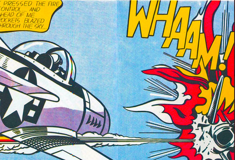
Wild Chaotic Humans Are Here
The chaotic jumble of idea, tests, humans, and designers is the tumult we’ve become, the discord and disorder we need. Every design promotes or diminishes conversations. There is no neutral. Standing still doesn’t exist anymore. You gain or lose every day with every design you publish, think about, or share. Passive consumers are gone. Wild, emotional humans are here. 

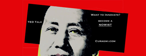
Discover Curagami's curated riff of an Interactive Design Institue post entitled What Is Design Thinking and Why Is It So Popular: https://www.curagami.com/design-thinking-matters-heres-why/

No comment yet.
Scooped by Martin (Marty) Smith
Scoop.it!

Nowism Design Implications via Curagami

Nowism Design Implications via Curagami | Must Design | Scoop.it

5 Super Secret Marketing Trends
One of the "Super Secret" Marketing Trends we see for 2016 is Nowism. As defined brilliantly in a TED Talk by Joi Ito (embedded in the post) Nowist plan less and react more. Nowist look to the web to provide the collaborative means to react to what is happening now.

Nowism brings several important design considerations including:

* Incorporation of Social Media Feeds

* More space for Content Curation 

* More flexibility and less rigid and static boxes

* More movement and change throughout a site


When something BIG happens and a web design looks and feels the same the sit steps away from the now. One of http://www.Moon-Audio.com major partners is about to launch an earth shatteing new product. 

Moon's site needs to have the ability to curate, create and spin content about this innovation fast and furious. The more your content marketing and website live in the now the stronger its relationship with your customers.

See the other 4 Super Secret Marketing Trends for 2016 here:

http://www.curagami.com/5-super-secret-marketing-trends/?v=7516fd43adaa 


No comment yet.
Scooped by Martin (Marty) Smith
Scoop.it!

Big Web Design Trends Happening Now via Creative Edge w/ @Scenttrail Notes

Big Web Design Trends Happening Now via Creative Edge w/ @Scenttrail Notes | Must Design | Scoop.it

We're boiling down 13 of the most prominent web design trends emerging in 2015. Will they change your understanding of a "modern website"? You be the judge.

Marty (@Scenttrail) Notes:

1. Make it big (Agree but not as easy to do well as they make it look).

2. The multimedia experience (agree and same as #1)

3. The Parallax effect mutations (Horizontal Scrolling) Agree

4. Animated storybook (Agree and cool).

5. Flat design (agree & effect of mobile)

6. No more boxes (Agree and YES!).

7. Tiles (Pinterest effect and agree).

8. Navigation widgets (Agree!)

9. Integrating Google maps (Agree where appropriate).

10. Mashup interfaces (AGREE grab those APIs :).

11. Minimize (Seems to contradict #1, but agree).

12. World Wide Wait (speed is going to be KEY).

13. Designer automation (Agree, can do a lot with templates now).

Scooped by Martin (Marty) Smith
Scoop.it!

Web Design Trends Sure To Rule 2015 - Designmodo & @tomaslau

Web Design Trends Sure To Rule 2015 - Designmodo & @tomaslau | Must Design | Scoop.it

In this post we will try to review the current status of web design scene and predict some trends for 2015.

Marty Note
Great summary of some "new to me" trends for next year such as video backgrounds and rise of website generators (still looking for a really good one of these, most suck).

Hope the stock photography and personal branding predictions come true.


No comment yet.
Suggested by Levent Cem Aydan
Scoop.it!

Top 15 Web Design Trends 2015 - via Toolyo Blog

Top 15 Web Design Trends 2015 - via Toolyo Blog | Must Design | Scoop.it
This article is written after a huge research about top web design trends for 2015. If you want to design an awesome website you should read this blog.
Martin (Marty) Smith's insight:

Just a few of the 2015 Web Design Trends discussed:

* Storytelling
* SVG Animations
* More Scrolling & Less Clicking
* Full Image / Video Backgrounds

Many more on this excellent 2015 Web Design Trends post from @Levent Cem Aydan

No comment yet.
Suggested by David Fournier
Scoop.it!

Web Design Trends 2015 [Infographic]

Web Design Trends 2015 [Infographic] | Must Design | Scoop.it
Explore the top web designing trends for 2015. The infographic discusses the top 6 predictions that are set to rule the web designing world in 2015.
Martin (Marty) Smith's insight:

Liked and agreed with all 6 of these 2015 Web Design Trends when I read the post without the infogfpahic. Infographic helps and I bet wil get more shares :). M

malek's curator insight, December 8, 2014 11:24 AM

I like“Card” design, no, it\s not new, but I find it a good tool for designers working on responsive websites. Cards are a great way to keep things modular

Scooped by Martin (Marty) Smith
Scoop.it!

Future Of Web Design: End Of Boxes & Borders via @HaikuDeck

Future Of Web Design: End Of Boxes & Borders via @HaikuDeck | Must Design | Scoop.it

Web Design
Cha Cha Changes are ahead for web design. Our social / mobile / connected world is blowing up our wireframes. and that's a good thing.

No comment yet.
Rescooped by Martin (Marty) Smith from Graphics Web Design & Development News
Scoop.it!

Conversations Scroll Visually: 3 HOT Web Design Trends:

Conversations Scroll Visually: 3 HOT Web Design Trends: | Must Design | Scoop.it

Check out the hottest web UI patterns used by Pinterest, Facebook, Twitter, Kickstarter, AirBnB, Tinder, and more.

Marty Note
This is a great web design scope full of examples and lots of good suggestions. At Curagami we are devoted to the conversations as The Next Ecom idea. Love the suggestion about conversational tone in forms.

Forms SUCK, but that doesn't mean you can ask for things in a MORE INTIMATE way than standard boring routine. The visual organization riff is evidence of a much larger tectonic shift - visual marketing is ruling the world.

Visual Marketing in a nutshell is...

1. GRAB attention with an arresting visual.
2. Tease a read with a great headline.
3. Snipit-ize your content so it daisy chains a series of "play list" like cliff hangers.
4. Move visitors to subscribers and buyers.

5. Create an ASK (such as Join our Ambassador Group).

6. Rinse and Repeat.


Via Jakarta Web Developer
Martin (Marty) Smith's insight:

add your insight...


No comment yet.
Scooped by Martin (Marty) Smith
Scoop.it!

70 Stunning Responsive Sites Inspire #responsive #webdesign

70 Stunning Responsive Sites Inspire #responsive #webdesign | Must Design | Scoop.it
Mobify is a mobile e-commerce optimization platform used by leading online retailers to deliver exceptional responsive shopping experiences.

Martin (Marty) Smith's insight:

Attending Search Exchange in Charlotte and MOBILE seems to be the dominant theme so here are 70 examples of responsive web design. On a laptop or desktop and want to see "responsive" design? Shrink your window and watch as the content adjusts to tablet and then phone size.

No comment yet.
Scooped by Martin (Marty) Smith
Scoop.it!

Time To Go Pageless? 8 Reasons Why Pageless Design is Future of Web Design

Time To Go Pageless? 8 Reasons Why Pageless Design is Future of Web Design | Must Design | Scoop.it

Pageless design frees websites from the outdated conventions of print design and fully utilizes the digital platform they’re built on. 

8 Compelling Reasons Why "Pageless' Web Design Wins (in the end):


* Tells a better story.

* Easier to "digest" or understand what to do.

* Emotionally more powerful.

* Higher Conversion Rates!!!
* Makes updating faster & easier.

* Lowers BOUNCE & encourages sharing.

* Looks great on all devices (mobile included).

* Lower cost to develop.

Marty Note
I confess to not being in love with the "infinite scroll" just yet. One modification we worked out for @Curagami, our Startup Factory funded startup, is to include a Call-To-Action at the top & Bottom.

CTAs help prepare the scroll. Remember "open book" tests? Putting a CTA on top of a waterfall of content helps prep a visitors mind. It "opens the book" for them. With this many impressive benefits I'm going to have to figure out how to start loving "pageless" design (lol).

I bet there are 5 (or so) similar modifications we can make to help us know how to create the paths and conversion we want by going "pageless".  

Scooped by Martin (Marty) Smith
Scoop.it!

Black and Blue Web Design Examples Inspire & Look Great on Smartphones

Black and Blue Web Design Examples Inspire & Look Great on Smartphones | Must Design | Scoop.it
What are two of the coolest colors in web site design? And do you think we've assembled a collection for you that will knock your socks off? Take a peek >>
Martin (Marty) Smith's insight:

Mobile is forcing some good design upon us including:

* Simplified Color.
* Flat design.
* Better Fonts.
* Bigger Heroes.

These Black and Blue examples shows how limiting colors can create simple, more straightforward web designs.  

No comment yet.
Scooped by Martin (Marty) Smith
Scoop.it!

Hot Web Design Trends for 2014 | Script Tutorials

Hot Web Design Trends for 2014 | Script Tutorials | Must Design | Scoop.it

2014 Web Design Trends - Marty Note
Not a secret we are seeing flatter more responsive design in 2014, but I liked the format of the way Script Tutorials explained each trend with examples and wireframes.

2 of these ideas, Video Backgrounds and Interactive Infographics could be huge. Video backgrounds was a new idea to me even halfway through the year.


No comment yet.
Scooped by Martin (Marty) Smith
Scoop.it!

Your 2014 Website Can't Be Too RICH, THIN or FLAT - 40 Web Design Examples

Your 2014 Website Can't Be Too RICH, THIN or FLAT - 40 Web Design Examples | Must Design | Scoop.it
Flat web design has been a huge topic in the web, even Apple is adopting flat web design style and you need to make sure you upgrade your site too!
Martin (Marty) Smith's insight:

Why so FLAT?
Mobile is the single word answer to why most websites are flattening out their designs. As phones outnumber desktops one of the manifestations of "mobile first" is we are adopting designs that look better on our phones and pads - FLAT designs.

Amazing how quickly this worm turned, but you won't have trouble finding hundreds of examples of great flat website design like these 40. My favorite is http://madebyfibb.com/ for its cascading windows feel and images that engage and point at CTAs.

Marty

No comment yet.
Rescooped by Martin (Marty) Smith from Digital Delights - Images & Design
Scoop.it!

Colors, Shapes, Minimalism - 9 Graphic Design Trends You Need To Know  

Colors, Shapes, Minimalism - 9 Graphic Design Trends You Need To Know   | Must Design | Scoop.it

Nine Graphic Design Trends
This post shares nine graphic design trends including:


* Move to Bright Colors

* Color Transitions

* Patterns and Geometry 


Read about the other trends on this Web Design Ledger post: https://webdesignledger.com/9-graphic-design-trends-need-aware-2017/?_tmc=Ef7mhzj4NfxCTVDKZ0E0ah3VKpYeh2R183X9wdgYBbk 


Via Ana Cristina Pratas
Martin (Marty) Smith's insight:

Agree and disagree with some of these trends. The bright colors trend seems obvious, but not when you factor in mobile first. Mobile doesn't handle gradients well thus the great flattening of images into more traditional "web safe" colors. Mobile requires simplification across the board images included. 

That is NOT to say arresting images don't matter. Arresting images matter more than every since your content must cut through a mountain of clutter. If you're using standard stock cut luck with that "cutting through the clutter" thing. 

Better to find arresting images like the one that got my attention long enough to read and scoop this post :). Marty 

Custom Logo Design Services's curator insight, September 28, 2017 9:04 AM

Marking basically, implies the way the organization logo and hues have been utilized to depict its picture to the outside world. It engraves the item you offer in the psyches of would be clients. It really implies that when one sees these specific hues and outline logo, the principal thing is to recall your image administrations and items. Letterhead Design Services

Scooped by Martin (Marty) Smith
Scoop.it!

Web Design: What's Next With Smarts & Surprises via @jowitaziobro

Web Design: What's Next With Smarts & Surprises via @jowitaziobro | Must Design | Scoop.it

Smart Web Design Trends Post
@jowitaziobro taught our team some important ideas about what's next in #webdesign this morning. She states her goal as digging deeper than the usual suspects in web trends and she succeeds. Here are her 7 What's Next in Web Design Trends:

1. Gestures are the new clicks.

2. The "Fold" is dead (longer swipe-y pages see #1).

3. Websites are quicker users too (so lack of speed kills).

4. Pixel is dead (we used to limit our image sizes and "weight" with the web's advanced caching and Content Delivery Networks no need for such limitations anymore).

5. Animation is back (and about to be in a big way).

6. Components and frameworks are the new design and programming (need to reread and think on this one some).

7.  Social Media is dead long live "direct" email. 

Great post for a Monday. Hell great post for any day. Well done Jowita. Rock on. Marty  

No comment yet.
Scooped by Martin (Marty) Smith
Scoop.it!

10 Trends Sure To Change Web Design in 2015

10 Trends Sure To Change Web Design in 2015 | Must Design | Scoop.it

Updated! Some of the web's smartest thinkers reveal what they believe will transform the web.

Summary & Marty Notes

1. Huge Background Images (Agree, but hard to do well in responsive design).
2. Card Based Design (Agree and need to know more about this since cards = responsive and responsive i.e. platform agnostic is the way to go now).
3. Digital First Branding (Agree and this will be a big shift for many who think of their websites as additions not the MAIN THING).

4. Open Data (Need to know more about this).
5. Responsive Design...Evolved (Agree, Agree, Agree).
6. Privacy (not sure about this one, think that ship has sailed).
7. Isomorphic Java Script (Need to know more about this).
8. Iteration (Agree, we will make MVPs, ship them and then watch and improve them).
9. Vibrant Design (not sure about this one, the example made my eyes hurt).
10. Web Components & Adaptive Design (this is Internet of Things and I agree).

No comment yet.
Scooped by Martin (Marty) Smith
Scoop.it!

10 Web Design Trends You'll See in 2015 (and how to survive them)

10 Web Design Trends You'll See in 2015 (and how to survive them) | Must Design | Scoop.it


This time last year I made 7 predictions for web design in 2014, with mixed results (I’m looking at you SVG). This year, I’ve sought out 10 web design trends you'll actually see:

1. Lettering
2. Goodbye to IE
3. Micro-design
4. The Internet of no thing

5. Mobile video
6. The decline of framework dominance

7. The beginning of the end for the old guard

8. Art direction
9. Pooled analytics

10. SVG will (finally) take off

Martin (Marty) Smith's insight:

Great post here and agree with every one of these 10 trends especially the glee in discontinuing support for IE 6 and IE7. Sounds like even Microsoft is about to turn away.

No comment yet.
Scooped by Martin (Marty) Smith
Scoop.it!

Contribute To The Web Design Revolution in 2015

Contribute To The Web Design Revolution in 2015 | Must Design | Scoop.it

Design Is Revolutionary
Don't have to be Steve Jobs to know design is revolutionary. Our Web Design Revolution feed on Scoop.it is one of our favorites. We love THINKING visual because most of us (save one poor CTO) are marketing geeks who visualize in our sleep.

If you visualize in your sleep consider contributing a Scoop or two or three to The Web Design Revolution in 2015. Several easy ways to contribute:

1. If you are on @Scoop.ituse the Suggest Feature. We appreciate all the great suggestions we've already received and promise a new focus on collaboration in 2015.

2. If you aren't on Scoop.it you are missing one of the best "do less, get more" tools we know, but you can still contribute ideas for stories we should include by:

email: martin(at)Curagami.com

Twitter: @Curagami

Call For Help NOW
Right now we are interested in creating a year-end mashup of all the web design predictions for 2015. If you have a favorite prognosticator and they write about what they think is going to happen in web design next year send us the link and we will mash your contribution up into a summary with early views going to contributors.

Thanks for a great year and hope you will contribute to The Revolution in 2015.


Scooped by Martin (Marty) Smith
Scoop.it!

Ghost Buttons & 9 Other Cool Web Design Trends In 2015 via @elegantthemes

Ghost Buttons & 9 Other Cool Web Design Trends In 2015 via @elegantthemes | Must Design | Scoop.it

Ten Web Trends To Look For In 2015


  1. Responsive Wins.
  2. Ghost Buttons (made with Divi). 
  3. Emphasis on Type.
  4. Large & Beautiful Backgrounds.
  5. Scrolling BEATS Clicking.
  6. Card Design Gets Better.
  7. Flat Design morphs into Material Design.
  8. Microiterations.
  9. Interactive Storytelling.
  10. Personalized UX.


Martin (Marty) Smith's insight:

Cool list from Elegant Themes and they should know since missing a "must have" new feature means no one buys your themes. My faves are Ghost Buttons and Interactive Storytelling. Heck if any 3 of these happen as described 2015 is going to be a breakthrough web design year.

No comment yet.
Scooped by Martin (Marty) Smith
Scoop.it!

The Hottest Web Design Trends of 2014: Updated | JUST™ Creative

The Hottest Web Design Trends of 2014: Updated | JUST™ Creative | Must Design | Scoop.it

An updated look at the hottest best web design trends of 2014 including a showcase of modern web design inspiration.

Marty Note
This @justcreative post hit many nails on the head when it was initially published and Jacob's update of Helga Moreno's post doesn't disappoint either. Things I REALLY agree with:

See Less of (PLEASE):

* Stock photography (no photos? ASK your employees / followers for help but please no more Stepford people in pics on websites).
* Flash (has killed more #seo and sites than you can shake a stick at and fact it is still alive is amazing).
* Capcha - spam sucks but so do capcha forms.

More of PLEASE:

* Content First (implied in Responsive or Mobile First Design is a new way of thinking about, tagging and presenting content).
* Interactive Exploring (BIG AGREEMENT see my post about Time is Money Online https://plus.google.com/+MartinWSmith/posts/RdjAjWoJTHw and tag this next to #gamification).
* Arresting pictures and Video (YES, your great content will be ignored or under-shared UNLESS it is paired with strong visual hooks and supports).

Great post by Helga for Just Creative and so TRUE to our experience of web dev in 2014 for leading ecommerce clients such as Moon Audio.com.

No comment yet.
Scooped by Martin (Marty) Smith
Scoop.it!

Clean & Simple Website Design Trends In 2014

Clean & Simple Website Design Trends In 2014 | Must Design | Scoop.it
Like the World Wide Web itself, the world of website design is constantly in flux as technologies change and design standards evolve. What worked in 2013 may

Martin (Marty) Smith's insight:

Worth revisiting some of these web design trends. What is the engine behind these trends? Social / Mobile web. Like the "winners" and "losers" organization here.

Carlos Polaino Jiménez's curator insight, July 29, 2014 2:59 PM

En el momento en que me lo estoy planteando

Scooped by Martin (Marty) Smith
Scoop.it!

Beauty, Data Visualization & Web Design's Future - TED Video w/ David McCandless

View full lesson: http://ed.ted.com/lessons/david-mccandless-the-beauty-of-data-visualization David McCandless turns complex data sets, like worldwide milita...


Marty's Take On Web Design & Data Visualization
Had an interesting conversation with Curagami ( http://www.Curagami.com ) co-founder Phil Buckley at lunch yesterday. We were discussing my attempt to change the CSS on the Hack Headphones Shopify store I'm creating. 

I shared how I found a post on how to change the buy button. I wanted a bigger button. The problem was the post with the answer must have been 2 or more iterations behind the theme I'm using.

The change moved slightly unintelligible java to completely unintelligible code (at least for me). Where once there was a "height" variable now there were nested variables.

Welcome to the future of web design.

If a company with more Ph.Ds than almost anyone, Google, decides to float their index creating a responsive float that seems to wrap search results around searchers like a blanket WHY don't we lucky few Internet marketers realize that's the planet we are all in transit to?

The New Web Designer
Once a "website" becomes a series of interlocking "IF" "THEN" statements "designing" a website becomes an exercise in data visualization.  

Design in a variable world is different as this great data visualization TED video shares (stay with it as the visual candy gets better in the middle).  The skills need to be this "new designer" include but are not limited to:

* Spatial reasoning and intelligence.

* Ability to read and translate metrics into meaningful images (i.e. data visualization).
* Enough Javascript to choke a horse.

* Even more CSS as everything is floating in a variable galaxy.
* Understanding how variables and results should influence design, color, layout in order to increase engagement and conversion.

If this sounds like the silos between design, code, marketing, research, sales and customer service are coming down fast we agree.  

No comment yet.
Scooped by Martin (Marty) Smith
Scoop.it!

RETHINK Web Design: Unusual Web Navigations Inspire | AWWWARDS

RETHINK Web Design: Unusual Web Navigations Inspire | AWWWARDS | Must Design | Scoop.it
Beautiful Unusual Navigation Designs for Inspiration. Selection of Awwwards websites with a strong presence of unusual navigation. An effective navigation design is crucial for a website
Martin (Marty) Smith's insight:

Navigation feels old and moldy. There are few things MORE critical than navigation. We've moved from left nav sitting firmly in the "golden triangle" to horizontal top navigation.

Neither of these options inspire and both are feeling long in the tooth and stupid. The social / mobile web requires a RETHINK about navigation. Can we find ways to make very page a homepage?

Can navigation be more relevant and less middle of the road boring? Here are some navigation examples from AWWWARDS.com that don't solve the problem...yet. But the dialogue helps begin the process of reducing our dependency on static, boring, "has-been" ideas like left or horizontal nav.

Are you as surprised that navigation hasn't been on the "top changes" list for web design in 2014? Has to be on our 2015 list because every current option is BAD and getting worse.

BOUTELOUP Jean-Paul's curator insight, June 27, 2014 2:21 AM

Merci ! il est bon de repenser aussi le webdesign pour une nouvelle expérience utilisateur

Scooped by Martin (Marty) Smith
Scoop.it!

BLACK in Web Design 50 Examples Inspire via Speckboy

BLACK in Web Design  50 Examples Inspire via Speckboy | Must Design | Scoop.it
A common misconception is that black is thought of as a color in the same way that red, blue, purple or even green are. In actual fact, black is the complete absence of all color...
Martin (Marty) Smith's insight:

This post reminds me of something I read about Andy Warhol.. "With Warhol there is always BLACK," the author said and went on to explain that it was Warhol's awesome use of black that made him a great artist.

Black is tough online. But here are 50 examples of how black can HELP not hurt web design.

No comment yet.
Scooped by Martin (Marty) Smith
Scoop.it!

15 Best CSS3 Websites Inspire Consistent With 2014 Design Trends - via AWWards

15 Best CSS3 Websites Inspire Consistent With 2014 Design Trends - via AWWards | Must Design | Scoop.it
Fantastic CSS3 Website Designs for Inspiration. Selection of Awwwards winning CSS3 websites. CSS3 is a powerful tool for web designers to enhance the appearance of a website.
Martin (Marty) Smith's insight:

Strong first few pages of examples here. My favs include 

Cat Magnet for actually telling a fish story (nice large CTA too). 
Design Council - love the flat, few colors with red as accent. 

True - don't like blocking the face, but works here. 

Stealable Ideas ae consistent with 2014 design trends:

* Big heros (tells a better story).

* Limit color palette. 
* Flatten out the design so it looks good on mobile too.
* Large Call-to-actions (DECLARE what you want your customers to do).

That last bullet, using a clear CTA, seems to be the hardest one to sell designers who feel to DECLARE is to shout. I disagree. I view DECLARATION in this context as helping by MAPPING and POINTING.

No one wants their TIME wasted and when you point them in the right direction with a large, high contrast CTA you've created a helpful hint. Subtle, when you have seconds, seems an unsupportable luxury. When DON'T we want to be CLEAR and help our visitors know how to journey along our paths?

A: NEVER :). M  


No comment yet.