 Your new post is loading...
Smashing Perfect Sliders
Sliders, those moving images at the top of your homepage or other key pages, can be effective communication tools. They can also, when done badly, drive traffic into the night.
This Smashing Magazine "Perfect Slider" tutorial helps define when sliders are a good idea and how to execute them for conversion, not aversion.
Content Marketing Is Key
Important post from Scoop.it CEO @Guillaume Decugis because the 12 step program he outlines clearly cleaves content marketing pros from everyone else. We share this post in our Design Revolution Scoop.it feed because we would add 2 more items to a solid list:
13. You aren't designing for content curation and content marketing. 14. You are building community in
Designing for content curation means incorporating the automated feeds Guilluame discusses and leaving room for community and collaboration.
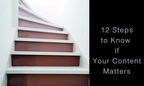
Community's pillars such as user profiles, timeliens, following, comments, wikis and blogging have to be fuilt into a design or you are talking to yourself about yourself even if you follow many of Guillaume edicts. Guillaume's 12 Step Progam: 1. You’re not tracking your results. 2. You’re not repurposing your content. 3. You aren’t automating at least part of your social media activity. 4. You aren’t automating some of your email marketing. 5. You’re only sharing your own content – you’re not adding any content curation to the mix. 6. You aren’t testing. 7. You don’t have a content strategy that’s tied to business goals and your buyers’ journey. 8. You haven’t defined your buyers’ personas or their typical journey. 9. You aren’t creating content strategically. 10. You don’t have a centralized “vault” of all your company’s content assets. 11. You aren’t promoting your content, either via social sharing or by making it visible to the search engines. 12. You have nothing to show for your work.
5 Super Secret Marketing Trends
One of the "Super Secret" Marketing Trends we see for 2016 is Nowism. As defined brilliantly in a TED Talk by Joi Ito (embedded in the post) Nowist plan less and react more. Nowist look to the web to provide the collaborative means to react to what is happening now.
Nowism brings several important design considerations including:
* Incorporation of Social Media Feeds * More space for Content Curation * More flexibility and less rigid and static boxes * More movement and change throughout a site
When something BIG happens and a web design looks and feels the same the sit steps away from the now. One of http://www.Moon-Audio.com major partners is about to launch an earth shatteing new product.
Moon's site needs to have the ability to curate, create and spin content about this innovation fast and furious. The more your content marketing and website live in the now the stronger its relationship with your customers.
See the other 4 Super Secret Marketing Trends for 2016 here:
http://www.curagami.com/5-super-secret-marketing-trends/?v=7516fd43adaa
Contests Landing Page Design
How Design Magazine believes in the power of contests. They have a logo, poster or print contest just about every day. Just look at their well designed landing page sharing their current contests to know how much they believe tapping into the User Generated Content wave is valuable.
Smart Web Design Trends Post
@jowitaziobro taught our team some important ideas about what's next in #webdesign this morning. She states her goal as digging deeper than the usual suspects in web trends and she succeeds. Here are her 7 What's Next in Web Design Trends:
1. Gestures are the new clicks. 2. The "Fold" is dead (longer swipe-y pages see #1). 3. Websites are quicker users too (so lack of speed kills). 4. Pixel is dead (we used to limit our image sizes and "weight" with the web's advanced caching and Content Delivery Networks no need for such limitations anymore). 5. Animation is back (and about to be in a big way). 6. Components and frameworks are the new design and programming (need to reread and think on this one some). 7. Social Media is dead long live "direct" email.
Great post for a Monday. Hell great post for any day. Well done Jowita. Rock on. Marty
Design Revolutions Now On Curagami
Finally decided to use @Scoop.it's easy to use embed tool. The tool makes it easy to add content curation to a blog. Simply copy the embed code and your Scoops appear inside your blog.
Why would you want Scoops on a blog? Content curation has more reach and costs less than content creation. Content curation is or can become a big help to content creation.
The "4th Estate" for Scoop.it is finding ways to bring the easy content curation Scoop.it creates with a company's content marketing. Scoop.it's easy to use embed (you embed the feed) bridges the 4th estate of content marketing. Well done!
Typography is an important but often under-represented part of a website's layout. With so much focus being placed on the presentational aspects of CSS and the use of large images and media that choke bandwidth restraints; it’s nice to occasionally remember that textual content can also make an impact on users and their experience. Content remains king, and a few good fonts can make even the simplest of sites look smart - though not so many that you have to wait for ages for the text to be visible.
Because of this, I’m going to show you a few handpicked examples of sites that make their content look terrific, and why you should consider following their example in your own work. We’re going to take a journey of how elegant typography can make a site shine; looking at the bold, creative, navigational, simplistic and interactive content that makes the designer's voice speak volumes - so let’s get started!...
Via Jeff Domansky, Os Ishmael
Web designers shouldn't be SEO experts since keeping up with DESIGN is a full-time job. But web designers are where SEO rubber meets the Google Road so understanding a handful of ideas is critical to the online success of any designers creations.
Parallax scrolling is a popular design technique used on websites in order to create an illusion of movement on the screen, to help engage website visitors and move visitor yes where you want them AND parallax scrolling plays beautifully on mobile devices!.
Here are 60 examples of great parallax scrolling.
Gary Marshall shares 50 of the best free web tools to help build your site, from well known tools as WordPress and Drupal through to some you may have never considered
Ecommerce Master Class: Conversion Metrics
There are only a handful of ways to increase sales from a website. Good idea to START with increasing your conversions since sending more traffic into a leaky boat is a fool's errand.
In this short Ecommerce Master Class Video we share three of our favorite tactics to increase conversion:
* Ubiquitous Free Shipping.
* Best Sellers.
* Reviews.
As you design your next website make sure you DESIGN IN these three ideas and your site will convert better. Conversion is a magic number too. Tiny improvements in conversion create HUGE benefits to your bottom line as costs go down and profit go up.
Updated! Some of the web's smartest thinkers reveal what they believe will transform the web.
Summary & Marty Notes
1. Huge Background Images (Agree, but hard to do well in responsive design).
2. Card Based Design (Agree and need to know more about this since cards = responsive and responsive i.e. platform agnostic is the way to go now).
3. Digital First Branding (Agree and this will be a big shift for many who think of their websites as additions not the MAIN THING). 4. Open Data (Need to know more about this).
5. Responsive Design...Evolved (Agree, Agree, Agree).
6. Privacy (not sure about this one, think that ship has sailed).
7. Isomorphic Java Script (Need to know more about this).
8. Iteration (Agree, we will make MVPs, ship them and then watch and improve them).
9. Vibrant Design (not sure about this one, the example made my eyes hurt).
10. Web Components & Adaptive Design (this is Internet of Things and I agree).
|
AI & UX and UI Mobile isn't everything it is the only thing at least as far as data architecture and design goes. The "mobile first" movement didn't go nearly far enough.
Mobile first means thinking about and changing how we think about User Interface design. As we're thinking about design we need to layer artificial intelligence (AI) in too.
AI impacts the sentient nature of the conversation between customers, websites and robots. Robots not of the Skynet variety but crawlers determined to understand, share, and search.
Web Design Lessons from Westworld This Curagami post shares Five Content Marketing Lessons from HBO's Westworld such as:
- Show Don't Tell
- Tease Never Bore
- Beauty is half the Battle
- Believe and MOVE
- Create Another Loop
http://www.curagami.com/content-marketing-five-lessons-from-hbo-westworld/
Lessons don't end there. HBO's Westworld uses design in ways web developers and designers should steal including:
- Design should speak to and deepen your story lines
- There is not half measures in design, all in or nothing
- Create space around your designs, don't overwhelm
- A few little things done very well often work better than many things done poorly
Design & Web Stories Websites must tell stories, stories consistent with and supporting brands represented. Look at the examples in our YouTube video (https://youtu.be/IC4KHAIZKWM ) and particularly REI.com for ways to blend your brand's message and site design.
No Half Measures You either believe in your designs, copy, website and brand or you don't. There are no half measures online. Half measures are like fear. Visitors can smell fear and know when they are being manipulated. Every webpage is s statement and you either believe in what you are doing or you don't. See the Red Bull example in the video for the impact BELIEF can have on marketing and movement creation.
Space
Great Designs need SPACE to breathe. White space may be the most important part of web design few think about. In our rush to crowd everything in we violate HBO's brilliant use of space, time and an unhurried process. HBO isn't trying to overwhelm or flood us into submission. HBO would rather create one incomplete thread after another and leave them and us hanging. Space is confidence. When you're confident in your product, brand or site you do what you believe and learn from every interaction. When you keep throwing things at customers hoping they will comply, they never do btw, your marketing looks chaotic and confusing. Confused customers do many things buying and advocating are rarely among them.
Brilliant Little Things
Have you noticed how DARK the Westworld lab is? If you're wondering why Westworld's titles are so amazing look no further than the dark lab. Creating the CGI needed to have a cool lab is expensive. Better to create a great title sequence and leave the lab a little seedy and rundown since doing so saves money and helps the plot.
Websites can't look "seedy" so much these days, but they can do a few things brilliantly and let the credit spread. When asked how teams I've managed made over $30M in online sales I often explain it was what we DIDN'T do that mattered most.
The list of things we needed to do was always infinite, so we were strict in the very few things we did and could do. HBO proves the point. Spending millions on the lab would rob the show of it's seedy underbelly. Better to create a great title sequence with a few brilliant pieces like the robot dipper and the "world overview" than try and do it all.
Find our Content Marketing tips from Westworld on Curagami:
Burn Down Your Website
As we noted on G+ (Inevitable Lightness of Being) websites are a tyranny few will be able to afford soon. Let's follow the rules of improvisation (always a good web marketing idea) and say, "Yes, and" to the issue of burning down your website. What are the web design implications of embracing the next generation of consumer marketing?
* Build for Curation Not Creation * Remember about THEM (customers) not you so build community in
* FAST, FLAT and FURIOUS
* Don't forget profiles, timelines and shares
* Read behavior THEN create the page (i.e. More Google-like)
Curation Not Creation
Friends @Scoop.itsuch as @Guillaume Decugisand @Marc Rougierare sitting in the cat bird seat. After the latest Google changes, and the last time we will know when Google makes algorithm changes, the curate don't create rule is strong.
Strong because you can't afford to put content on owned properties that isn't insanely great. In a world where the NY Times gets gigged for poorly supported content you need to test BEFORE you write.
Scoop.it is our favorite, "Test before you write" tool. Content curation is more democratic tool. Nothing like finding a cool post, sharing it and explaining why you think it is cool with rich snippets to create relationships. Doubt that? I have 45,300 followers on Scoop.it. Curate don't create and build your next site to make your curation easy, sticky and shareable.
Them Not You
One of the wooden stakes in the heart of tactical web development is it assumes too much control for the creators. As a creator I can attest where the power lives - THEM (your customers) not you. Your future web development needs to build community, make your curation of your user's content, the User Generated Content (UGC) every web miner needs to win today. If you don't have a plan to create user profiles, timelines and following better get one.
Fast, Flat and Furious (in Real Time)
If you haven't watched Joi Ito's TED talk about Nowism do so. The web only has one time - NOW. We've noticed anything we do, share, or create close to NOW does better. Figure the need to share and have content pinging (updating and being shared) constantly will be a huge need in tomorrow's web development.
Building flat and fast sites influenced by mobile's less is more philosophy is highly recommend. If your dropdowns are War and Peace novels you need to reconsider. EASY, simple and beautiful works better in a mobile, connected, and FAST world.
Profiles & More
Changing your role from creator to curator opens your thinking. If your site is about what THEY (your customers) do with it include them in your web design. Create profiles, timelines and make it easy for your customers to speak to and interact with each other.
Gamified and Predictive
No one gives things for long without reinforcement. We agree with Daniel Pink's great book Drive. Paying = jobs. Don't pay money, but do find ways to share your legitimacy.
Share your position and site and your community will help build it. Make sure to curate too. When you find great content THEY (customers) gave you, share and elevate the example everyone learns.
Learning From Video Game Designers
Video game designers can teach you a lot about how to great great ecommerce and B2B websites. Video games are gamified, social and understand the stimulus - response nature of online interaction in a fluid and must imitate ways.
Here are WhatCulture.com's picks for the 20 best video game websites in the world. We like Gamers With Jobs and Kotaku (though we don't understand a lot of it).
Designing a good website that accommodates a lot of content is a tricky balancing act to pull off. Does one attempt to present the user with all the information
Web Design Jazz is the conversational alchemy that is website design riffing important conversations your brands have with visitors and potential customers. What about you? What conversations are your having with customers? How did you get there?
Check out our Web Design Jazz video and join the conversation:
http://www.curagami.com/master-classes/web-design-jazz/
Burn Down Your Website
Websites are cool and a great marketing aid...until they aren't. If the line of when they aren't isn't behind us we are approaching it. What is a "website" when we share posts on Medium, Scoop.it and GPlus?
Feels like the idea of a website as a MUST GO HERE to interact with our marketing message is hopeless out of touch. Even when we do GO to a website what are we looking for?
FUN, ENGAGEMENT and RELEVANCE.
The typical talking to yourself about yourself marketing that most flog online feels more than dead, it feels dangerous. Google's vote is clear - if your content doesn't create an increasing number of likes, loves, shares and loyalty your website is screwed, blued and tattooed.
Especially if someone in your immediate competitive sphere knows how to THROW DOWN, create community and MOVEMENTS instead of the usual solipsistic crap. Keep talking to yourself while someone else in your business vertical is hosting a party and you will be waxed.
Waxed because what really matters NOW is LOVE. If your win hearts and minds because you are honestly all in and listening hard you get to "win". If you are amazing you create blue oceans and uncontested competitive space for however long the ride lasts. Talking about FUN.
This Haiku Deck discusses the death of tactical web marketing. You can't out email market my team and I, or not for very long. We've been doing this crazy biz since 1999. You can gain an inch and we are likely to come back and take a mile.
https://shar.es/12ekPU
Marty Note
@David Amerlandis one of the great THINKERS of our generation and he gives much of his work away (as we all do, but his thoughts are worth more than most). Every Sunday David Amerland on G+ shares a “Sunday Read”. Since my prism leans toward web marketing I see lessons in today’s Sunday Read for Internet marketers and web designers.
David is discussing "life design", but web designers would be well advised to watch the TED talks he references and build empathy into their lives and websites. David is a "must follow". Find his blog, twitter and GPlus links in the post and follow him if you want to learn how all of this stuff really works.
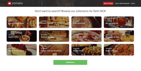
Best of Indian Web Design with Zomato.com A Clear Standout
Indian web design is marked by innovation, clear Calls-To-Action and graceful use of current and future technology. "In India my generation," my friend Ravi told me the other day, "went right to mobile skipping laptops and desktops altogether".
I was looking at these sites with my laptop and expect they look great on smart phones too. Nothing like having must of your customers using mobile tech to make mobile first in both responsive templates and impressive data architecture (easy to see how these sites would accordion in mobile.
The foodie site Zomato.com lives up to its great name. The content, despite their not being "here" yet, is fresh, beautiful to look at and engaging. Zomato is about FOOD and, much like India herself, has few preconceived notions about what that means. .
Instead they curate with clear passion and grace. Every Indian site we studied had a clear sense of GET TO IT many American sites could learn from. Indian web designers know how to "tease", charm and win clicks by providing just the right information at the right time.
Many American designers seek to overwhelm and thus end up speaking to themselves about themselves. Better to box not look for the haymakers we seem to love so much here these great Indian web designed sites illustrate.
We're boiling down 13 of the most prominent web design trends emerging in 2015. Will they change your understanding of a "modern website"? You be the judge.
Marty (@Scenttrail) Notes:
1. Make it big (Agree but not as easy to do well as they make it look). 2. The multimedia experience (agree and same as #1) 3. The Parallax effect mutations (Horizontal Scrolling) Agree 4. Animated storybook (Agree and cool). 5. Flat design (agree & effect of mobile) 6. No more boxes (Agree and YES!). 7. Tiles (Pinterest effect and agree). 8. Navigation widgets (Agree!) 9. Integrating Google maps (Agree where appropriate). 10. Mashup interfaces (AGREE grab those APIs :). 11. Minimize (Seems to contradict #1, but agree). 12. World Wide Wait (speed is going to be KEY). 13. Designer automation (Agree, can do a lot with templates now).
Why is the new Moon-Audio.com crushing last year? We worked hard BEFORE drawing a wireframe. Know your WHY & business then design & follow these redesign tips.
In this article, Kendra Schaefer examines the things all web professionals should know before swan-diving into the Chinese market, including how mobile-only social platforms have become the revolutionary new frontier of Chinese web design, and who’s designing beautiful websites in China today.
|

 Your new post is loading...


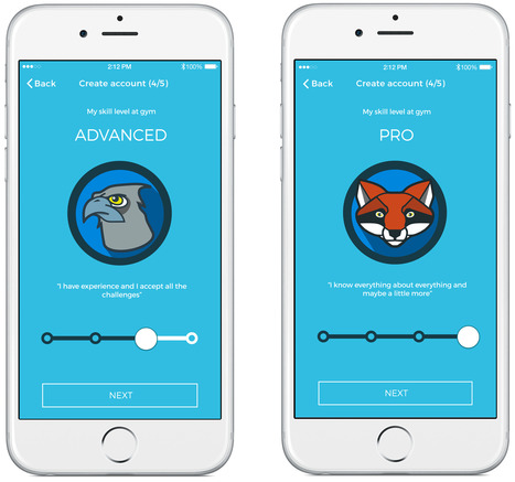

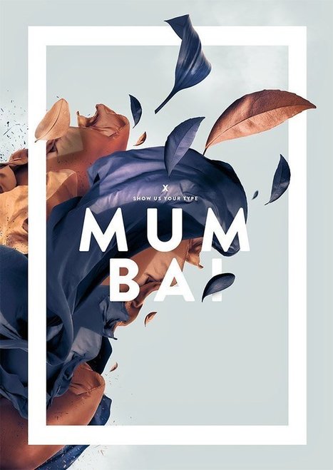









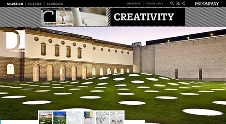


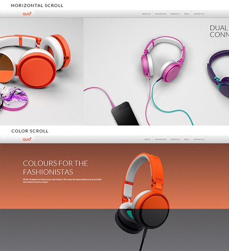

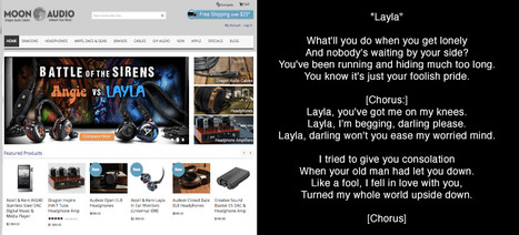


Great, comprehensive, and illustrated "perfect slider" tutorial from Smashing Magazine.