Must Design
75.6K views | +0 today
Follow
Must Design
Design Is Revolutionary
Your new post is loading...
Scooped by Martin (Marty) Smith
Scoop.it!

Disruptive Ecommerce Burn Your Website Down via @HaikuDeck #setyourstoryfree

Disruptive Ecommerce Burn Your Website Down via @HaikuDeck #setyourstoryfree | Must Design | Scoop.it

Burn Your Website Down
Websites are about to become an expensive tyranny. Tomorrow's e-commerce happens everyone and at any time on any device. Still demanding customers come to your website?  Crazy! 

Better to "burn your website" and all of the preconceived notions about what a website is and should be down today. Recreate your site as a fluid expression of content, community and commerce.

Here's how:

http://bit.ly/burn-down-website

No comment yet.
Scooped by Martin (Marty) Smith
Scoop.it!

Best Website Design May be NO DESIGN

Best Website Design May be NO DESIGN | Must Design | Scoop.it

Burn Down Your Website
Websites are cool and a great marketing aid...until they aren't. If the line of when they aren't isn't behind us we are approaching it. What is a "website" when we share posts on Medium, Scoop.it and GPlus?

 Feels like the idea of a website as a MUST GO HERE to interact with our marketing message is hopeless out of touch. Even when we do GO to a website what are we looking for? 

FUN, ENGAGEMENT and RELEVANCE.

The typical talking to yourself about yourself marketing that most flog online feels more than dead, it feels dangerous. Google's vote is clear - if your content doesn't create an increasing number of likes, loves, shares and loyalty your website is screwed, blued and tattooed.

Especially if someone in your immediate competitive sphere knows how to THROW DOWN, create community and MOVEMENTS instead of the usual solipsistic crap. Keep talking to yourself while someone else in your business vertical is hosting a party and you will be waxed.

Waxed because what really matters NOW is LOVE. If your win hearts and minds because you are honestly all in and listening hard you get to "win". If you are amazing you create blue oceans and uncontested competitive space for however long the ride lasts. Talking about FUN.

This Haiku Deck discusses the death of tactical web marketing. You can't out email market my team and I, or not for very long. We've been doing this crazy biz since 1999. You can gain an inch and we are likely to come back and take a mile.

 https://shar.es/12ekPU

No comment yet.
Scooped by Martin (Marty) Smith
Scoop.it!

7 Simple Ecommerce Design Tips Infographic - Curagami

7 Simple Ecommerce Design Tips Infographic - Curagami | Must Design | Scoop.it

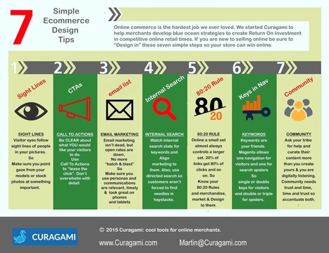
7 Easy To Forget Simple Ideas
As you design your ecommerce store keep in mind these easy to forget but sure to make you more money online commerce tips:

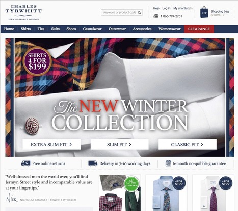
* Sight Lines - visitor eyes go where your models eyes go so point them at something good.
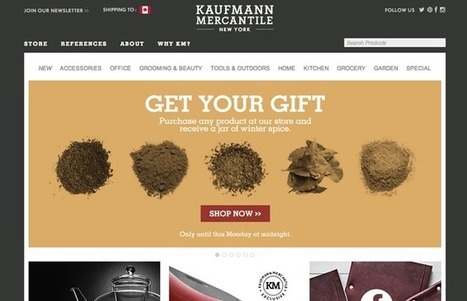
* CTAs - don't be afraid to tell your customers what to do with Calls To Action.

* Email - email marketing is the ability to communicate with your tribe without asking permission from a middleman.
* Internal Search - tells you if your navigation is working and what customers are looking for so use data from internal search.

* 80:20 Rule -  a small set almost always controls a larger set online so find your 80:20 rules and design, merchandise and sell to them.

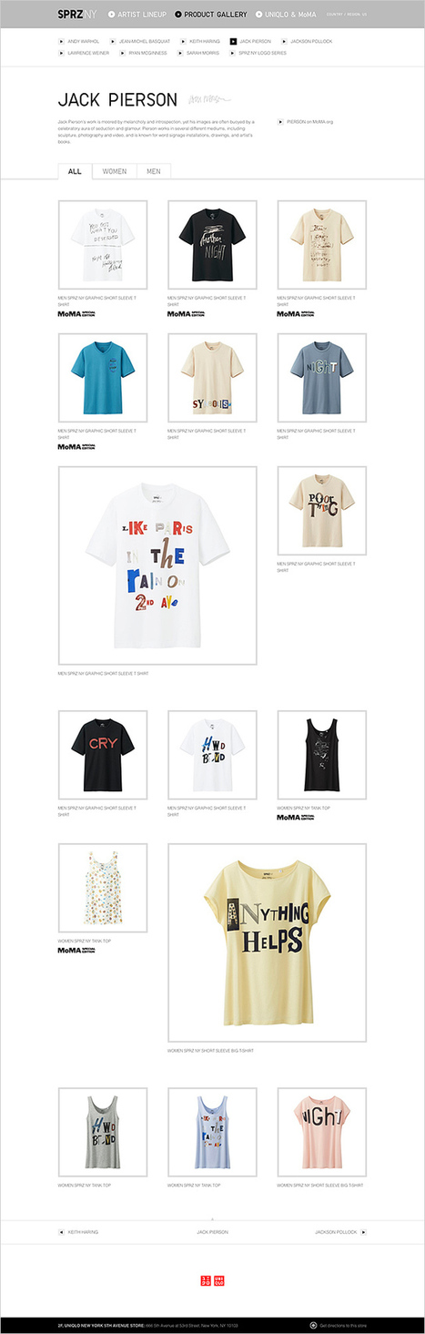
* Keywords - make sure you use keywords in your navigation and use a rewrite tool to show visitors one set of keys and spiders another.

* Community - create an ASK (for help) and listen more than you talk and online community will form.  

No comment yet.
Scooped by Martin (Marty) Smith
Scoop.it!

27 E-commerce Website Designs Scenttrail Hates & Why

27 E-commerce Website Designs Scenttrail Hates & Why | Must Design | Scoop.it

Marty (Scenttrail) Note: 27 Bad Ecommerce Designs
These CSS Design Award Winning sites illustrate why designers shouldn't be in charge of your commercial website. In a recent G+ post I shared our journey across time, place and money online (Why Time Is Money Online: https://plus.google.com/102639884404823294558/posts/RdjAjWoJTHw ).

It's easy to get lost. We kept trying to make narrative, movie and book-like) logic work on our ecommerce site and it never did. To the extent we told stories we depressed conversions and we conducted these tests before the web was drowning in content.

Not that the web has been fully "content shocked" to within an inch of its life one of the FIRST jobs any ecommerce site must accomplish is loudly and clearly proclaiming their STORE-NESS.

These 27 "pretty picture" designs are find for big established brands people trust, but they would CRUSH a new commercial site. The "store-ness" is confusing. Are these content sites or can we buy stuff here.

Some communicate some "store-ness",but none have the "ditch digging" realities of large, successful ecom sites such as REI.com or Schwan's.com (highest converting ecom site in world). Call-To-Actions are missing (mostly), navigation is murky and not keyword dense and images don't you line of sight rules (viewers' eyes go where people's eyes in your images go).

Real ecommerce needs a few things to be successful that most of these sites ignore, miss or don't know such as:

* Email subscription forms (email list = your most profitable channel because YOU OWN IT, don't believe BS about email marketing being dead mobile is making email marketing different but dead =nope.
* AN OFFER - see REI.com's "daily deals" or Amazon's ability to sell any and everything.
* Great navigation balanced between seo and customer engagement.
* Images mapped to produce CLICKS where merchants want them.
* Every image, click and share creates analytics and data so part of what you need to map into an ecom design is WHAT DATA YOU NEED. Can't figure out what actionable thing I would know after a month's traffic on these designs.
* Sense of TIME and PLACE (what season are we in? Where are these sites?).
* TRUST and that comes from other people (testimonials, curation of User Generated Content and NONE of these have anything like that so unless they are major brands they won't pass the trust test with many shoppers).
* TRUST MARKS = didn't see a VISA or MC logo either. One way to create trust online is to align with brands and marks people already trust. Those badges look like ugly scars to designers and they help make merchants millions.
* Content - we love VISUAL MARKETING but some context such as the context one satisfied customer would share is a must.
* Design = Trust - we grant that these sites look amazing and looking amazing helps with creating trust, but junk 'em up a little and make more money.

That last bullet reminds me of a story from my P&G tenure. My boss Russ Mills taught me to never leave a display too neat. "People won't disturb a display that is too neat," he explained. These ecommerce designs are too neat for me (by half). If you aren't a major brand ignore every one of these 27 "inspirational" ecom web designs.

PS. Favorite has to be the example in the picture above. Not only do we chop people in half we ask visitors to kiss their behinds (lol). Opposite of the welcoming atmosphere I want to create on my ecom sites (lol) back when I was responsible for millions of online sales yearly. At my core I remain an online merchant, but I don't miss not sleeping and sweating sales numbers from now until Valentine's Day. Don't miss that at all :).


No comment yet.
Scooped by Martin (Marty) Smith
Scoop.it!

Best Responsive Ecommerce WordPress Themes

Best Responsive Ecommerce WordPress Themes | Must Design | Scoop.it

My favs: Clean Sale (pictured here), Retail Therapy and Kiosk. What are your favorites? 

No comment yet.
Rescooped by Martin (Marty) Smith from AtDotCom Social media
Scoop.it!

Want To Make MILLIONS Online? Use Images Like This In Your Website Designs

Want To Make MILLIONS Online? Use Images Like This In Your Website Designs | Must Design | Scoop.it
They say a picture is worth a thousand words. True or not, images are an important part of any website we create. Since it is so easy to embed an image in a website (even the process of creating your

Via Robin Good, John van den Brink
Martin (Marty) Smith's insight:

Confessions of A Director of Ecommerce
I've spent the last few years trying to share as many "secrets" as I learned as a Director of Ecommerce. I don't run an ecommerce website anymore so can afford to be generous (lol). 

One of my pet peeves was directing the eye sight line of people in our images. I wanted the eyes pointed at something that mattered. People follow the eye line of those they are looking at. We had three tactics:

1. Gaze straight at visitor - promotes engagement.

2. Gaze directly at a Call To Action - promotes clicks.

3. Gaze at other people in same picture - promotes connection.


 We used #1 for pages with broad reach such as our homepage and category top-level pages. 

We used #2 in 4Q on the home page and bending the sight lines of any people in images on a product page works well (our product pages tended to make the PRODUCTS the heroes so few people). 

We used #3 when connection was one of the benefits of a product. If you sell wine, travel or family cars you may want to have pictures of people looking at each other. I would never ONLY have this picture on a webpage since it can make the viewer feel left out. 

The natural companion to the "connection" picture is a picture of a single person gazing out at the viewer. This says, "Yes, we see you, value your visit and want to be friends". 


Websites communicate SO MUCH in covert ways. Balancing what you say with one image such as the people looking at each other with another image to promote engagement is the game you play, the inside baseball "secrets" that separate teams capable of making millions in profits online from those who won't and wonder why :).M 


Robin Good's curator insight, March 6, 2013 5:40 AM


If you want to learn how to use images effectively inside your website or blog here is a truly excellent guide by Chistian Vasile on 1WD.


In the guide you will find rational and fact-supported advice on how to choose, place and test image use inside web-based content as well as lots of extremely relevant examples of effective image use online.


From the original article: "...if you manage to find the right pictures and insert them in the right places, they can do wonders for you, as they did for some others."


Well written. Informative. Resourceful. 8/10


Full guide: http://www.1stwebdesigner.com/design/images-on-web-design-usability-guide/


Peter Zalman's curator insight, March 10, 2013 8:06 AM

#cro

Scooped by Martin (Marty) Smith
Scoop.it!

SEO, Canonical URLs, Rel=Canonical & Meaning of Ecommerce Life

SEO, Canonical URLs, Rel=Canonical & Meaning of Ecommerce Life | Must Design | Scoop.it

Canonical URLs Explained
The Yoast post provides an easy way to understand why rel=canonical is a powerful new SEO tag. Yoast has a dog in the hunt. They make a Magento plugin that easily writes the rel=canonical tag into a product page's head.

The explanation about WHY canonical URLs are so important is only half right. We have a million ways of expressing and sharing URLs these days. Without rel=canonical we end up duping content to distraction.

Here's the rub. All ecommerce sites dupe content. They must. When I was a Director of Ecommerce a single product accounted for 50% of our profits. You better believe I merchandised that product into every nook and cranny our site offered. I duped that product and it's content to distraction.

There are other ways to limit duplication including:

* Use of your Robots.txt file.
* Locking content behind a firewall.  

* Use of blockquotes & rel=canonical tags. 
* Rewrite duplicated content so it's not as duplicated (lol). 

We included our email output into a folder with a "no follow" line in our robots.txt. You may think such a move is enough. It isn't. Be sure NOT to drive links from spiderable content INTO that folder or you eliminate the effectiveness of the robots.txt.

In the end every ecom site worth it's salt MUST duplicate content. Rewriting sounds like a good strategy, but it isn't. Content = time and time = money when managing million dollar commercial sites. You will be duping content.

Best to use rel=canonical because it shows Google you aren't trying to STEAL anything. Reminds me of what a friend shared about the disavow tool (used to deny inbound links or signal they may be untrusted).

 My friend was using the disavow tool daily on his clients accounts. "So you are brown-nosing Google," I kidded him. "Exactly," was his answer. Rel=canonical tells Google you are TRYING to do the right thing and sometimes that is enough. 

No comment yet.
Scooped by Martin (Marty) Smith
Scoop.it!

Be Something Ecommerce via @Curagami

Be Something Ecommerce via @Curagami | Must Design | Scoop.it

Good News & Bad News
As a rare web marketer with more than ten years experience,  I created our first site FoundObjects.com in 1999 (gone now sadly), we want to confirm something every likely reader of our online marketing post already knows - the low hanging fruit is gone plucked by previous generations of pickers.

What to do now? Be something online and start today with these "be something now" tips. 

No comment yet.
Scooped by Martin (Marty) Smith
Scoop.it!

Best-in-Class eCommerce Web Designs via @conversioniq

Best-in-Class eCommerce Web Designs via @conversioniq | Must Design | Scoop.it

Best In Class From Conversion IQ
The other day I complained about "pretty picture' ecommerce sites that make conversion harder. So much of ecom is ditch digging. Ditch digging to make sure you have things such as:

* Email subscription form (prefer presence to popunders).
* Clearly ECOM - looks like a store with things to sell not content to read.
* Social (easy to find theirs and easy to contribute).
* Content Curation from social / comments / reviews (should feel like a party with people who share love / interests).

* Offers, deadlines and a sense of time (of the year today is Columbus Day for example).

These examples from Conversion IQ are closer to "ditch digging" ecommerce websites. Conversion either BUYING or into a list are easier, more clear and so these designs make more money than the pretty picture websites I shared last (http://sco.lt/4ijZIH ),

No comment yet.
Scooped by Martin (Marty) Smith
Scoop.it!

Who Did MoMA Hire To Create Their Web Store? Yugo Nakamura

Who Did MoMA Hire To Create Their Web Store? Yugo Nakamura | Must Design | Scoop.it

Japanese web designer Yugo Nakamura has created some cool sites. Great clean lines, white backgrounds, splashing of color, movement both real and implied reminds me of Haring, Warhol and de Kooning. #toogood #webdesgin

Martin (Marty) Smith's insight:

add your insight...

No comment yet.
Scooped by Martin (Marty) Smith
Scoop.it!

30 Beautiful and Creative Ecommerce Website Designs – Shopify

30 Beautiful and Creative Ecommerce Website Designs – Shopify | Must Design | Scoop.it

A blog about ecommerce marketing, running an online business and updates to Shopify's ecommerce community.

Marty Note
Ecommerce is hard to make "BEAUTIFUL". The conventions are well established now such as hero, underneath or to the right of the hero is a line of products, nav leads to category pages then to product pages, big search box and so on.

Here are 30 cool takes on convention that don't spill conversions all over the floor, the danger of modifying ecommerce convention, but do create intelligent and NEW feeling ecom web design.

My favorite is Norwegian Rain because their hero tells such a amazing story with so few words. Very difficult to do a group shot like that without looking too exclusive. Like a club that would never have YOU (the visitor) for a member.


I don't get that feel from their image and design. Very cool and NOTHING I would have considered before seeing that a group shot of that magnitude can be accomplished.

Norwegian Rain
No comment yet.