Must Design
75.5K views | +0 today
Must Design
Design Is Revolutionary
Your new post is loading...
Scooped by Martin (Marty) Smith
Scoop.it!

Web Design Bleeding Edge: China

Web Design Bleeding Edge: China | Must Design | Scoop.it
In this article, Kendra Schaefer examines the things all web professionals should know before swan-diving into the Chinese market, including how mobile-only social platforms have become the revolutionary new frontier of Chinese web design, and who’s designing beautiful websites in China today.
Martin (Marty) Smith's insight:

Cool post. China is ahead of us on MOBILE leaving "Mobile First" for "mobile only" and they take more web design risks that pan out more often than you think.

No comment yet.
Scooped by Martin (Marty) Smith
Scoop.it!

Funk Up Your Web Design: Find Your Site's VOICE

Funk Up Your Web Design: Find Your Site's VOICE | Must Design | Scoop.it

Marty Note
Watching the excellent HBO Documentary about James Brown Mr. Dynamite made me think of FUNK and web design. Web design is easy to get WRONG (lol).

It is tricky to design online with a sense of surprise, beauty and novelty. I like the Digital Invaders design as it feels free and spontaneous. Other designs such as Monster CSS and Creative With A K feel like they are trying to appear spontaneous and free.

Trying too hard is EASY in web design too. Remember all websites are STAGES we designers SET. The trick is to set a stage that feels like it is happening now and won't feel dated tomorrow. Feels like there are enough visual hooks in Digital Invaders it would be easy to keep it fresh with minimum fuss.

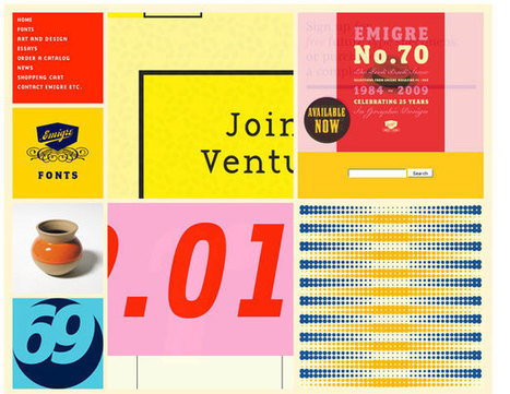
I like Emigre too. Emigre creates the same sense of happening now but that design is at the other end of the spectrum from Digital Invaders. Its hard to beat the grid. First website I created, in 1999, used a Mondrian grid.

Grids help organize massive amounts of information without that mountain feeling like it is about to crush you. I like the funky NOISE contrasted to the quiet grid because they demonstrate the need to find a visual VOICE in your web design. That voice can be anything as long as it feels authentic TO YOU.

The web is very good at finding and amplifying DISSONANCE. When you try to FUNK IT UP and aren't really funky it shows like you are wearing the wrong decades fashion (painful). Your customers are your audience.Set the stage anyway you want, but do so with an eye toward YOUR TRUTH.

The closer you stay on the tiny beam of "authentically us" the more success your web design has. This is why there are no web design maxims that apply all the time. What works for Emigre is very different than Digital Invaders but both work, both are authentic and have that hard to describe but know it when you see it TRUTH great web design must have.

No comment yet.
Scooped by Martin (Marty) Smith
Scoop.it!

Hot, Flat, Colorful: 33 Examples of Ultra-Hot Flat Web Design Trend

Hot, Flat, Colorful: 33 Examples of Ultra-Hot Flat Web Design Trend | Must Design | Scoop.it
Currently, one of the biggest trends in the web design industry is the flat design style. In case you are not yet familiar with the term, flat design is essentially design without the drop shadows, gradients, and textures that have been common in web design for some time. Flat design uses solid colors and often typography figures prominently into the design. In this post we'll showcase 33 excellent examples of the flat web design trend. Hopefully they can provide some inspiration that can be put to use in your own work. Buffalo
Martin (Marty) Smith's insight:

Mobile is the secret driver of many of 2014's hottest web design trends. One of the hottest is flattening out web design. Small screens can't handle shading and three dimensionality as well as bigger screens, so flat is one of the HOTTEST web design trends as these 33 examples share. .

Alaina Duty's curator insight, September 25, 2015 1:45 PM

Here are some great examples of some bold, attention-grabbing color combinations incorporated in flat design.

Scooped by Martin (Marty) Smith
Scoop.it!

10 Award-Winning Website Designs Inspire via Hubspot

10 Award-Winning Website Designs Inspire via Hubspot | Must Design | Scoop.it

Check out these 10 gorgeous websites to see what makes them so critically acclaimed.

Marty Note
Solid work here if somewhat on the heavy side for my taste. I do like Rdio. M

No comment yet.
Scooped by Martin (Marty) Smith
Scoop.it!

70 Stunning Responsive Sites For Inspiration Before A Mobile Holiday

70 Stunning Responsive Sites For Inspiration Before A Mobile Holiday | Must Design | Scoop.it

This holiday season will be the Christmas of MOBILE devices. Here are some amazing examples of the art and science of responsive design.


Martin (Marty) Smith's insight:

This holiday selling season will be all about MOBILE. Responsive websites look great no matter what device is lookign at them. Here are 70 examples of how to do responsive web design right.

No comment yet.
Scooped by Martin (Marty) Smith
Scoop.it!

19 Inspiring Examples of Text Over Images in Web Design

19 Inspiring Examples of Text Over Images in Web Design | Must Design | Scoop.it
In web design there are a lot of combinations that deliver a beautiful page, including the image + text duo. Combining beautiful images and nice/readable text
Martin (Marty) Smith's insight:

Web Design Tips

Text is hard to do well. Images are hard to do well. Tex over images is impossible except when you follow the lead of other great designers and learn how and when text over images can work like these 19 great and inspirational examples of text over images.

Note the balance where neither image nor text dominates. This is the rub of text over image design. Too much image and the text goes away. Too much text and the image doesn't seem to make sense or contribute anything.

Follow these great examples and your text over images will look great and contribute to your website design.

No comment yet.
Scooped by Martin (Marty) Smith
Scoop.it!

Contribute To The Web Design Revolution in 2015

Contribute To The Web Design Revolution in 2015 | Must Design | Scoop.it

Design Is Revolutionary
Don't have to be Steve Jobs to know design is revolutionary. Our Web Design Revolution feed on Scoop.it is one of our favorites. We love THINKING visual because most of us (save one poor CTO) are marketing geeks who visualize in our sleep.

If you visualize in your sleep consider contributing a Scoop or two or three to The Web Design Revolution in 2015. Several easy ways to contribute:

1. If you are on @Scoop.ituse the Suggest Feature. We appreciate all the great suggestions we've already received and promise a new focus on collaboration in 2015.

2. If you aren't on Scoop.it you are missing one of the best "do less, get more" tools we know, but you can still contribute ideas for stories we should include by:

email: martin(at)Curagami.com

Twitter: @Curagami

Call For Help NOW
Right now we are interested in creating a year-end mashup of all the web design predictions for 2015. If you have a favorite prognosticator and they write about what they think is going to happen in web design next year send us the link and we will mash your contribution up into a summary with early views going to contributors.

Thanks for a great year and hope you will contribute to The Revolution in 2015.


Scooped by Martin (Marty) Smith
Scoop.it!

65 Best Responsive Web Designs 2014 via SocialDriver.com

65 Best Responsive Web Designs 2014 via SocialDriver.com | Must Design | Scoop.it

Responsive Web Designs
Responsive design, forming a website's information so it looks great on any device, is becoming mission critical. Here are 65 of the best responsive designs in 2014 via SocialDriver.com.

Martin (Marty) Smith's insight:

I like Salesforce and SquareSpace and was surprised I didn't hate the Microsoft design.

Helen Stark's curator insight, September 30, 2014 3:53 AM

Unusual and creative responsive designs that look great on a huge monitor and a tiny smartphone screen - that's great

Rescooped by Martin (Marty) Smith from WebsiteDesign
Scoop.it!

Emotion in Web Design Is A Critical Success Factor (CSF)

Emotion in Web Design Is A Critical Success Factor (CSF) | Must Design | Scoop.it
Putting emotion into web design may seem a strange concept, but many sites have been doing it for years, and we are only now beginning to recognize it and talk about it.

Via Brian Yanish - MarketingHits.com
Martin (Marty) Smith's insight:

People buy with emotion and justify with logic, so finding ways to incorporate emotion into web design is a CSF (Critical Success Factor). 

Mike Donahue's curator insight, March 25, 2014 8:36 AM

Seems designing for emotions is beginning to get its day in the sun. Nice article with several clear examples.

Scooped by Martin (Marty) Smith
Scoop.it!

Why "Apple Design" Works and 60 Apple Inspired Websites

Why "Apple Design" Works and 60 Apple Inspired Websites | Must Design | Scoop.it

Apple's clear navigation, romantic heroes (largest images on the page) and easy to understand information heirarchy (based on a grid) are design tactics any website should steal as this excellent post about websites who've stolen direclty from Apple's design shares.

No comment yet.
Scooped by Martin (Marty) Smith
Scoop.it!

5 Jazz Influenced Website Designs

5 Jazz Influenced Website Designs | Must Design | Scoop.it

5 Cool Jazz Website Designs


Hero Roll Static Text

http://www.jetztzeitclub.de/


Love this idea of rolling the hero image while keeping a single textural idea. The impact is to EPHASIZE the text while allowing the visual field to create interest and calm. The problem with heroes that roll and bring new messages is the website can become ADD. You never know where or what to look at. Here the roll reinforces a single message. Cool. 


Color & Texture Shock 

http://www.austynweiner.com/


Same image shift with single text here but an explosion of color and texture. This is an example of going to an extreme to create a sense of visual shock. The only liability with this technique is showing your visitors where to go next FAST since the shock needs to work FOR not AGAINST you. 


Hero with Insert

http://thecarcrush.com/blog/2013/8/y3uaah5ojl6zi4iia95h10iircb8o0


Love the lush images with inserts here. The cars are seductive and romantic, but the insert allows the text and descriptions to add instead of distract from the hero images. 


 Magazine Like

http://boompa.ca/


This waterfall, the infinite scroll, magazine shows how you can build a visual and copy story with large hero images water falling on top of one another. There is real visual organization here. Very cool. 

 
Radically Simple Ecom 

http://www.lushtype.com/


Love tis ide of radical simplicity in ecommerce. Big icons sell icons. By selling one thing the page is easy to understand, easy to buy yet very cool and engaging too. 


No comment yet.