
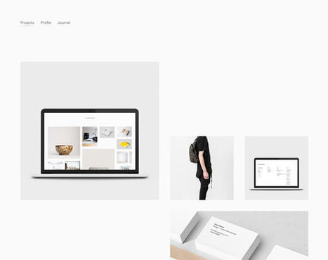

There are a many aspects of good web design, and whitespace is certainly one of them. Whitespace is the empty space around design elements such as images, text,
Get Started for FREE
Sign up with Facebook Sign up with X
I don't have a Facebook or a X account


 Your new post is loading... Your new post is loading...
There are a many aspects of good web design, and whitespace is certainly one of them. Whitespace is the empty space around design elements such as images, text, 
No comment yet.
Sign up to comment
Apple's clear navigation, romantic heroes (largest images on the page) and easy to understand information heirarchy (based on a grid) are design tactics any website should steal as this excellent post about websites who've stolen direclty from Apple's design shares.
|

|
Scooped by Martin (Marty) Smith |

There is no doubt that choosing the right colors for a design is a very important step of the creative process. We need to think about the message and the style
Pick 3 Best Examples Competition
Love at least 3 of these examples of great use of color in website design. Can you pick the 3? Share your top 3 in comments.
|
|
Scooped by Martin (Marty) Smith |

It's quite easy to get stuck in creativity blocks, but it's damn hard to get out of them. Particularly if you are out of time and don't want to compromise your professional principles selecting the first "quick-n-dirty" solution you can think of.
Refined, elegant and classy website designs from Smashing Magazine.
|
|
Scooped by Martin (Marty) Smith |
It almost seems that this year flat designs have taken over the world of graphic design by force, but especially in the arena of mobile apps with the first industry-shaking flat design being for the iPhone5. Reality is that flat design has been around longer than the emergence of the iPhone5, but of course it was Apple that helped to bring such cross-industry awareness to the design style.
I was wrestling with why we are suddenly awash in "flat design". My first thought was flat design is more lean, easier to figure out where to go and what do do. Nope.
Flat design is upon us because of mobile as this excellent post and 25 examples shares flat transfers beautifully between desktop and mobile. Flat is the new black, so wear it well and find inspiration in these 25 examples.
|
|
Scooped by Martin (Marty) Smith |
This holiday season will be the Christmas of MOBILE devices. Here are some amazing examples of the art and science of responsive design.
This holiday selling season will be all about MOBILE. Responsive websites look great no matter what device is lookign at them. Here are 70 examples of how to do responsive web design right.
|
|
Scooped by Martin (Marty) Smith |

Showcase of web 3.0 web sites (html5, css3, parallax, ecc...)
Marty
Great board from @Pupixel (an Italian web designer) sharing examples of web design leading the way to Web 3.0 - a semantic real time web.
|
|
Scooped by Martin (Marty) Smith |
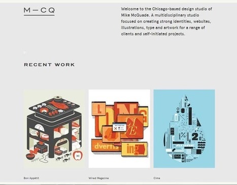
Minimalist design means using simple and basic elements only in the design. This article shares 60+ beautiful web designs that showcase minimalism in web design.
Minimal is so hard in website design. Mission creep is inevitable. We layer on more and more. Stopping that train is impossible or maybe not as these 60 website designs demonstrate.
|
|
Scooped by Martin (Marty) Smith |

You can’t imagine your life nowadays without the internet. We all spend hours and hours doing various things, like work, research, entertainment.
Marty Note
Sometimes it is good to look at a group of websites. This link includes 35 examples of rock band websites. The convention is clear. Rock band staged photo looking out directly at the camera, lots of texture and dark colors in the designs. Here is how any one of these sites could increase conversion 3x or 4x:
* Lighten Up - all that dark texture and color lowers conversion.
* Calls To Actions - few CTA's (BUTTONS) hurt conversion.
* Scream Less - visitors are fans, so scream less convert more.
* FANS - where are the fans (testimonials, games, contests).
* Games & Mobile - scream to download the app.
Of these 35 designs Metallica and Incubus would convert the best. I understand branding must be done, but this much screaming branding is obsessive and damaging to conversion. Sometimes the best brand strategy is to make it easy for fans or supporters to JOIN and CONTRIBUTE.
Everyone of these band sites feels like a lecture NOT a conversation. Funny concerts aren't like this. Concerts are a give and take between the crowd's energy and the band's performance one contributing to the other. Web, at its best, works that way too but not here so much.


White space can be the most defining design element of any website. Hard to use well though. Here are 13 examples of how to use whitespace in your website designs.