Must Design
75.6K views | +0 today
Follow
Must Design
Design Is Revolutionary
Your new post is loading...
Scooped by Martin (Marty) Smith
Scoop.it!

Hot, Flat, Colorful: 33 Examples of Ultra-Hot Flat Web Design Trend

Hot, Flat, Colorful: 33 Examples of Ultra-Hot Flat Web Design Trend | Must Design | Scoop.it
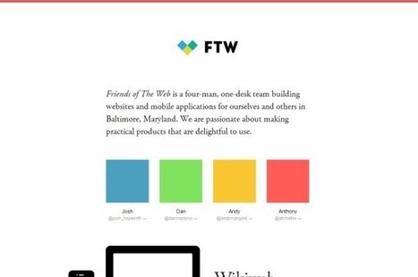
Currently, one of the biggest trends in the web design industry is the flat design style. In case you are not yet familiar with the term, flat design is essentially design without the drop shadows, gradients, and textures that have been common in web design for some time. Flat design uses solid colors and often typography figures prominently into the design. In this post we'll showcase 33 excellent examples of the flat web design trend. Hopefully they can provide some inspiration that can be put to use in your own work. Buffalo
Martin (Marty) Smith's insight:

Mobile is the secret driver of many of 2014's hottest web design trends. One of the hottest is flattening out web design. Small screens can't handle shading and three dimensionality as well as bigger screens, so flat is one of the HOTTEST web design trends as these 33 examples share. .

Alaina Duty's curator insight, September 25, 2015 1:45 PM

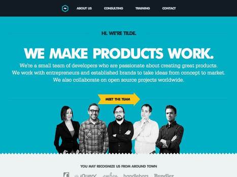
Here are some great examples of some bold, attention-grabbing color combinations incorporated in flat design.

Scooped by Martin (Marty) Smith
Scoop.it!

70 Stunning Responsive Sites For Inspiration Before A Mobile Holiday

70 Stunning Responsive Sites For Inspiration Before A Mobile Holiday | Must Design | Scoop.it

This holiday season will be the Christmas of MOBILE devices. Here are some amazing examples of the art and science of responsive design.


Martin (Marty) Smith's insight:

This holiday selling season will be all about MOBILE. Responsive websites look great no matter what device is lookign at them. Here are 70 examples of how to do responsive web design right.

No comment yet.
Scooped by Martin (Marty) Smith
Scoop.it!

Build Great SEO Friendly Mobile Websites

Build Great SEO Friendly Mobile Websites | Must Design | Scoop.it
15% of internet usage is done on a mobile device, and that's expected to climb to 20% by the end of 2013. Review the facts to build the best mobile site you can, whether it's a separate mobile site, a responsive site, or a combination of the two.
Martin (Marty) Smith's insight:

Great SEO Moz tips here about a tricky subject - how to build SEO friendly mobile websites.

No comment yet.
Scooped by Martin (Marty) Smith
Scoop.it!

Future of Web Design 3: Semantic Web Is A Game

Future of Web Design 3: Semantic Web Is A Game | Must Design | Scoop.it

Future Of Web Design In 3 Parts
What does the future of web design look like? So much is up in the air this Haiku Deck is my third and the topic is far from exhausted:

Future of Web Design 1: Web design in a SoLoMo world.

http://sco.lt/61eqNF 

Future of Web Design 2: Web  design when THEY and US &  OUT THERE and IN HERE are the same. 
http://sco.lt/7r6zkf 

Future of Web Design 3: How does a semantic and mobile web change design, marketing and sales. 

What happens when TIME becomes a perpetual now, sales happens in real time and marketing is about curation? Web design as we've known it is about to change as much as something can change. 

Why? I scratched the surface of why in How Entropy Is Creating Web 3.0 Right Under Our Noses:
http://scenttrail.blogspot.com/2012/11/how-entropy-is-creating-web-30-right.html  

Bottom line is everything is changing FAST so rewards go to the quick and flexible. If you have the courage to throw out almost everything you believe about everything once again you may just WIN BIG.  


No comment yet.