


 Your new post is loading...


What does the Infographic Revolution mean for your website design efforts?
* Less is more.
* Get to the point.
* Tease Don't Smother.
* Interactive beats Lectures.
* Colors Matter.
* Design Matters.
Friends @Scoopit are creating the Lean Content Movement and it is a movement web designers should join. Lean sites can still SUCK if they don't deliver a meaningful experience. Think of "meaningful experience" as one of two things:
1. Visitors quickly find what they want.
2. Visitors are intrigued enough to explore.
3. Some combination of 1 and 2.
One common web design error is to SMOTHER visitors instead of teasing them. Designers think great design means sharing everything NOW. Turns out you want poeple to work A LITTLE to find cool things. If we don't work we don't value and until a visitor starts clicky you don't know enough to smother.
What is the most common social stance now? Head down looking at a phone right? We expect and want to be include now. Visitors don't want lectures. They want to be included, to see what their friends thought and to share their take - LET THEM.
Color and Design have and will always matter. Be aware of the social signals your color choices send. Know if your design is clean and easy or complex and confusing (and you want the former :).
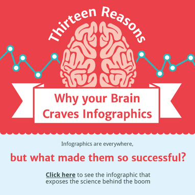
Note: The interactive Why Your Brain Craves Infographic seemed the best link for this post (and its fun :).


