* DO LESS and let them DO MORE (them = customers, visitors, advocates_. * GALLERIES ROCK - especially when your gallery is chock a block full of User Generated Content (UGC). * Engagement Rocks - do you have a tool that is fun to use AND promotes positive site heuristics such as time on site, pages viewed, lower bounce? * Every product, idea or website starts about the creators and must become about those who visit and love it. * People love what THEY create and contribute more than what you do. * This means all web design is or will be about collaboration.
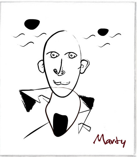
We love the simplicity of this little app, but the even COOLER riff came from our confirming email. This is the email that shares the link where my Picasso At The Beach drawing lives (linked from this post http://www.picassohead.com/?id=5290a28#.VBCSuy4Lksk.twitter ) and where this little pitch lived:
"This summer check out Picasso Looks at Degas at the Clark in Williamstown, MA. You won’t want to miss this groundbreaking, Clark-exclusive exhibition that is the first to look at Pablo Picasso’s deep fascination with Edgar Degas.
Wow, cool idea. Create a little art based app and sell related links in the confirmation email. That's brilliant marketing, subtle marketing and the art of web design. Kudos to Picassohead creators RFI Studios, http://www.rfistudios.com.
A poorly designed website has real impacts, whether page views or sales. We won't hesitate to bounce away to another with a better user experience.
1. Requiring users to signup before browsing your site 2. Forgetting about multiple screens 3. Having ridiculous forms to fill out 4. Using hard to read or cutesy fonts 5. Implementing a Search bar that sucks 6. Bombarding the reader with a wall of text 7. Displaying your products with low-res images
MS - 8 Non stop animated gifs (you will discover what I'm talking about)
Marty Note Agree with all 7 of these annoying disasters and would add an 8th - too many animated gifs all running at the same time with NO STOP.
Designing G+ In Crazy to suggest using G+ as a tool to power your online marketing right? Maybe not. Greatest return always comes from the least understood ideas. GooglePlus is a "least understood" idea these days.
Their leader left and TechCrunch said G+ the social net is dead. They may be right, but that is beside the point. G+ has always been more than a social net. G+ is a suite of tools marketers can use to find blue oceans.
Blue oceans are the as yet unspoiled places where marketers can still swim without fear of a herd of sharks. Oceans where sharks eat themselves are "red oceans" such as Facebook.
We suggest designing G+ into your marketing and site. Hold weekly hangouts, you don't need a G+ profile to use hangouts now, and created a branded community if only so you rule your name in #seo. Finally we suggest curating the great comments you will receive on G+ as a source of future content.
We've never been able to figure out how to use circles in a unique way, but they too beckon with possibility. By creating weekly content based on Hangouts and Community you get lots of GoogleJuice, the least expensive #videomarketing we know about and great community development tools that cost you NOTHING.
The linked post discusses Mark Traphagen's call to use G+ as a hub of your marketing. That's a great call since the price is RIGHT (free though you may spend some making G+ play the way you want it in your design). Designing G+ tools INTO your community creates the cheapest, biggest and best online win we can think of.
So the death of G+ is greatly exaggerated and, if you are smart, you will find a way to design the tool's many possibilities into your marketing.
The 10 most egregious UX offenses against users. Web design disasters and HTML horrors are legion, though many usability atrocities are less common than they used to be.
Marty Note If you took a day and fixed any of these Top 10 Web Design Mistakes That Apply you would make 50% more this holiday season. These are "cost of poker" fixes that can easily remain for years and years. Every year one of these mistakes exists your website is 10% less effective.
When you make 2 or more of these mistakes you pay with an order of magnitude more pain for each added mistake so 2 mistakes doesn't cost you 20%. No 2 mistakes cost you 200% of what your website could be doing for you.
Fix all 10 of these basic problems and your site is on its way to its "mission critical" place in your company.
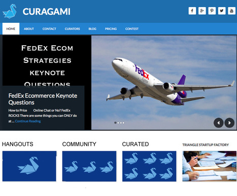
Marty's Take On Web Design & Data Visualization Had an interesting conversation with Curagami ( http://www.Curagami.com ) co-founder Phil Buckley at lunch yesterday. We were discussing my attempt to change the CSS on the Hack Headphones Shopify store I'm creating.
I shared how I found a post on how to change the buy button. I wanted a bigger button. The problem was the post with the answer must have been 2 or more iterations behind the theme I'm using.
The change moved slightly unintelligible java to completely unintelligible code (at least for me). Where once there was a "height" variable now there were nested variables.
Welcome to the future of web design.
If a company with more Ph.Ds than almost anyone, Google, decides to float their index creating a responsive float that seems to wrap search results around searchers like a blanket WHY don't we lucky few Internet marketers realize that's the planet we are all in transit to?
The New Web Designer Once a "website" becomes a series of interlocking "IF" "THEN" statements "designing" a website becomes an exercise in data visualization.
Design in a variable world is different as this great data visualization TED video shares (stay with it as the visual candy gets better in the middle). The skills need to be this "new designer" include but are not limited to:
* Spatial reasoning and intelligence.
* Ability to read and translate metrics into meaningful images (i.e. data visualization). * Enough Javascript to choke a horse.
* Even more CSS as everything is floating in a variable galaxy. * Understanding how variables and results should influence design, color, layout in order to increase engagement and conversion.
If this sounds like the silos between design, code, marketing, research, sales and customer service are coming down fast we agree.
Pageless design frees websites from the outdated conventions of print design and fully utilizes the digital platform they’re built on.
8 Compelling Reasons Why "Pageless' Web Design Wins (in the end):
* Tells a better story.
* Easier to "digest" or understand what to do.
* Emotionally more powerful.
* Higher Conversion Rates!!! * Makes updating faster & easier.
* Lowers BOUNCE & encourages sharing.
* Looks great on all devices (mobile included).
* Lower cost to develop.
Marty Note I confess to not being in love with the "infinite scroll" just yet. One modification we worked out for @Curagami, our Startup Factory funded startup, is to include a Call-To-Action at the top & Bottom.
CTAs help prepare the scroll. Remember "open book" tests? Putting a CTA on top of a waterfall of content helps prep a visitors mind. It "opens the book" for them. With this many impressive benefits I'm going to have to figure out how to start loving "pageless" design (lol).
I bet there are 5 (or so) similar modifications we can make to help us know how to create the paths and conversion we want by going "pageless".
Beautiful Unusual Navigation Designs for Inspiration. Selection of Awwwards websites with a strong presence of unusual navigation. An effective navigation design is crucial for a website
Martin (Marty) Smith's insight:
Navigation feels old and moldy. There are few things MORE critical than navigation. We've moved from left nav sitting firmly in the "golden triangle" to horizontal top navigation.
Neither of these options inspire and both are feeling long in the tooth and stupid. The social / mobile web requires a RETHINK about navigation. Can we find ways to make very page a homepage?
Can navigation be more relevant and less middle of the road boring? Here are some navigation examples from AWWWARDS.com that don't solve the problem...yet. But the dialogue helps begin the process of reducing our dependency on static, boring, "has-been" ideas like left or horizontal nav.
Are you as surprised that navigation hasn't been on the "top changes" list for web design in 2014? Has to be on our 2015 list because every current option is BAD and getting worse.
Here’s a fun fact: Over the last 10 years, our attention spans have decreased from 12 minutes to 5 minutes. Our ability (and our desire) to read lots of c
Martin (Marty) Smith's insight:
My favorite is the NYT's Home and Garden in depth look at 4 square blocks in Philly. Great content daisy chained well so it never overwhelms and keeps readers moving. Great use of anchor links (from the sidebar) makes the piece feel more interactive than it really is.
Long form content has many #newseo benefits. The more engagement your content creates the greater chances for conversion. Web heuristic measures such as time on site, pages viewed and returning visitors help with the "new seo" too.
Steal some of these easy tricks from NYT and make your content feel more interactive than it is and read faster and more fun so your metrics go up and readers love you enough to become buyers or subscribers.
"I spent a lifetime learning to draw like a child." Picasso
This is an interesting post from Thomas King about the complex nature of simplicity. Picasso's point about spending a lifetime learning to draw like a child seems important for web designers too.
The hardest thing to do is do less. The hardest mind to recover is the exploratory mind, the mind before judgement. When we recover the playful mind, the simple easily rewarding routine of play, our designs run free like Picasso's bull.
Graphic Designers ROCK I have more than tremendous respect and admiration for graphic designers. The ability to use tools like Photoshop and Illustrator to create MAGIC is something I will always envy. I know enough to know just how magical those skills truly are, so thank you.
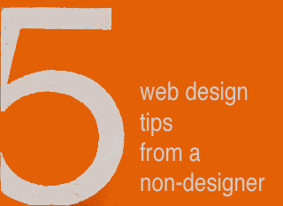
I would LOVE to convince gifted visual marketers of the need to fix five mistakes I see over and over, mistakes that can HARM a websites bottom line and ability to scale.
I confess to making some of these mistakes myself. Easy to do when caught up in the NEW chase. I got so I printed out this list and keep it in view so it smacks me as a reminder while creating ideas for a new design.
Despite the list being omnipresent I forgot a subscription option on CrowdFunde.com two months ago, so EASY to forget these ideas:
** Email Subscription Any websites lifeline is the LIST of supporters and subscribers they OWN. If Google changes their algorithm and PPC goes bankrupt you can always may your own list, so making sure the ability to opt in to that list is omnipresent is a CSF (Critical Success Factor).
** Keywords In Category Names Think, "Do we want to win that keyword," when reviewing your navigation. You may select to have your URLs rewritten to be more keyword specific, but those internal links play an important role with Google's spider and SEO so KEYWORDS are a must.
** Research Keywords My CrowdFunde co-founder Phil Buckley asked me if I thought attorneys or lawyers would be the most searched term. "Lawyers," I answered confidently knowing I was wrong (you never win these who will win questions lol). Attorneys is the winner and by a large margin. Don't write copy to what you THINK when it is so easy to do a little research and KNOW.
** The Tricky Part To Web Analytics Here's the rub to web metrics. They operate in a constant seesaw dance with one another. Attorneys may be the most searched, but maybe that is because the Mass Tort guys have crushed the deck in some way (have no knowledge of that only using it as an example so please don't sue me lol). When you DESIGN with numbers you design better, but be sure to ask your SEO contact where the rubs are in the numbers. Rubs are numbers that LOOK one way but actually ARE another. Trust me you NEVER want to spend the kind of time in Google Analytics knowing where the rubs are requires, so ask.
** 80/20 Rule One Internet marketing FRACTAL we discovered is 20% of the links, traffic, pages always get 80% or more of the value. Your job is to build a flexible framework so when your managing team SEES the emerging 80/20 rule you can easily shift the presentation to favor the 20 over the 80.
Now please take these practical, money making ideas and make them beautiful and THANK YOU for your dedication to BEAUTY in design and life :). Marty
* Holistic design will increasingly mean Mobile Fist design.
* We are all in the community building business (whether we know it or not) & community creates mass production OUT OF individual expression. * Our adaptations will be social & mobile, gamified & curated.
The link between math and architecture goes back to ancient times, when the two disciplines were virtually indistinguishable. Pyramids and temples were some of the earliest examples of mathematical...
Marty Note I share these amazing pictures of architecture inspired by math because Web 3.0 feels less wireframes and more movable feast. As the social conversation becomes the medium of exchange online we are LESS likely to GO TO A PLACE and more likely to seek the warmth of conversations with friends.
Math will become a building block of our web architecture just as the only way to imagine these buildings was with math. The math that will matter will be the predictive analytics of Wall Street combined with the artistic beauty of Gehry, the music of jazz and smooth surface of an Alex Katz or the broken plates of an early Julian Schnabel.
As we move into the web's social future our place will be where there are relevant conversations. We will be Bedouins moving from one conversational camp to another, brewing tea in the dessert and listening to the wind as we appreciate the rarity of rain.
Arquitectura se remonta a tiempos antiguos. Esta un sito de la Matematicas incluir en arquitectura. La sito tenga muco pictures de la arte. Edificio es un reflexion de la paisaje. Es un muy bien sito.
* How did the painter meet his model? * What would explain that look in her eye? * Why is that man … blushing?
She shares three stories inspired by portraits, including the one that led to her best-selling novel "Girl With a Pearl Earring."
3 Find Your Story Tips One of the most common "we can't do it" complaints we hear is, "Our content is boring and no one on out team knows how to tell a story". There are no "boring" products or services and we are surrounded by stories. Here are 5 tips to help you find the magical content needed to wins hearts and minds online.
Story Finder Tip #1: Your Employees You never need to look far for great stories. Stories of heroic efforts against great odds are sitting in your office now. There are cancer survivors, triathletes and parents with special children in your company as I write this.
You might think, "I don't want to invade their privacy," and we aren't suggesting it. We suggest explaining that any company really only exists in the minds of its employees. Since publishing costs are now zero you can afford to explain who you are by proxy - via your employees stories, passions and loves.
This is "Employee Story of the Month" instead of a banal award your customers learn about the journey your team members have experienced and so feel close to them, you and your brands and products. "I feel like I know you," a woman said hugging my ex at the Gift Show in San Francisco.
Our potential customer learned about Found Objects and Janet McKean from our monthly newsletters. Those newsletters led to the hug and made doing business together easy.
Oh, btw each month I included a short story about Janet's life, experiences and family. May be why I'm divorced (lol), because Janet hated sharing so much. "You married a storyteller, " I would say smiling and writing and well you can figure out how well that worked in our relationship. Worked GREAT with our customers though (lol).
Story Finder Tip 2: Be Like Tracy Imagine An Image's Story Tracy wrote a best seller by imagining questions implied but not stated. Your online marketing uses images all the time, but what are the questions BEHIND the image.
If you have a picture from a company event who is there? What was being celebrated? What in the image doesn't make sense? Is there something that hints at a mystery o some enigma? Work backwards from an image. Begin like Tracy. Ask questions. The answers are your story.
Story Finder Tip 3: Ask For Customer Stories Take the image in example #2 and ask your customers to share their questions, stories or answers to hidden riddles. Asking for a story may be too hard and intimidating, but asking what these people in the corner are doing could be fun and spark imaginations and lead to stories.
Once you have an "Ambassador" group of customers / advocates established ask them to help shape your ASK. Ask your advocates to help you know the best way to engage and hear stories your customers are itching to share.
Writing this tip reminds me of a story (of course lol). I left home for the first time. I was in the 10th grade and enrolled at The Choate School. My mom cried when she and my father dropped me off. Now I was sitting in my first English class.
Mr. Noland, a bearded thirty something teacher dressed not unlike every preppie in the room (straight leg corduroys, button down oxford shirt) asked, "Tell me the story of this pencil". He said this hold a pencil inches from his nose and staring at it as he rotated it and waved it up and down.
Dutifully I set out to describe the pencil. "Pencils down," Mr. Noland said asking a student he clearly knew to read his story first. "She couldn't tell why. All she could smell was stale cigar...." the novella this student wrote about a possible murder, broken hearts and a love affair gone wrong made me realize I wasn't in Kansas anymore.
If Mr. Noland's shill can write 500 words on a pencil, YOU can tell a captivating story online about you, your company, brands and products.
Web Design & Stories Now that you know WHERE to find stories don't forget to DESIGN them in. Sharing stories online is tricky. You want to make readers do a little work to get to a place they can read and read.
Don't do like some and break your stories into tiny 200 word bites. Too much clicking ruins the "all in" feel of a good story. Make your readers click a couple of times to pan out readers from scanners and then let them read.
Will cover more "story design" tips in another post. First FIND your stories since that is often the hardest task. Next create a design that does the impossible - makes it fun to read online.
If you spend enough time online, it's surprising how much most websites start to look alike. Sure, there are variations, but to a large extent, web design is
Martin (Marty) Smith's insight:
Wow, some cool web design ideas here and some HORRIBLE ones. I like Wolf & Badger: https://www.wolfandbadger.com/ Current site doesn't look like the FLASH example.
Never use Flash at this point as it kills SEO and its not "trending" in the right direction). Some of these ideas are a mess, but see which ones are your favorites. Always good to see where the line is. Some of these sites are well over the line.
New design isn't as funky, but it is solid. The idea of walking a customer into the middle of a strange fantasy seen and letting them find their links would not normally be something I would like since it obscures instead of makes clear.
The Online Shop (lower right) is what sold me on this fantasy. I also think we are in a time when sites are sites and so BORING. The Flash needed to be killed but check out the link to there new site and see if you don't still rock a good design.
Depending on your brand and message some can be very professional and straight to the point, and others a bit more relaxed and playful. Here is a collection of taglines and intro messages from freelance designers and design agencies around the world for your inspiration.
Our @Curagami Evolution of Web Design Infographic (http://sco.lt/74Nvsn_ broke daily view records for our startup. Here are 5 Web Design Implications implied by that infographic:
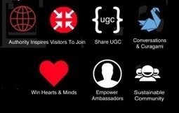
Leave Room For THEM (visitors & customers) - As User Generated Content (UGC) becomes increasingly important its important to build in ROOM for comments, reviews and other UGC. UGC needs an ASK and the room to curate and share results of the ask.
One For You, 2 For Them - Every System & Process you build for YOU, build 2 for them. Can users follow each other? Can users share a profile? Can users share content ideas and content easily? What is your social reward system for content shares.
Social Graphics - there is a reason people in the army wear rank. Wearing "social rank" immediately says who someone IS with a single graphic. Easier to trust social avatars when they are similarly grounded with graphics earned and proudly socially displayed. Social graphics reward those who've earned them AND set the stage for the next generation of people aspiring to "be like them" so a double win. Find ways to share feedback in social spaces like charities do with thermometers.
Build an Ambassadors Area - ambassadors are so important to creating and sustaining online community. Ambassadors are volunteers wiling to sacrifice to JOIN and ADVOCATE you and your ideas. One CSF our startup Curgami is working on is how to quickly identify a website's 1% Contributors and 9% Supporters. Once identified GIVE THEM JOBS and a special place to "hang out".
Curate & Collaborate More, Create Less = more "blank pages" - design is an important wrapper, but web design can become an obstruction too. If you curate a "Member of the Month" feature leave room to fill up as you go. Maybe this month's feature sits on top of 3 previous months. The more face-time you can build for THEM the more social shares and support your online community earns.
What about you? What design changes do you see ahead? As we move to "community" how can our design support and create trust?
Seasonality creates relevance & relevance creates community. Every website's hero should change at least 4x a year: Summer, Fall, Winter & Spring.
Martin (Marty) Smith's insight:
This Curagami post shares our favorite Top 10 Summer Web Designs in the hope people will VOTE for theirs and share ones we missed. The post also shares a link from @Mike_Alton about the magic of List.ly (the Digg-like tool that runs the social voting engine that's free and easy to embed).
Master Blasters When everything is social community rules. Curagami our Triangle Startup Factory funded startup is working on helping ecommerce merchants and content marketers validate the ROI of social and content marketing. Community is a CSF, Critical Success Factor, because community is what creates an army of advocates.
This post is about how to win the hearts and minds of your most important customers - those willing to advocate your products, services and web content.
Great post from The Guardian on creating clean well lighted websites. My favorite? Discussion on how important surprise is to What's Next.
We've become both cynical and searchers. As incompatible as cynical searchers sounds it is our natural state. We have a tough hide created by more push advertising than the next generation will need to put up with the loss of a very important idea -
We are not human beings having a spiritual experience; we are spiritual beings having a human experience.
How does your web design SOUND? Strange question, but new neuromarketing research suggests we mentally sound out words we read. Implications for web designers are significant and new.
Most web designers care about how their design LOOKS, but maybe we should worry about how our sites SOUND too. Sound is a HUGE learning aid and one easy to overlook as we focus on colors, font and line.
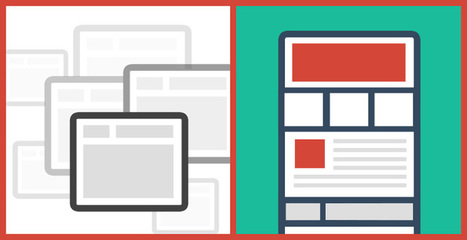
There are many of content heavy websites out there, but very few seem to take good design into account. We take a look at those that do.
Marty Note Content can KILL a website design. Content needs to be well thought out. How can you tease the click without frustrating your visitors and readers? How can you share all the content you need to share without wrecking your design? Here are 25 examples of how to use content as a helpful design element instead of ending up on content's rocky shores.
To get content containing either thought or leadership enter:
To get content containing both thought and leadership enter:
To get content containing the expression thought leadership enter:
You can enter several keywords and you can refine them whenever you want. Our suggestion engine uses more signals but entering a few keywords here will rapidly give you great content to curate.


 Your new post is loading...


![Finding Stories Inside Paintings via Tracy Chevalier TED Talk [+ 3 Find Your Story Tips via @Scenttrail] | Must Design | Scoop.it](https://img.scoop.it/9KsJuaD4g7w6ZRzYDL-2TDl72eJkfbmt4t8yenImKBVvK0kTmF0xjctABnaLJIm9)
![Funky Webdesign Ideas [some great, some horrible] | Must Design | Scoop.it](https://img.scoop.it/E7lQO7XPS2ZyjBQKsnipZDl72eJkfbmt4t8yenImKBVvK0kTmF0xjctABnaLJIm9)


add your insight...