Must Design
75.5K views | +0 today
Follow
Must Design
Design Is Revolutionary
Your new post is loading...
Rescooped by Martin (Marty) Smith from Incion Web Design Blog
Scoop.it!

Responsive Website Design - Must Know Facts

Responsive Website Design - Must Know Facts | Must Design | Scoop.it
Responsive design is a relatively new term in web design. It was only coined three years ago in May of 2010, when web designer Ethan Marcotte used the term.

Via Incion
Martin (Marty) Smith's insight:

There are many reasons to create responsive design. This post shares most of them.

ramil navidad's curator insight, June 17, 2013 3:04 PM

it's all about responsive design now

Adapt or Die 

Scooped by Martin (Marty) Smith
Scoop.it!

Latest Trends in Web Design [Infographic]

Latest Trends in Web Design [Infographic] | Must Design | Scoop.it
Infographic: Latest Trends in Web Design. Which web design trends have ruled the first quarter of 2013 and what you should be focusing on.
Martin (Marty) Smith's insight:

Responsive To Visual
Excellent infographic summarizing current web design trends from responsive to larger images and more of them. I would add in @Scoopit's Lean Content Movement ( http://www.atlanticbt.com/blog/the-lean-content-movement/ ), but excellent summary of what is happening now.

Michael Wilkinson's curator insight, March 21, 2014 2:09 AM

Web design trends of 2013, can use a guide to keep website up to date with current trends and appeal to users.

Scooped by Martin (Marty) Smith
Scoop.it!

42 Design/Tech Magazines Inspire

42 Design/Tech Magazines Inspire | Must Design | Scoop.it
Regardless of what it is that you're selling, in order to remain competitive, you have to know exactly, what's going on in the field you're working in.
Martin (Marty) Smith's insight:

Since one of the best ways to learn design is to look at OPD (Other People's Designs) take a look through these excellent design references and LEARN.

No comment yet.
Scooped by Martin (Marty) Smith
Scoop.it!

How Facebook Graph Search Is Example Of Web 3.0's Smarter Infrastructure

How Facebook Graph Search Is Example Of Web 3.0's  Smarter Infrastructure | Must Design | Scoop.it
Web 3.0 will enable an unprecedented level of intelligence in almost all systems and applications.
Martin (Marty) Smith's insight:

Interesting take on Facebook's graphic search an example of the new, more flexible and intuitive Web 3.0 design. 

No comment yet.
Scooped by Martin (Marty) Smith
Scoop.it!

The Fantastics - 30 Eye Catching Website Designs Inspire

The Fantastics - 30 Eye Catching Website Designs Inspire | Must Design | Scoop.it
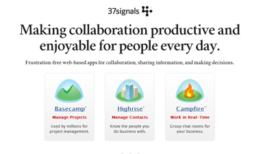
The web design world seems to be changing rapidly as designers push the boundaries on what can be done on the web. There are a lot of inspirational website lists out there so I wanted this one to be different.
Martin (Marty) Smith's insight:

37 Signals does rock and there are a handful of rockers in this group of "fantastic" website design. 

No comment yet.
Scooped by Martin (Marty) Smith
Scoop.it!

22 Red, Red, Red Website Designs Inspire

22 Red, Red, Red Website Designs Inspire | Must Design | Scoop.it
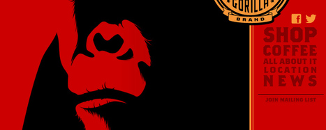
Red is such a powerful colour, it provides emotion and a great emphasis on detail. With a dark, grey colour scheme - red can be used to emphasis text, navigation menu and more.
Martin (Marty) Smith's insight:

Red is a favorite color, but online a little red goes a long way. Red is aggressive, attention getting and stress producing. On the other hand several of these websites show how to use red to conquer, to distinguish and to ROCK. 

Which are your favorites? 

No comment yet.
Scooped by Martin (Marty) Smith
Scoop.it!

60 Classy Website Designs Inspire

60 Classy Website Designs Inspire | Must Design | Scoop.it
It's quite easy to get stuck in creativity blocks, but it's damn hard to get out of them. Particularly if you are out of time and don't want to compromise your professional principles selecting the first "quick-n-dirty" solution you can think of.
Martin (Marty) Smith's insight:

Refined, elegant and classy website designs from Smashing Magazine. 

No comment yet.
Scooped by Martin (Marty) Smith
Scoop.it!

Top 8 Web Design Tips [Marty Note]

Top 8 Web Design Tips [Marty Note] | Must Design | Scoop.it

Solid tips here with the exception of #4 and #6. My note explains why Internet type is more tricky than the tip in this post explains and why full screen photos should only be used by the most skilled. 

Martin (Marty) Smith's insight:

Top 10 Minus 2
This is an excellent post, but I removed two of the top 10 tips. I removed #4 Type because it isn't clear. Unique type in an image is fine since you know how it will render. Unique type in body text can be a disaster because you don't know how it will render.

The Internet is a billion computers all with different setups for type. When you render an exotic type in HTML text the receiving computer must have that same exotic type or it renders as a more common type (Arial, Veranda).

Let's call this "type roulette" and it is to be avoided. Exotic type in .JPGs or .PNGs or .GIFs (best format for type only images) render exactly as you see them. Type in body text is dependent on the receiving device so I tend to use non-serif universal type (easier to read non-serif type online).

There are ways to select how your type will render when it isn't available on the receiving computer, but I don't like the variability of playing font roulette. Type plays an important but floating point role in website design. I pick a type that will WORK, look pretty much the same on all receiving computers and be easy to read. Don't play font roulette.

I also removed #6 - Drop In Full Screen Photos
Yes this idea can be done well, but your designer better be VERY good. I prefer lots of white space on a website design. White space creates spacing and so highlights design elements NEXT to it. Strange to think of creating highlights by using negative space, but if you think of every great picture or painting you love there is always the use of negative space.

Warhol was famous for using BLACK to create his negative space. Great photographers such as Annie Leibovitz frame negative space in like huge arrows getting your eyes to go where they want them.

You may be the one in 100 designer who can use full screen photos and still create design tension and navigational hierarchy, but odds are better to say USE WHITE SPACE than full screen photos.

No comment yet.
Scooped by Martin (Marty) Smith
Scoop.it!

10 Basic Tips About Responsive Design - Infographic

10 Basic Tips About Responsive Design - Infographic | Must Design | Scoop.it
Responsive web design could be a specific sort of internet development and design that utilizes CSS3 with fluid proportion-based grids to adapt the layout of a design to viewing setting.
Martin (Marty) Smith's insight:

Great infographic. Don't assume because it is reponsive it is GOOD or EASY (it is neither) and beware SEO complications. 

No comment yet.
Scooped by Martin (Marty) Smith
Scoop.it!

Best of Web Design in 2012 Inspires: Examples of Scoop.it Lean Content Movement

Best of Web Design in 2012 Inspires: Examples of Scoop.it Lean Content Movement | Must Design | Scoop.it
First of all, we would like to wish a Happy New Year to all of our readers! And to start 2013, we decided to gather some of the most appreciated designs we
Martin (Marty) Smith's insight:

Evidence Of The Lean Content Movement
I like the balance of smooth as butter UX combined with large supportive graphics in these best of 2012 website design examples. The team at Scoop.it is creating a "Lean Content Movement". See my blog post on the subject here:

http://www.atlanticbt.com/blog/the-lean-content-movement/ 


One aspect of the Lean Content Movement is to tell more story with fewer words, images, navigation and anything and everything else. These Best Of 2012 designs achieve more with less. 


No comment yet.
Scooped by Martin (Marty) Smith
Scoop.it!

A Brief History of Time and Web 3.0

A Brief History of Time and Web 3.0 | Must Design | Scoop.it
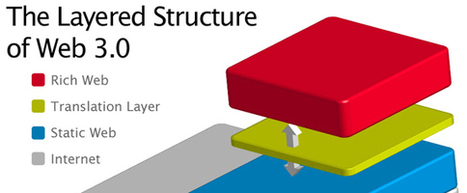
If you ask some, they'll tell you Web 2.0 as we know it is probably on its way out the door.
Martin (Marty) Smith's insight:

Web 3.0 Sure TO ROCK
Great primer on the difference between the structured Web 2.0 and the vastly less structured Web 3.0. Mobile, the cloud and WE are shaping web 3.0. 

We are different. We've been using the web for years now. Some of our children ONLY know a web enabled world. Web 3.0 will detach the presentation layer from its current pre-conceived and static code. 

In less than two years such static presentation will seem old hat and ancient. Web 3.0's on demand structure will create frameworks and what if statements where static HTML structures a presentation layer now. 

In Web 3.0 a website's presentation will be controlled by branching AI-like algorithms and trimmed paths developed from analytics that fit to the behaviors and personas moving through the ecosystem. In fact path creation will be so fast and seamless novel combinations of elements is possible on the fly. 

The future converts better because we will "surf" environments that anticipate our needs and use wisdom of crowds and analytics to fit any website to our experience like hand to glove.  


Web 3.0's implications for designers and web developers include:

* Need to understand conditional logic (If/Then).

* Understanding of predictive analytics will help.

* Creative right brain skills + left-brain analytics.

* Presentation and program layer are connected twins.


It may be hard to have visual creators become more analytical and vice versa, but that is the journey Web 3.0 is on. Until the next generation, the generation who will only know this kind of hybrid web mashup, arrives teams will need to round out the skills needed to win with Web 3.0 designs.  


see Also
Website Design In 3 Dimensions
http://www.scoop.it/t/curation-revolution/p/3995705467/website-design-in-3-dimensions-why-google-s-float-is-a-blueprint-for-web-3-0  


No comment yet.
Scooped by Martin (Marty) Smith
Scoop.it!

55 Big Beautiful and BLUE Website Designs Inspire

55 Big Beautiful and BLUE Website Designs Inspire | Must Design | Scoop.it
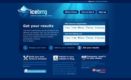
Another monday has come and here we are, ready to inspire you with our web design related lists! Today is all about blue... a color that personally, I love. A color that represents the oceans and the sky.
Martin (Marty) Smith's insight:

Blues is seductive, smooth and calming especially the way these great web designers use it. 

No comment yet.
Scooped by Martin (Marty) Smith
Scoop.it!

25 Simple yet Graceful Website Designs Inspire

25 Simple yet Graceful Website Designs Inspire | Must Design | Scoop.it
Ever thought of trying 25 Simple yet Graceful Website Designs. Experience the wonders of simplicity and uniqueness allowing for easy navigation and faster loading time.
Martin (Marty) Smith's insight:

Love these simple, graceful yet muscular website designs. 

No comment yet.