
The top 5 graphic design trends of 2019 will help you push boundaries and ignite your creativity. Use Adobe Creative Cloud products to bring your ideas to life.
Get Started for FREE
Sign up with Facebook Sign up with X
I don't have a Facebook or a X account


 Your new post is loading...
 Your new post is loading...
Your new post is loading...
The top 5 graphic design trends of 2019 will help you push boundaries and ignite your creativity. Use Adobe Creative Cloud products to bring your ideas to life. 
No comment yet.
Sign up to comment
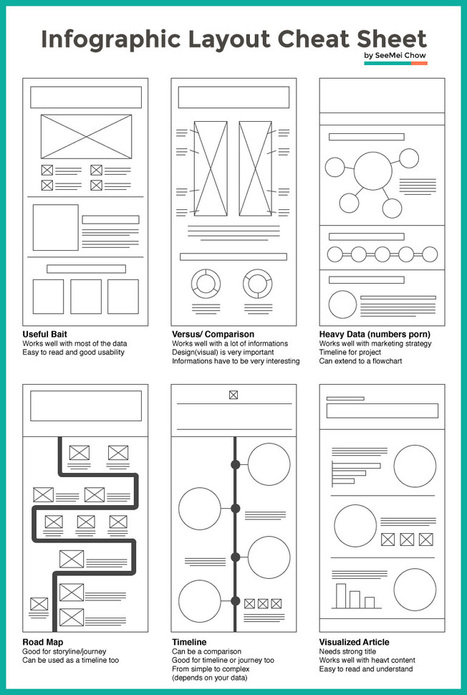
Infographic layouts refer to the arrangement of your visual elements and your content. When you begin working on a piece of infographic, you should have a story to tell hence, you will need to select a layout that best suits your story. Using the right layout will ensure good readability and convey your message well.
We have put together a cheat sheet for your quick reference to the right arrangement to use, here are six common ones you can quickly work with.... Via Jeff Domansky

Tony Guzman's curator insight,
March 2, 2015 3:29 PM
This article helps you determine the best layout for the type of infographic you may be creating. 
David Baker's curator insight,
March 13, 2015 1:21 AM
This is a great tool to share with my seminar teachers whose final project for the year is an infographic. 
Monica S Mcfeeters's curator insight,
March 20, 2015 11:51 PM
HERE ARE SOME HELPFUL LAYOUTS TO SPEED UP YOUR DESIGNS.
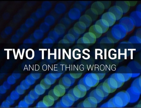
"Dear Lifehacker, I have been tasked to make a slideshow for an event at work. I don’t want to make a generic PowerPoint with just boring text or pictures. What are some ways I can enhance the slideshow so it looks impressive and knocks the socks off my audience?" Via Baiba Svenca

Elke Watson's comment,
May 19, 2013 5:26 PM
I was an early adopter of Prezi (I think), and am now starting to get a bit tired of the predictable jumping around. It's like cinnamon or something. A wonderful spice but in small doses and not every day! I found that I returned to PPT, using punchy images (thanks Common creative section on Flickr!!) and short / one-word statements. Very powerful

Joaquín Ballester's comment,
May 19, 2013 5:32 PM
I agree with you, Elke. PPT is more customizable and powerful.

Marion Mulder's curator insight,
May 22, 2013 6:00 AM
Oke - if you work in the corporate world there is just no escaping from having to create powerpoints at one point or another. You might as well create amzing one's while your at it. Here are some handy tips, do's & don'ts worth looking at

This article and infographic posted by Chelsey Kilser and Daily Infographic and is about the of findings from Entrepreneur, TheLogoFactory and Logodesignworks.
Jan Gordon:
Effective social business requires a strong brand message, great content and the ability to build community through deeper engagement and is first and foremost. However, the way you package your services matters and the colors you use are very important.
Excerpt:
"Colors matter and they are one of the factors that keeps your company standing out, gives your company a voice and gives you leverage over other similar companies."
Here are a few takeaways:
**The true colors of the world's top brands:
*29% use red *33% use blue *13% use yellow *28% use black or grayscale
**Good information about how people respond to different colors
Here are just a few:
*Red is agressive, provacative, attention- grabbing
*Purple signifies royalty, sophistication, mystery
*Black means prestige, value, timelessness
*Brown is earthlike, natural, simplistic
Selected by Jan Gordon covering "Content Curation, Social Business and Beyond"
See article and infographic here: [http://bit.ly/OjaJjM] Via janlgordon

Graphic design, computer graphics and computer animation play a major role in materials development in print, audiovisual or computer based applications. Curtin's experienced Graphic Designers can create attractive and informative visuals for teaching, learning and research by schools/departments and by external users.
Use the Filter pull-down menu above to search for topics by keywords.
|
Professional designers will advise against ever using bullet points in a deck: Bullet points act like bullets — they kill your presentation. However, this mentality can change if you transform your bullet points into a visual component of your presentation. Via Baiba Svenca

David Swaddle's curator insight,
May 7, 2015 2:49 AM
5 great examples of how to avoid using bullet points. 
Wendy Zaruba's curator insight,
May 15, 2015 9:06 AM
Great tips on transforming those old "bullets" and how to make a more engaging presentation.

Baiba Svenca's curator insight,
May 12, 2014 11:51 AM
The article deals with the role of photos in your presentations and discusses 3 methods of using images with purpose. Great image examples and explanations! 
Mirta Liliana Filgueira's curator insight,
May 13, 2014 7:41 PM
Como elegir fotografías para una presentación.
Short talk about presentations given at Startup Dynamo, a workshop held by Startup@Singapore NUS using the Learn Startup Methodology. My segment was on Present Via Baiba Svenca

Alex Grech's curator insight,
October 9, 2013 4:18 PM
It's the first time I've taught undergraduates. I've found myself stripping slides to the core message and trying to find visuals that can communicate that message quickly, simply and yet - resonate. There is nothing as tough as trying to unclutter the mind and focus on what really needs to be said - as opposed to 'making a point' or simply 'showing off'. This presentation is about the art of visuals, clear design, and keeping it 'stupidly simple'. 
Louise Robinson-Lay's curator insight,
January 17, 2014 1:28 AM
While beautiful Powerpoint may seem like an oxymoron this slideshow proves it is possible.
Business Cards - A gallery and showcase of the most beautiful, cool, and unique business card design.
Smashing Magazine is an online magazine for professional Web designers and developers, with a focus on useful techniques, best practices and valuable resources.
Largest Collection of Free Adobe Photoshop Tutorials, Easy to Advanced Tutorial with Free Photoshop Download.
|