Your new post is loading...
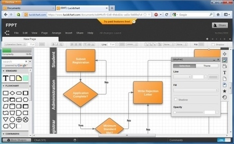
Lucid Chart is an online platform for creating powerful diagrams and flowcharts that can be used for creating presentations and for visual communication with your audience. KF: Of course these images can always be captured to illustrate information in other contexts besides presentations. The resultant graphs/charts and diagrams can as easily be repurposed for LMS and social media.
Via Baiba Svenca
Creative Commons licensed photos are a sort of internet miracle: By providing an easily-understood syntax for attribution and permissions, they make it possible to add visual interest to blog posts, web sites, syllabuses, presentations–anything you like, really. They also facilitate remixes and other forms of creative adaptation (or deformation), which can be useful in a wide variety of teaching and research contexts.
Clipica lets you paste pictures to the web! Upload and host images for free by pasting them right into your browser.
This infographic is a fascinating look at images and the web and their affect on us when making decisions about a particular company, how important they are when it comes to selling products online and much more. Here is one thing that caught my attention: How images affect Social Engagement Social media posts also benefit from adding photos. According to an analysis by Web Liquid (conducted pre-Timeline), Facebook posts with photos have the highest user engagement than any other post Engagement rate with Facebook posts by type *0.37% Photo *0.31% Video *0.27% Test Only *0.15% Link We are bombarded with too much text, images have a way of connecting with the reader that can persuade, create a connection, affect your decision to purchase a product and much more Selected by Jan Gordon covering "Content Curation, Social Business and Beyond" See article and infographic: [http://tinyurl.com/6n9k4e2]
Via janlgordon
E-Learning Heroes: Step-by-step tutorials for building better courses, fast answers to your e-learning questions, free downloads for your e-learning projects.
Every word we search online is represented by the first image that Google Image shows. By using the most popular online search engine, we are able to turn the images into a new language.
I was intrigued to see the paper series about Student Motivation published by the U.S. Center on Education Policy shared as a resource on GETideas.org.
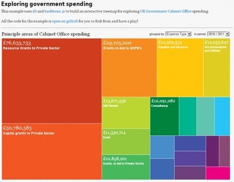
Robin Good: This has got to be a dream come true. Create professionally-looking interactive graph charts (and soon also full infographics) with the best tool and easiest interface available out there. Infogr.am makes it as easy as it can possibly be the creation of charts that will always look great and effective no matter what your design skill level is. You simply choose the type of graph you want (bar, line, pie, matrix) to create, edit the existing data with your own, and you are ready to go. Each chart is designed following some basic information design principles, allowing data to be easily read and for the chart to look very credible and "professional".
Also: each chart created with Infogram can be easily embedded on any web site, and customized in size and colors used.
Infogram integrates an online library where to save your completed work, and an upcoming online store.
Try it out now: http://infogr.am/app/ ; Awesome. 10/10
Via Robin Good, Jenny Pesina
This week has seen the launch of The Miso Project, an “open source toolkit designed to expedite the creation of high-quality interactive storytelling and data visualisation content”. It is a joint development between The Guardian (with Alastair Dant and Alex Graul at the helm) and Boston-based Bocoup (led by Irene Ros). The first set of libraries released is entitled Dataset is a JavaScript client-side data ‘transformation and management’ library which makes life easier for visualisation designers by “handling loading, parsing, sorting, querying and manipulating data from all sorts of sources”.
Easily combine your voice, pictures, videos and more into a beautiful, interactive experience describing anything.
Pixtick, an online application, can capture screenshot from browser. No download or installation required. Its having robust annotation tools to annotate and edit screenshots and images from hard drive or from web.
Learn how to add a Poster Frame for your video clips in PowerPoint 2010. When you insert a video in your presentation, you might see that the placed video clip displays a blank or black screen on the slide, as shown in Figure 1 below. Until the clip actually starts playing in slide show view, your users will see this black rectangle, which doesn't look professional at all. With PowerPoint 2010's new Poster Frame feature, you can easily overcome this limitation, and change the black rectangle to an image by selecting a frame from the video itself, or even a picture from a different source. Also, the Poster Frame feature presents a good option for displaying a company logo or a picture of a speaker in the video. The Poster Frame that you add or insert to a video is a frame that appears first when you view the containing slide in a slide show.
Wibbitz is a text-to-video platform that can automatically turn any text-based article, post or feed into a short video.
|
Inspiration, Turorials and Resources for design
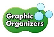
Gone are the days when planning and thinking were done mainly by pen and paper.Technology have made it pretty much easier to think in different other ways. Free mind mapping , brainstorming and concept mapping applications are ubiquitous online and more and more teachers are using them . The 21st century education is based , on a large part of it, on the visual output. The benefits of graphic organizers in education - Teachers can use graphic organizers to engage visual learners and help them organize their thoughts
- Graphic organizers help students make powerful connections between ideas and concepts
- They help students develop their convergent thinking by providing a framework for the development of new ideas through analysis, reflection and display.
- They also help students promote their divergent thinking by using such techniques as brainstorming to generate ideas.
- They can be used for developing vocabulary skills and improve reading, writing and communication skills.
- Students can easily learn new concepts and think in new novel ways using graphic organizers
- They help students focus on connections rather than words - Finally , graphic organizers can help both teachers and students develop creative and critical thinking skills. Read more: http://www.educatorstechnology.com/2012/06/teachers-guide-on-use-of-graphic.html
Via Gust MEES
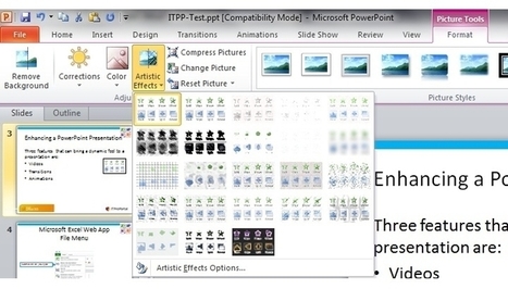
This article provides an overview of the PowerPoint 2010 Photo/Picture manipulation tools, that can speed up the process of creating appropriate pictures, to help emphasise your presentation.
Via Baiba Svenca
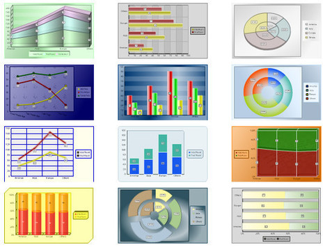
Charts and graphs are the best ways to represent information and relationship between two interlinked entities.
Via @LearningWheel
A designer tool for creating color combinations that work together well. ColorSchemeDesigner.com is a wonderful online tool helping people create their own palettes of colors they work well together. Color Scheme Designer is a unique modern interpretation of ancient color theories, utilizing the palettes of classical masters for everyone's use. It's been online for more than 10 years, loved by milions and is constantly growing
High-end 3D medical images and animation for marketing and advertising professionals engaged in the fields of healthcare, biotechnology and medicine. About 3D4Medical 3D4Medical.com sets the standard in the development of revolutionary design for medical, reference, and health and fitness applications. 3D4Medical.com's latest apps offer exceptional interactivity and are medically approved, insuring that they provide intuitive and unique learning experiences. The latest Nova Series apps developed by 3d4Medical.com enable users to effortlessly navigate via 360° views of the human body and are ideal for biology and medical students studying anatomy. The highly detailed interactive visualizations, combined with comprehensive and searchable indexing systems and quiz functions, make Nova Series apps indispensable learning resources. Nova Series apps have also proven to be of enormous benefit to professionals as a means in which to illustrate and communicate effectively with patients, pupils and clients. All of the Nova Series apps are available on a choice of platforms such as the iPhone, iPad, Mac OS, and Flash.
ShareX is an open-source program that lets you take screenshots, save them in your clipboard, hard disk or upload them to over 20+ different remote locations. ShareX can capture screenshots with different shapes: rectangle, rounded rectangle, ellipse, triangle, diamond, polygon and also free hand...
Via Baiba Svenca
Snapguide is a free iOS app and web service for passionate, creative people and DIY enthusiasts. Share and discover beautiful, step-by-step how to guides.
The Miso Project... Miso is an open source toolkit designed to expedite the creation of high-quality interactive storytelling and data visualisation content.
Screenr | Instant screencasts: Just click record. Screenr’s web-based screen recorder makes it a breeze to create and share your screencasts around the web. Just click the record button, capture your screen & voice, and share the link. Visual surprise and slicing image effects in PowerPoint.
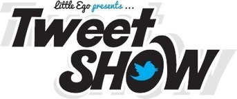
Tweet Show - A Fullscreen Tweet Streamer... Tweet Show is a web app that streams tweets containing a hashtag of your choice with style & pizzazz in fullscreen splendour! Enter a hashtag & click the start show button - that's it! Tweets with your chosen hashtag will now be a part of your show. If you're organising an event, why not hook Tweet Show up to a projector & engage your audience at #yourevent in realtime. Others may just want to follow your hashtag & enjoy the show! We’re working hard to bring you advanced features such as custom themes, auto-censorship, secure shows, �analytics & much more..
Where prezi excels - Create using frames - Check your overview - Use a Path - Nonlinear discussions...
|


![How Images Impact us Online [Infographic] | Visual Design and Presentation in Education | Scoop.it](https://img.scoop.it/0BqchKi-InZI8oh9FXP4mzl72eJkfbmt4t8yenImKBVvK0kTmF0xjctABnaLJIm9)