


NASA visualizes the 22,000 tons of life-giving dust that flows between Africa and South America.
Via Lauren Moss
Get Started for FREE
Sign up with Facebook Sign up with X
I don't have a Facebook or a X account


 Your new post is loading...
 Your new post is loading...
Your new post is loading...
NASA visualizes the 22,000 tons of life-giving dust that flows between Africa and South America. Via Lauren Moss 
No comment yet.
Sign up to comment
Infographics have become extremely popular online tools to create a compelling visualization by conveying a message much more effectively than a stand alone written article or photo. They must be well-designed and appealing to the eye; these 10 online tools below will aid you in creating infographics to champion your cause and convey a visual message... Via Lauren Moss
|
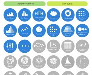
If you've ever struggled with what visualization to create to best show the data you have, The Data Visualization Catalogue might provide just the help you Via Robin Good

Robin Good's curator insight,
February 2, 2014 5:47 AM
The Data Visualisation Catalogue is an on-going project developed by Severino Ribecca which attempts to index and catalogue all of the data visualization approaches available, in order to help journalists, designers and professional communicators identify more easily the type of data visualization most appropriate for their needs. . In the Catalogue there are now over 50 different data visualization approaches that have been identified, and about a third of them have also been documented with a basic description, visual examples, relevant tags to associate it with their possibe best uses, variations, and with a list of alternative tools available to create that type of data chart. . You can browse the catalogue also by using the "Search by Function" which is designed to aid in choosing the appropiate data visualization approach based on the specific communication need at hand, or with the "View by List" approach, which organizes dataviz methods by types. . My comment: Excellent resource for visual communicators of all kinds as it helps you see the great variety of dataviz approaches available. It makes it easier to identify and select relevant solutions according to needs and use. . Check it out: http://blog.visual.ly/the-data-visualization-catalogue/ . . Hat Tip to @LelioSimi 
Una Sinnott's curator insight,
February 2, 2014 4:54 PM
A great collection of data visualisation tools, categorised by the characteristics of the data you want to show. 
Juliana Elisa Raffaghelli's curator insight,
February 19, 2014 7:14 AM
Rappresentare: raccontare la realtà in modo tale da attrarre in modo efficace l'attenzione del nostro interlocutore/lettore. In una società iperconnessa e dialogica, fondamentale competenza. |


