Dr. Goulu
435.3K views | +0 today
Follow
Dr. Goulu
sélection de nouvelles scientifiques et articles de blogs
http://www.drgoulu.com
Curated by Goulu
Your new post is loading...
Rescooped by Goulu from Journalisme graphique
Scoop.it!

Top 10 Video Infographics of 2012

Top 10 Video Infographics of 2012 | Dr. Goulu | Scoop.it

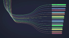
In the great tradition of end of year blog posts, here's a feature on the top 10 video infographics of 2012.


Over the year, I’ve curated 222 videos on this site [videoinfographics.net], and reviewed hundreds more. As part of my process of watching and curating so many infographic videos, I started to keep my own 3-star ranking system of these videos in a spreadsheet to help me keep track of those that I think are the most outstanding. The result was about 60 3-star videos in 2012. That’s too many to feature in a top X list so I turned to the Likes and Comments of my top ranked videos (and in doing so eliminated videos only featured on YouTube since YouTube comments are pretty much trash). This resulted in a list of 10 videos that had triple digit Likes on their Vimeo pages.

Voila! A top 10 list. So, in a ascending order, here are the top 10 most liked animated video infographics featured here in 2012, including number of Likes and Comments for each (as of December 30, 2012).


Via Lauren Moss, Karen Bastien
No comment yet.
Rescooped by Goulu from Digital Presentations in Education
Scoop.it!

10 Fun Tools To Easily Make Your Own Infographics

10 Fun Tools To Easily Make Your Own Infographics | Dr. Goulu | Scoop.it

People love to learn by examining visual representations of data. That’s been proven time and time again by the popularity of both infographics and Pinterest. So what if you could make your own infographics? What would you make it of? It’s actually easier than you think… even if you have zero design skills whatsoever.


Via Baiba Svenca
Sadhana Pittala's curator insight, May 16, 2014 11:54 AM

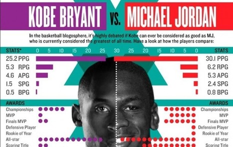
Type: Versus

Pros: Easy to understand and read

cons: The colors clash with one another to the point at which it's hard to look at, the colors also look dull and washed out

Kiya James's curator insight, May 13, 2016 3:21 PM

Pro: Good idea for useful bait. The headline really grabs a readers attention.

Con: The colors chosen for the font and details of the infograph clash a little with the picture of the players. 

Rescooped by Goulu from Digital Presentations in Education
Scoop.it!

The top 20 data visualisation tools

The top 20 data visualisation tools | Dr. Goulu | Scoop.it

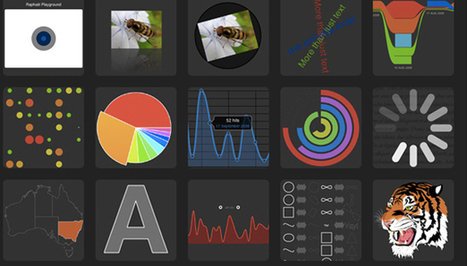
From simple charts to complex maps and infographics, Brian Suda's round-up of the best – and mostly free – tools has everything you need to bring your data to life...

A common question is how to get started with data visualisations. Beyond following blogs, you need to practice – and to practice, you need to understand the tools available. In this article, get introduced to 20 different tools for creating visualisations...


Via Lauren Moss, Baiba Svenca
Randy Rebman's curator insight, January 28, 2013 12:33 PM

This looks like it might be a good source for integrating infographics into the classroom.