


These 22 charts and maps all told me something I found surprising. Some of them genuinely changed the way I think about the world.
Get Started for FREE
Sign up with Facebook Sign up with X
I don't have a Facebook or a X account


 Your new post is loading...
 Your new post is loading...
Your new post is loading...
These 22 charts and maps all told me something I found surprising. Some of them genuinely changed the way I think about the world.
Beth Dichter's insight:
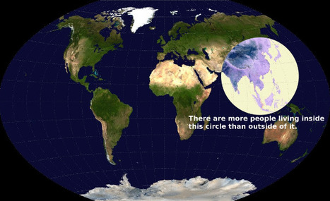
If you are looking for some maps that will have students scratch their heads and consider come concepts in a new light this post will provide you with 22 choices. The one above intrigued me. It shows a map of the world, and has a circle that shows where more people live than the rest of the world. I suspect this image would bring up many questions, and that many would be interdisciplinary. Click through to the post to find many other great maps and charts. 
Why do we ask students to create charts? Perhaps to help them tell a story. Charts and graphs help students understand data through visualization. Many websites exist today that help students create charts and graphs. This post explores a variety of resources and shares some graphs made by 8th graders. Once again ASIDE has put together a robust post with excellent resources.

There are so many tools now available to help you make your own infographic, and this post shares information on ten tools that will help you visually represent data. For each tool a short description is provided as well as a visual. The tools discussed are: Visual.ly, Dipity, Easel.ly, Venngage, Infogr.am, Tableau Public, Photo Stats (for iPhone), What About Me? (create an infographic about your digital life), Gliffy, and Piktochart. Ten great tools that will allow you to create (or have your students create) infographics for this school year!
An addictive collection of beautiful charts, graphs, maps, and interactive data visualization toys -- on topics from around the world.
|
Beth Dichter's insight:
Richard Byrne shares seven free tools to help create graphs and charts. Check out the list below and click through to the post for additional information on each tool. * LucidChart - available free to schools and also as a Google app * Google Fusion Tables - a spreadsheet app that allows you " to create visualizations of data set comparisons" * Hohli Online Chart Builders - allows you to create "a variety of charts for online display" * Infogr.am - " an online tool for creating interactive charts and graphs to use in interactive infographics" * Better World Flux - this was created for the World Bank and "allows users to create animated visualizations of development data" * Gapminder - also allows for data visualization and provides a page for educators * Haiku's Deck Web App - Haiku Deck continues to add new features and now provides the ability to create graphs and charts As always it pays to check out each tool and determine which you think will best meet the needs of your class (and that may be a choice of more than one).

Laurent Picard's curator insight,
April 7, 2014 3:30 AM
Beth Dichter's insight: Richard Byrne shares seven free tools to help create graphs and charts. Check out the list below and click through to the post for additional information on each tool. * LucidChart - available free to schools and also as a Google app * Google Fusion Tables - a spreadsheet app that allows you " to create visualizations of data set comparisons" * Hohli Online Chart Builders - allows you to create "a variety of charts for online display" * Infogr.am - " an online tool for creating interactive charts and graphs to use in interactive infographics" * Better World Flux - this was created for the World Bank and "allows users to create animated visualizations of development data" * Gapminder - also allows for data visualization and provides a page for educators * Haiku's Deck Web App - Haiku Deck continues to add new features and now provides the ability to create graphs and charts As always it pays to check out each tool and determine which you think will best meet the needs of your class (and that may be a choice of more than one). 
María Dolores Díaz Noguera's curator insight,
April 7, 2014 7:21 AM
7 Online Tools for Creating Charts & Diagrams
Larry Ferlazzo provides "a short and simple list of multimedia resources that would be useful for introducing students to the value of charts, graphs and infographics and what they mean."
"Numbers don't lie, but a bad chart decision makes it extremely difficult to understand what those numbers mean." So think before you select your your chart type...what message are you presenting? What will be the best arrangement to display the information? How should the chart be formatted? This article provides many tips and ideas on how to go about creating a chart that will allow your information to be presented clearly.
|


Some cool stuff to share with your students.
agregar su visión ...
If you are looking for some maps that will have students scratch their heads and consider come concepts in a new light this post will provide you with 22 choices. The one above intrigued me. It shows a map of the world, and has a circle that shows where more people live than the rest of the world. I suspect this image would bring up many questions, and that many would be interdisciplinary. Click through to the post to find many other great maps and charts.