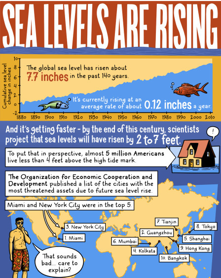
Sea levels are rising and recent research tells us the impact will happen more quickly than originally stated. This infographicshares information on how the sea level has risen over the last 140 years and how much it is predicted to rise by the end of the century. It also shares information on the two main reasons this is taking place. This infographic would be appropriate to share with students studying climate change/global warming.
UPDATE: On June 23, the U.S. Supreme Court effectively upheld the Environmental Protection Agency's authority, under the Clean Air Act, to regulate carbon and
Beth Dichter's insight:
If you are looking for a visual that looks at the new rules surrounding carbon emission and at what each state may have to do and how others are perceiving the new regulations you should check out this visual. You may scroll down the page (first click through to the site) or you can view it as a slideshow.
This visual would be great to share with students as it is designed as a cartoon (with many panels). It is easy to understand and describes where carbon emissions come from (in the US) as well as the impact this may have on countries outside the US.
To get content containing either thought or leadership enter:
To get content containing both thought and leadership enter:
To get content containing the expression thought leadership enter:
You can enter several keywords and you can refine them whenever you want. Our suggestion engine uses more signals but entering a few keywords here will rapidly give you great content to curate.
this photo shows how rising sea levels effect all of australia