

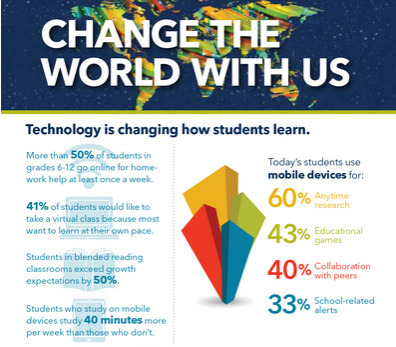

Educational technology is making a huge impact on how students learn, how teachers teach and how education is done.
Get Started for FREE
Sign up with Facebook Sign up with X
I don't have a Facebook or a X account


 Your new post is loading...
 Your new post is loading...
Your new post is loading...
Educational technology is making a huge impact on how students learn, how teachers teach and how education is done.
Beth Dichter's insight:
ISTE has released this new infographic that shares data on how technology in impacting our learners. It is divided into the following categories: * Technology is changing how how students learn. * Technology is changing how teachers teach. * Together we're changing education - one classroom at a time. Before clicking through to the infographic take a moment to think about how technology is used in your school or classroom. Then check out the infographic and see if these statistics surprise you. There may be some new avenues you would like to explore. 
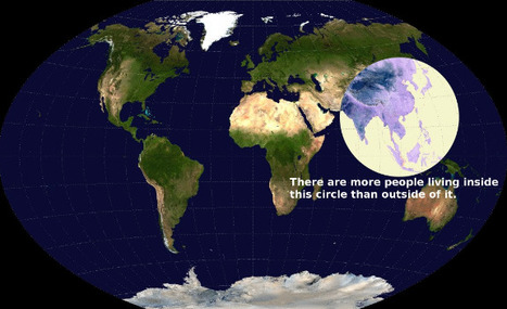
These 22 charts and maps all told me something I found surprising. Some of them genuinely changed the way I think about the world.
Beth Dichter's insight:
If you are looking for some maps that will have students scratch their heads and consider come concepts in a new light this post will provide you with 22 choices. The one above intrigued me. It shows a map of the world, and has a circle that shows where more people live than the rest of the world. I suspect this image would bring up many questions, and that many would be interdisciplinary. Click through to the post to find many other great maps and charts.

Gary Harwell's curator insight,
October 5, 2014 2:06 AM
Some cool stuff to share with your students. 
Leah Hood's curator insight,
August 22, 2017 4:54 PM
If you are looking for some maps that will have students scratch their heads and consider come concepts in a new light this post will provide you with 22 choices. The one above intrigued me. It shows a map of the world, and has a circle that shows where more people live than the rest of the world. I suspect this image would bring up many questions, and that many would be interdisciplinary. Click through to the post to find many other great maps and charts.

"It’s tempting to say that no matter how much technology pushes on education, every teacher will always need to know iconic teacher practices like assessment, curriculum design, classroom management, and cognitive coaching. This may end up being true...Below are 15 tasks that are less skill-based. and a bit more conceptual, collectively representing how teaching is changing."
Beth Dichter's insight:
I suspect that every teacher has seen major change over the last few years. This post provides a look at changes that have happened, or are in the process. The first seven provide the change and a look at the old, the new, the difference and a short summary. One example from the post is quoted below. Personalization The Old: Administer assessment, evaluate performance, report performance, then–maybe–make crude adjustments the best you can The New: Identifying, prioritizing, and evaluating data for each student individually–in real time The Difference: Precision For more information click through to the post.

Infographics are popular. They’re a fun way to present and read data, and many people believe that information that is presented visually is often retained better (at least for some learners). Many teachers today are using infographics, both in their classrooms and for their own professional development. There are so many tools out there to …
Beth Dichter's insight:
What steps can one take to make an infographic more interactive? How about creating one that will allow the users to interact with data? This post explores this concept, providing information on four tools that will help with the process. Learn more about: * Many Eyes is a free tool that IBM provides. * Google Public Data allows you to use data from Google or upload your own and create interactive content. Have fun exploring the options!
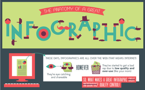
"These days, infographics are all over the web (That means internet). They're eye catching and shareable. However, they've started to get a bad rap due to low quality and over-use. (like your mom) So, what makes a great infographic great infographic? QUALITY CONTROL!"
Beth Dichter's insight:
Are you wondering what your infographic needs to be a great infographic? This post disects an infographic, sharing what is important to include. Sections include: * A brief look at the history of infographics * Does it have all the important parts * Gotta have brains: data and story * Ooo la la visualization * Shareability Additional information as well as links to resources are located under the infographic. If you plan on having students create infographics this year you may want to share this as a tool for discussion as students review infographics and learn to identify great infographics.

Dr. Robin Yap, JD, PhD's curator insight,
September 10, 2013 10:29 AM
What is your takeaway from this? 
Ana C. Robles's comment,
September 12, 2013 9:34 AM
Ideas and elements when creating an info-graph... Good source for designers.
How do we prepare out students for Web 3.0 learning? This slide show by Judy O'Connell provides us an opportunity to look back in time, from what we might refer to as Web 0 and the journey to where we are today and where we are heading. Many define Web 2.0 as the social web. Web 3.0 will be defined by data, and the ability to link data in new ways. Many excellent resources are embedded within this slide show, so find some time to pull up your chair and learn more about what the future may hold.
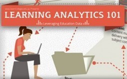
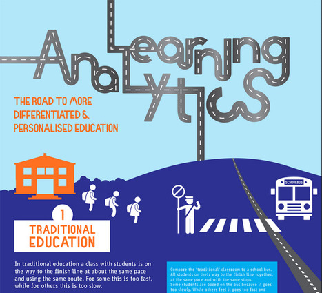
Today we are pushed to determine what is working in education? Data is being collected and in the U.S. teacher evaluations will involve the use of data from a variety of sources. This infographic, Learning Analytics 101, presents a visual representation of what it means to leverage education data looking at issues such as: * What can data do? * When can it be used? * What is "effective learning"? * What are the limitations and costs? * How will it affect the future? If you are trying to wrap your head around learning analytics check out this inforgraphic.

Do you have any idea of how much data is created every minute? Phones, websites, applications...it is mind boggling. Check out this infographic Data Never Sleeps for more information.

A new initiative, supported by state education leaders and funded by prominent foundations, plans to provide a place in the cloud for each state to store all data for every student, using "free" open source software. There are certainly concers over cloud storage (with data about all students). This article introduces the "Shared Learning Collaborative" and discusses this new initiative.

In One Minute, Facebook Logs 6 Million Pages Views, Google Handles 2 Million-Plus Search Queries, Twitter Adds More Than 320 Accounts and the Data Deluge Threatens to Overwhelm Network Infrastructure Network infrastructure as a topic lacks the sex...
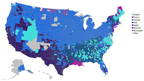
An interactive map of the distribution of national heritages across the U.S. See the most predominant ethnic groups, explore the county by county data for each background or compare two ancestries.

So what happens when we teach to the test? Check out this infographic to learn more. Scroll down past the infographic to see detailed information on the material found in Teaching to the Test.
Vimeo is a respectful community of creative people who are passionate about sharing the videos they make. Use Vimeo if you want the best tools and highest quality video in the universe.
|
Beth Dichter's insight:
Last year I used fast foods as a way to teach students graphing (and nutrition). When surveying students as to their favorite fast food restaurants McDonald's was often at the top. This infographic provides a great deal of information that may be new to students. This infographic shows: * Just how big McDonald's is (and the number may surprise you) * The one location where the Golden Arches are not golden * Where McDonald's are located (a world map with percentages of McDonald's based on area) * The one fast food restaurant that has more locations that McDonald's * The number of employees worldwide (as well as the number of hamburgers and customers served) And much more. You can have fun with maps that look at fast food locations across the US as a tool for students to learn how to interpret visualizations as well as do some calculations. One source you might check out is listed below. * A map of all the McDonald's in the U.S. (published in 2009 and updated in 2010 at http://www.datapointed.net/2010/09/distance-to-nearest-mcdonalds-sept-2010/
"Learning Analytics is the measurement, collection, analysis and reporting of data about learners and their contexts, for purposes of understanding and optimizing learning and the environments in which it occurs."
Beth Dichter's insight:
This detailed infographic provides an in-depth look at learning analytics. It begins by describing traditional education as a school bus, with the expectation that all students will get to "the finish line together." The infographic then turns to personalized learning, where students would work at their pace and in their way to master material. Analytics play a key role in personalized education. Why? If you use a tool that provides you with the ability to measure, collect, analyze and report data about your students you have the opportunity to adapt curriculum. The infographic shares seven areas that may be considered. From here the infographic moves to the learning analytics cycle which moves to four areas: * Descriptive - What has happened? * Diagnostic - Why has it happened? * Predictive - What will happen? * Prescriptive - What should I do? What comes next? The role of the teacher, which is followed by a What's Next section. There is much to learn about learning analytics in this infographic. You may download the complete infographic from the site.

miguel a. rodriguez's curator insight,
July 19, 2014 5:24 AM
Interesante infografia de google analytics 
John Lemos Forman's curator insight,
July 20, 2014 10:55 PM
Muita expectativa mas ainda poucos resultados concretos ... De qualquer modo, esta se formando uma percepção de que o modelo educacional vai ser fortemente impactado nos próximos anos
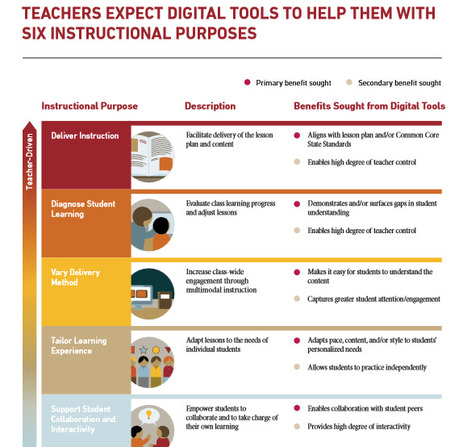
The Gates Foundation released a report today surveying teachers and students on the kinds of digital tools they'd like to see available in classrooms.
Beth Dichter's insight:
This report focused on four questions: ● What do teachers want and need from digital instructional tools? ● How can product developers use this information to more effectively serve students, teachers, and schools? ● What do we know about how teachers and districts select and purchase digital instructional tools? ● What do we know about the overall market for digital instructional tools? The report identified six instructional purposes for technology, moving from teacher-driven to student-driven and identify both a primary and a secondary benefit. The areas are: ● Deliver Instruction ● Diagnose Student Learning ● Vary Delivery Method ● Tailer Learning Experience ● Support Student Collaboration and Interactivity ● Foster Independent Practice One piece that pops out quickly is that 54% of teachers surveyed did not find the digital tools they use effective.

KCenter SKEMA's curator insight,
April 25, 2014 4:53 AM
"The Bill and Melinda Gates Foundation just released a report detailing the results of 3,100 teacher surveys and 1,250 student surveys on the kinds of digital instruction tools that are useful and effective. The foundation has asked teachers and students what they need when it comes to digital instruction, aiming to close the communication gap between commercial developers and schools. One of the biggest takeaways is that most teachers — 54 percent — don’t find many of the digital tools they use effective. That’s partly because teachers often aren’t making purchasing decisions. When they do have a say in tool selection they often report on its effectiveness more favorably. When asked about free products, teachers reported that free products are just as likely to be effective as the products the district purchased for them."

Schools across the country are looking at new online ways to integrate and analyze information about their students. But privacy advocates remain wary.
Beth Dichter's insight:
There is so much data being collected on students today and the question is now being raised on some school districts about how much of this data should be shared. This article discusses InBloom, a business that has support from Microsoft and the Carnegie Corporation of New York to help store data and personalize learning. The article explores one school district where parents are rasing concerns about the amount of data that may be stored ( up to 400 fields) as well as issues of security and how data from elementary school may follow children. This is an issue that all schools will need to address in the future. To learn more about the issues involve click through to this article.

Why shouldn't the smartest people in the world want to go into education? One reason that comes to mind: maybe they just don't know much about how education--and for that matter, how quickly education technology has been evolving.
Beth Dichter's insight:
This EdSurge Guide has 10 sections, with a "big question" for each of them and a number of resources for each. Check out the list of topics below and click through to learn more about any of the 10 areas. * What are the influentical ideas behind "edtech"? * How can you be part of the edtech community? * Does the profit motive belong in education? * How do you find and evaluate edtech products? * Can technology help prepare better teachers? * Where does 'Making' or project-based learning fit into edtech? * How should we measure student "success"? * Who owns the data? There are three to six excellent resources listed under each question. Many great resources will be found in this post!

Schools are now driven by data...but not all data is good data. This post looks at 10 ways the data by be problematic. It is not suggesting that you dismiss "data as a valuable teaching too, but understanding its limits in pursuit of better assessment design and data extraction practices, especially in the form of data-friendly curriculum and instrutional design." A list of 10 ways data "can sabatoge your teaching" is provided with explanations. The list includes: * The assessments are "bad" * Assessment is infrequent * Depth of Knowledge isn't factored * Inflexible curriculum that resists data "absorption" For more information click through to the article.
Data is big in education today and it appears to be the driving force behind school reform. Today I was exploring the Michael &Susan Dell Foundation and discovered a series of articles they are running that looks at 10 education data myths. This post is an overview of the series they are running. A list of the 10 education myths is below, but you may want to spend some time of this site exploring materials that are available to school districts that help teachers access and use data to plan daily lesson, help students achieve goals, have productive conversations with parents, identify trends and collaborate with collegues. So what are those myths? 1. Data = test scores 2. Data-driven instruction is a new concept 3. Data-rich is the same as data-driven 4. Software = The solution 5. Teachers are just data consumers 6. More data creates more work for teachers 7. Tools alone lead to student growth 8. Test data is a good tool for evaluating teachers 9. Classroom data is a tool for teachers 10. Data-driven instruction limits teachers creativity.
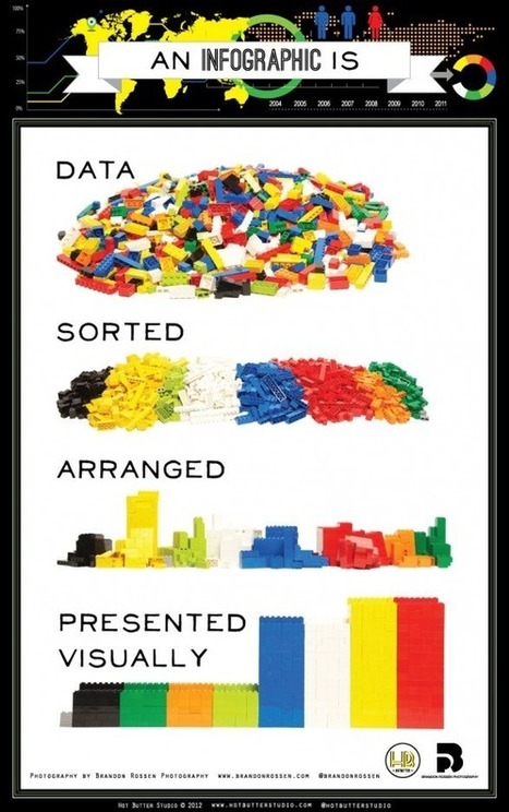
LEGO bricks illustrate the simple idea behind infographics.
"Numbers don't lie, but a bad chart decision makes it extremely difficult to understand what those numbers mean." So think before you select your your chart type...what message are you presenting? What will be the best arrangement to display the information? How should the chart be formatted? This article provides many tips and ideas on how to go about creating a chart that will allow your information to be presented clearly.

"The State of the News Media 2012 is the ninth edition of our annual report on the status of American journalism.

"ChronoZoom is an open source community project dedicated to visualizing the history of everything to bridge the gap between the humanities and sciences using the story of Big History to easily understand all this information. This project has been funded and supported by Microsoft Research Connections in collaboration with University California at Berkeley and Moscow State University. You can browse through history on ChronoZoom to find data in the form of articles, images, video, sound, and other multimedia. ChronoZoom links a wealth of information from five major regimes that unifies all historical knowledge collectively known as Big History." An overwhelming amount of information in one location...this will take time to explore!

FindThatFile searches as deeply as possible to identify the most relevant data from over 300 million files. This means we open each file, identify its author, title, contents, text extracts and all kinds of goodies that nobody else does. We also search more places than anyone else : Web, FTP, Usenet, Metalink and P2P (ed2k/emule) including 47 file types and 558+ file extensions including over 239 file upload services.
|


![Things You Never Knew About McDonald's [infographic] | Eclectic Technology | Scoop.it](https://img.scoop.it/LEkQV2Q9psu2DAga-sKHITl72eJkfbmt4t8yenImKBVvK0kTmF0xjctABnaLJIm9)


ISTE has released this new infographic that shares data on how technology in impacting our learners. It is divided into the following categories:
* Technology is changing how how students learn.
* Technology is changing how teachers teach.
* Together we're changing education - one classroom at a time.
Before clicking through to the infographic take a moment to think about how technology is used in your school or classroom. Then check out the infographic and see if these statistics surprise you. There may be some new avenues you would like to explore.