


![Things You Never Knew About McDonald's [infographic] | Eclectic Technology | Scoop.it](https://img.scoop.it/LEkQV2Q9psu2DAga-sKHITl72eJkfbmt4t8yenImKBVvK0kTmF0xjctABnaLJIm9)
Research and publish the best content.
Get Started for FREE
Sign up with Facebook Sign up with X
I don't have a Facebook or a X account
Already have an account: Login

Eclectic Technology
224.6K views |
+0 today
Tech tools that assist all students to be independent learners & teachers to become better teachers
Curated by
Beth Dichter
 Your new post is loading...
 Your new post is loading...
Your new post is loading...

From
visual

Jamie and the Food Revolution team want to change the way people eat by educating every child about food, giving families the skills and knowledge to cook again, and motivating people to stand up for their rights to better food... 
|
From
ed
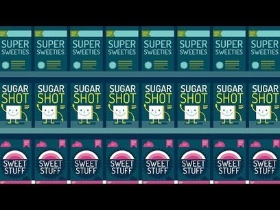
"While sugar is easy to spot in candy, soft drinks and ice cream, it also hides out in foods you might not expect -- including peanut butter, pasta sauce and even bologna! Robert Lustig decodes confusing labels and sugar's many aliases to help determine just how much of that sweet carbohydrate makes its way into our diets."
Beth Dichter's insight:
How difficult it is to determine how much sugar is in a processed food? Because sugar can be labeled 56 ways. If you do not know all the variations of how sugar can be listed there is no way to determine how much sugar is in the product. As always this video includes a Think section with 7 questions, a Digging Deeper section with additional resources, and access to an online forum. If you are interested in additional TED-Ed videos that explore food and nutrition check out the You Are What You Eat collection at TED-ED at http://ed.ted.com/lessons/sugar-hiding-in-plain-sight-robert-lustig#watch.
|


Last year I used fast foods as a way to teach students graphing (and nutrition). When surveying students as to their favorite fast food restaurants McDonald's was often at the top.
This infographic provides a great deal of information that may be new to students. This infographic shows:
* Just how big McDonald's is (and the number may surprise you)
* The one location where the Golden Arches are not golden
* Where McDonald's are located (a world map with percentages of McDonald's based on area)
* The one fast food restaurant that has more locations that McDonald's
* The number of employees worldwide (as well as the number of hamburgers and customers served)
And much more.
You can have fun with maps that look at fast food locations across the US as a tool for students to learn how to interpret visualizations as well as do some calculations. One source you might check out is listed below.
* A map of all the McDonald's in the U.S. (published in 2009 and updated in 2010 at http://www.datapointed.net/2010/09/distance-to-nearest-mcdonalds-sept-2010/