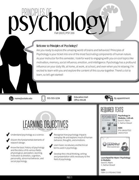
If there’s ever been a Top 10 List of Most Boring Documents, a course syllabus would most certainly be on it. It’s unfortunate, too, because syllabi have a unique ability–as much as a written document can, I suppose–to get students excited about course content. There are a lot of things you can do to liven up a syllabus (check out 10 Reasons Why Your Syllabus Might Suck for a few good ideas), but nothing I have done has received more excitement from both my colleagues and my students than when I have turned my syllabus into an infographic.
Via Peter Mellow


 Your new post is loading...


