Geography for All!
1.5K views | +0 today
Follow
Geography for All!
Geography that affects YOU!
Curated by Trisha Klancar
Your new post is loading...
Scooped by Trisha Klancar
Scoop.it!

Visualizing Regional Population Statistics

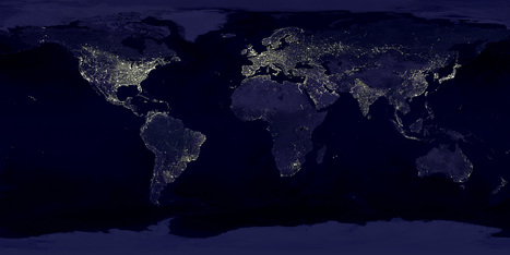
It was just over two centuries ago that the global population was 1 billion — in 1804. But better medicine and improved agriculture resulted in higher life expectancy for children, dramatically increasing the world population, especially in the West.


This is an excellent video for population and demographic units, but also for showing regional and spatial patterns within the global dataset (since terms like 'overpopulation' and 'carrying capacity' inherently have different meanings in distinct place and when analyzed at various scales). It is also a fantastic way to visualize population data and explain the ideas that are foundational for the Demographic Transition Model.


Tags: population, scale, visualization, Demographics, models, unit 2 population, sustainability, regions, spatial.
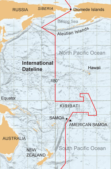
Sarah Ann Glesenkamp's curator insight, September 17, 2014 7:55 PM

Unit 2

Mohamed Mohamed's curator insight, October 13, 2014 4:03 PM

This video describes and explains how we got to a population of 7 billion people so fast

Mohamed Mohamed's curator insight, October 13, 2014 4:04 PM

It also uses water to demonstrate it.

Scooped by Trisha Klancar
Scoop.it!

The Border That Stole 500 Birthdays

The Border That Stole 500 Birthdays | Geography for All! | Scoop.it

Little tid-bit of information for kids ....something quick to have on the smart board as they come in and read it...how Geography can affect something like YOUR BIRTHDAY!


"The story behind the the International Date Line."


Not too long ago (Jan. 2012), the arbitrary International Date Line (roughly opposite the Prime Meridian) was moved to better accommodate the regional networks and economic geography of the area straddling the line.  American Samoa, although politically aligned with the United States, was functionally more integrated on the Asian side of the Pacific Rim when it came to their trade partners and their tourism base.  Dynamic economic networks, political allegiances and cultural commonalities create a beautifully complex situation near this 'border.'    

Edgar Manasseh Jr.'s curator insight, May 1, 2015 8:06 PM

500 birthdays were taken away due to an international date line. In Samoa is in a confused state between the united states and the Asian pacific side of the timeline which would cause time and dates to be confusing.Dynamic economic networks and political allegiances have created a very difficult situation for the people near the border in Samoa.  The International Date line in Samoa is something that is needed to be watched and paid attention because it can affect people in ways that can be very significant even at a small tiny rate.

brielle blais's curator insight, April 26, 2018 1:33 PM
This post shows the importance of trade to each country, so much so that Samoa was able to get the International Dateline changed to accommodate their trade needs, skipping a day and allowing easier economic networks with China and Australia, who are important trading partners. 
Stevie-Rae Wood's curator insight, December 9, 2018 11:11 PM
The International date line is a tricky situation, initially more thought should have been put into it considering it is just a straight line right down the middle of some islands. One could be next door neighbors with someone who's calendar day is Saturday while they are already are on Sunday. Talk about jet lag.  
Scooped by Trisha Klancar
Scoop.it!

Earth's City Lights

Earth's City Lights | Geography for All! | Scoop.it
NASA's Visible Earth catalog of NASA images and animations of our home planet...


This classic image is full of classroom applications.  The first impulse of most students is to note that this image will show us where people live, where the cities are or some other comment that speaks to the magnitude of the population in the white areas.  Let them analyze this for more time, and they'll notice that population isn't the whole story of this image.  A place like India shines, but less brightly than the eastern part of the United States.  I like to point out that South Korea appears to be an island (because North Korea is literally blacked out).  Politics, development, affluence and population information are all embedded in this image.  As with all maps, the more information you have about the place in question (in this case, Earth), the more meaningful information you can extract out of the map. 


Tags: remote sensing, worldwide, consumption, poverty, population, spatial, political, regions.

No comment yet.
Scooped by Trisha Klancar
Scoop.it!

Understanding "Eat Local"

Understanding "Eat Local" | Geography for All! | Scoop.it

This Oregon-based infographic succinctly summarizes the local food movement and taps into the cultural ethos that permeates the growing number of consumers that are demanding more home-grown products.

No comment yet.