Design, Science and Technology
45.7K views | +0 today
Design, Science and Technology
#ideas #design #science #technology #inspiration #media #information
Your new post is loading...
Rescooped by Antonios Bouris from Amazing Science
Scoop.it!

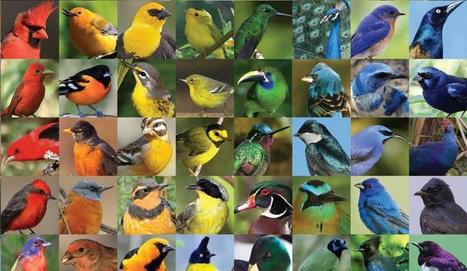
Researchers Create New Non-Toxic Pigments Inspired By Bird Feathers

Researchers Create New Non-Toxic Pigments Inspired By Bird Feathers | Design, Science and Technology | Scoop.it
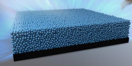
Birds display a rainbow palette of colors, many of which come from special arrangements of melanin, the pigment that gives color to our skin. Researchers at the University of Akron have developed a safe and stable pigment based on the melanin structures.


In the colorful world in which we live, colors are significant for not only aesthetics and pleasure, but also for communication, signaling, and security. Colors are produced through either absorption of light by molecules -- pigmentary colors -- or scattering of light by nanostructures -- structural colors.


Via Miguel Prazeres, Dr. Stefan Gruenwald
No comment yet.
Rescooped by Antonios Bouris from Biomimicry
Scoop.it!

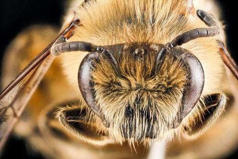
Visionary Biomimicry: Five Insects Inspiring Cutting-edge Technology

Visionary Biomimicry: Five Insects Inspiring Cutting-edge Technology | Design, Science and Technology | Scoop.it
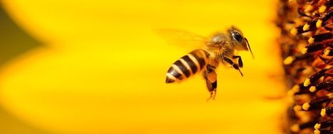
One area where biomimicry is yielding fascinating results is in the field of optics and machine vision. While our cameras and ways of thinking about sight have largely been informed by the human visual system, cutting-edge research is looking to insects to find new tricks for everything from depth perception to colour analysis.

Via Miguel Prazeres
No comment yet.
Rescooped by Antonios Bouris from visual data
Scoop.it!

Infographic: The Sound of Color

Infographic: The Sound of Color | Design, Science and Technology | Scoop.it

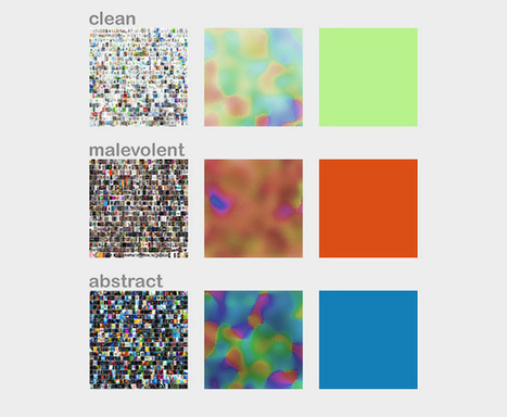
Creating a color palette with your favorite music.


Color and music are both about evoking emotions; why not combine them? This infographic shows beautiful abstract visualizations, based on color palettes inspired by each album.


Via Lauren Moss
Youcef Kébaïli's curator insight, April 24, 2014 5:40 AM

Couleurs et  Musiques évoquent des Émotions, cette infographie fait le lien entre les trois !

A.K.Andrew's curator insight, April 26, 2014 12:01 PM

This is amazing the correlation between sound and color translated into actual songs

Franco Llamas III's curator insight, May 31, 2014 9:09 PM

Data Visualization Infograph


Strength: Easy to follow and to understand, catches eye

Weakness: Not that much data on it, usually can only comfortably fit one or two pieces of data

Rescooped by Antonios Bouris from innovative design
Scoop.it!

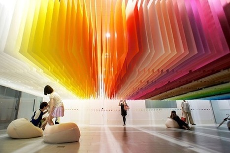
Color as 3-dimensional architectural elements: An art installation by Emmanuelle Moreaux

Color as 3-dimensional architectural elements: An art installation by Emmanuelle Moreaux | Design, Science and Technology | Scoop.it

Inspired by the Japanese traditional sliding screens, French architect Emmanuelle Moreaux has created the concept of Shikiri, which literally means ‘dividing space with colours’.


Created using traditional Japanese paper, Moreaux’s installation '100 Colours' for Shinjuku Creators Festa 2013 modulates a designed space with candy colours. Her intelligent utilization of colours as three dimensional elements to create actual spaces rather than just finishing touches on surfaces is commendable.


Via Lauren Moss
No comment yet.
Rescooped by Antonios Bouris from Must Design
Scoop.it!

Color Is MASTER of Us All [Infographic]

Color Is MASTER of Us All [Infographic] | Design, Science and Technology | Scoop.it
The Art of Color Coordination

Such a helpful infographic. Beyond helpful for web design.


Via Martin (Marty) Smith
James A Smith MCIM's curator insight, May 20, 2013 5:49 AM

Slightly off topic but thought it of potential general interest.

Monica S Mcfeeters's curator insight, May 24, 2013 12:07 PM

I thought this looked like a great helpful online reference on color. When you have someone that needs review this info it's nice to have a go to link handy.

Tyler Rrokk's curator insight, July 14, 2013 8:15 PM

Excellent article and great insight!

Rescooped by Antonios Bouris from visual data
Scoop.it!

The World as 100 People / Infographic

The World as 100 People / Infographic | Design, Science and Technology | Scoop.it

A demographic portrait of humanity if the world were 100 people.


From data source, 100people.org:

The world population has now reached 7 billion people. This milestone inspired us to conduct research to update our statistics, and the changes over the past 5 years are remarkable. In 2006, only 1 person out of 100 would have had a college education-- today that number has jumped to 7 thanks in part to advances in higher education in Asia. The detailed research and source information can be found here and the statistics provided by Donella Meadows in 1990 that originally inspired our project can be viewed here.
Via Lauren Moss
Aurélia-Claire Jaeger's curator insight, March 29, 2013 6:03 AM

J'aime bien ce coup d'oeil sur notre monde ...

Scooped by Antonios Bouris
Scoop.it!

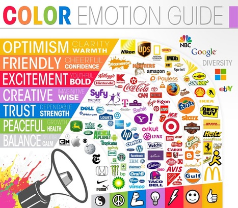
The Psychology of Color In Logo Designs

The Psychology of Color In Logo Designs | Design, Science and Technology | Scoop.it
Adam Atodl's curator insight, January 18, 2013 4:51 PM

Color is very important to brand recognition. Scientists and researchers believe certain colors make us feel a certain way about something like this infographic by The Logo Company suggests.

Red : Excitement, Youthful and Bold.
Green : Peaceful, Growth and Health. ( even eco-friendly)
Blue : Trust, Dependable and Strength.
Orange : Friendly, cheerful and confidence.
Black and White : Balanced, Netural and calm.

 
Rescooped by Antonios Bouris from Biomimicry
Scoop.it!

Bee Brains Could Help Your Camera Take Better Photos

Bee Brains Could Help Your Camera Take Better Photos | Design, Science and Technology | Scoop.it

"New research on how bees perceive colour could be put to good use in our digital cameras, meaning photos shot by drones or phones would look more natural than ever. It's all to do with colour constancy, the way that bees (and humans) can tell a flower is red no matter what the colour or quality of the light – a mental trick that the digital cameras of today really struggle with."


Via Miguel Prazeres
No comment yet.
Rescooped by Antonios Bouris from Biomimicry
Scoop.it!

Biomimicry with Artificial Structural Colors

Biomimicry with Artificial Structural Colors | Design, Science and Technology | Scoop.it

"Bright colors in the natural world often result from tiny structures in feathers or wings that change the way light behaves when it’s reflected. This structural color is respon­sible for the vivid hues of birds and butter­flies. Arti­ficially harnessing this effect could allow us to engineer new materials for appli­cations such as solar cells and chame­leon-like adap­tive camou­flage. Inspired by the deep blue colora­tion of a native North American bird, Stellar’s jay, a team at Nagoya Uni­versity reproduced the color in their lab, giving rise to a new type of arti­ficial pigment. “The Stellar’s jay’s feathers provide an excellent example of angle-inde­pendent structural color,” says Yukikazu Takeoka, “This color is enhanced by dark materials, which in this case can be attri­buted to black melanin particles in the feathers.”


Via Miguel Prazeres
No comment yet.
Rescooped by Antonios Bouris from innovative design
Scoop.it!

Panoramic Rainbow: Circular Space Spans Color Spectrum

Panoramic Rainbow: Circular Space Spans Color Spectrum | Design, Science and Technology | Scoop.it

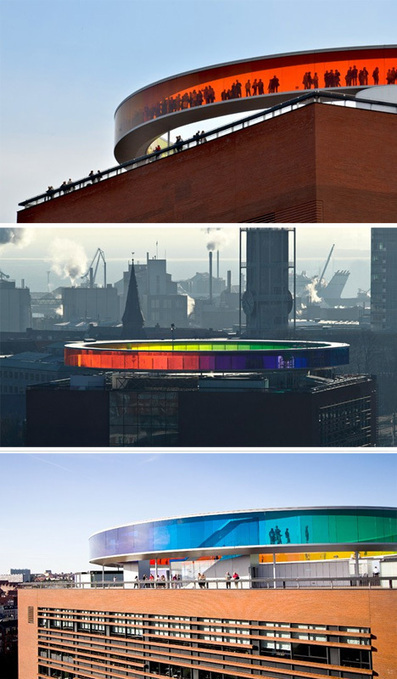
Your Rainbow Panorama by Olafur Eliasson is an enclosed circular walkway that sits atop the ARoS Aarhus Kunstmuseum in Denmark.

Its colored glass spans from floor to ceiling and rotates visitors through five hundred feet of color, looping them through a rainbow of panoramic city views.


Via Lauren Moss
No comment yet.
Rescooped by Antonios Bouris from visual data
Scoop.it!

Subtleties of Color: Connecting Color to Meaning

Subtleties of Color: Connecting Color to Meaning | Design, Science and Technology | Scoop.it

'About a year ago, we published a blog post framed as a letter to NASA, asking them to stop using rainbow color scales. The post was written out of a general frustration with rainbow color scales, but especially out of seeing field experts and leaders, like NASA, using a perceptually incorrect color scale. We weren’t alone.


Robert Simmon from NASA’s Earth Observatory has been crusading for the same changes. He’s made great progress, and as a continuation of that, he’s responding to our “letter” with a brilliant series of blog posts on proper use of colors and color scales.'


Via Lauren Moss
No comment yet.
Rescooped by Antonios Bouris from visual data
Scoop.it!

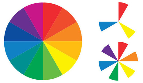
Visual Design: Understanding Color Theory and the Color Wheel

Visual Design: Understanding Color Theory and the Color Wheel | Design, Science and Technology | Scoop.it

Sometimes the toughest step in building a new website or redesign can be the conceptual ones. Selecting a color palette is one of them that can be tough if you don’t have the right tools. So where do you start?


It all comes down to basic color theory and the color wheel. That same tool that teachers used in school really is the basis for how designers plan and use color in almost every project from the simplest web page to expansive brands with multiple sites and campaigns...


Via Lauren Moss
No comment yet.
Rescooped by Antonios Bouris from visual data
Scoop.it!

Infographic: Mining Pinterest To Discover Our Color Preferences, By Room

Infographic: Mining Pinterest To Discover Our Color Preferences, By Room | Design, Science and Technology | Scoop.it

Colour and Space is a project by designers Mie Frey Damgaard and Peter Ørntoft for decorative paint brand Jotun. It digs through Turkish Pinterest boards, analyzing two fairly basic but powerful categories: color and location. The results are placed into simple pie charts, showing preferred colors in places around the home like kids’ rooms (the faintest pink), living rooms (maize), and kitchens (white).


Colour and Space leverages big data to boil all that design into the simplest of actionable metrics--what color should my living room be? Because what you’re responding to in some random interior design photo may be the unique furnishings, but it’s just as often the color--that striking palette that’s all of a trip to Lowe’s away from reality.


Via Lauren Moss
No comment yet.