Your new post is loading...
Best of Japanese Design
Turns out the best of Japanese design is pretty good. These 15 examples cross the thin line between design, art and commerce and so so with a grace and beauty you'd expect from Japanese design. I'm building a "tiny house" based on Japanese design so I love it.
Via Martin (Marty) Smith
Across all the categories in HOW's Promotion & Marketing Design Awards, we see a number of projects featuring great typography. Check out these selected projects for some typography inspiration.
Via Martin (Marty) Smith
From time to time, even web designers need a good joke to keep the humdrum away. We’re sure that you’ve seen some or all of these jokes already. What we did is compile what we think are the best and funniest jokes from around the Web and put them here in one place.
Via Jeff Domansky
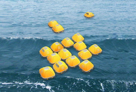
Zhou Ying and Niu Yuntao created a floating emergency shelter that could save lives during floods and tsunamis. The alarming pace of rising sea levels has inspired designers Zhou Ying and Niu Yuntao to create a floating emergency shelter that could save lives during floods and tsunamis. Instead of conventional exposed life rafts, survivors can use the Duckweed Survival House as an enclosed floating shelter that protects people from large waves while trying to get to safety.
Via Lauren Moss
Teams who want to adopt a modular design approach should start with a shared vocabulary, emphasizes author Alla Kholmatova.
Via yannick grenzinger
There are both many privileges and many challenges that go hand-in-hand with living the life of a designer. From dealing with difficult clients to figuring out how to manage your time, the designer life has a slew of common problems -- many of which are illustrated in the hilarious cartoons below.
Read on to learn more (and laugh!) about some familiar designer problems that you most likely share with creative types across the world....
Via Jeff Domansky
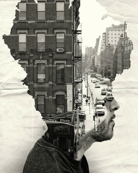
Andrea Constantini is an Italian photographer and graphic designer, and founder of PhotogtaphizeMag, an independent, free, electronic magazine. He believes that “photography in the modern has received the gift of digital”, a gift that he uses in his beautiful works. In his architecturalized collection, he emphasized the idea of the human mind is made for being constantly elsewhere, this being one of the single, most important distinctions between a “conscious man and an instinctive animal”, giving us the ability to overcome the boundaries of not only social restraints, economical differencies and other such daily struggles, but also infinite concepts such as space and time...
Via Lauren Moss
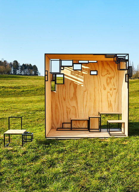
Filip Janssens expanded on his 2014 collection of small steel furniture called JOINTED, which was presented at the Design Biennale Interieur Kortrijk, and went big, really big. The JOINTED CUBE is based on the same idea but is a steel framed outdoor installation. It’s partly closed with pine walls, floor, and ceiling, but with moments of openness highlighted by steel cubes. The cubes become places to sit or tables to highlight objects. Modular seats are both inside and outside the cube.
Via Lauren Moss
Mexico City-based BuBa Arquitectos proposes a vertical zoo wrapped in lush vegetation that relies on solar power, rainwater and natural ventilation. Why not take the same theories and technologies used to grow organic produce and raise animals and apply them to build more compact, more sustainable zoos? Proposed by Mexico City-based BuBa Arquitectos, the Vertical Zoo is a balanced and sustainable space where people and animals can coexist in harmony. Wrapped in lush vegetation, the star-shaped building makes use of green building strategies to reduce heat gain, encourage natural ventilation and soak up rainwater. Totally self-sufficient, the tower's aim is to be a sustainable refuge for all animal kingdom species.
Via Lauren Moss
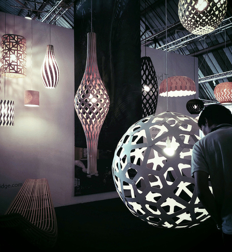
The WestEdge Design Fair held its second annual design event over at the Barker Hangar in Santa Monica. Take a virtual tour of the showroom floor and a closer look at a few favorite exhibitors, from lighting design to art installations and custom furniture pieces...
Via Lauren Moss
Details of the website as featured within CoolHomepages web design inspiration gallery.
Marty Note
Blue is a great color. There is a reason blue is many of your visitor's favorite color. Online blue is soothing, easy on the eyes and beautiful against black. My favorite is the UK design "un.titled.co.uk" (used as the image above).
Love using opacity to "hide" things in plain view as that kicks in the curiosity of visitors and gets the click. Current Un.titled site isn't as interesting or special as the design noted here. . Love blue online and these examples show why.
Via Martin (Marty) Smith
We have been witnessing major transformations in the corporate mentality regarding office design. Here are some of the main workspace design trends... According to this infographic from Alliance Interiors, more changes are yet to come, as the office of the future will be less business-focused and more employee-oriented. As a result of switching from closed offices to open offices- one of the most visible upgrade in workspace layout- we find out that the speed and accuracy of work has increased with 440%. This is mostly why open offices will continue to shape working environments in the years to come.
Via Lauren Moss
A poorly designed website has real impacts, whether page views or sales. We won't hesitate to bounce away to another with a better user experience.
1. Requiring users to signup before browsing your site
2. Forgetting about multiple screens
3. Having ridiculous forms to fill out
4. Using hard to read or cutesy fonts
5. Implementing a Search bar that sucks
6. Bombarding the reader with a wall of text
7. Displaying your products with low-res images MS - 8 Non stop animated gifs (you will discover what I'm talking about)
Marty Note
Agree with all 7 of these annoying disasters and would add an 8th - too many animated gifs all running at the same time with NO STOP.
Via Martin (Marty) Smith
|
Across Australia some of these ideas are being put into practice. Some schools have dropped the notion of year levels to enable them to meet children at their point of need and acknowledge that not all students learn at the same pace.
Computer programs are enabling instruction tailored to the student by assessing where they are at and providing a tailored curriculum.
Capabilities , such as personal and social capability and critical and creative thinking, are being embedded in the curriculum. Work is under way to develop assessment measures. Teachers across Australia are working on developing new models of practice to support this approach.
We need to accelerate the change. We are wasting too much of students’ learning time and are failing to amplify their talents. To continue along the current path is increasingly unscientific, unjustifiable and plain dull. Learn more / En savoir plus / Mehr erfahren: https://gustmees.wordpress.com/2014/10/03/design-the-learning-of-your-learners-students-ideas/ https://gustmees.wordpress.com/2015/07/19/learning-path-for-professional-21st-century-learning-by-ict-practice/
Via Kim Flintoff, Gust MEES
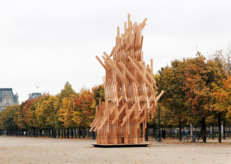
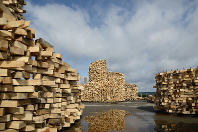
Visitors can climb to the top of this pavilion in the Jardin des Tuileries, which is made up of a complex lattice of identical timber beams. Designed by Kengo Kuma & Associates for Galerie Phillipe Gravier, the structure is based on small nomadic shelters, and has been assembled using techniques typical of traditional Japanese carpentry. "The pavilion consists of identical wooden pieces that have been stacked, twisted and assembled to create a poetic dynamic volume," said Kuma. "It offers an organic geometry by a geometric composition of wood."
Via Lauren Moss
Russian artist Nikolay Polissky has transformed a dilapidated building in the village of Zvizzhi into a pavilion covered in pieces of timber, which he described as "a sculpture you can walk through.
Via Lauren Moss
The french public will discover the eclectic mix of styles, tastes and creations and the contemporary brilliance of this astounding artistic heritage still little known in europe. The intriguing and fascinating megalopolis that seoul is today is a cultural melting pot and above all a centre of creative effervescence whose trends are followed closely on the international design and fashion scenes.
As a part of its EMBARQ Sustainable Urban Mobility initiative, the WRI Ross Center for Sustainable Cities has created a global reference guide called Cities Safer by Design “to help cities save lives from traffic fatalities through improved street design and smart urban development."
Via Lauren Moss
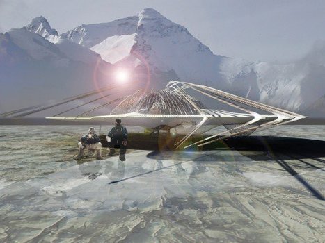
Margot Krasojevic's latest proposal, a mesh shelter that takes the concept of snow caves and applies it to an artificial structure, is built for an eminently practical purpose: a built emergency shelter for climbers and others caught in extreme conditions. The elaborate, high tech and naturally contoured structure is as much a thought experiment as it is a serious architectural proposal, with the carbon fibre mesh acting as a snow-catcher, forming a frame for a large snow drift. The captured snow works as both building material and insulation, allowing for the creation of a shelter of several rooms. Inside sits a wooden frame suspended from the mesh and attached to the landscape by climbing ropes, which avoid freezing by swaying. This frame can have canvases attached to it, and contains cell-like modules that would act as sleeping areas...
Via Lauren Moss
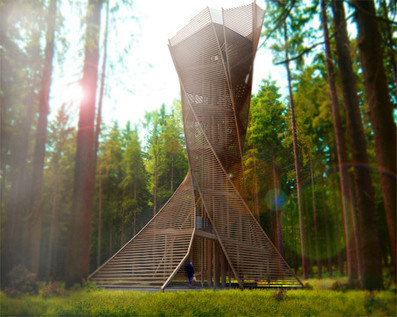
Architects Anton Pramstrahler and Alex Niederkofler have unveiled their proposal for a wooden viewing tower near Bruneck, northern Italy, with a twisted body shaped like a tree trunk . The structure's spiralling form is intended to look like a tree that spreads out at its base and canopy – the result of a hexagonal section that rotates gradually as the tower ascends. The proposed location is a forest nearby, and the architects want to build 90 per cent of the tower's structure from wood to evoke its natural context.
Via Lauren Moss
Ecologico ed elegante: il rubinetto riduce il consumo d'acqua trasformandola in design
Via Massimiliano Cammuso
New York's Museum of Modern Art (MoMA) has acquired a kit for building a simple games console for the museum's "humble masterpieces" collection.
Knight Architects and AKT II have completed a moving bridge in Paddington, London, that opens and closes like the blades of a traditional hand-held fan. Consisting of five steel beams that rise and fall using hydraulic jacks, Merchant Square footbridge by Knight Architects and AKT II spans a 20-metre width of the Grand Union Canal in Paddington Basin, close to Thomas Heatherwick's Rolling Bridge that curls into a ball.
Via Lauren Moss
PicassoHead App
Sharing this cool "draw a "Picasso Head" app (my PicassoHead http://www.picassohead.com/?id=5290a28#.VBCfth1bqjo.twitter ) to illustrate a few of our favorite web design concepts such as:
* DO LESS and let them DO MORE (them = customers, visitors, advocates_.
* GALLERIES ROCK - especially when your gallery is chock a block full of User Generated Content (UGC).
* Engagement Rocks - do you have a tool that is fun to use AND promotes positive site heuristics such as time on site, pages viewed, lower bounce?
* Every product, idea or website starts about the creators and must become about those who visit and love it.
* People love what THEY create and contribute more than what you do.
* This means all web design is or will be about collaboration.
We love the simplicity of this little app, but the even COOLER riff came from our confirming email. This is the email that shares the link where my Picasso At The Beach drawing lives (linked from this post http://www.picassohead.com/?id=5290a28#.VBCSuy4Lksk.twitter ) and where this little pitch lived:
"This summer check out Picasso Looks at Degas at the Clark in Williamstown, MA. You won’t want to miss this groundbreaking, Clark-exclusive exhibition that is the first to look at Pablo Picasso’s deep fascination with Edgar Degas.
http://www.clarkart.edu/exhibitions/picasso-degas/ "
Wow, cool idea. Create a little art based app and sell related links in the confirmation email. That's brilliant marketing, subtle marketing and the art of web design. Kudos to Picassohead creators RFI Studios, http://www.rfistudios.com. #toogood
Via Martin (Marty) Smith
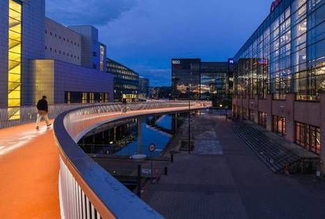
The Ambitious Cykelslangen by DISSING+WEITLING enables Copenhagen's vision to become the best cycling city in the world by the end of 2015. The 235-meter-long orange snake meanders 5.5 meters high above sea level from Havneholmen through the mall Fisketorvet, ending at Kalvebod Brygge. This “snake” is actually a ramp and a bridge, called the “Cykelslangen — The Bicycle Snake,” that provides more than 12,000 bicyclists with a safe route through this busy district every day. The architecture firm DISSING+WEITLING was asked to design a ramp to replace a nearby staircase. Instead of just designing a simple ramp, they went a step further and designed a bridge. The result is a destination and focal point that can be seen for miles from the air and has also completely transformed the area for all who enjoy it.
Via Lauren Moss
|


![30 Black And Blue Web Designs Inspire [examples] | Design, Science and Technology | Scoop.it](https://img.scoop.it/Y3CTqfjVjelTmXyz04bEZzl72eJkfbmt4t8yenImKBVvK0kTmF0xjctABnaLJIm9)
![Shaping The Office Of The Future: Workspace Design Trends [Infographic] | Design, Science and Technology | Scoop.it](https://img.scoop.it/c1Y1QpaBh_S3BwnqiUu17zl72eJkfbmt4t8yenImKBVvK0kTmF0xjctABnaLJIm9)