Design, Science and Technology
45.7K views | +0 today
Follow
Design, Science and Technology
#ideas #design #science #technology #inspiration #media #information
Your new post is loading...
Rescooped by Antonios Bouris from green infographics
Scoop.it!

An Eye-Opening Map of the Future of Global Development

An Eye-Opening Map of the Future of Global Development | Design, Science and Technology | Scoop.it

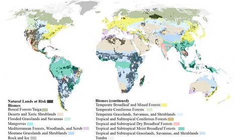
By 2050, the world’s population is projected to approach nine billion. With more people will come more developed land—a lot more.

Urbanization, agriculture, energy, and mining put 20 percent of the world’s remaining forests, grasslands, and other natural ecosystems at risk of conversion by 2050.

With that kind of expansion, there are sure to be harms—namely clean water, clean air, and biodiversity. 

To mitigate some of those risks, scientists and geographers at the Nature Conservancy have taken a crucial step by mapping the potential impact that human growth will have on natural lands.

It’s the most comprehensive look to date at how major forms of development will take over fragile ecosystems, if left unchecked...


Via Lauren Moss
CTy Thiet Ke Kien Truc Neohouse's comment, October 3, 2017 10:46 PM
Bài viết rất hữu ít . Cùng tôi chia sẻ những điều hữu ít đi .
Rescooped by Antonios Bouris from visual data
Scoop.it!

Hot Spots: Mapping the World's Most Photographed Locations

Hot Spots: Mapping the World's Most Photographed Locations | Design, Science and Technology | Scoop.it

Sightsmap forms an aggregation of the most photographed buildings by integrating Google's Panoramio, which allows users to tag a location or attraction within their photo.


In a colorful gradient of purples, reds, and yellows, the website reveals the most photographed places around the globe. Broad patches of purple coincide with a lesser amount of photographs, while smaller clusters of yellow reveal the locations where people can't seem to put their cameras down. Unsurprisingly, the densest areas of yellow are the world's most popular tourist spots − including New York City and cities across Europe such as Istanbul.

Sightsmap is more than just a map of tourist destinations however; it also shows the close connection between architecture and what inspires people to take photos. Sightsmap forms an aggregation of the most photographed buildings by integrating Google's Panoramio, which allows users...


Via Lauren Moss
No comment yet.
Rescooped by Antonios Bouris from visualizing social media
Scoop.it!

Infographic: Watch Tweets Appear Worldwide in Real-Time

Infographic: Watch Tweets Appear Worldwide in Real-Time | Design, Science and Technology | Scoop.it

By Franck Ernewein, Tweetping is a map that shows where everyone in the whole world is tweeting from in real time.


Much like Poptip’s treatment of Twitter, you’re not really meant to follow it all. Country-by-country tickers do track the total tweets, words, and characters sent since you signed on, but hashtags and @-mentions flash for milliseconds, constantly replaced by a stream of data that can’t be paused for a moment, lest the system fall perpetually behind. Meanwhile, the geolocations of each tweet make their way to a world map as a glowing dot. As the tweets pile up, so do the dots, meaning the world transforms from prehistoric shadows to blindingly bright connectivity in a matter of minutes.


Via Lauren Moss
Rescooped by Antonios Bouris from green infographics
Scoop.it!

Infographic: The Cost Of Living Around The World

Infographic: The Cost Of Living Around The World | Design, Science and Technology | Scoop.it

Using data collected from Numbeo—the “world’s largest database of user contributed data about cities and countries worldwide”—web resource Movehub has created an infographic that points out the cost of living in different countries around the world. 

According to Movehub, the Consumer Price Index (CPI) was used to determine the living costs in the countries, which takes into account the prices for groceries, transportation, restaurants and utilities. 

Switzerland, Norway, Venezuela and Iceland have been identified as countries with the highest living cost, while India, Nepal, Pakistan and Tunisia have the lowest cost of living. 


Via Lauren Moss
Suzette Jackson's curator insight, May 29, 2015 6:08 AM

wondering where your money goes?  the cost of living around the world!

Rescooped by Antonios Bouris from visualizing social media
Scoop.it!

Internet Users By Region – How Much Of The World Is Online? | Infographic

Internet Users By Region – How Much Of The World Is Online? | Infographic | Design, Science and Technology | Scoop.it
A showcase of the best infographics from around the web (Internet Users By Region – How Much Of The World Is Online?


A look at the current statistics of worldwide internet usage.


Via Lauren Moss
God Is.'s comment July 11, 2013 5:05 PM
Interesting facts. Thanks for sharing them with us...