Design, Science and Technology
45.7K views | +0 today
Follow
Design, Science and Technology
#ideas #design #science #technology #inspiration #media #information
Your new post is loading...
Rescooped by Antonios Bouris from What's new in Visual Communication?
Scoop.it!

The New Exhibition is a new online directory championing Ukrainian creatives – here’s why you should hire them

The New Exhibition is a new online directory championing Ukrainian creatives – here’s why you should hire them | Design, Science and Technology | Scoop.it

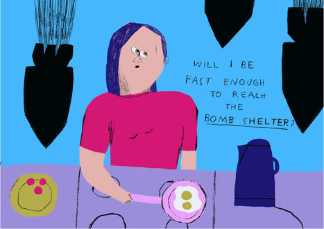
Curated by a team of US-based Eastern European designers, The New Exhibition connects artists caught in the crossfire of war directly with art directors and agencies in the West.
When a team of designers at design company Collins began researching portfolios for an online directory of Ukrainian creatives, they noticed something striking. “The style of many illustrators has completely shifted since Russian tanks rolled across the border into Ukraine,” says the team behind The New Exhibition, launched by Collins. It is but one of many creative revelations that have come out of the research process behind the new project, The New Exhibition – an ongoing online resource that features artists from across the creative world.

Read the full article at: www.itsnicethat.com


Via ECAL Library
No comment yet.
Scooped by Antonios Bouris
Scoop.it!

What are some beautiful images of death (as a concept or idea)?

What are some beautiful images of death (as a concept or idea)? | Design, Science and Technology | Scoop.it
No comment yet.
Rescooped by Antonios Bouris from visual data
Scoop.it!

Designing Fictional Planets: Photography + Stereographic Projection Dan Peterson

Designing Fictional Planets: Photography + Stereographic Projection Dan Peterson | Design, Science and Technology | Scoop.it

Dan Peterson is a designer and illustrator, originally from Portland, OR. His experience in print and interactive design led to his latest project ‘Tiny Planets’ - an impressive group of images using both real photographs and remixed, edited photographs meshed together.


'Some are actual 360 panoramic photos turned into tiny planets, and others are heavily edited and remixed panoramic photos that make up abstract patterns.' -Dan Peterson.


Via Lauren Moss
Rim Riahi's curator insight, October 9, 2013 11:51 PM

Some are actual 360 panoramic photos turned into tiny planets, and others are heavily edited and remixed panoramic photos that make up abstract patterns.' -Dan Peterson.

Rescooped by Antonios Bouris from visual data
Scoop.it!

An Infographic About Infographics

An Infographic About Infographics | Design, Science and Technology | Scoop.it

A picture is worth a thousand words, and Californian digital marketing agency, Bixa Media, have illustrated (pun intended) by creating an infographic about the importance of… well, infographics.


Based on the company’s research and insights, they found that visual data is absorbed 60,000x faster than text and people will only read about 20% of the text on a page.


Via Lauren Moss
No comment yet.
Scooped by Antonios Bouris
Scoop.it!

MALIKA FAVRE MAKES THE POSTER DANCE! | Montreux Jazz Festival

MALIKA FAVRE MAKES THE POSTER DANCE! | Montreux Jazz Festival | Design, Science and Technology | Scoop.it
The Montreux Jazz Festival gave carte blanche to French illustrator Malika Favre to create the poster for the 51st edition.
No comment yet.
Rescooped by Antonios Bouris from green infographics
Scoop.it!

Milton Glaser designs campaign to tackle climate change

Milton Glaser designs campaign to tackle climate change | Design, Science and Technology | Scoop.it

Milton Glaser, the graphic designer behind the ubiquitous I heart NY logo, has launched a campaign to raise awareness of climate change.


Glaser's It's Not Warming, It's Dying campaign aims to create a greater sense of urgency around climate change, moving away from benign language like "global warming".


Via Lauren Moss
No comment yet.
Rescooped by Antonios Bouris from visual data
Scoop.it!

Imagining The ‘Creative Process’ As Abstract Illustrations

Imagining The ‘Creative Process’ As Abstract Illustrations | Design, Science and Technology | Scoop.it

Toronto-based designer Scott Wise has illustrated the ‘creative process’—imagining it as abstract illustrations. 

In the series, the elements commonly-known to those in the creative industry—‘core idea’, ‘brainstorm’, ‘ideation’, ‘iteration’, ‘refinement’, and ‘feedback loop’—are visually summarized.

View more illustrations at designtaxi.com.


Via Lauren Moss
Lola Ripollés's curator insight, August 18, 2013 5:20 AM

Siempre hablamos de los mind maps. Si le añadimos creatividad además al hecho de describir la creatividad en sí, el resultado es asombroso.

Lua Valentine's curator insight, September 17, 2013 4:56 PM

Interesting. As thoughts actually appear. Randomly and like a mess. 

Mrkjcbs Inh's curator insight, October 5, 2013 9:21 AM

A creative process can sometimes be quite difficult to describe. This actuallly makes it look easy.